

Packaging Design for Baifenzhi Ceramide Repair Shampoo
Design Agency: HONGLUOTU Brand Design
Product Line: Ceramide Repair Hair Care Series – Repair Shampoo
Application Scenarios: E-commerce product pages, livestream presentations, beauty retail stores, supermarket hair care aisles, everyday bathroom display, and beauty influencer product reviews.
Project Overview
This project covers the complete packaging identity and bottle development for the Baifenzhi Ceramide Repair Shampoo, fully planned and executed by HONGLUOTU Brand Design Studio.
The packaging was created around the brand positioning of scientific hair care and ceramide-based scalp barrier repair, resulting in a distinctive packaging system that balances professional aesthetics with modern technology and a refined matte finish.
The shampoo is formulated with low-molecular-weight ceramides to repair damaged scalp barriers and hair cuticles while incorporating a gentle amino acid cleansing system. It is designed for consumers with color-treated hair, sensitive scalps, dry hair, and split ends.
The packaging integrates brand identity, functional benefits, visual appeal, manufacturing considerations, and production techniques into a unified design suitable for online retail, physical stores, marketing campaigns, and everyday use.
Core Design Concept: Visualising Scientific Hair Repair
Rather than relying on the overused botanical illustrations and decorative elements commonly found in hair care packaging, the project adopts “Scientific Repair with Minimal Luxury” as its central creative direction.
The design transforms the brand philosophy of healthy, resilient hair, the ceramide molecular technology, and scalp barrier repair into an intuitive visual language.
The packaging is structured around three fundamental design principles:
- Visualising the brand identity
- Symbolising the product’s repair mechanism
- Enhancing user experience across multiple touchpoints
This allows consumers to immediately recognise the product as gentle, effective, and scientifically formulated.
Visual Expression of Brand Values
Brand Philosophy
Inspired by the values of precision, balance, and complete repair, the layout employs symmetry, restraint, and carefully controlled proportions to communicate scientific accuracy.
Generous white space eliminates unnecessary decoration, creating a clean visual impression associated with a healthy scalp.
Unlike conventional hair care packaging filled with marketing claims and dense typography, this design presents a calm, premium, and trustworthy professional image.
Signature Visual Symbol: The Repair Molecule
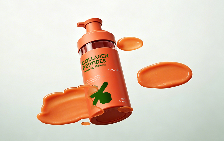
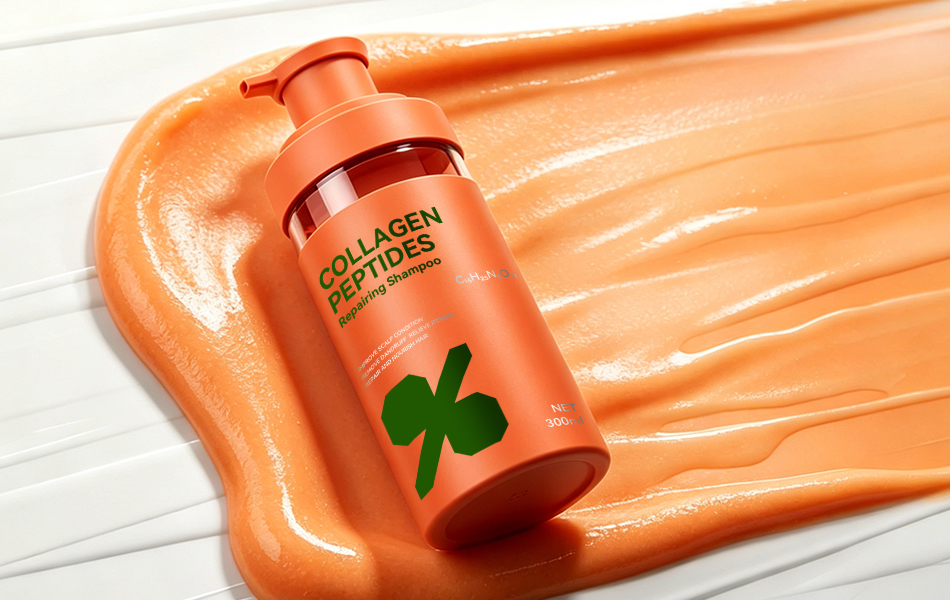
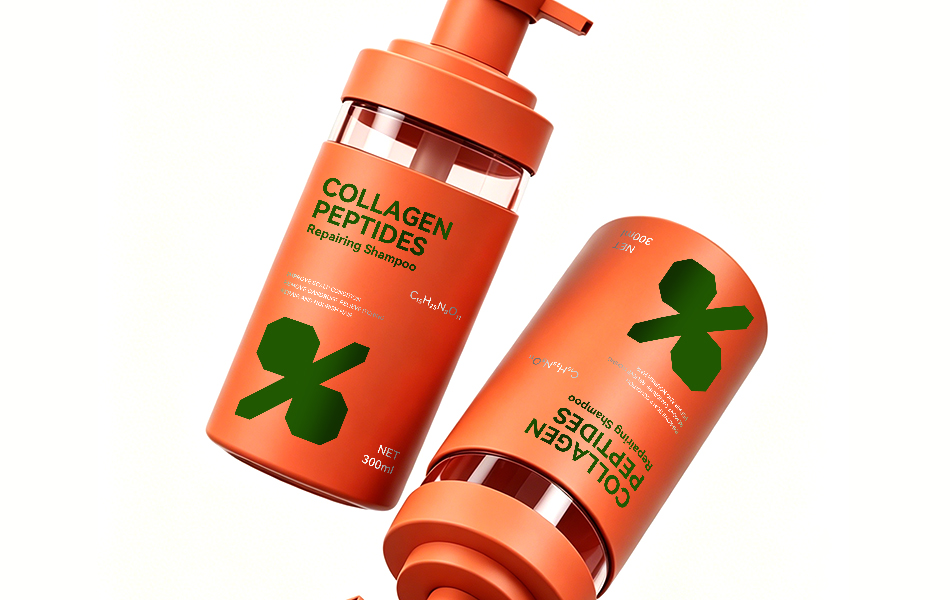
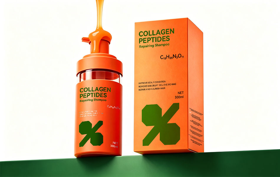
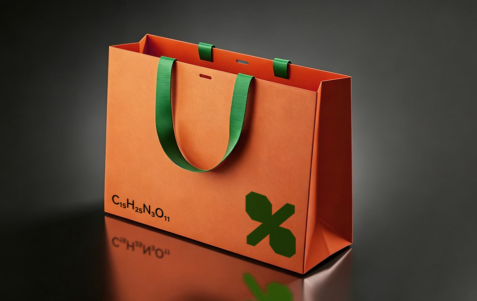
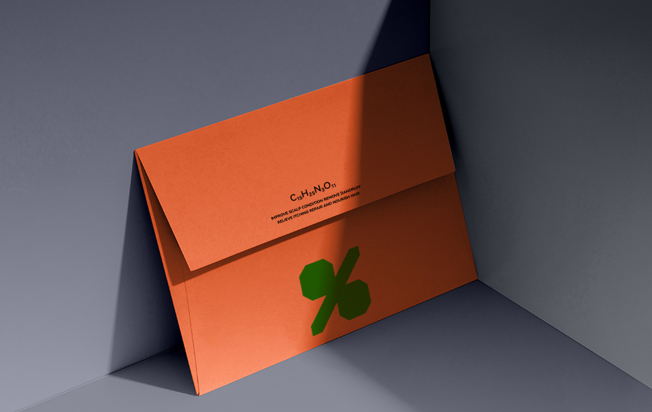
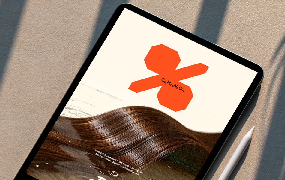
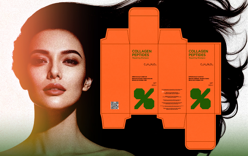
The molecular formula representing the product’s core active repair ingredient (C₁₅H₂₅N₃O₁₁) is extracted and transformed into a proprietary visual icon.
Simplified into elegant geometric linework, the symbol occupies the centre of the bottle, visually reinforcing the scientific foundation of the formula.
Rather than relying on exaggerated ingredient claims, the molecular icon creates a memorable visual identity unique to the Baifenzhi brand.
Dual Barrier Repair Graphic System
The product addresses two major hair concerns:
- Damaged scalp barrier
- Open and weakened hair cuticles
To communicate this visually, a custom dual-line graphic system was developed.
The inner line represents the scalp’s keratin barrier.
The outer line represents the hair cuticle.
Small droplets and flowing nutrient lines illustrate ceramides filling damaged barrier gaps, sealing lifted cuticles, and locking in long-lasting moisture.
This visual approach replaces lengthy technical explanations with an intuitive graphic language that consumers can understand immediately.
Colour Palette Strategy
The packaging adopts a low-saturation matte colour palette designed to communicate calmness, professionalism, and premium quality.
Primary Colour – Matte Pale Blue-Green
Represents soothing scalp care and immediately signals suitability for sensitive or irritated scalps.
Base Colour – Matte Soft White
Communicates the gentle amino acid cleansing formula while reinforcing cleanliness and protection of the scalp’s natural barrier.
Accent Colour – Light Charcoal Grey
Applied to the molecular graphics and typography to enhance the scientific appearance while maintaining subtle visual contrast against the soft background.
The overall matte, desaturated colour palette complements contemporary bathroom interiors, photographs beautifully for digital content, and attracts attention naturally on retail shelves.
Layout and Typography
Three-Zone Minimal Layout
The packaging follows a clean three-section hierarchy:
- Brand identity at the top
- Molecular graphic as the central focal point
- Functional information and regulatory content at the bottom
This clear information structure enables consumers to identify both the brand and its core repair benefit from several metres away, improving shelf visibility and retail recognition.
Dual Typeface System
Brand Name
A refined bold sans-serif typeface with clean geometric strokes conveys professionalism and contemporary aesthetics.
Product Information
A lightweight sans-serif font minimises visual fatigue while reinforcing the product’s gentle positioning for sensitive scalp care.
All typography incorporates softened corners to echo the overall theme of comfort, repair, and care.
Ergonomic Bottle Design
The bottle features smooth blow-moulded curves without sharp edges.
Its width has been designed to fit comfortably within an adult hand, providing a secure grip even in wet bathroom conditions.
A precision flat pump dispenser delivers consistent product dosage while reducing unnecessary waste.
The bottle combines aesthetics with practicality, making it suitable for everyday home use as well as travel-sized refills.
Packaging Materials
Bottle
Constructed from food-grade virgin matte PET plastic with excellent durability, moisture resistance, and impact resistance.
The virgin material contains no recycled impurities, ensuring consistent translucency, colour stability, and a uniform matte finish.
Pump
Manufactured from environmentally friendly PP plastic with a silicone sealing core for leak resistance.
The pump shares the same matte colour treatment as the bottle, creating a seamless appearance.
Label Film
A premium matte BOPP film provides a soft texture with low reflectivity while resisting fingerprints, water, and bathroom humidity.
Printing uses environmentally friendly soy-based inks that comply with cosmetic packaging safety standards while maintaining long-term colour stability.
Folding Carton
Produced from 300gsm premium matte white paperboard offering excellent rigidity and compression resistance.
A soft-touch matte lamination enhances tactile quality, while a light grey interior improves the unboxing experience and protects products during e-commerce shipping.
Production and Manufacturing
Integrated Matte PET Surface
The bottle achieves its matte appearance through physical surface treatment rather than coatings or paint.
This produces a durable, even matte finish that resists whitening, scratching, watermarks, and long-term wear.
High-Precision UV Screen Printing
The molecular graphics and typography are printed using ultra-fine UV screen printing technology.
This delivers exceptionally sharp line quality without colour bleeding while introducing a subtle tactile dimension that complements the matte surface.
Full Matte Protective Lamination
All labels and cartons receive a matte BOPP protective film that provides resistance against water, oils, fingerprints, and daily bathroom use.
Rounded Die-Cut Construction
Every carton corner is rounded through precision die-cutting, improving handling comfort while reducing edge damage during transportation.
A self-locking carton base eliminates the need for adhesive, improving manufacturing efficiency.
Environmentally Responsible Printing
Low-temperature printing with soy-based inks eliminates volatile organic compounds (VOCs), meeting cosmetic packaging environmental standards while ensuring safety for mothers, babies, and consumers with sensitive scalps.
Design Value
Developed by HONGLUOTU Brand Design Studio under the creative direction of Scientific Hair Repair, this comprehensive packaging system transforms the brand philosophy, active ingredients, and repair technology into a clear and memorable visual identity.
Combined with premium sustainable materials and scalable manufacturing processes, the design successfully achieves three key objectives:
- Strong visual differentiation
- Practical everyday usability
- Consistent performance across online and offline retail channels
The result is a distinctive premium packaging system that establishes a recognisable brand identity while supporting efficient large-scale production and reinforcing Baifenzhi’s positioning as a professional scientific hair repair brand.
 Derrick Lin
 Biaa
Biaa Petitmoulin Studio
 White Bear Studio
 Eva Chistyakova
 monther al omari
 Atipus
 alchimistestudioParis
 oneandother
 bloomburo
 helocrene
 Shapers Studio
 Denver Design
 Aidearte
 andrew.huerta
 softmachine
 airobtq
 Buzz & Co.
 Ruby
Ruby themythographer
 IDNB Inc.
 viktorflr
 Zenpack