

The Alchemy of Distillation: Turning Quadruple Distillation into a Visual Language
When Bruichladdich approached us to create an identity for X4+18, the world’s first quadruple distilled 18-year-old single malt Scotch whisky, we were faced with a simple challenge:
How do you design for a process nobody can see? Quadruple distillation is what makes X4+18 unique, but it happens behind closed doors. Consumers never witness the four passes through the stills that shape the liquid. If this whisky was going to stand apart, we needed to find a way to make that invisible process visible. The answer became the foundation of the entire identity.
The Alchemy of Distillation
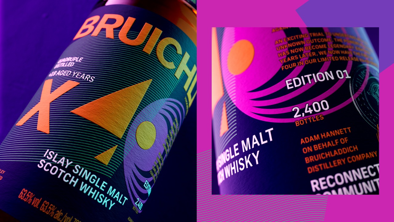
Our strategic thought was simple: hero the quadruple distillation process through its own artistic interpretation. That led us to the idea of The Alchemy of Distillation. Instead of relying on familiar whisky cues, we created a visual language inspired directly by the power of four. Four abstract graphic elements represent the four passes through the stills, building a system that feels layered, energetic and transformative.
The forms overlap, shift and evolve, creating a sense of movement that mirrors the process itself. The result is something both scientific and artistic – a visual expression of transformation. The identity takes a highly technical production method and translates it into something immediate, memorable and easy to understand. Four distillations, four graphic elements, all part of one unmistakable idea.
Building Anticipation
From the outset, X4+18 was conceived as more than a single release. The first expression in a planned four-part series, it needed an identity capable of evolving over time while maintaining a clear visual thread. Rather than creating a one-off pack, we set out to build a flexible system that future editions could inherit and reinterpret.
We looked beyond whisky for inspiration. Limited sneaker drops, fashion collaborations and collector culture all informed our thinking. Much like these worlds, X4+18 is designed to create anticipation. Each future release becomes another chapter in the story, giving collectors and enthusiasts something to follow over time rather than simply purchase once.
As Matt Burns, Co-Founder and Executive Creative Director at Thirst, explains: “Bruichladdich is a gift to design for. They give you licence to walk new paths and never repeat what already exists. Risk is behind X4+18’s creation, and our job was to create an identity that reflected that same spirit.”
The outcome
Released as a limited edition of just 2,400 bottles, X4+18 sold out on launch. More importantly, it established a visual platform for the future of the series – one built around experimentation, collectability and the power of making the invisible visible. As Gareth Brown, Global Marketing Director at Bruichladdich, said: “In whisky design, there’s a huge temptation to play safe, but risk can lead to beauty – both in the bottle and on it.”
Curator’s Insight
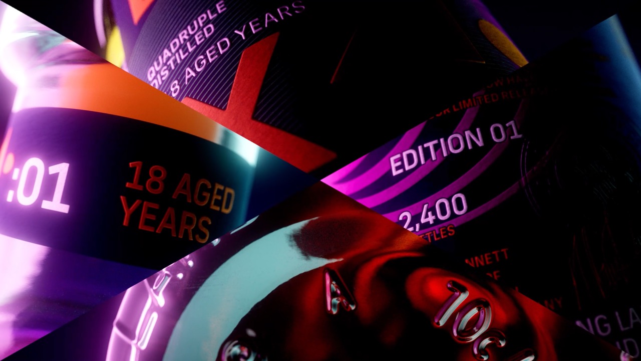
What makes this label work is restraint at the concept level, even though the execution is loud. One process, four passes, four shapes: the system never tries to say more than that, which is why it reads clearly even at a glance. A lot of premium spirits packaging reaches for texture and heritage cues to signal quality. This one skips that entirely and leans on color and geometry instead, which is a riskier bet but pays off here because the shapes actually carry meaning rather than just filling space.
The gradient foil on the neck label and the glow around the bottle in these shots also do something worth noting: they borrow more from tech or fragrance launches than from traditional whisky photography. That’s a deliberate distancing from the category’s usual visual habits, and it signals early that this bottle isn’t trying to sit quietly next to the older releases on the shelf.



 monther al omari
 Ximena Ureta Design Studio.
 vitoramockup
 Up-Brands
 Sophiagdotcom
 Peter said
 ayeidadezigns
 Tancybox
 宏洛图品牌设计HONGLT
 Modern Theory
 Dozen Agency
 Atiq Alam
 Olio Studio
 Ruchi S. Joshi
 mmdesign
 awaiskhadim
 Octasoft
 United Creatives Studio
 Kingdom & Sparrow
 Anastasia Bakhmatskaya
 CreativeWise
 Great and Golden