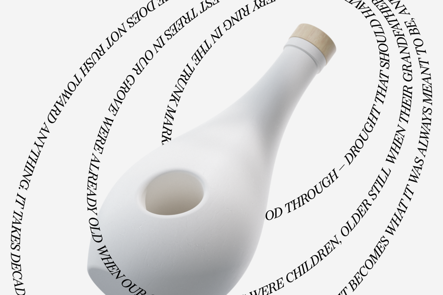

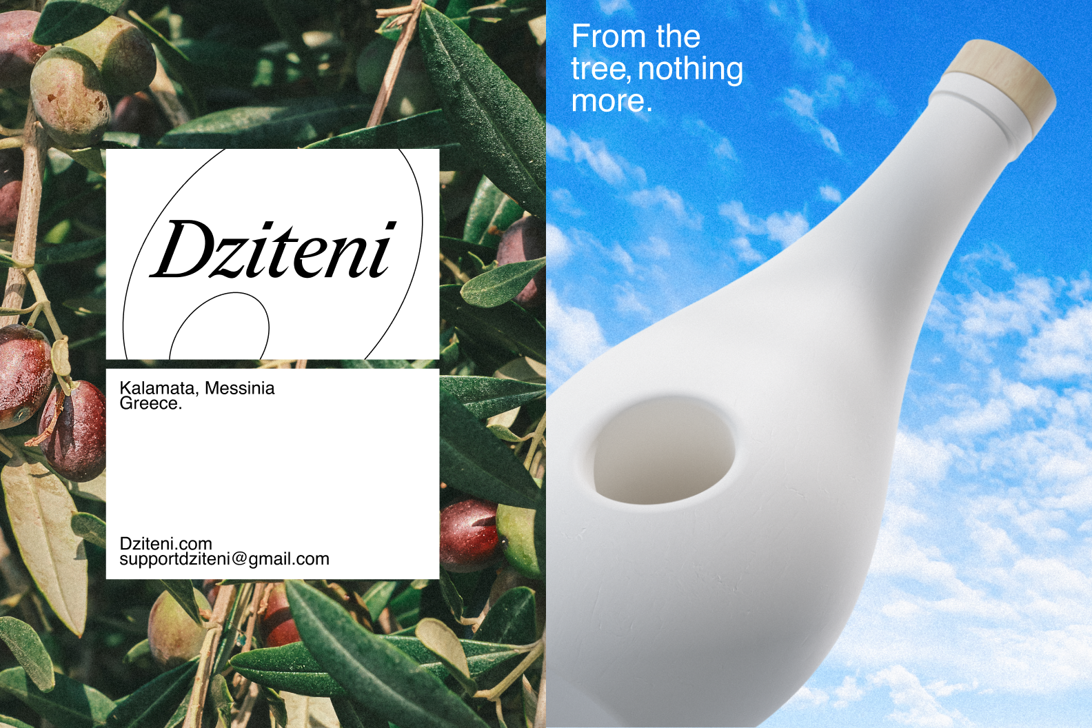
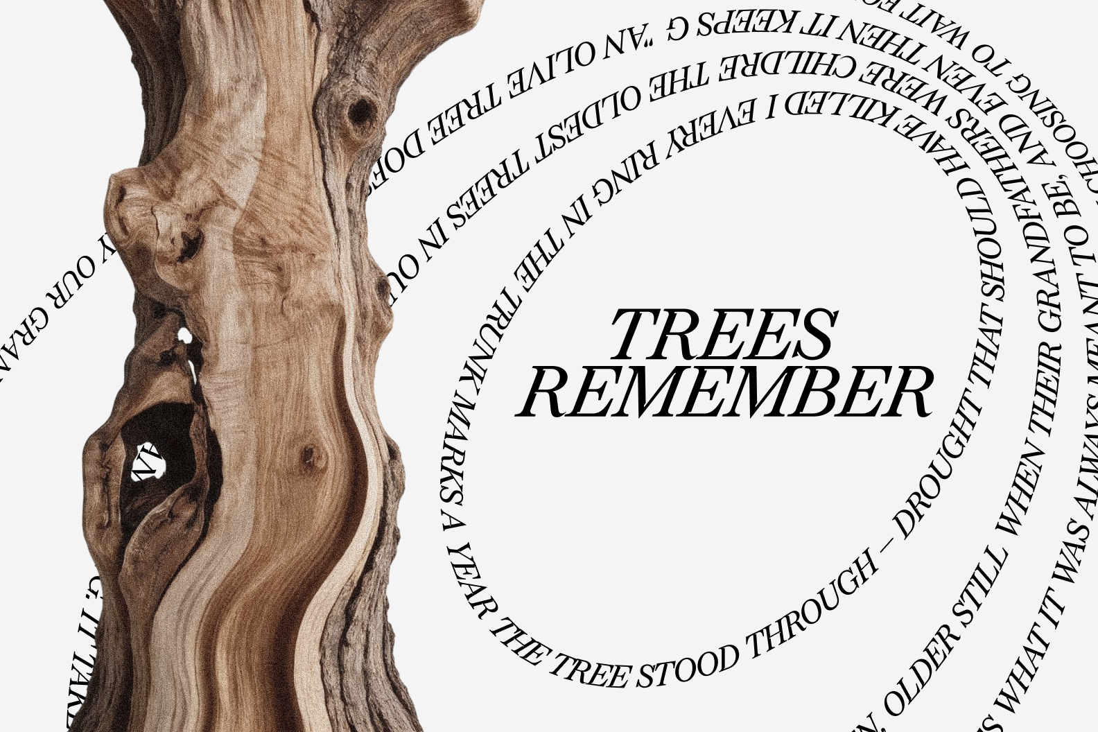
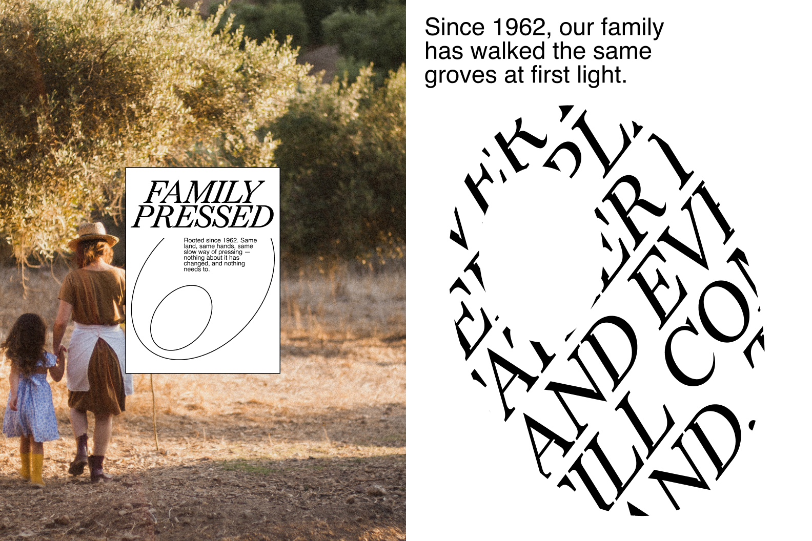
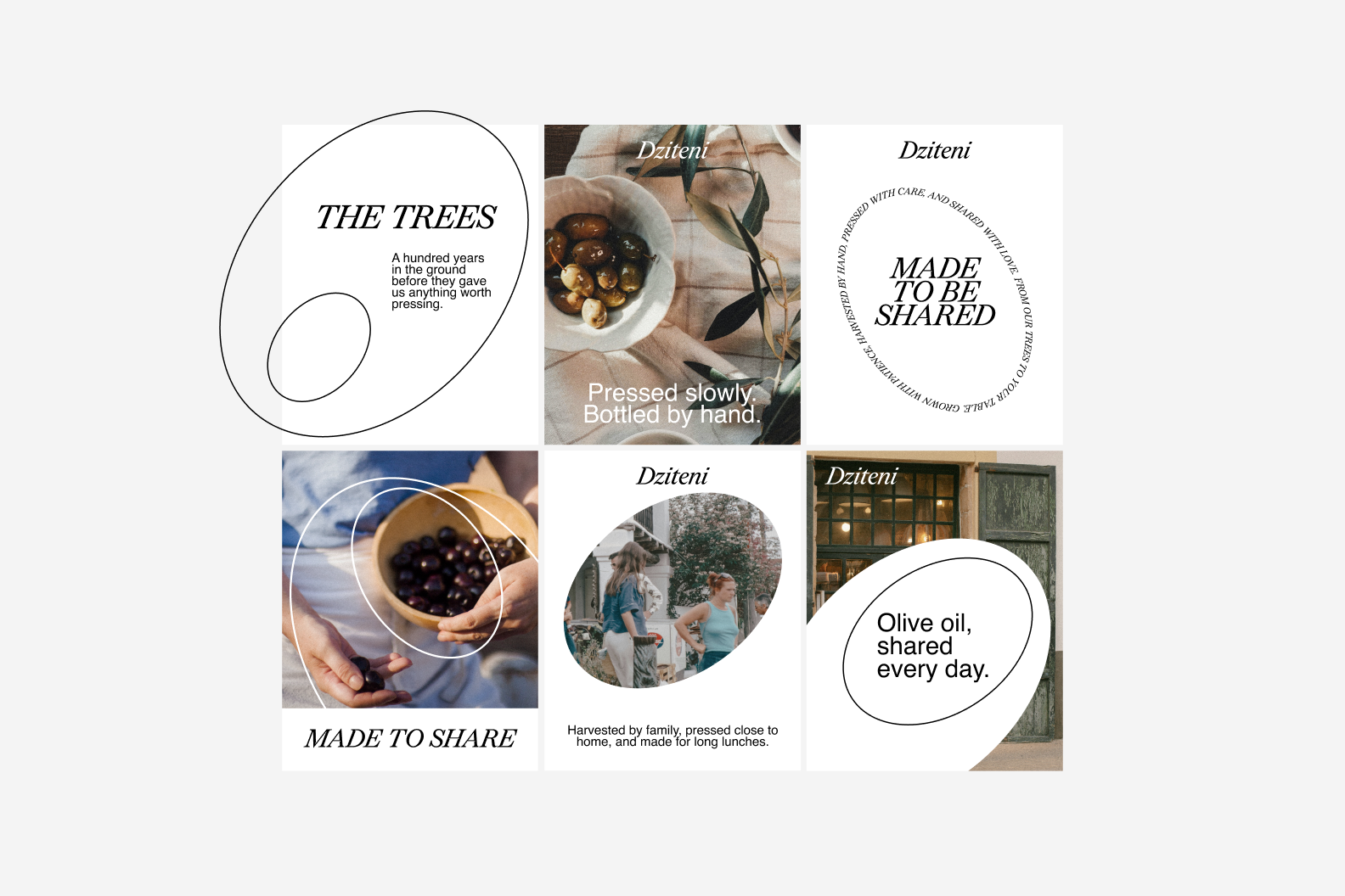
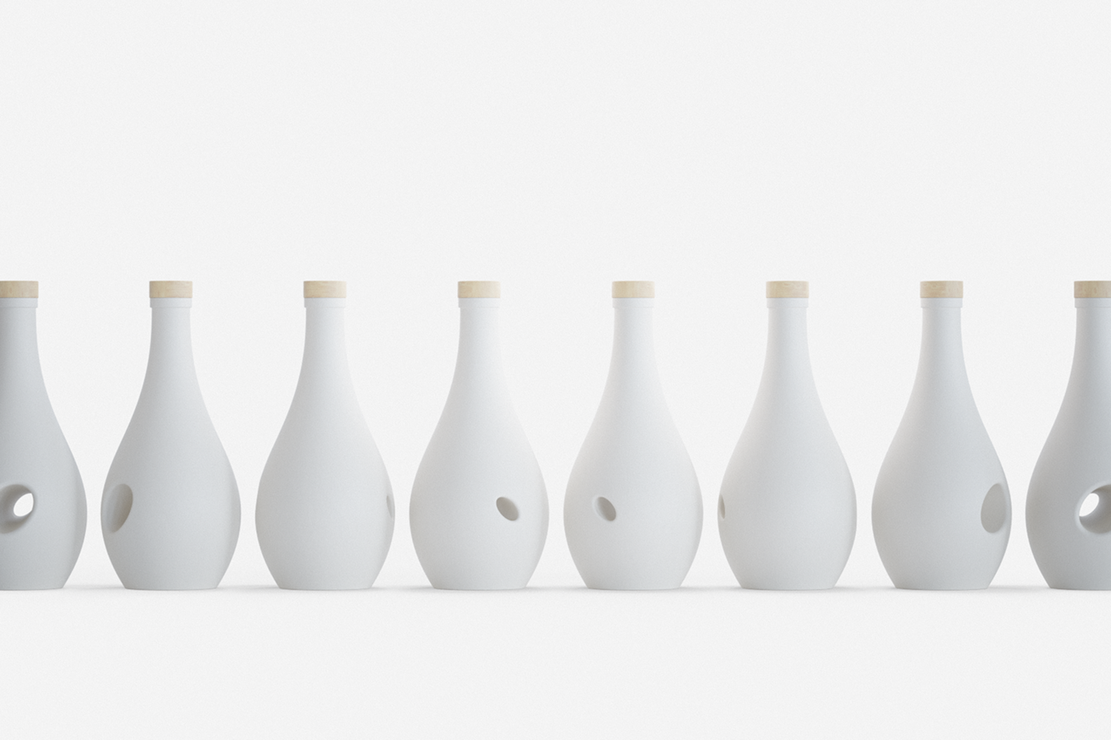
Dziteni is a concept for a family-owned Greek olive oil brand inspired by the olive tree itself. The entire identity grows from a single idea: the shape of an olive. That simple form appears throughout the visual system, while the bottle becomes the tree it came from, creating a quiet relationship between the product and the brand instead of treating them as separate elements.
Rather than leaning on traditional Mediterranean clichés or luxury cues, the goal was to create something that feels calm, timeless, and familiar. Soft curves, restrained typography, and natural materials work together to let the product speak for itself.
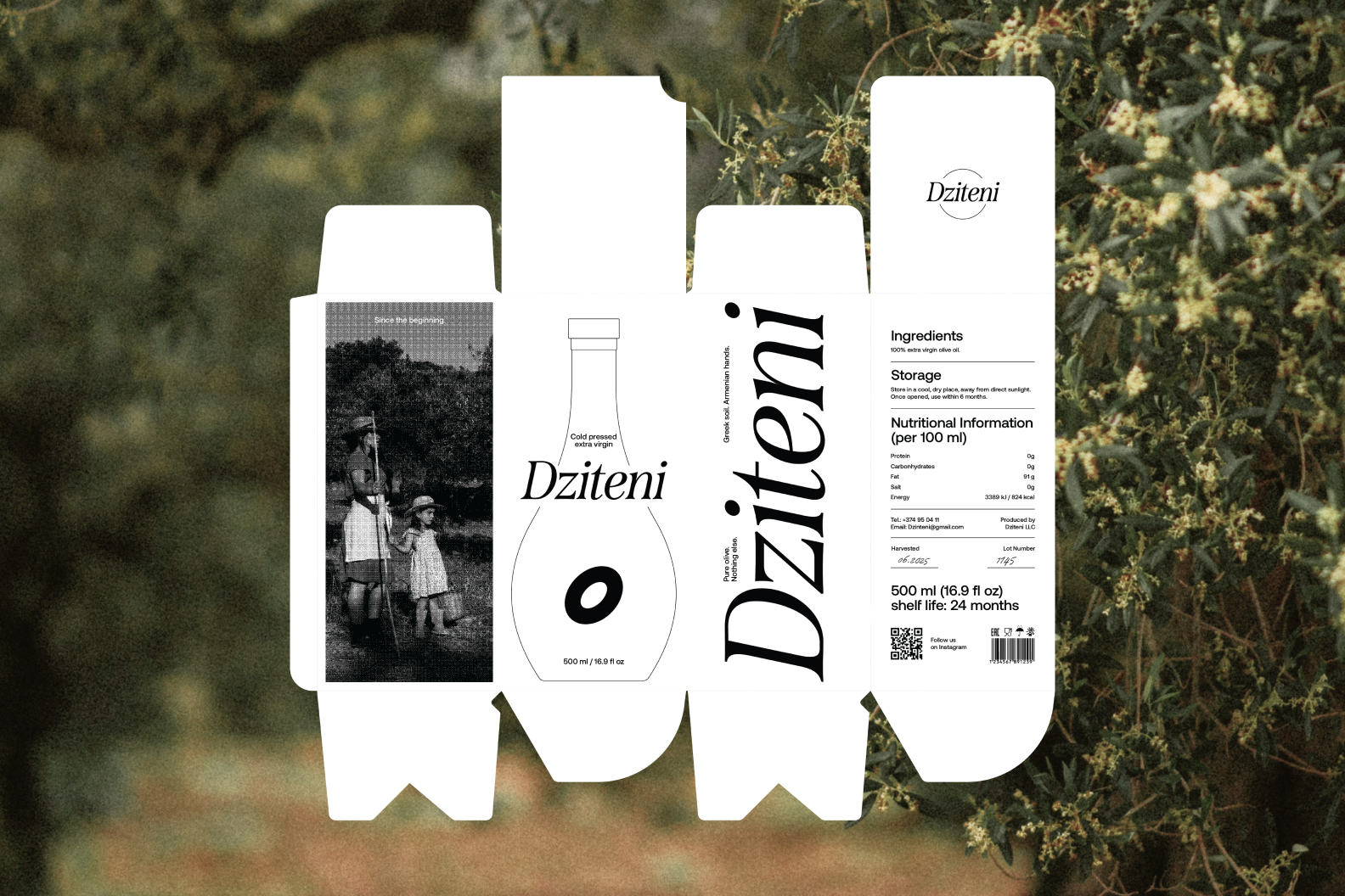
The identity extends across packaging, stationery, printed materials, and social content while staying consistent through one visual language. Every element was designed to reflect the same values: family, patience, and everyday rituals. Dziteni celebrates olive oil as something meant to be opened often, shared around the table, and become part of daily life rather than saved for special occasions.
Curator’s Insight:
Olive oil packaging usually solves for heritage signalling: amphora silhouettes, wax seals, sun-bleached labels borrowed from a Mediterranean postcard. This project solves a different problem entirely, how do you make a bottle argue for itself without any of that shorthand.
The answer sits in the cut-out. Instead of printing an olive motif onto a label, the design punches an oval straight into the ceramic body, so the negative space does the branding. It’s a structural choice, not a decorative one, and it means the identity survives even with every label peeled away. The tapered, slightly asymmetric body reinforces this further, closer to a single olive caught mid-drop than to a conventional bottle profile, so the vessel and the product start to blur into the same object.
The wood cap and unbleached ceramic finish do quieter work too. Nothing here reflects light the way foil or gloss would, which keeps attention on form rather than surface treatment. Restraint becomes the differentiator in a category that usually competes on ornament.
The transferable principle: when a category defaults to symbolic decoration, extracting the symbol into the structure itself, rather than adding it as surface art, tends to read as more considered and more permanent.

 lunapanda
 Tridimage
 Analoguecreative
 lettera7
 alchimistestudioParis
 Lana B
 Colossal
 Pivot Studio
 M&A CREATIVE AGENCY
 monther al omari
 Anastasia Cherepanova | xtramez
 Hollóka Grafikai Műhely / Graphic Design Studio
 BOLD branding
 Antonia Skaraki
 Pâmella Lorrany
 Z9BKAdsgn
 Francesco Paternoster
 b1studio.ro
 Chris Creative Works
 Boordon
 Dmitriy Kuzovlev
 Brand Society
 yasharpic