

ELEVATOR
Broken is the first step up.
(Elevator — Movement to the Essence)
ABOUT
ELEVATOR is a conceptual wine packaging design inspired by the idea that true value often lies beneath the surface.
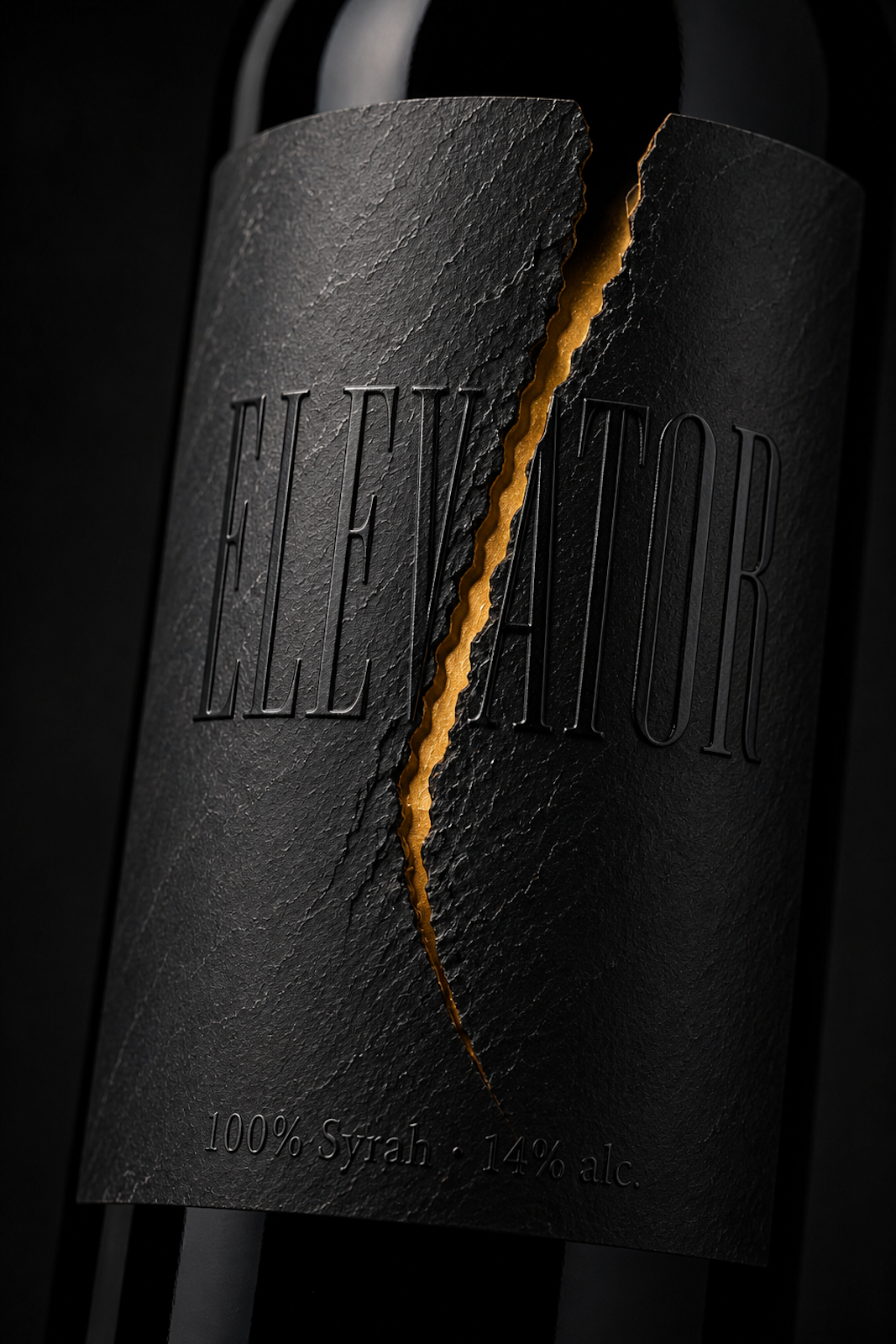
The label resembles a slab of dark slate that appears to split open, revealing a warm golden core. The fracture is not a symbol of destruction, but of transformation. It represents the moment when pressure becomes strength and when imperfection reveals something precious.
The project explores the tension between darkness and light, weight and fragility, stone and gold. Rather than decorating the bottle, the packaging becomes the story itself.
⸻
SOLUTION
The label is treated as a sculptural object rather than a printed graphic.
A deeply textured slate surface creates the illusion of real stone wrapped around the bottle. A realistic geological fracture reveals a subtle layer of molten gold beneath it, suggesting hidden richness instead of damage.
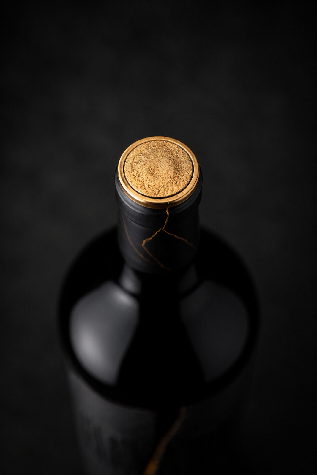
The embossed ELEVATOR logotype appears to emerge naturally from the slate surface, while the golden detail continues seamlessly onto the bottle capsule, connecting the entire object through a single visual gesture.
Every element was intentionally reduced to its essence: one material, one fracture and one light source.
⸻
RESULT
The design invites the viewer to pause before reading.
Instead of communicating through illustration or colour, it relies on texture, material and contrast to create curiosity and emotional engagement.
ELEVATOR transforms a wine bottle into an object that feels discovered rather than designed—as if its most valuable part had always been hidden inside the stone.
Because sometimes the first step upward begins with a fracture.
Broken is the first step up.


 monther al omari
 Ximena Ureta Design Studio.
 vitoramockup
 Up-Brands
 Sophiagdotcom
 Peter said
 ayeidadezigns
 Tancybox
 宏洛图品牌设计HONGLT
 Modern Theory
 Dozen Agency
 Atiq Alam
 Olio Studio
 Ruchi S. Joshi
 mmdesign
 awaiskhadim
 Octasoft
 United Creatives Studio
 Kingdom & Sparrow
 Anastasia Bakhmatskaya
 CreativeWise
 Great and Golden