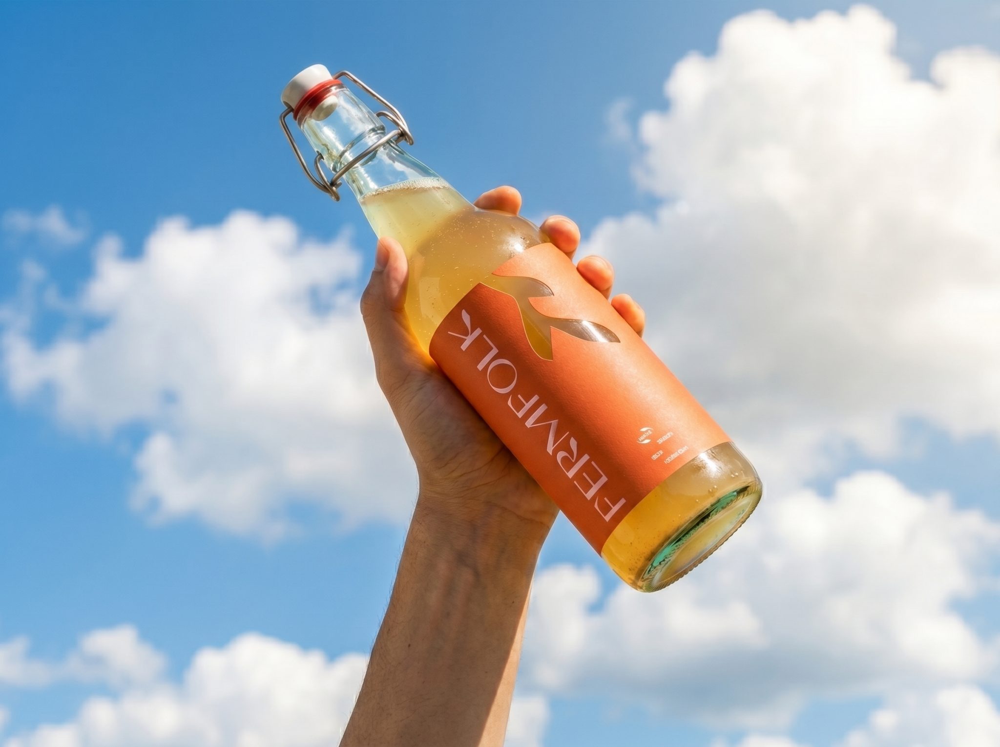

FERMFOLK is a women-led fermented foods brand based in Stamford, UK, specializing in handcrafted kombucha, kimchi and other naturally fermented products.
The challenge was to create a visual identity that would reflect the premium quality of the products while avoiding the traditional aesthetic often associated with organic and health-food brands. The goal was to combine craftsmanship and authenticity with a bold, contemporary visual language.
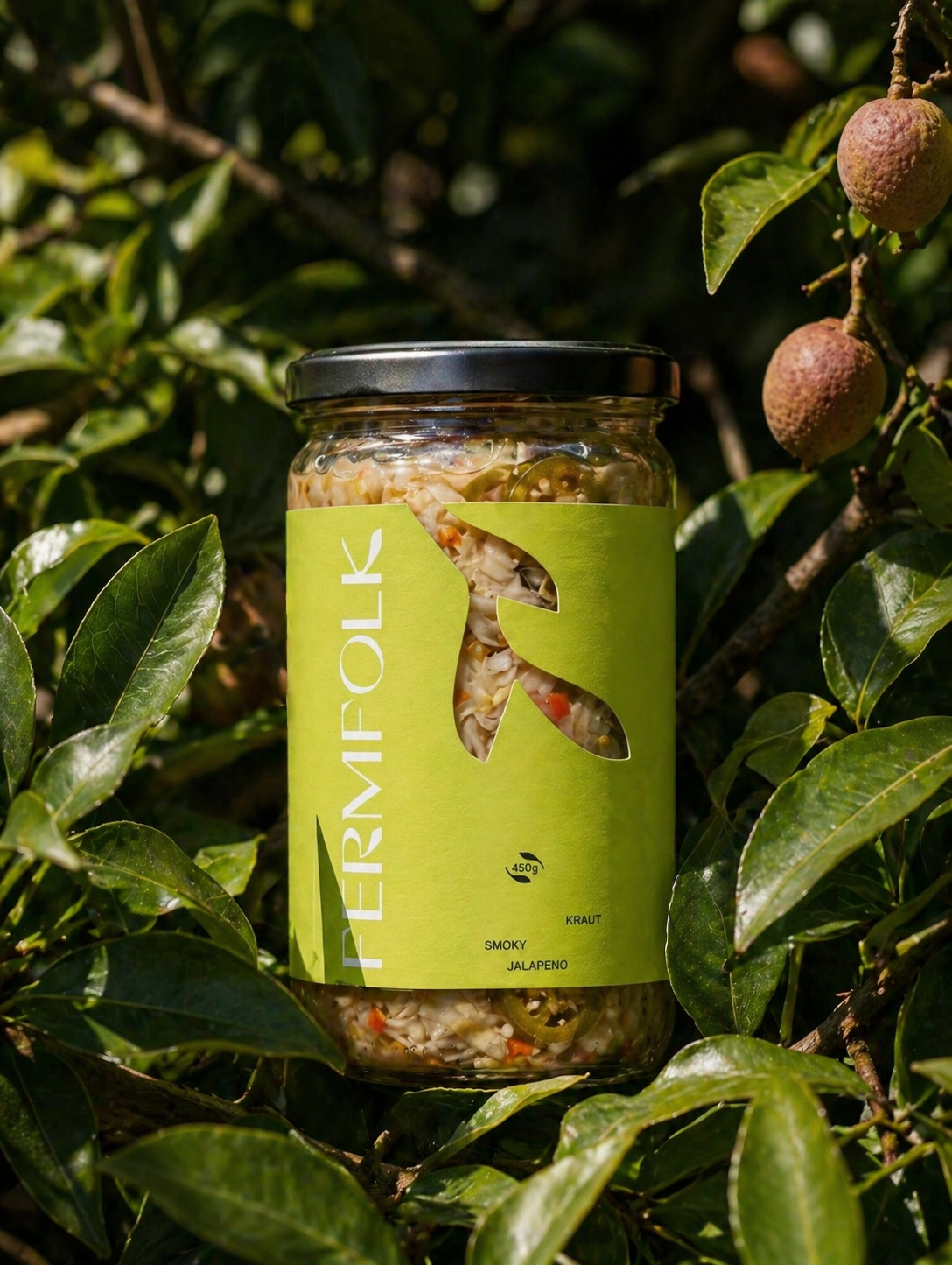
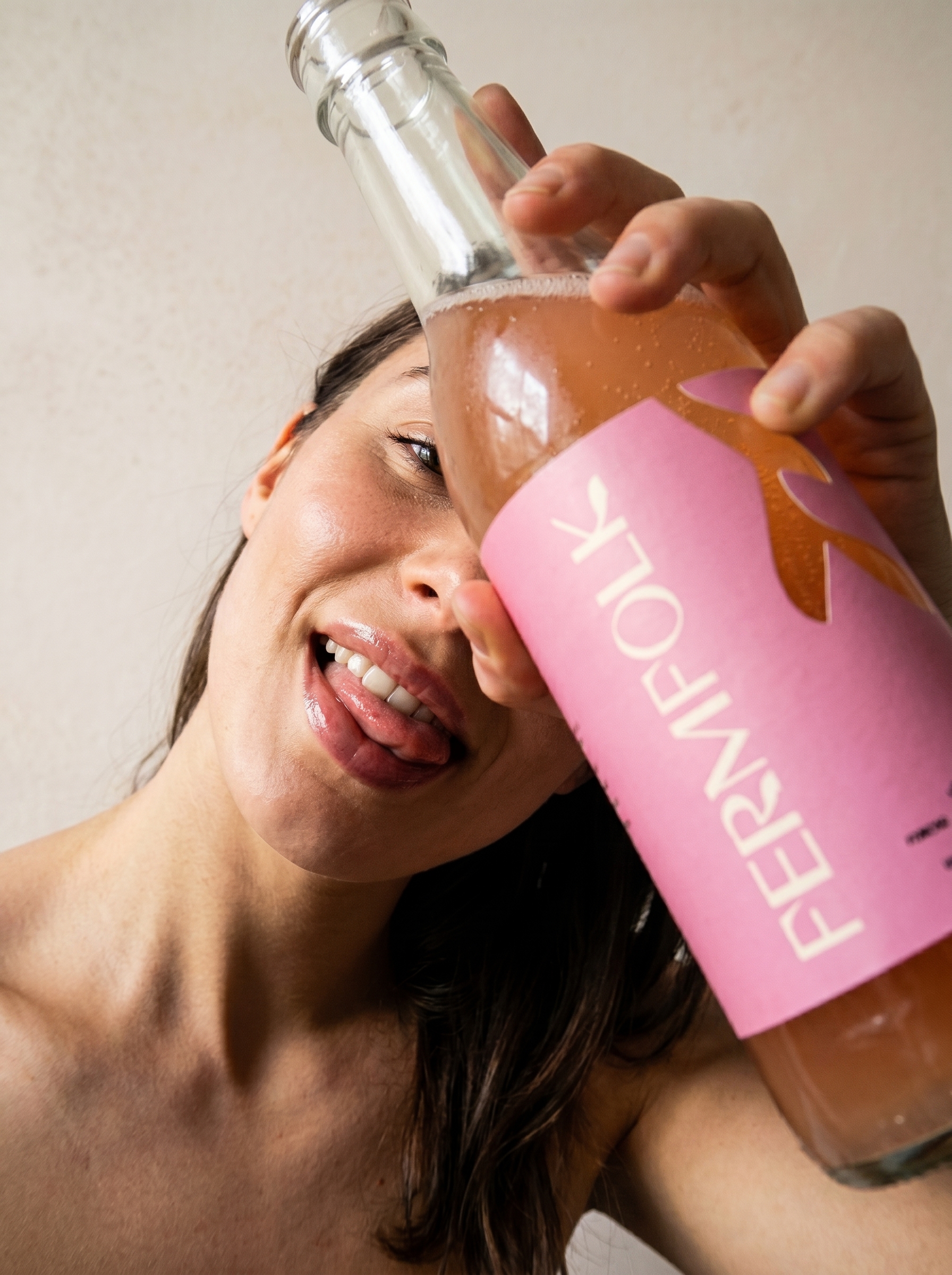
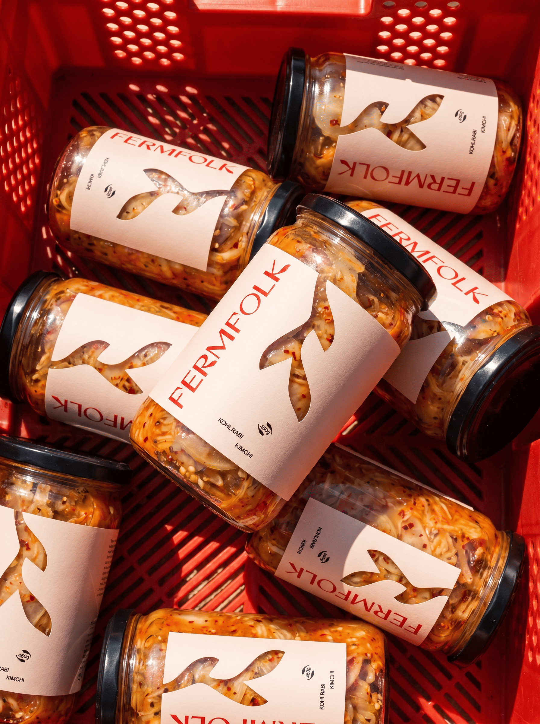
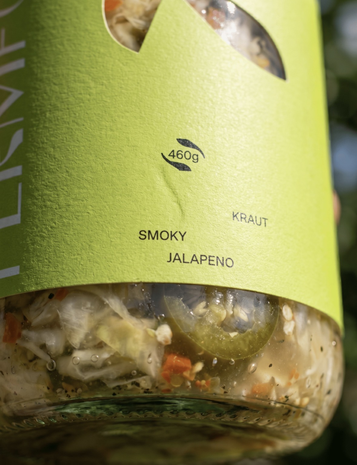
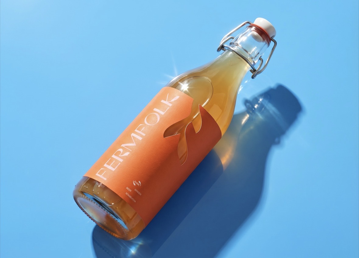
The visual identity was built around the contrast between modern creativity and artisanal production. Bright colors, expressive typography and confident compositions help the brand stand out on the shelf, while clean layouts and carefully balanced details maintain a premium feel.
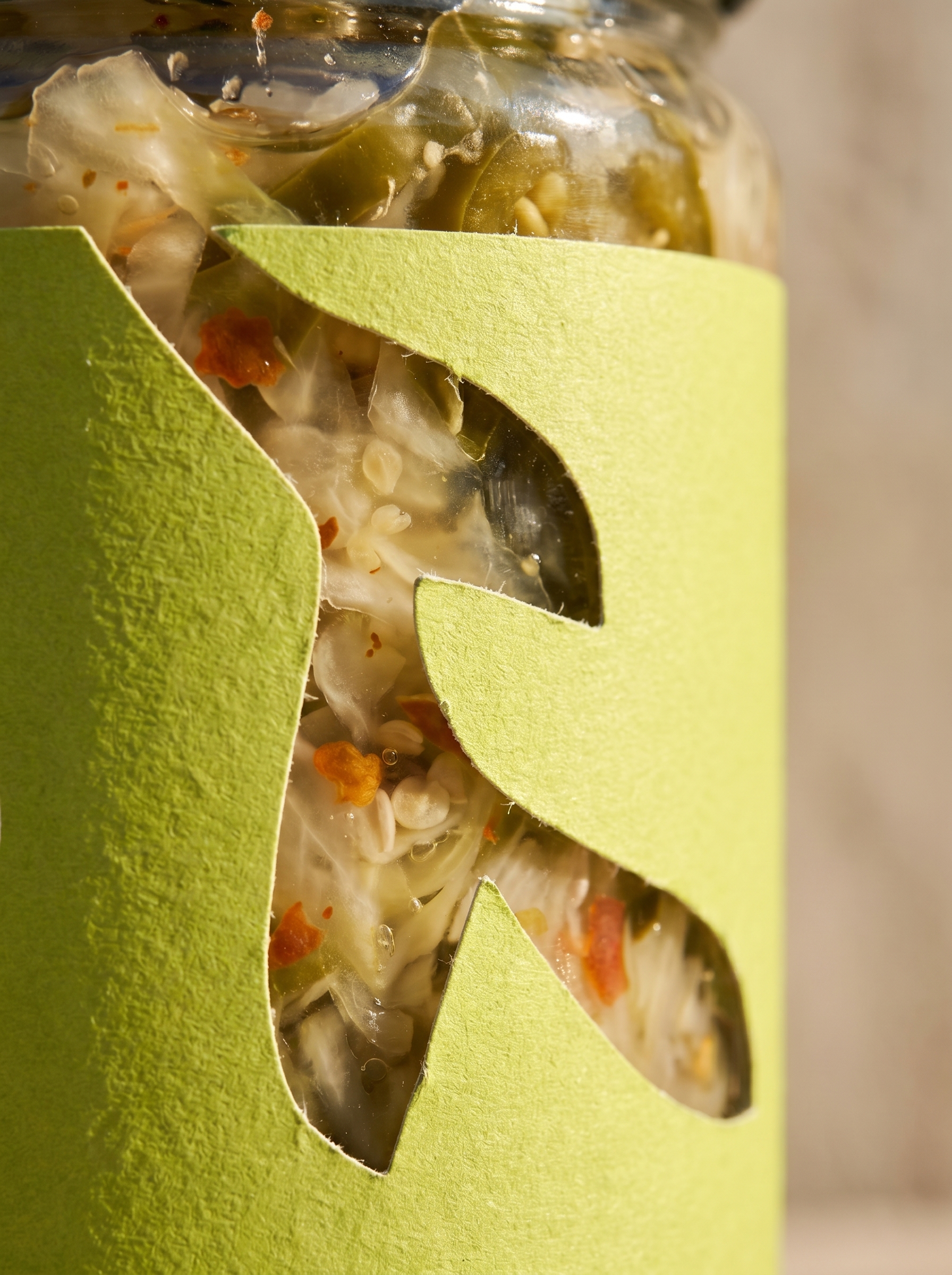
Packaging became a central part of the project. Each product received its own color and personality, creating a vibrant product family while preserving consistency across the entire range. The labels were designed to communicate freshness, energy and the handcrafted nature of the products without relying on predictable visual clichés.
The final result is a bold and memorable brand identity that brings a fresh perspective to the fermentation market, combining premium positioning with modern, creative expression.




 Derrick Lin
 Biaa
Biaa Petitmoulin Studio
 White Bear Studio
 Eva Chistyakova
 monther al omari
 Atipus
 alchimistestudioParis
 oneandother
 bloomburo
 helocrene
 Shapers Studio
 Denver Design
 Aidearte
 andrew.huerta
 softmachine
 airobtq
 Buzz & Co.
 Ruby
Ruby themythographer
 IDNB Inc.
 viktorflr
 Zenpack