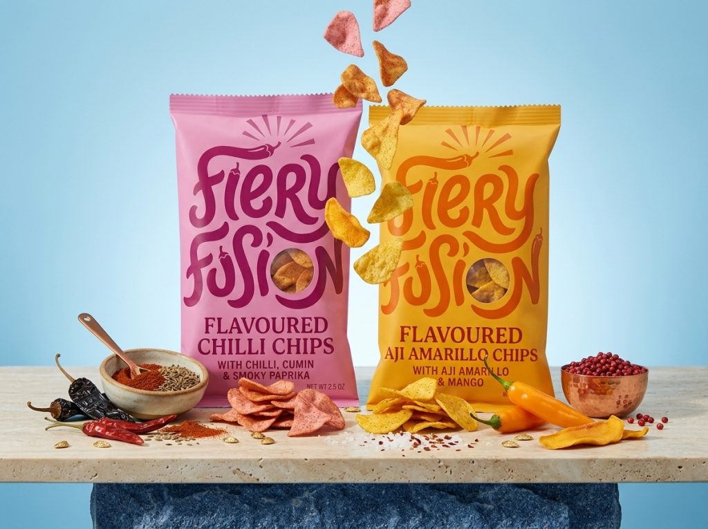

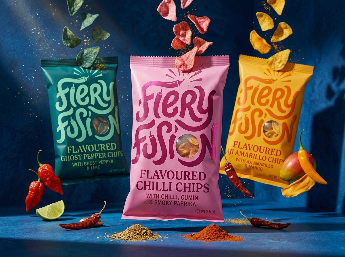
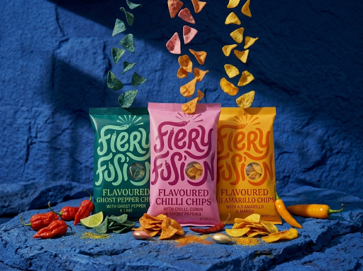
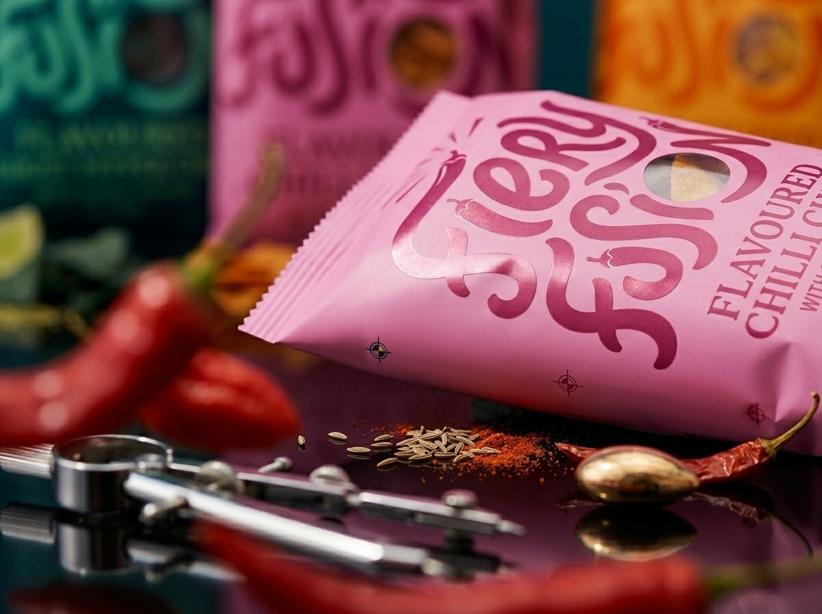
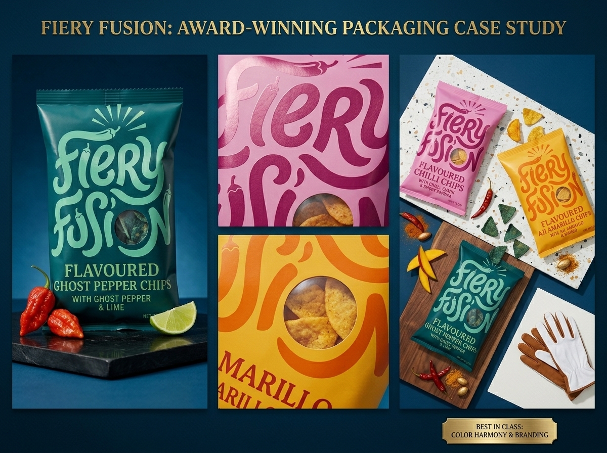
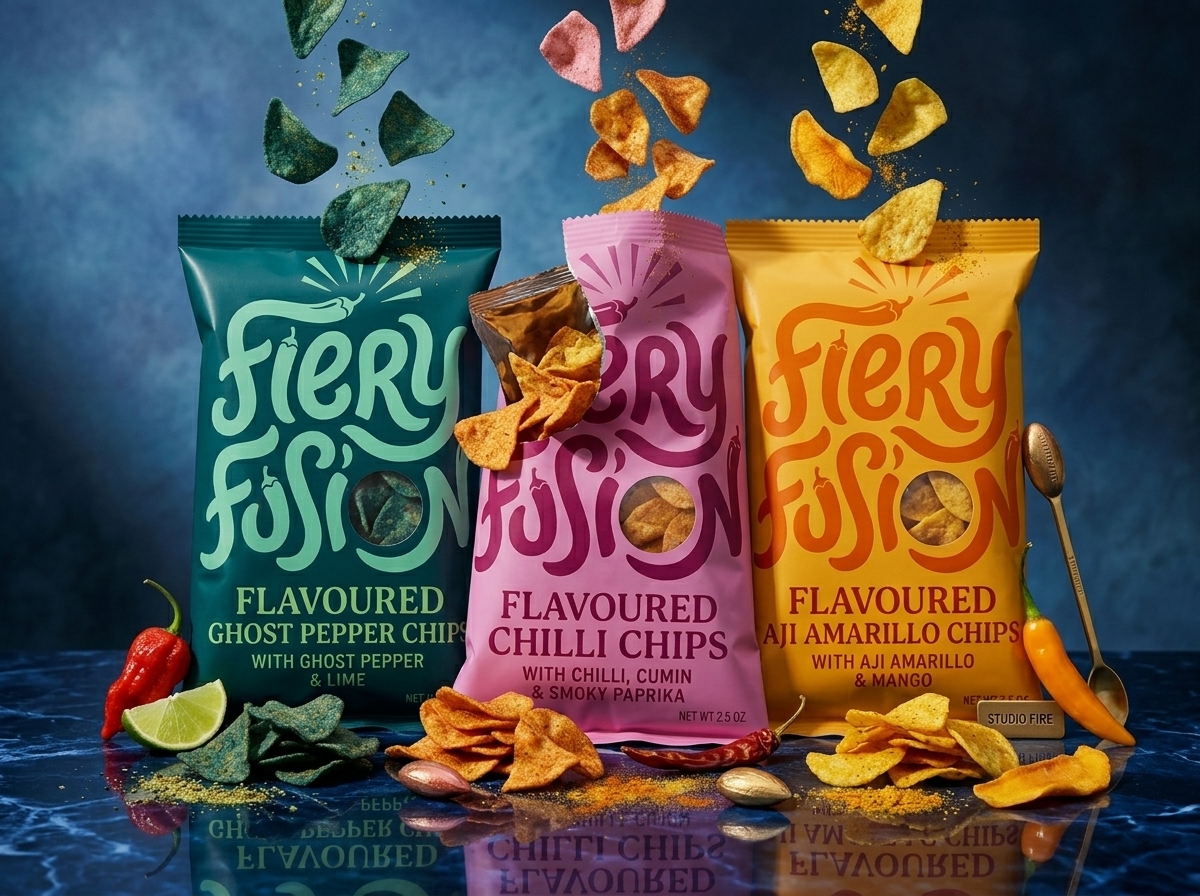
Fiery Fusion is a range of globally inspired flavored chips built around bold heat and adventurous flavor pairings. The identity uses expressive custom lettering, vibrant color blocking, and ingredient-led storytelling to communicate intensity, personality, and flavor differentiation at shelf. Rather than relying on conventional spicy-snack cues, the packaging creates a playful, premium visual language that celebrates culinary exploration while maintaining strong retail visibility.
Curator’s Insight
What’s being solved here isn’t heat, it’s differentiation within heat. Spicy snack aisles are crowded with a narrow visual vocabulary: fire graphics, red-to-black gradients, flame typography. Fiery Fusion sidesteps that entirely by mapping each flavor to a distinct color family instead of a shared “spicy” signifier, so the range reads as a spectrum of experiences rather than three variations on one idea.
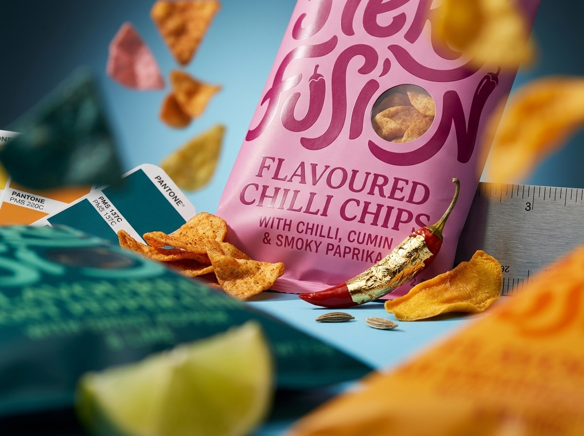
The lettering does double duty. Its loose, elastic strokes give the wordmark enough personality to survive without a mascot or illustrated character, which keeps production simpler while still delivering shelf recognition at a glance. Pairing that expressive type with a clean, functional window cutout is a smart tension: one element sells the fantasy, the other proves the product.
The broader takeaway: when a category has an overused visual shorthand, differentiation often comes less from rejecting the category cues altogether and more from choosing which single cue to keep (here, ingredient imagery) and building everything else around a fresh system.
 MID-AIR STUDIO
 monther al omari
 Tríona O'Donoghue • Design
 Cocoon Prague
 alchimistestudioParis
 hugo zapata
 Bonsanco Creative Studio
 parawaradesign
 UPRISE
 Brand Society
 Que Cálido Studio®
 Richest Branding Pvt. Ltd.
 STRATEDGY
 Shapers Studio
 Platon Ivantsov
 WPA Pinfold
 giselepereiradesign
 ShalaSketches
 05Creation
 Voit Studio
 SSTO
SSTO Abox Agency