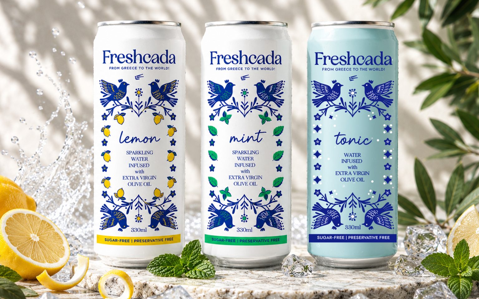

FROM GREECE TO THE WORLD!
Freshcada reimagines the Mediterranean refreshment experience by combining sparkling water with award-winning Extra Virgin Olive Oil.
Freshcada is a fresh, functional beverage inspired by Greece’s natural heritage.
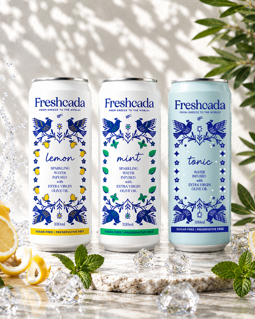
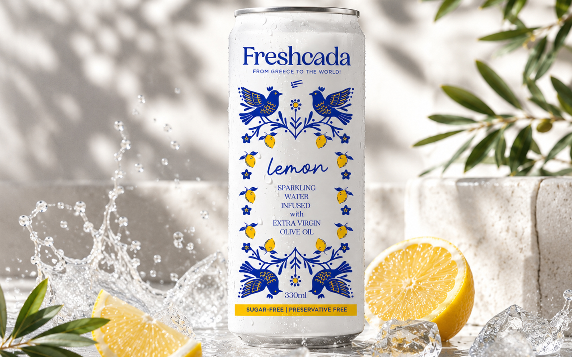
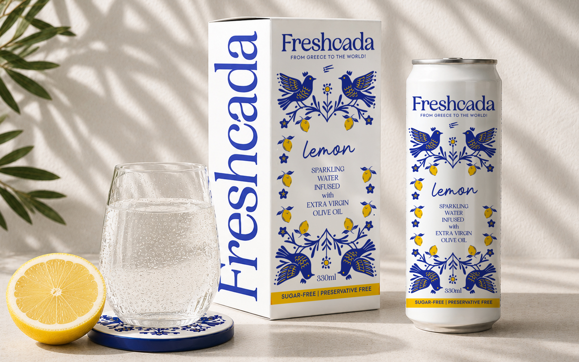
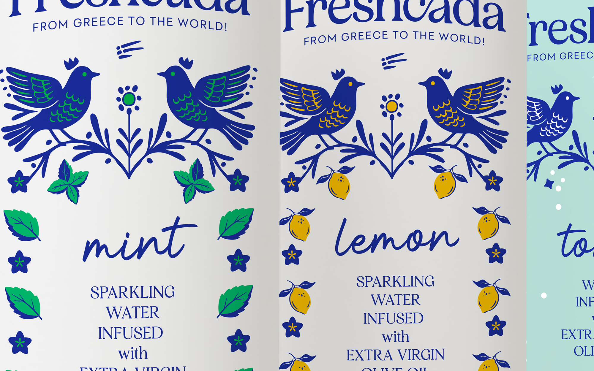
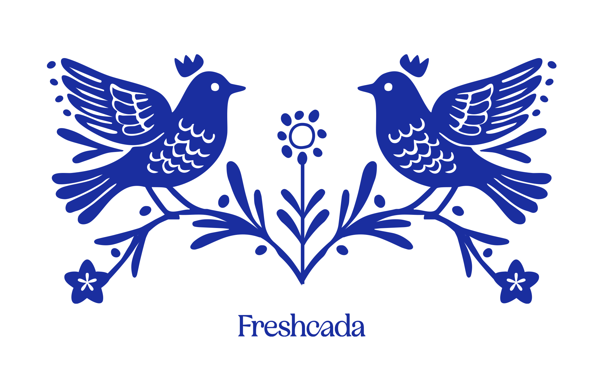
The identity captures a contemporary Greek spirit through clean typography, a minimal F symbol subtly reminiscent of the Greek flag, and modern folk-inspired illustrations of birds, olive branches and citrus. Rather than relying on clichés, the design expresses freshness, authenticity and premium simplicity.
The predominantly white packaging communicates purity, while the signature cobalt blue creates a strong Mediterranean character and shelf recognition.
Freshcada is positioned as a new generation of sparkling refreshments: healthy, approachable and enjoyable for the whole family.
*some of the visuals are created with the use of AI
Curator’s Insight
The hardest part of this brief isn’t the illustration, it’s the category problem underneath it. Olive oil infused sparkling water doesn’t have shelf precedent, so there’s no existing visual shorthand to borrow or subvert. The design has to build recognition from nothing while still reading as instantly Mediterranean.
The solution leans on pattern repetition rather than photography or flavour-forward imagery. Each can uses the same symmetrical bird and branch composition, just recoloured and reworked with different botanical details, lemons for lemon, mint leaves for mint, geometric dots for tonic. That structural consistency across the SKU line does more for shelf recognition than any single flavour cue could on its own, since the eye learns the pattern once and then reads variation quickly across the range.
White as a dominant field is doing quieter work here too. It’s an unusual choice for a category that typically reaches for saturated color to signal flavour intensity, but it lets the cobalt blue linework carry all the visual weight without competing surfaces. The white also does double duty as a purity cue, useful for a product built around health positioning.
The transferable principle: when launching into a category with no established visual language, structural repetition across a product line can build shelf memory faster than any single hero illustration. Consistency of system, not novelty of image, is what teaches the eye to recognize a new brand.










 Sophiagdotcom
 Derrick Lin
 monther al omari
 43oz
43oz lilyz design23
 Modern Theory
 Eighteen Brand Studio
 Bhumika Singh
 MohamedMashaly
 Pixels Studio
 Gulya
Gulya UPRISE
 Lizaveta Kharitonyuk
 Bonsanco Creative Studio
 DesignRepublic
 GIRAFA STUDIO
 PiotrWisniewski
 CreativeWise
 SoreThumbStudio®
 Modern World Studio
 Palashcc
 Valérie Colace