

Identity | Packaging design Helder
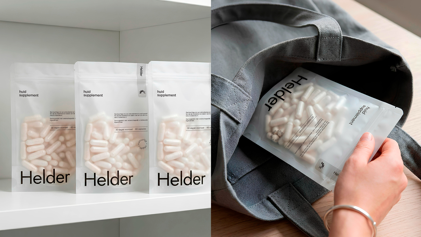
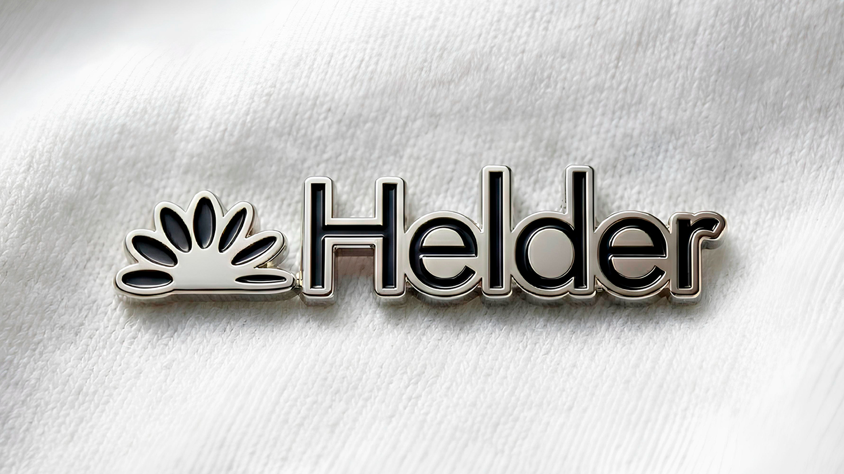
Helder is a contemporary skincare supplement brand built around clarity, balance, and quiet confidence. The name “Helder,” derived from the Dutch word for “clear,” reflects both the brand’s visual identity and its core promise: to support healthy, radiant skin from within.
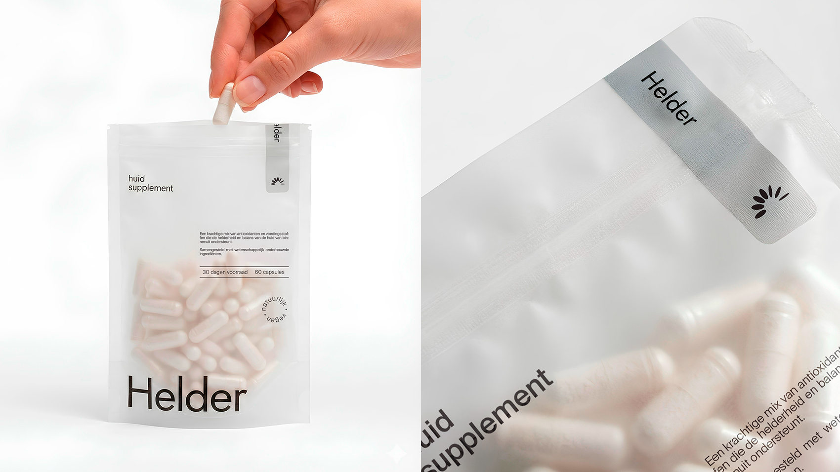
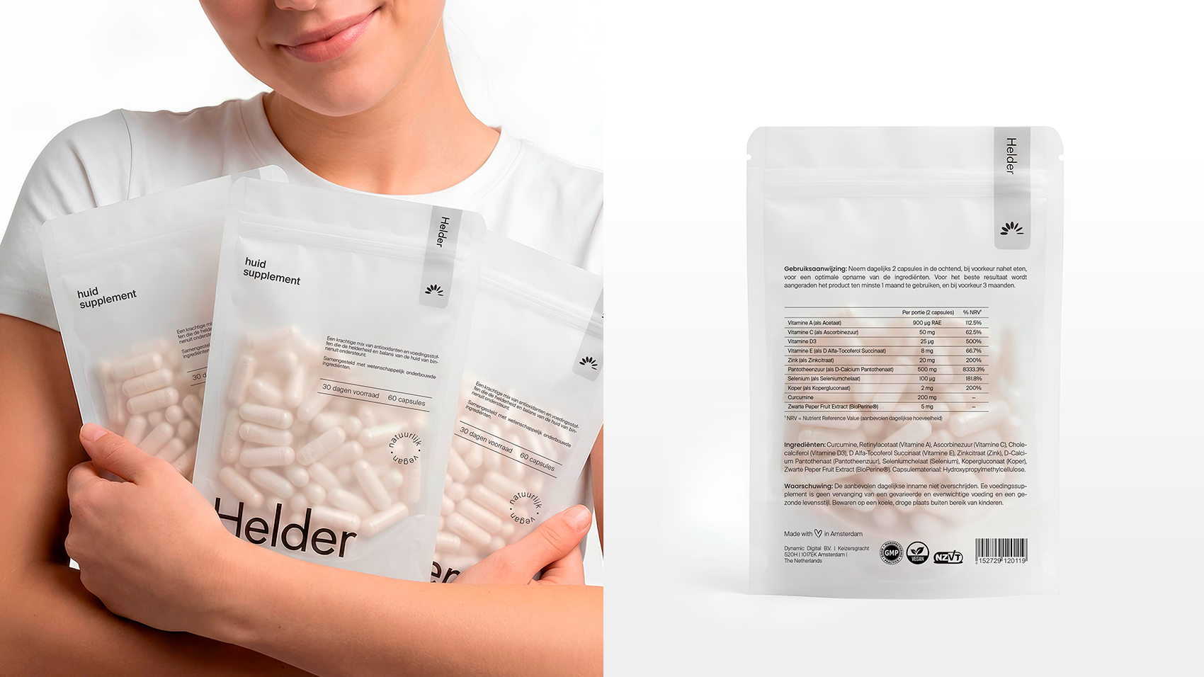
The brand strips away excess – focusing instead on transparency, scientifically backed ingredients, and a calm, refined aesthetic that communicates trust. The packaging design embodies this philosophy. A soft, neutral color palette and semi-translucent material create a sense of purity and honesty, allowing the product itself to remain visible. Typography is clean and understated, reinforcing a sense of modern simplicity while ensuring legibility and balance.
Every element – from copy to composition – has been carefully considered to evoke a sense of calm assurance. This project explores how minimalism, when executed thoughtfully, can elevate a brand’s perceived value and authenticity.
 NEV
NEV Stefano Bracci
 Alina
Alina monther al omari
 Lizakjx
 JOAOMARCOSDESIGN
 alchimistestudioParis
 Harriet Neild
 octavio rojo
 宏洛图品牌设计HONGLT
 DESIGN CONCEPTS
 Alexander Skurihin
 Studio K95
 ARMBRAND
 Richa Rai
 houseoferas by Miti
 Agence des Coteaux
 Kushi Eaknath
 Ann Treasa
 Xiao Ning
 krrrrrllii
 babyage
 Deep
Deep