
Premium Gin Label Design — HIGHGINLAND
HIGHGINLAND — Flow of Distilled Energy
BRAND PHILOSOPHY
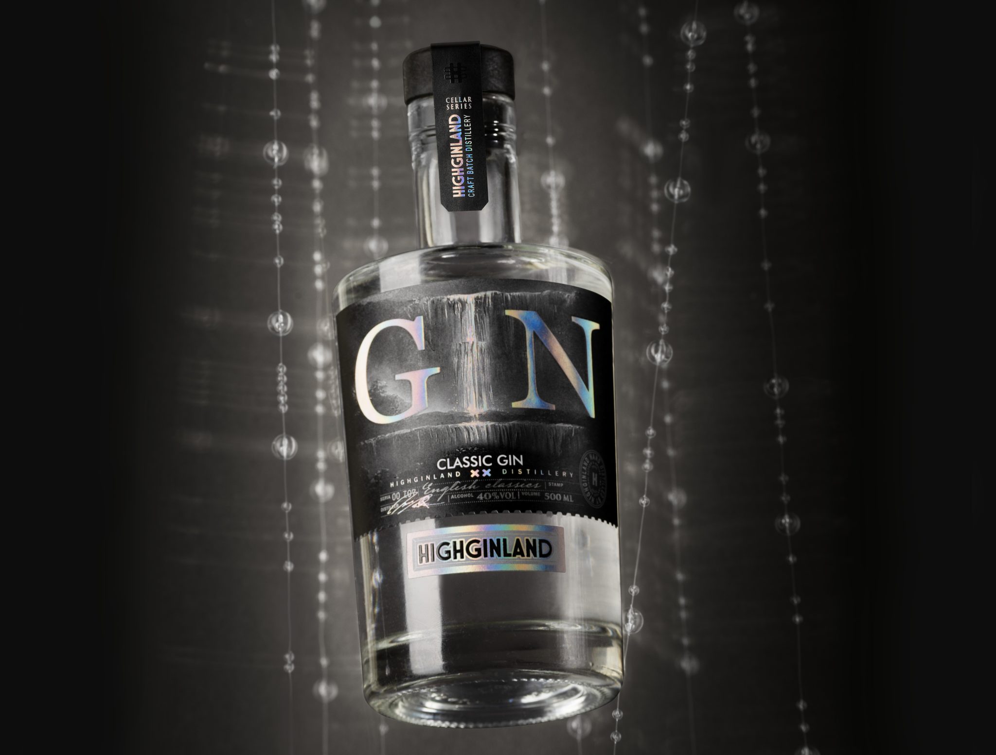
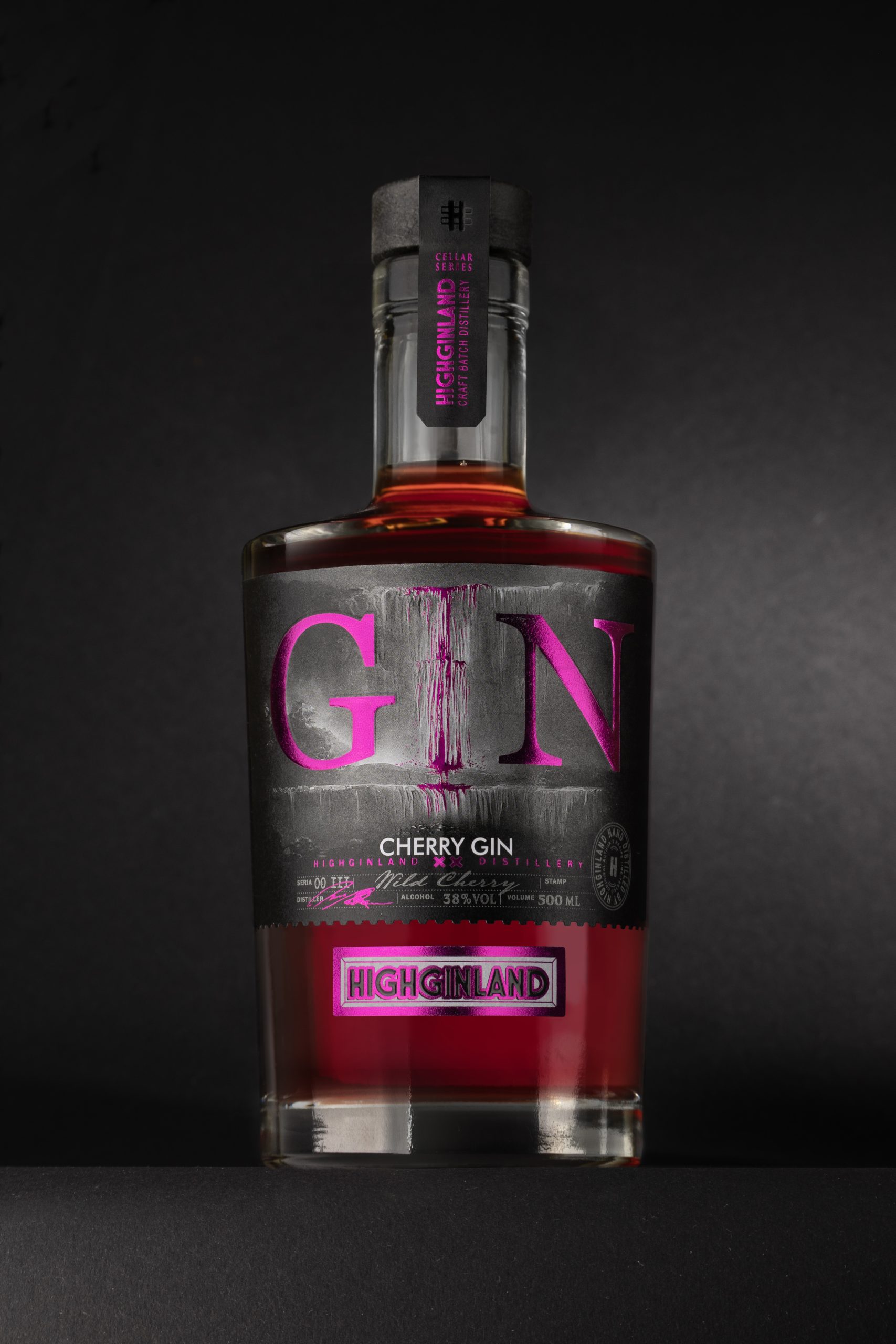
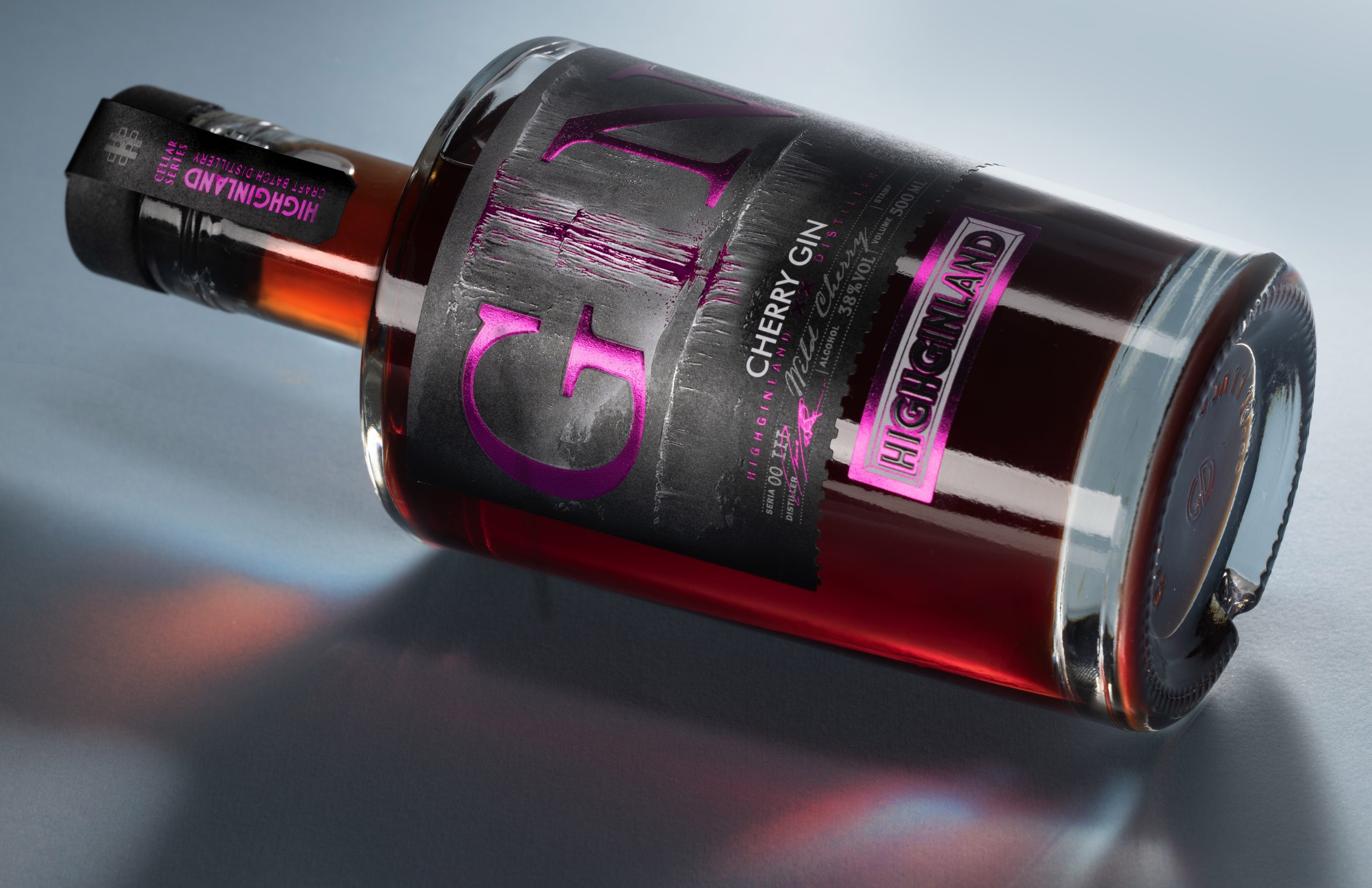
At the heart of this concept are two essential elements: crystal-clear water and the art of distillation.The visual concept draws inspiration from a mountain waterfall—a symbol of purity, continuous movement, and the energy of nature. Its flowing streams become a visual metaphor for the distillation process, where water acts as the carrier of flavour, bringing botanicals together into a harmonious composition.
THE BRAND CONCEPT
The brand concept is based on the harmony between nature and craftsmanship.HIGHGINLAND reinterprets the traditional image of premium gin through a contemporary visual language, where every design element carries meaning. Instead of relying on decorative botanical illustrations, the identity is reduced to its essential forms, creating a clean, confident, and memorable brand image that reflects purity, balance, and refinement.
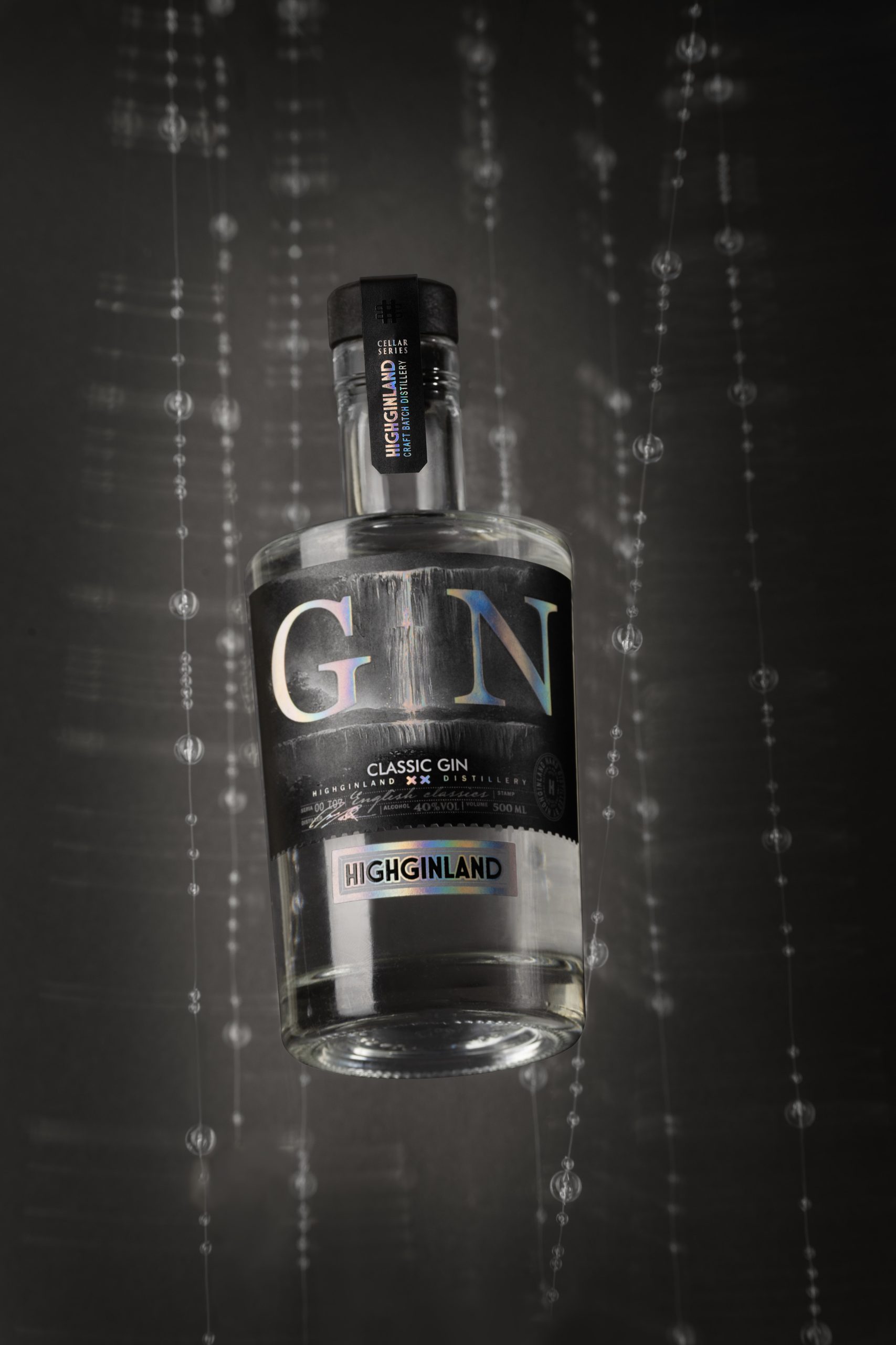
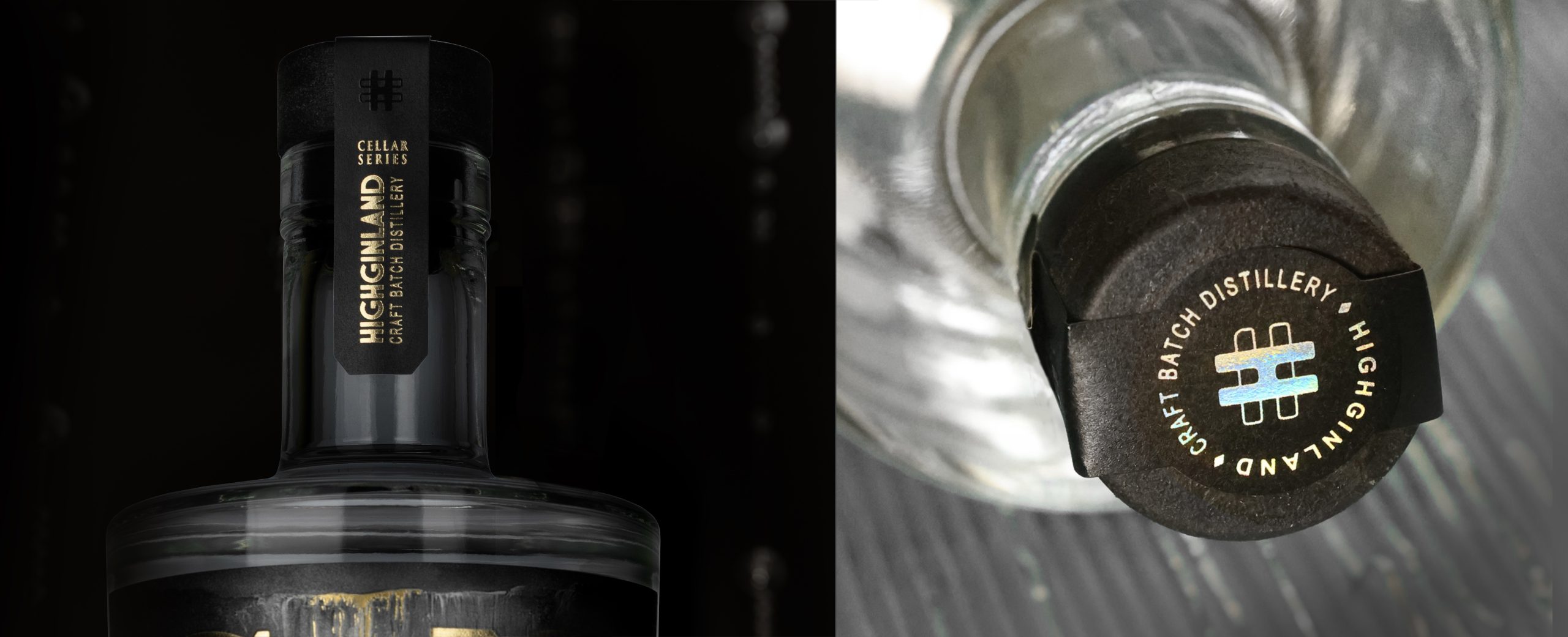
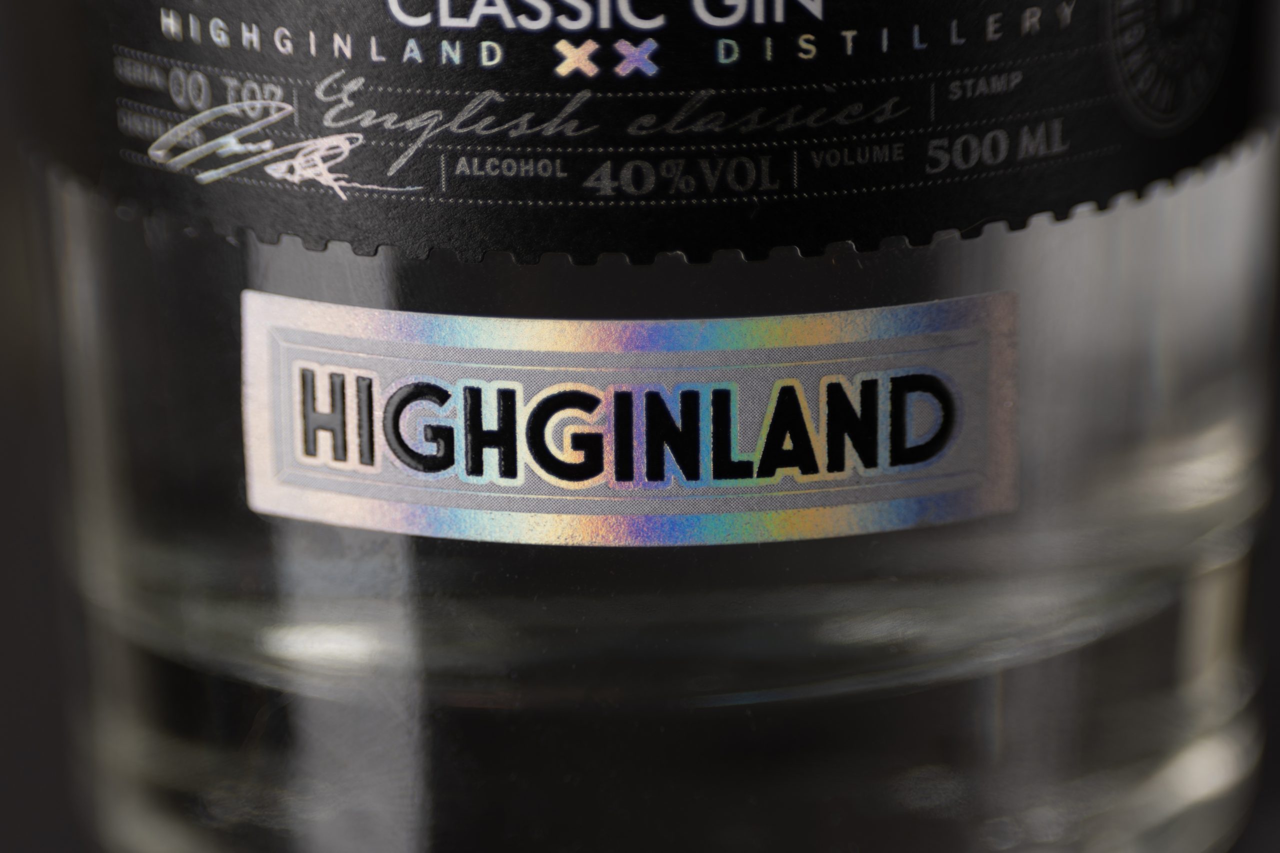
The vertical threads surrounding the bottle represent the journey from pure water to a perfectly balanced gin, while the holographic finishes interact with light to express the energy captured within every drop.
CREATIVE DESIGN
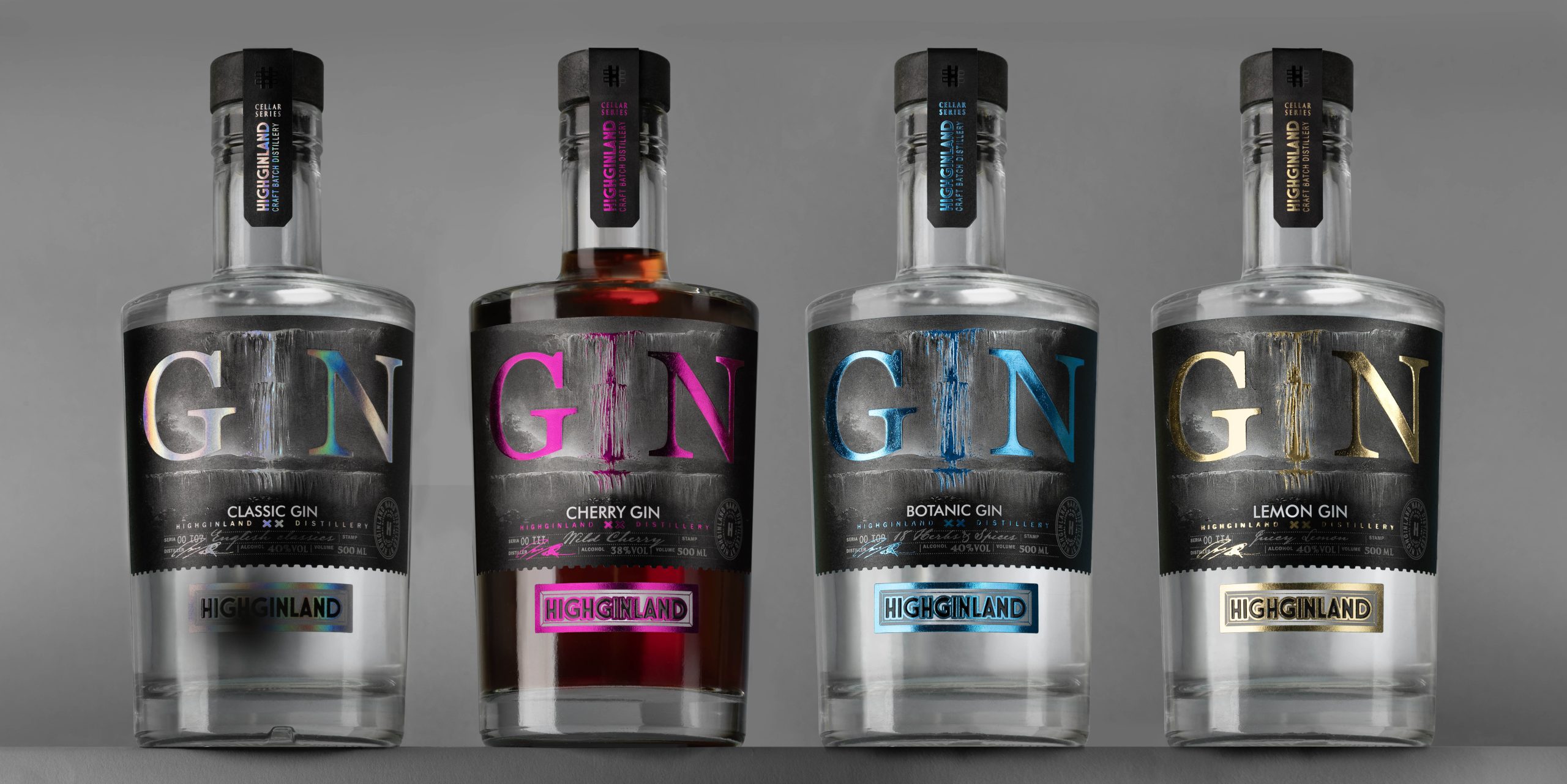
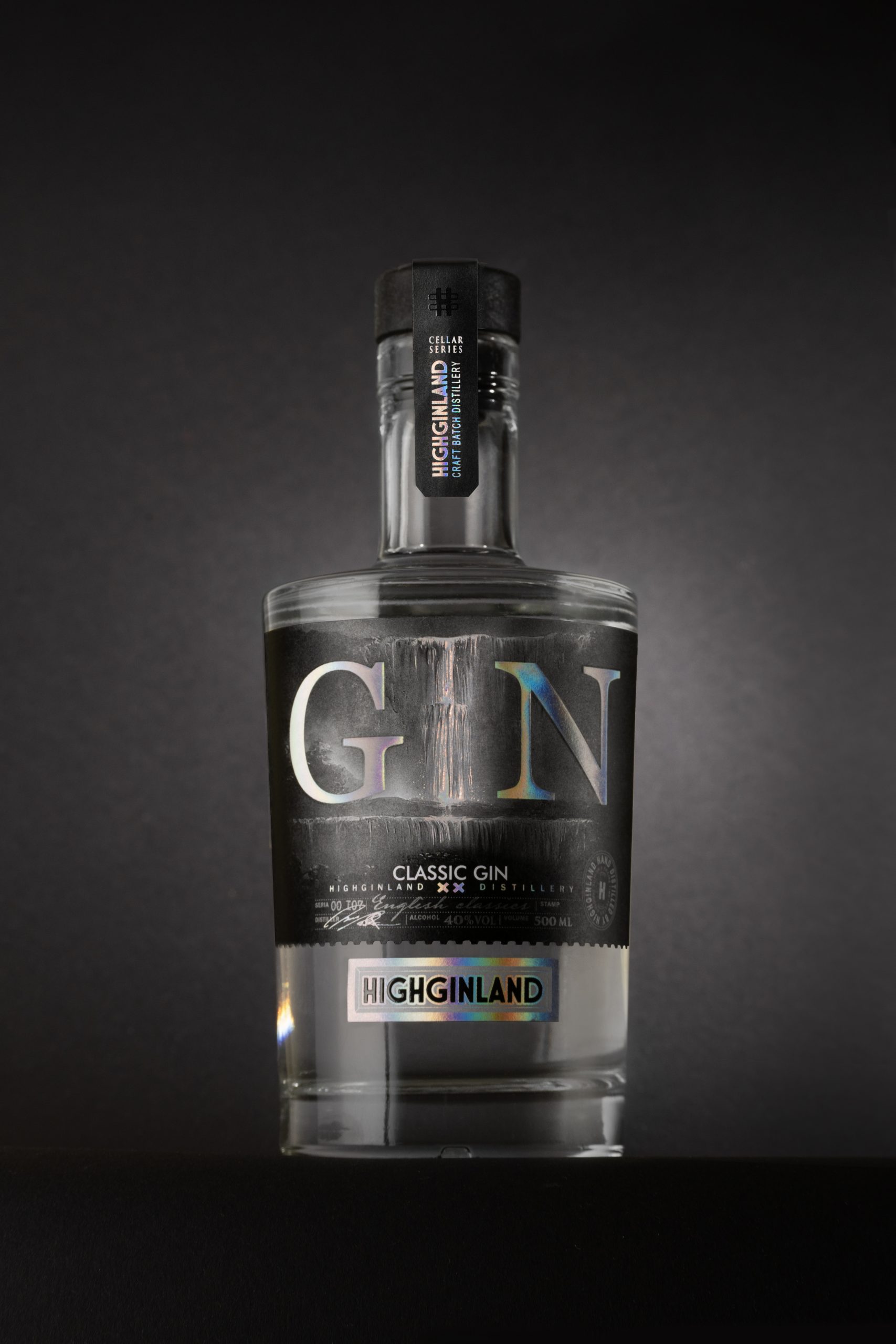
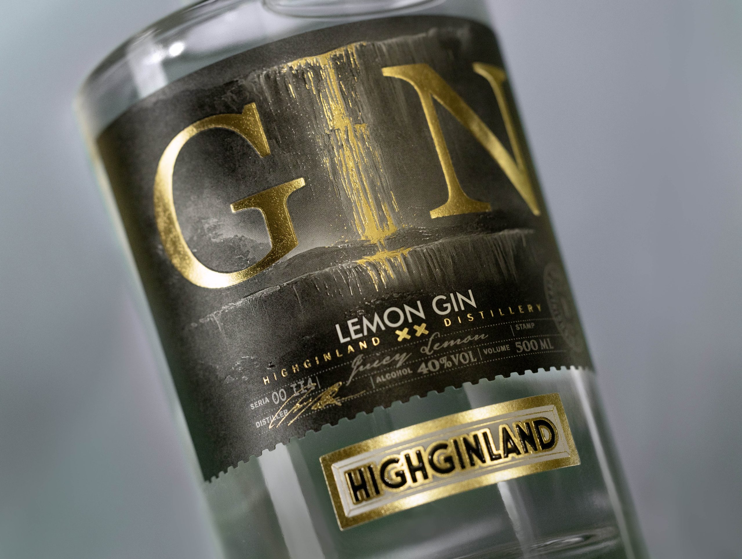
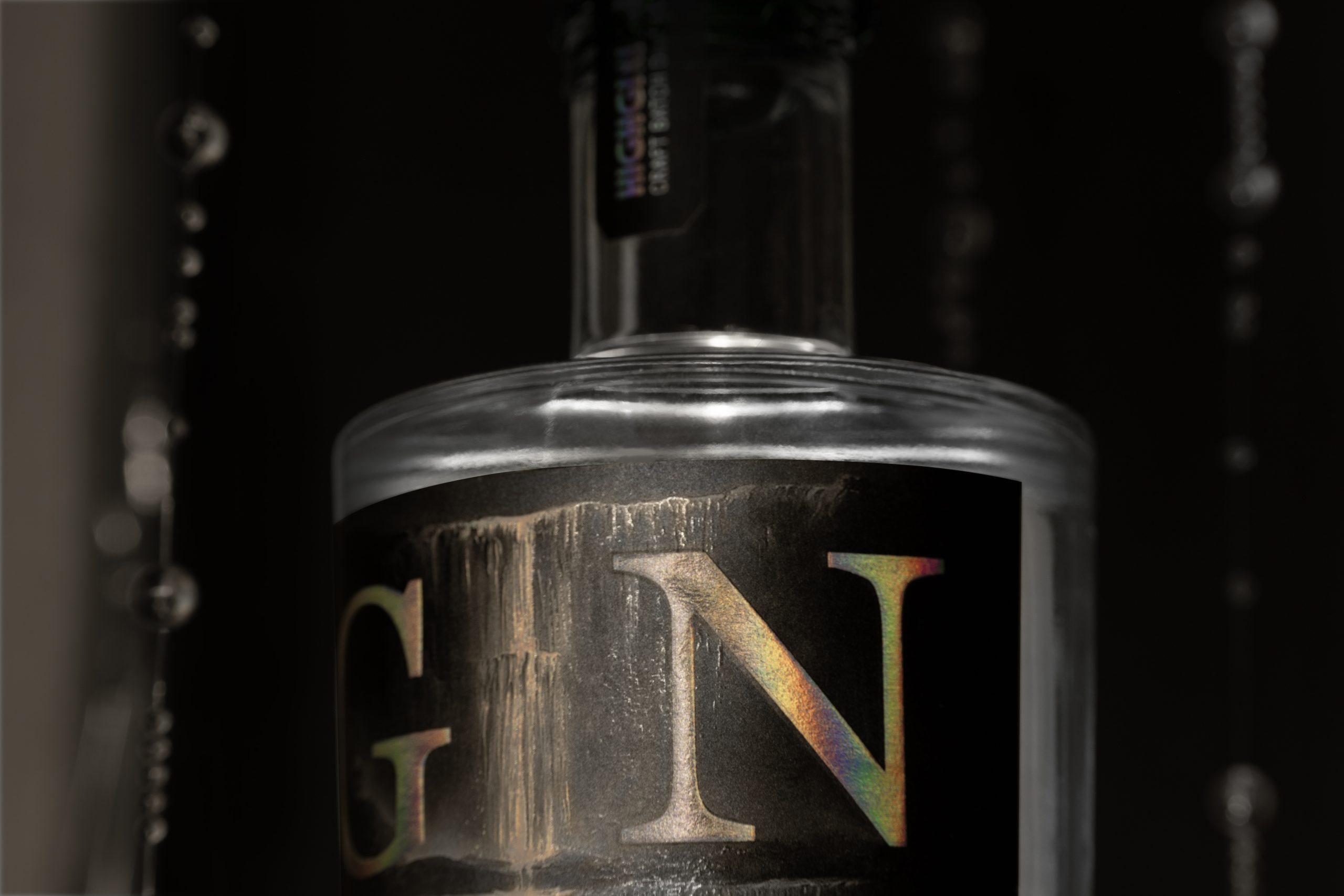
The creative direction is defined by bold typography that transforms the product category into the hero of the packaging.The oversized GIN lettering establishes a strong visual hierarchy and gives the design an unmistakable shelf presence. Clean composition, generous negative space, and carefully balanced proportions allow every element to breathe, while deep embossing and metallic finishes enhance the tactile experience and reinforce the premium character of the brand.
MATERIALS & TECHNOLOGIES
Metallic Foil
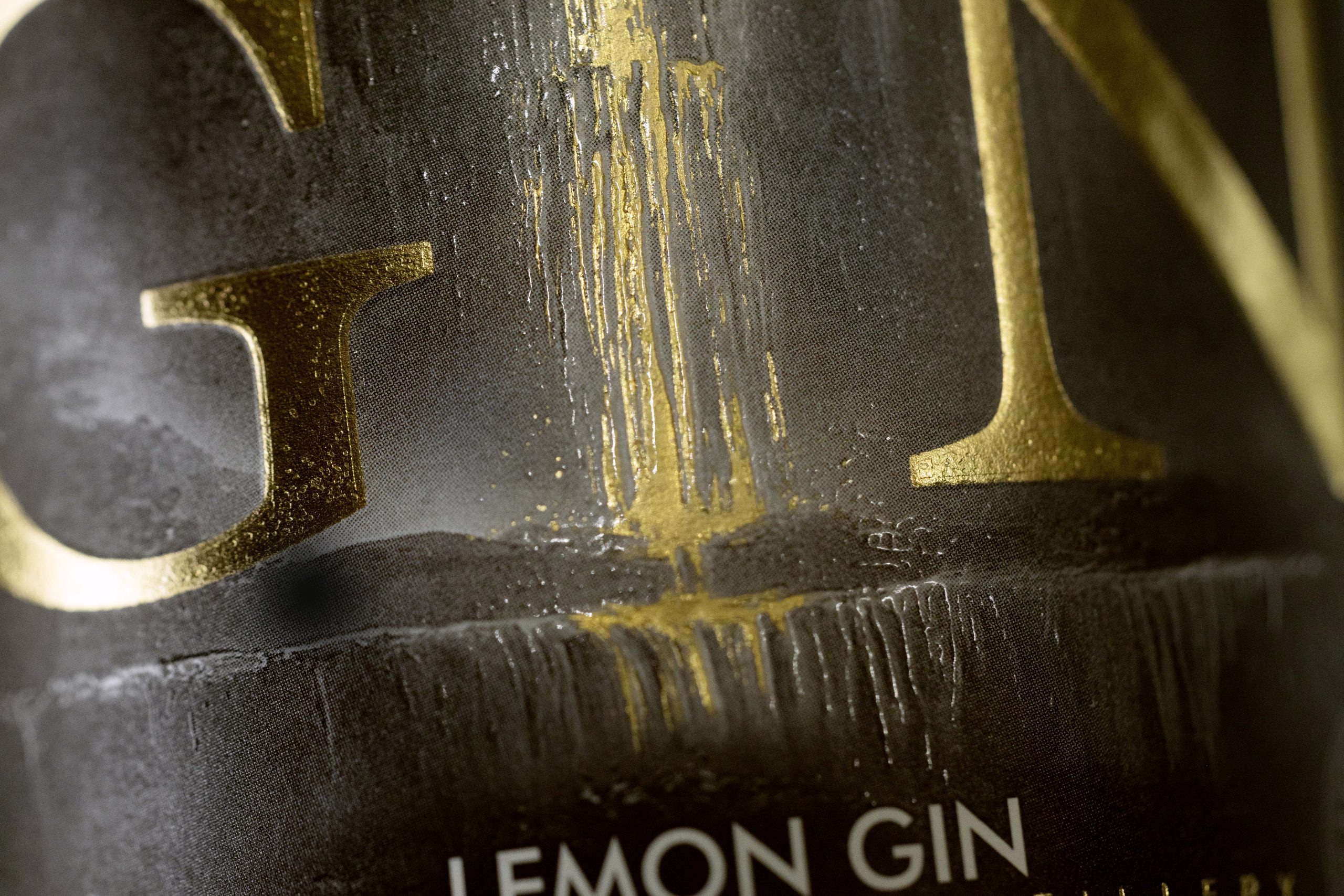
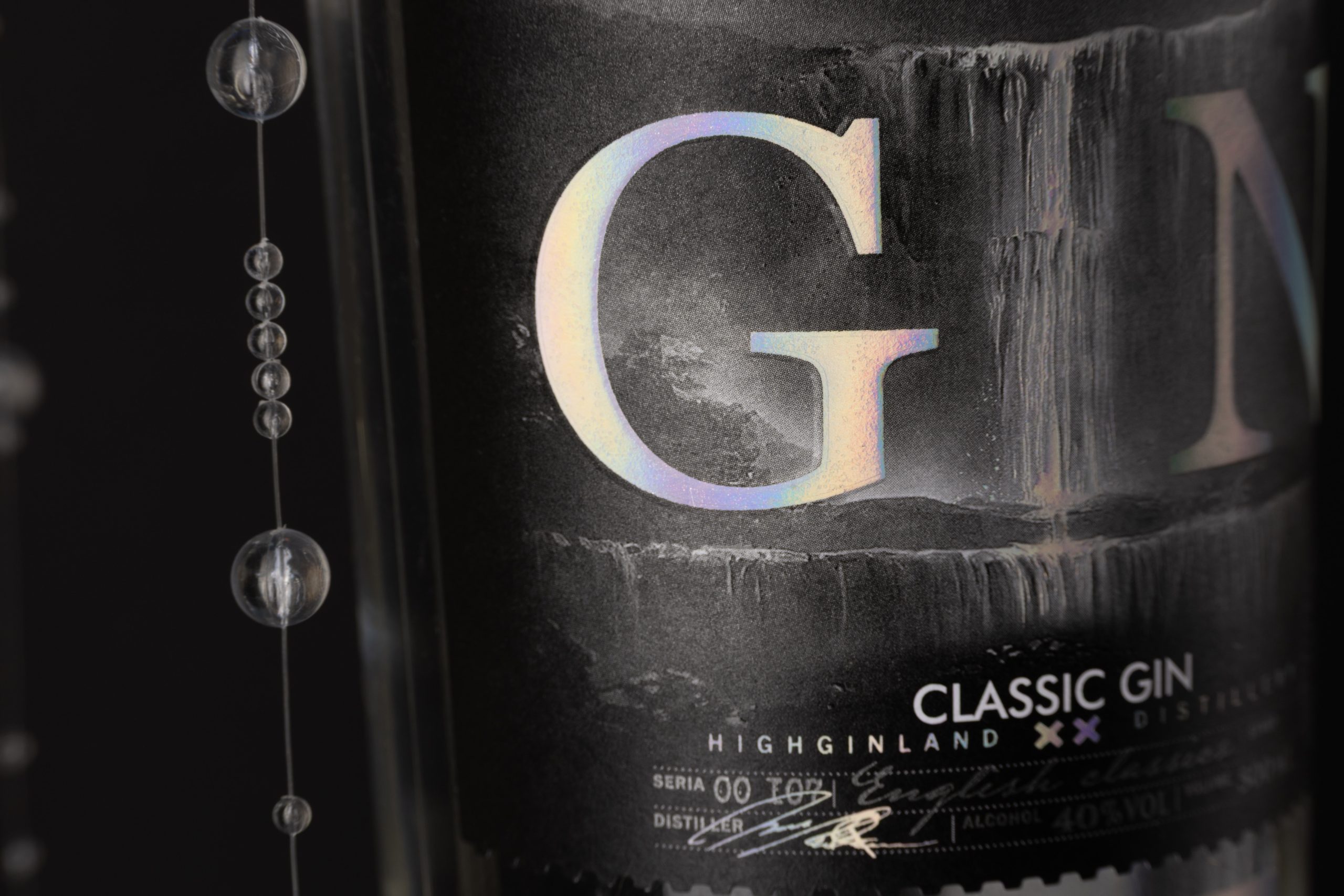
Metallic foil highlights the waterfall against the deep black background, enhancing contrast and emphasizing the purity and movement of flowing water.
Spot UV
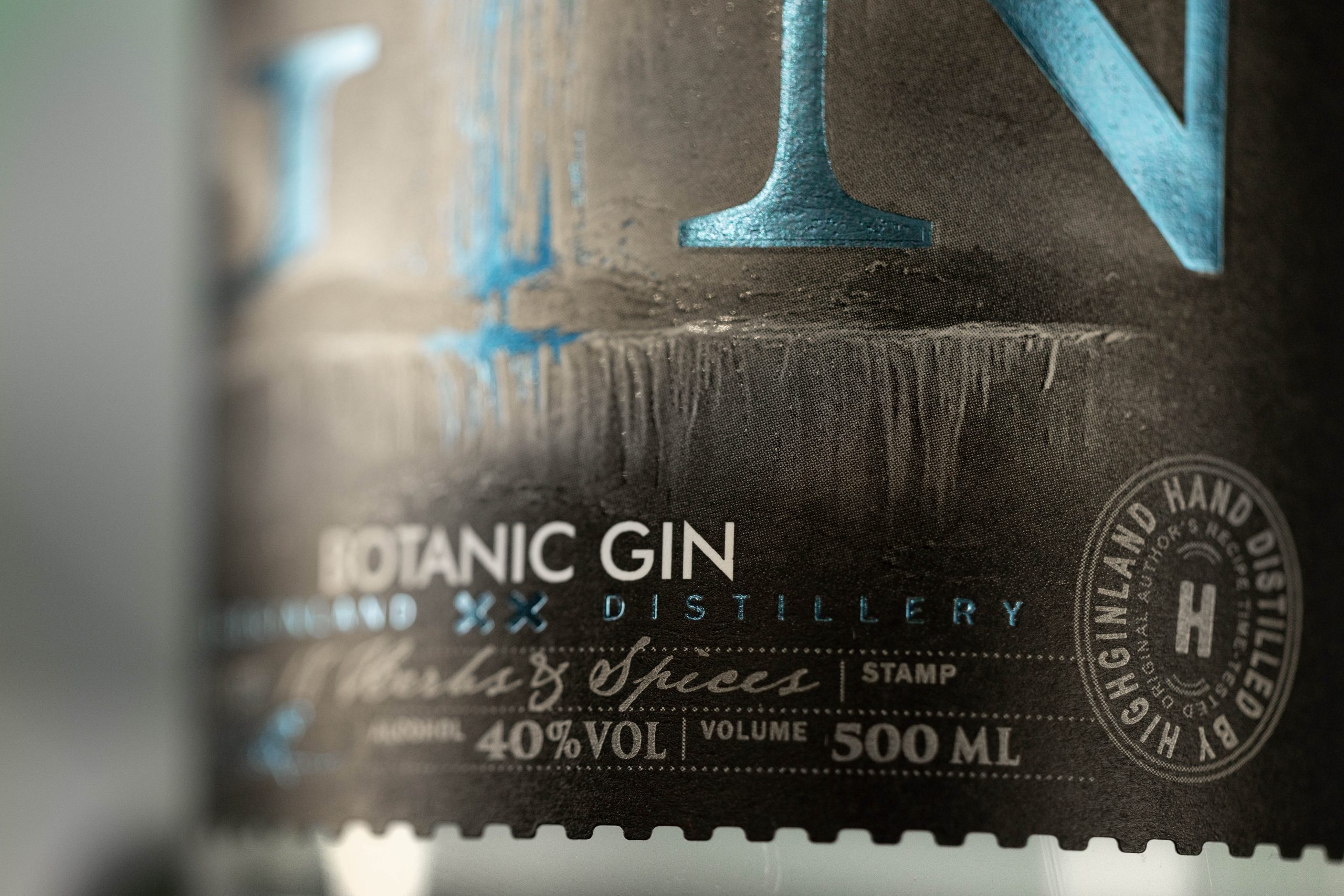
Raised Spot UV follows the cascading streams, creating a tactile surface that catches the light and reinforces the illusion of flowing water.
Embossing
Deep embossing gives the oversized GIN typography sculptural depth, strengthening its visual presence and tactile appeal.
Matte Paper
Premium matte paper provides a refined tactile foundation, creating a sophisticated contrast with the reflective foil and glossy finishes.
MARKETS
The brand was developed for commercial production and successfully launched in Azerbaijan, with a visual identity designed to meet the expectations of both the Azerbaijani and European premium spirits markets.The packaging combines contemporary European minimalism with premium finishing techniques and a distinctive brand identity, creating a design that feels relevant across international markets while preserving its unique character.
CREDITS
Client: HIGHGINLAND
Concept / Label Design / Photography: Cosovan Svetlana
Printing: Flexlabel
Contact: cosovandesign.com
Curator’s Insight
What makes this label work is the decision to let the waterfall live entirely in finish rather than illustration. There’s no rendered mountain scene, no literal botanical linework, just raised Spot UV tracing vertical streams against matte stock, with metallic foil doing the work of light and movement. That restraint is what keeps the design from tipping into the generic “nature meets craft” territory so much of the category defaults to.
The typographic choice carries most of the strategic risk and most of the payoff. Making GIN itself the dominant visual element, rather than the distillery name, is a category positioning move as much as a design one. It reads instantly on shelf, in low light, at a distance, which matters more for gin than for most spirits given how crowded and visually loud that segment has become. Deep embossing gives the lettering enough physical presence to compete with the foil treatment happening behind it rather than get flattened by it.


 Derrick Lin
 43oz
43oz vitoramockup
 Oksana
 KOS
KOS Hui Hua
 Rana Elkady
 Modern Theory
 Eclectic M
 Katya Slobodskaia
 Evgenia Beresneva
 CreativeWise
 宏洛图品牌设计HONGLT
 erandy
 Abbas Sayyed
 Ollie
Ollie Moço Wine Branding
 khadijaaljifri
 Abdulrahman Taha
 Juana Sarabia
 Mohammed Nasr Sharfi