

Dynamite Valley has revealed a bold new brand identity created by Kingdom & Sparrow, marking the next chapter in the brewery’s story as it opens two new mini-taproom and event spaces.
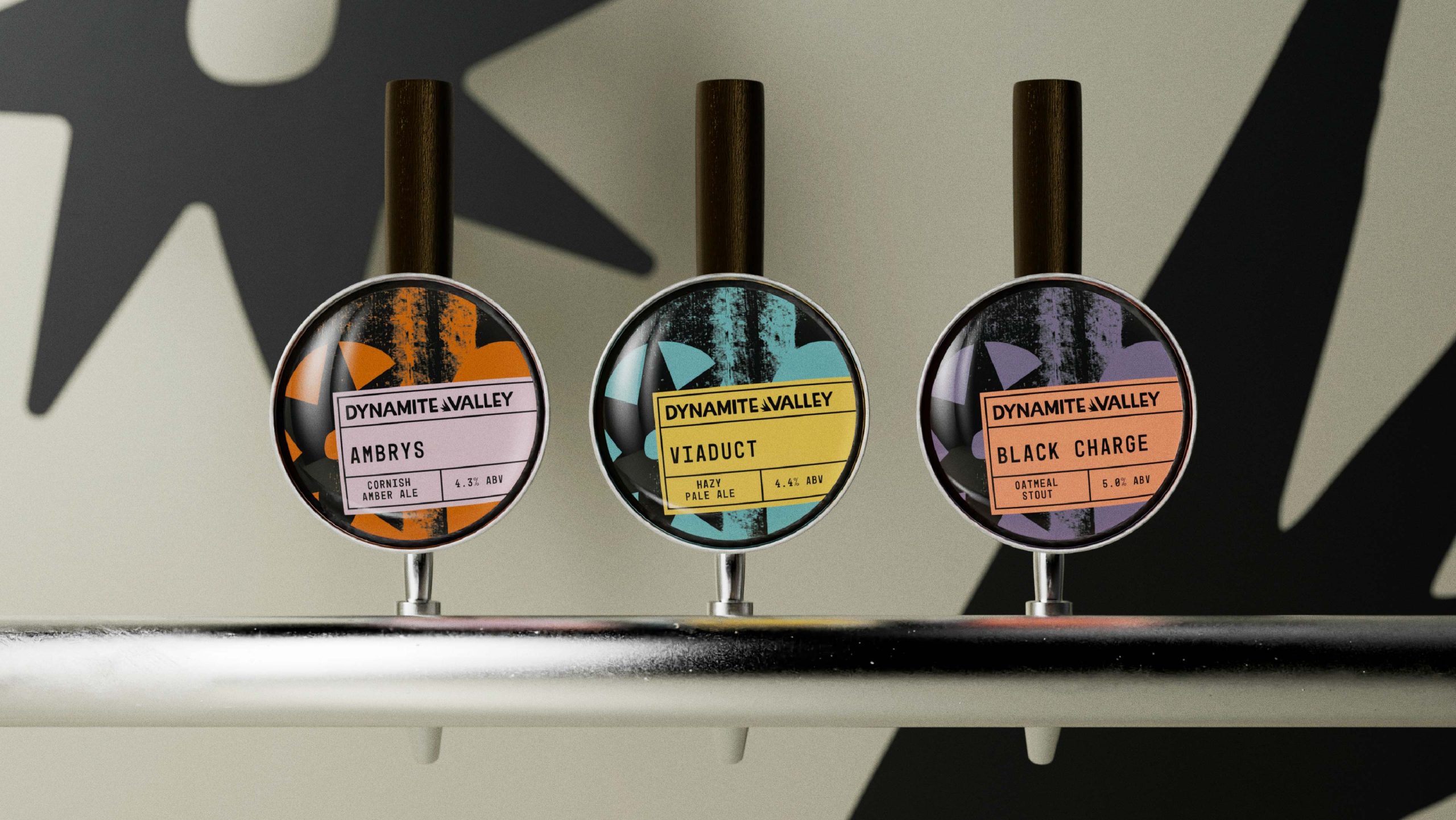
The partnership brings the relationship between the two companies full circle: Kingdom & Sparrow first developed Dynamite Valley’s brand back in 2015, working with the founders to create the distinctive illustrated style and hand-drawn bottle wraps that quickly became a hallmark of the brewery. Now, ten years on, Kingdom & Sparrow have given the brewery a bold new look – one that can sit alongside competitive modern craft beers and broaden the brewery’s audience and match the exciting new direction for the owners. The signature bottle wrap still remains, but has been given a colourful update, with an extensive palette across the range in earthy and natural tones that retain their vibrancy.
Approaching this rebrand, Kingdom & Sparrow’s challenge was to retain heritage, while elevating the brand for the modern, competitive craft beer market, reflecting the new owners’ ambition, and creating a flexible identity for future growth.
Drawing spirit from Ponsanooth’s Kennall Vale 19th-century gunpowder works, the rebrand immersed itself in the industrial landscape, gathering textures to inform the new visual language.
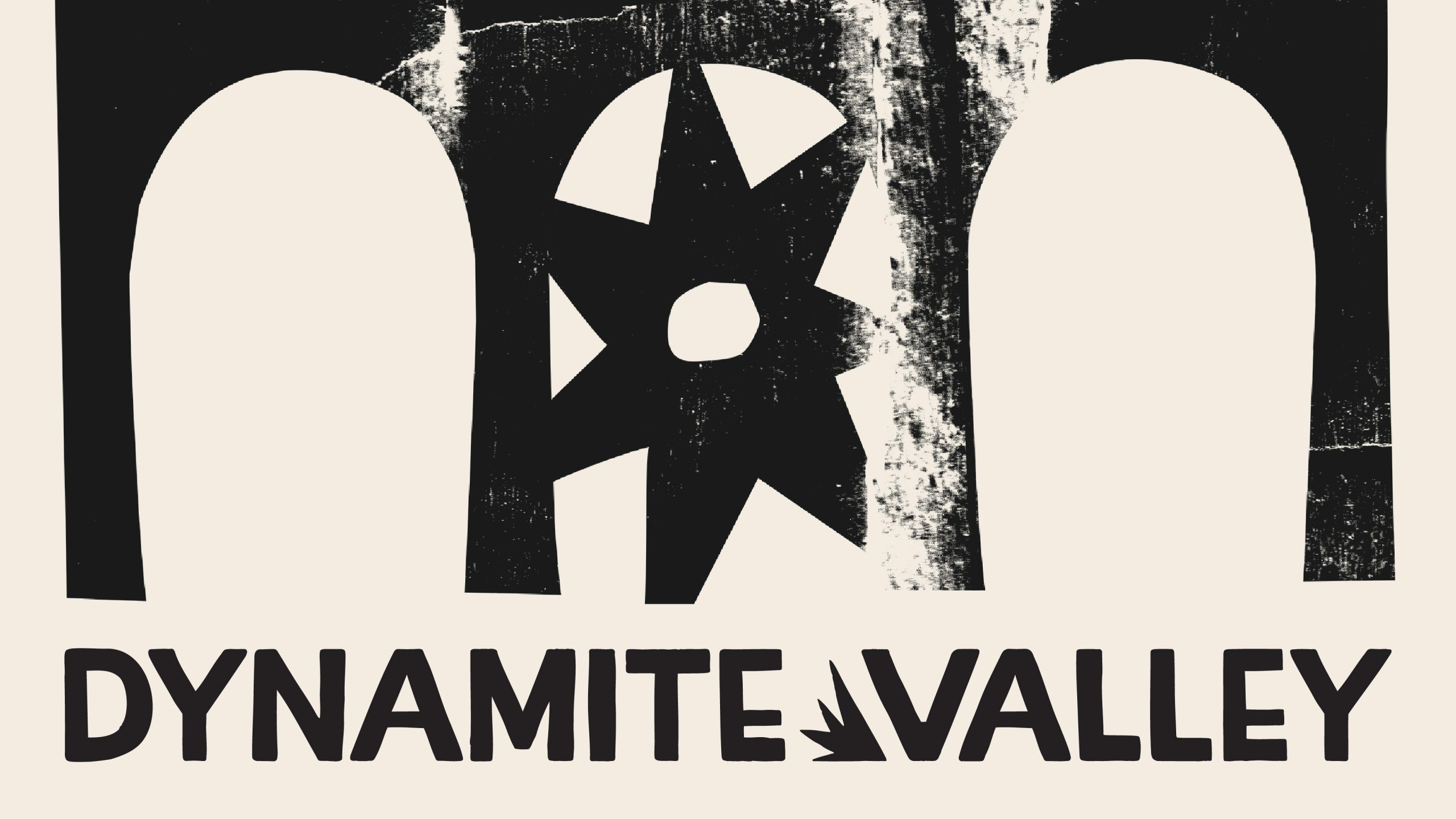
The refreshed identity features three viaduct arches representing the three owners, united by a central spark asset; custom, handcrafted typography with expressive lettering with greater clarity, and flexible and scalable cohesive brand system for taproom and retail.
The project has been a rewarding full-circle partnership for us here at Kingdom & Sparrow, honouring the brewery’s roots while confidently shaping its future.
Curator’s Insight
What makes this rebrand work is restraint disguised as boldness. Ten years of shelf equity is a liability as much as an asset. Change too little and the brand stalls next to sharper competitors. Change too much and you lose the recognition built up since 2015. Kingdom & Sparrow’s answer was to keep the wrap format, the brewery’s most distinctive structural signature, and rebuild everything around it rather than replace it.
The three-arch motif does double duty. It reads as ownership storytelling on the surface, but structurally it also solves a harder problem: how do you unify a range that spans stouts, pilsners, and IPAs without flattening each SKU into sameness? The arches and central spark act as a fixed anchor point, letting the earthy, saturated palette shift freely underneath without the system ever feeling scattered.
The transferable lesson here is about hierarchy of change. When a brand has genuine heritage equity, the smartest move usually isn’t a new mark, it’s identifying the one structural element worth protecting, then using everything else as the space to evolve.




 Derrick Lin
 monther al omari
 43oz
43oz lilyz design23
 Modern Theory
 Eighteen Brand Studio
 Bhumika Singh
 MohamedMashaly
 Pixels Studio
 Gulya
Gulya UPRISE
 Lizaveta Kharitonyuk
 Bonsanco Creative Studio
 DesignRepublic
 GIRAFA STUDIO
 PiotrWisniewski
 Sophiagdotcom
 CreativeWise
 SoreThumbStudio®
 Modern World Studio
 Palashcc
 Valérie Colace