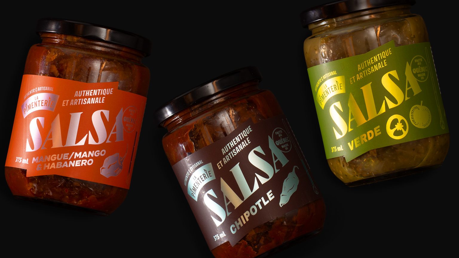

La Pimenterie, a Montreal-based producer known for its craft hot sauces and condiments, sought to refresh its salsa lineup with a packaging system that felt as vibrant and distinctive as the products themselves.
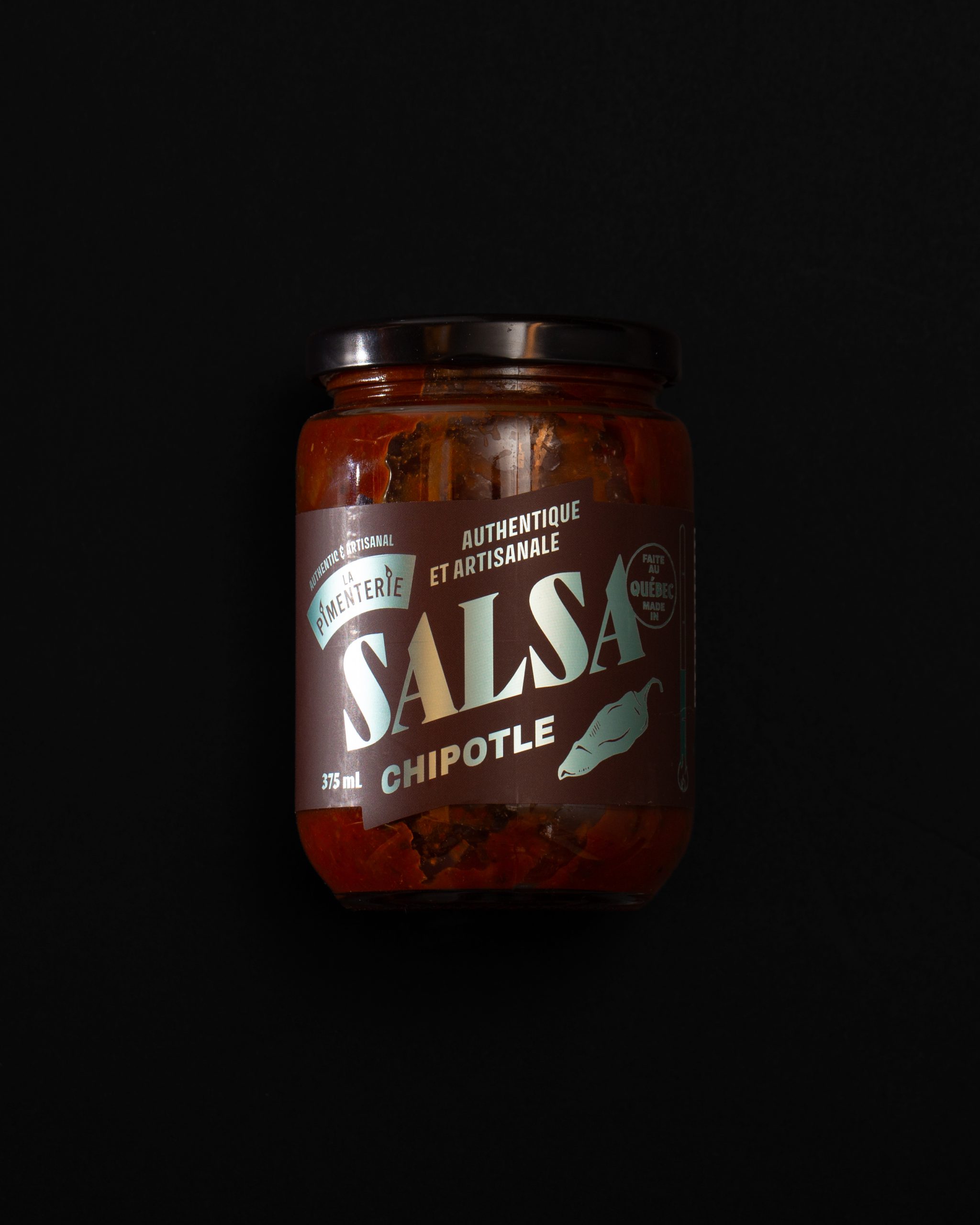
The redesign introduces a bold visual architecture centred around oversized typography, flavour-specific colour palettes, and custom die-cut labels that create a more dynamic presence on shelf. Metallic finishes add contrast and visual impact, while a matte label stock enhances the tactile experience and reinforces the brand’s premium, artisanal positioning.
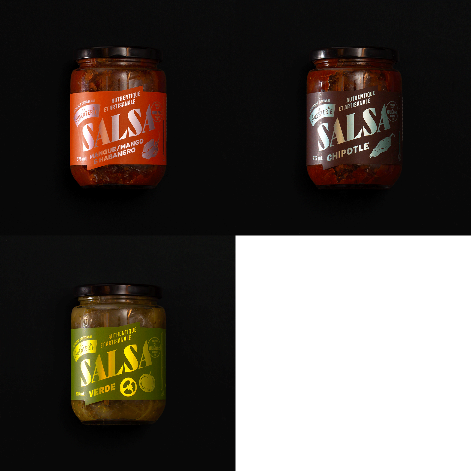
Each variety is easily differentiated through a unique colour system, allowing the collection to stand together as a cohesive family while maintaining strong individual identities. The result is a packaging system that balances clarity, shelf visibility, and brand recognition while staying true to La Pimenterie’s energetic personality and Quebec roots.
The redesign was created to strengthen the product’s presence in specialty food stores and grocery environments, ensuring the packaging communicates both quality craftsmanship and bold flavour at first glance.



 softmachine
 monther al omari
 alchimistestudioParis
 airobtq
 Buzz & Co.
 Ruby
Ruby themythographer
 IDNB Inc.
 viktorflr
 Zenpack
 Wessam Hussien
 samarabdelmonem
 StudioMordius
 Polaris Designs
 Atiq Alam
 duha mohamed
 HassanEtman22
 agarcia studio
 Wynand88
 Eva Chistyakova
 Maria Bukhtilova