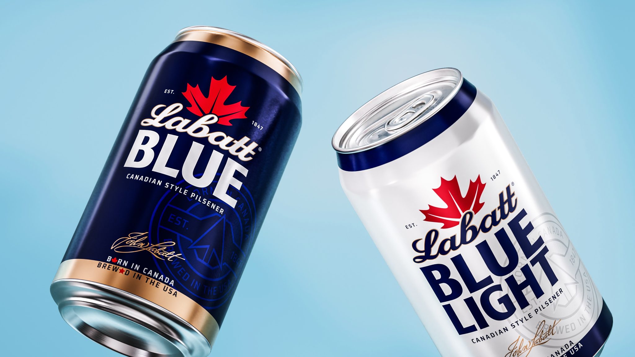

Labatt Beer Embraces Friendly Rivalry in New Identity by Sister Mary
The heritage beer brand reveals a refreshed identity and packaging system by Sister Mary, bringing greater clarity and confidence to Labatt’s Canadian roots and U.S. presence.
—
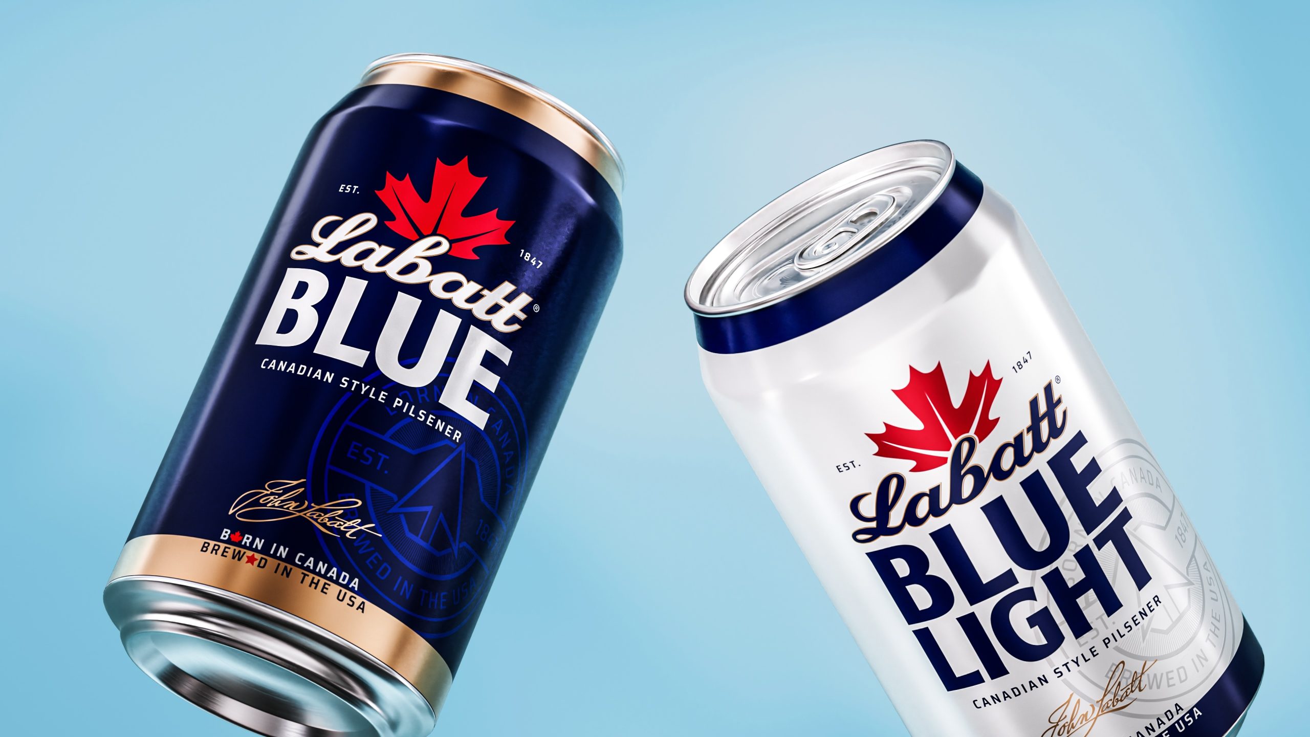
[NEW YORK, July 7th, 2026] Strategic Design Studio Sister Mary has unveiled a refreshed brand identity and packaging system for Labatt Beer, the Canadian-born beer first brewed in 1847. Developed with the team at Labatt USA, the work reasserts Labatt’s distinctive heritage while giving the brand a clearer and more confident presence in the U.S.A.’s domestic beer category.
Labatt came to Sister Mary with a clear challenge: in a category dominated by domestic beer brands’ familiar blue packs, interchangeable visual language, and tablestakes lifestyle codes, Labatt wanted to ensure its name and story stood out with its Canadian heritage and loyal fan base in the Great Lakes region.
The challenge was made more interesting by Labatt’s unique position. It is Canadian-born, but brewed in the U.S. for the American market. Rather than hide that tension, Sister Mary turned it into the heart of the brand story.
“Labatt has a unique story at its core, Canadian-born, brewed in the U.S.A, and loved by generations of drinkers on both sides of the border,” said Lisa Texido, Brand Director. “Sister Mary helped us bring much more clarity and character to that identity in a way that feels true to our history while giving the brand new energy moving forward.”
Through strategy, research, and a deep dive into Canadian-American cultural codes, Sister Mary identified an opportunity to move Labatt beyond simply being “from Canada” and into a more ownable cultural territory: the beer of friendly rivalry. The idea draws on the natural back-and-forth between close neighbors, sports fans, drinking buddies, and anyone who enjoys a little good-natured provocation.
“Friendly rivalry became the unlock for the entire brand,” said Emily Cristoforis, Head of Strategy at Sister Mary. “It gave us a way to celebrate the tension at the heart of Labatt — Canadian-born, American-brewed. As a kind of dual citizen, the brand has permission to champion the epic relationship between the U.S. and Canada, while fuelling the friendly rivalries that bring people together across all walks of life. That created a broader cultural role for Labatt rooted in playful banter, competition, and connection.”
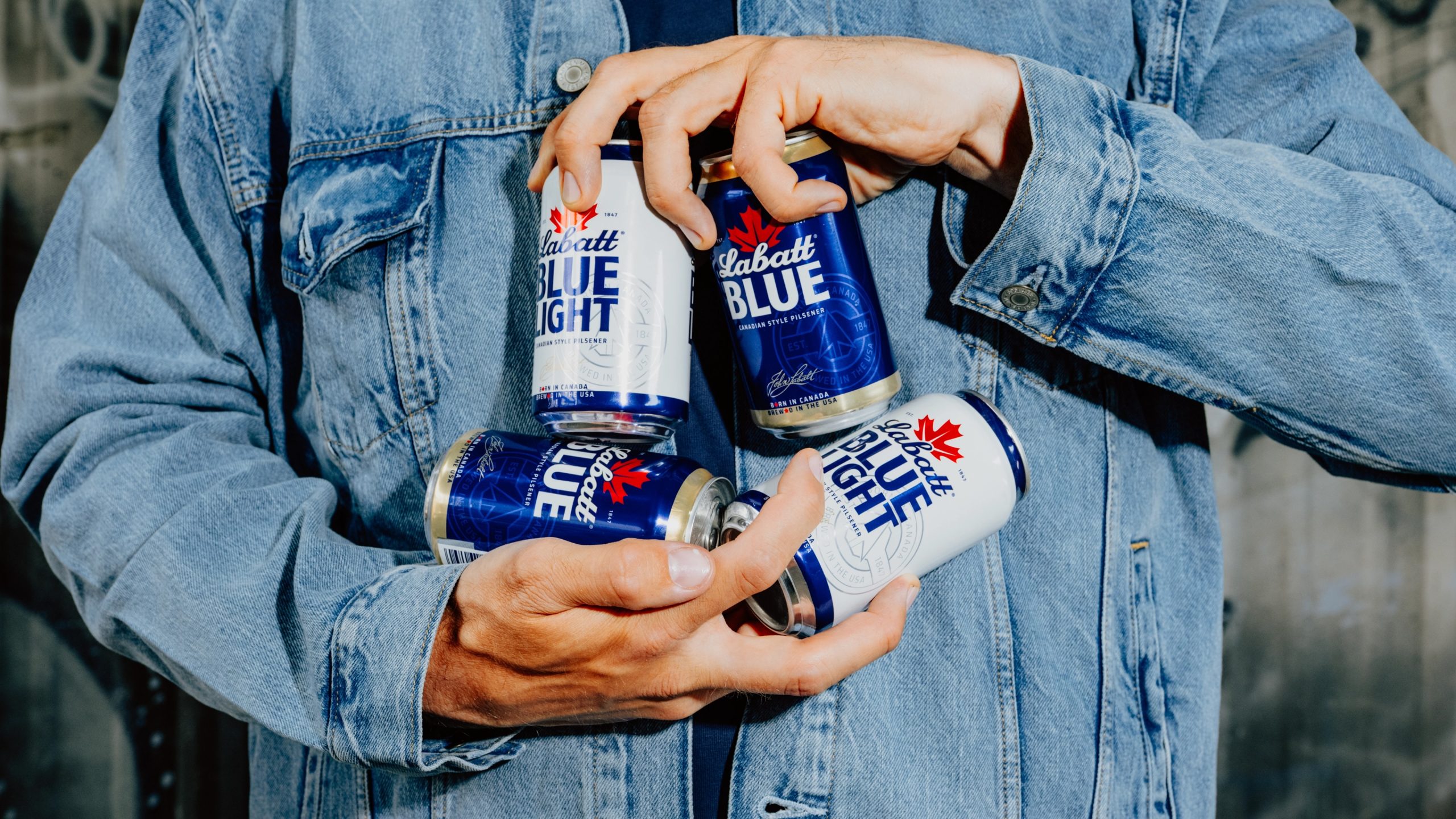
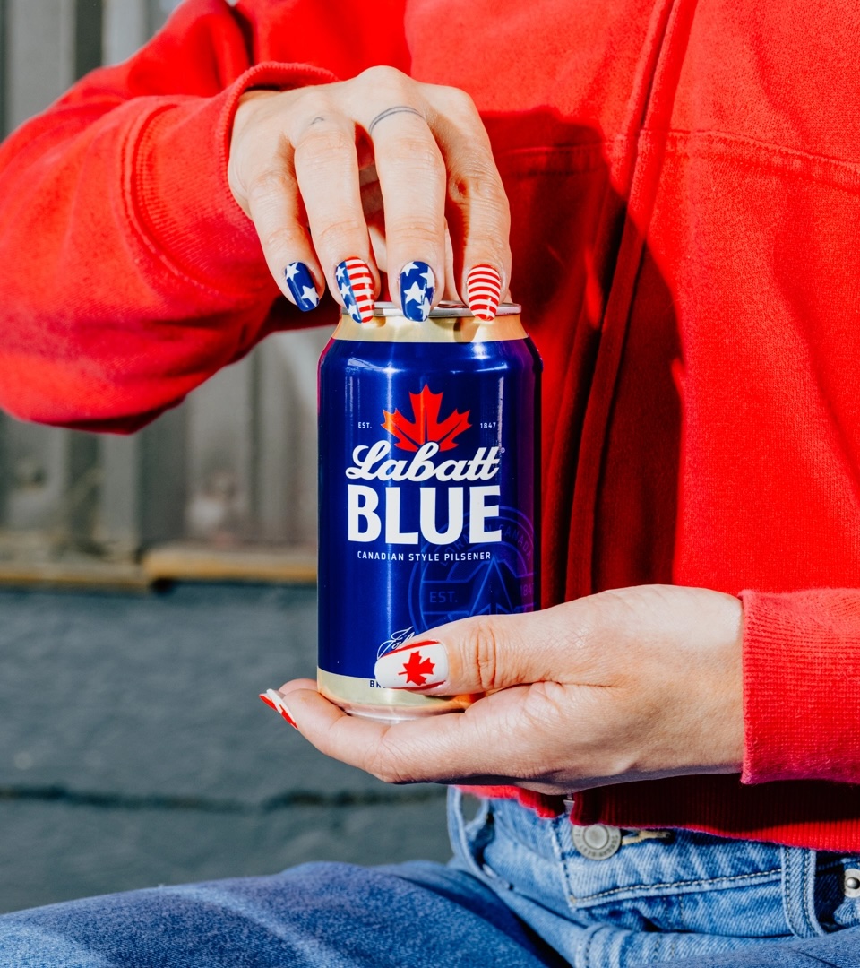
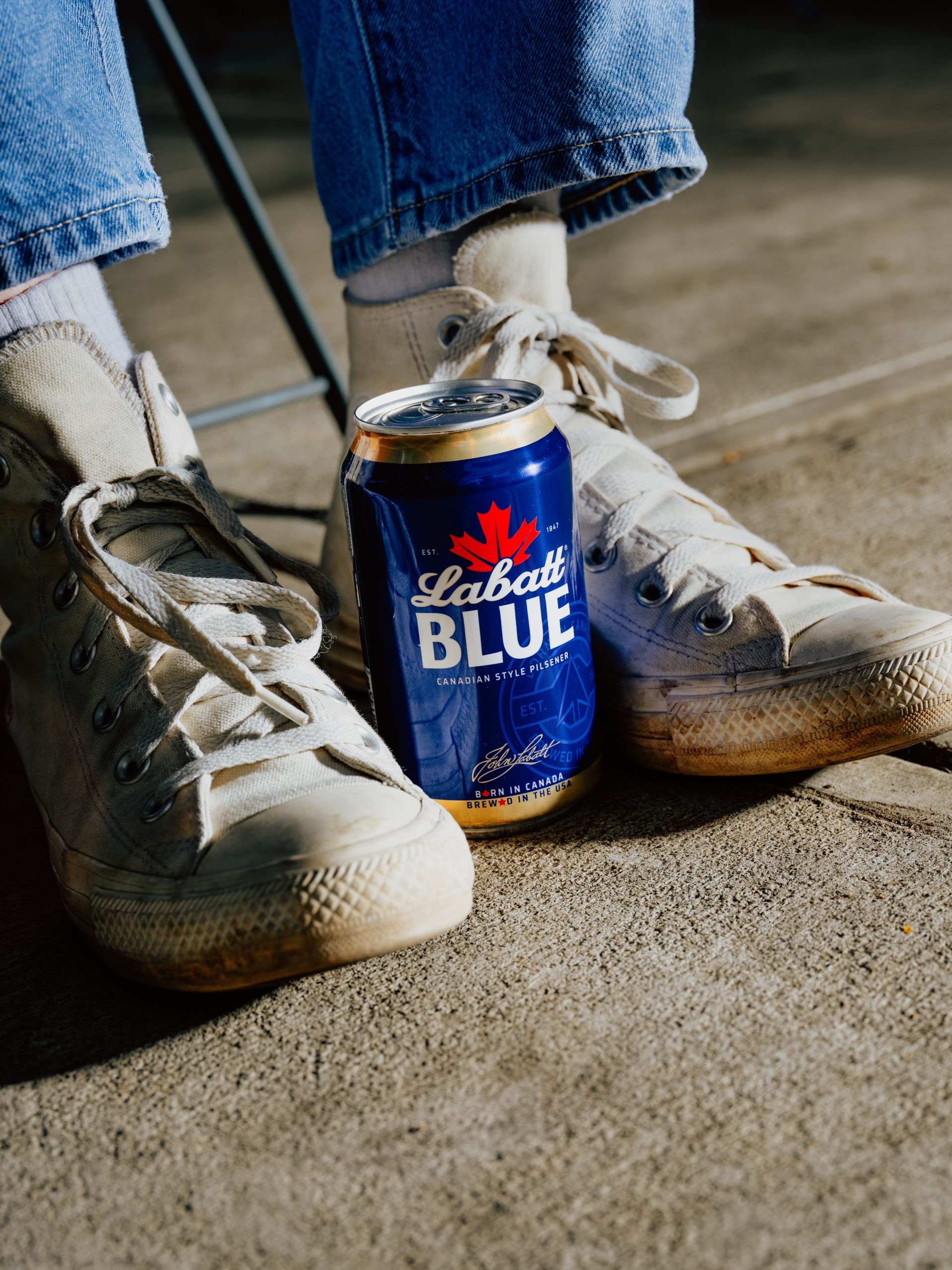
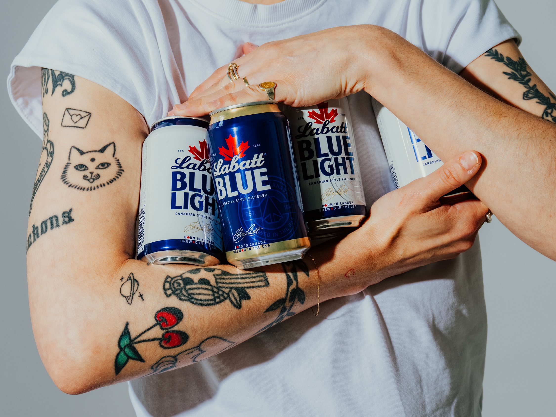
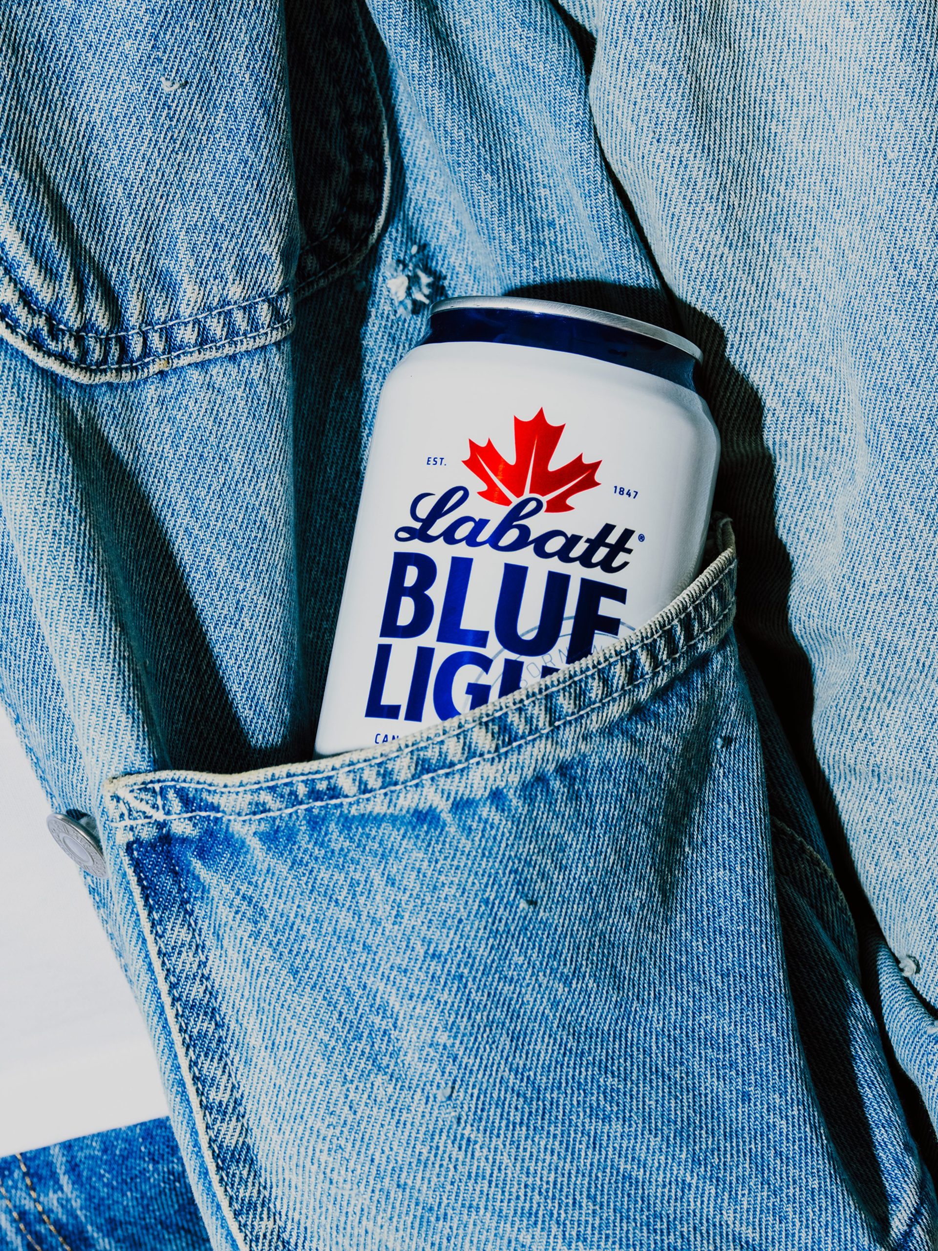
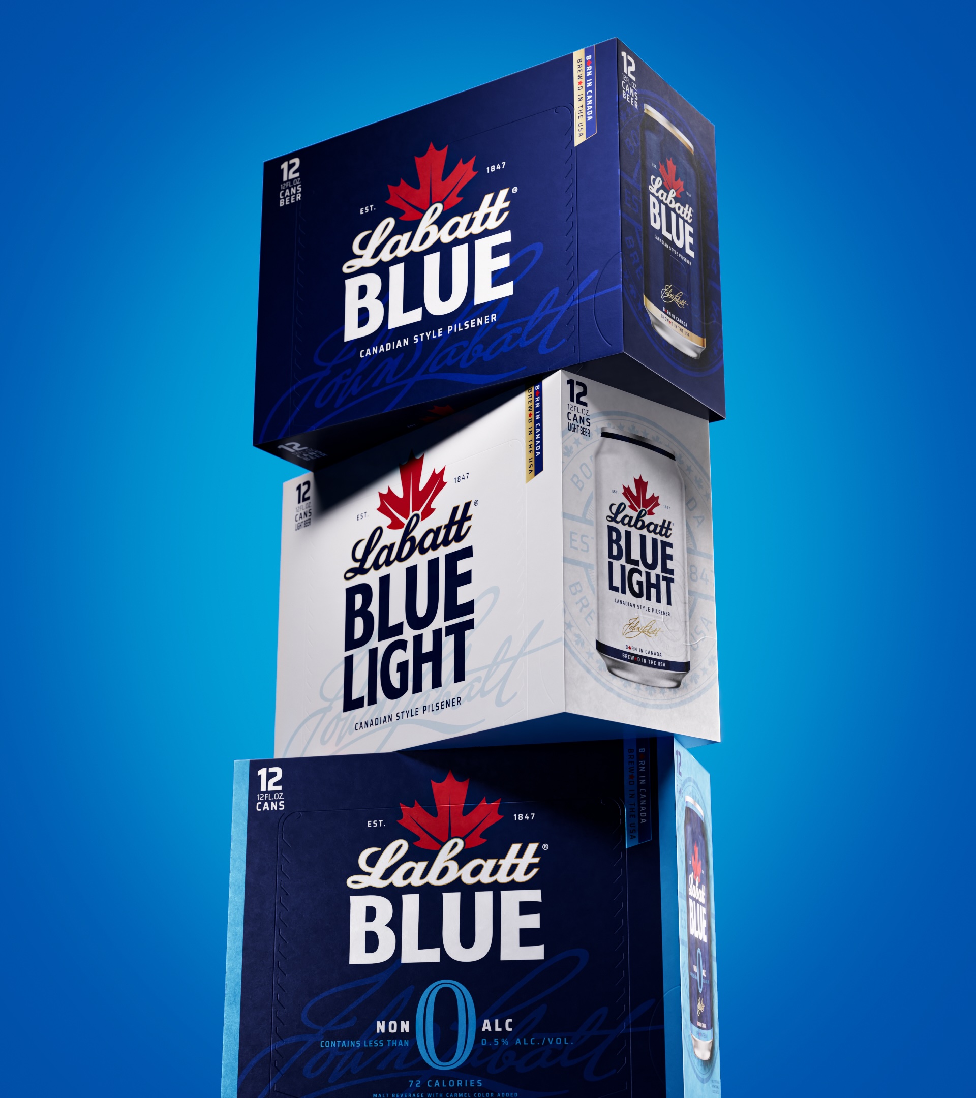
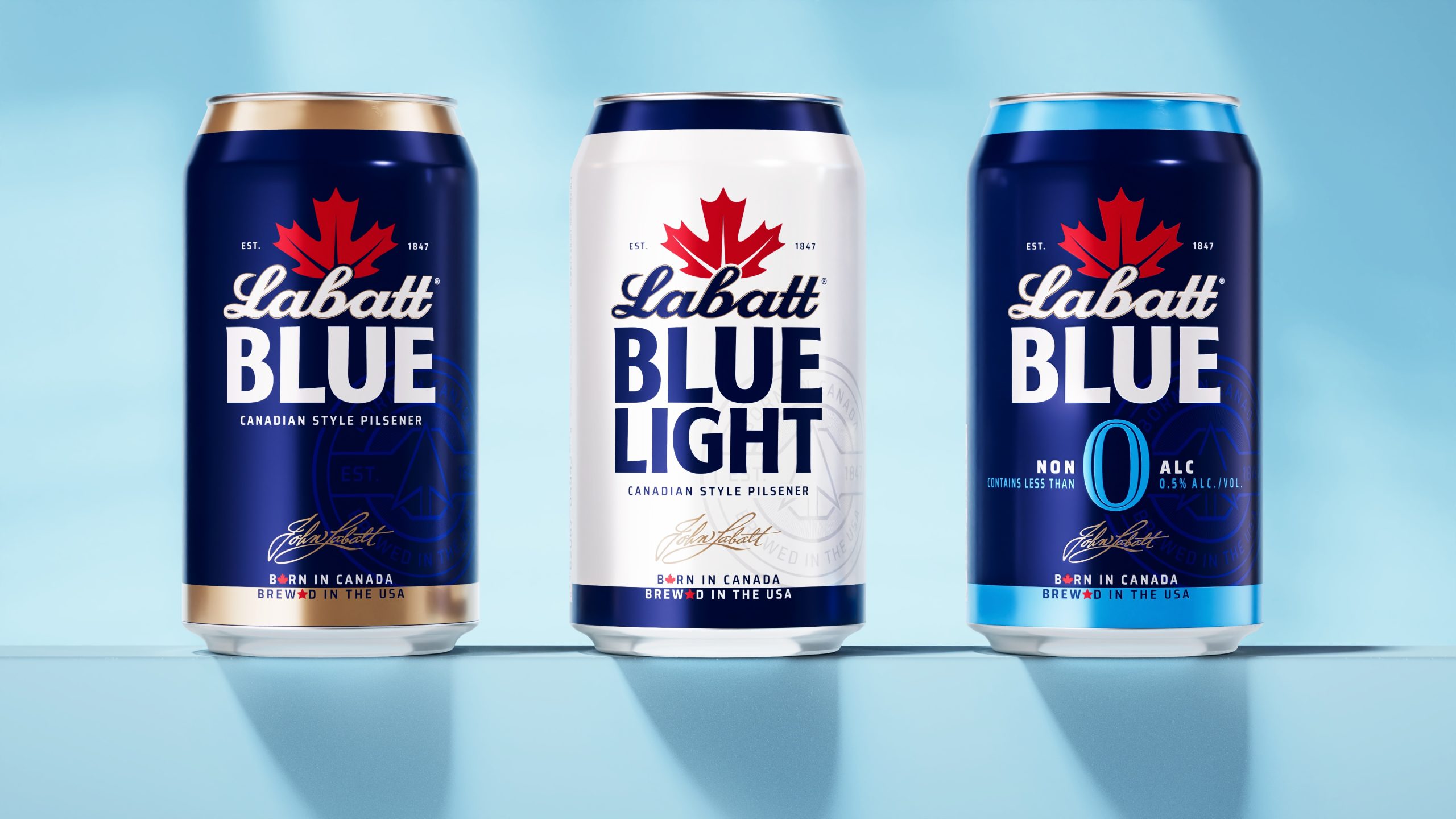
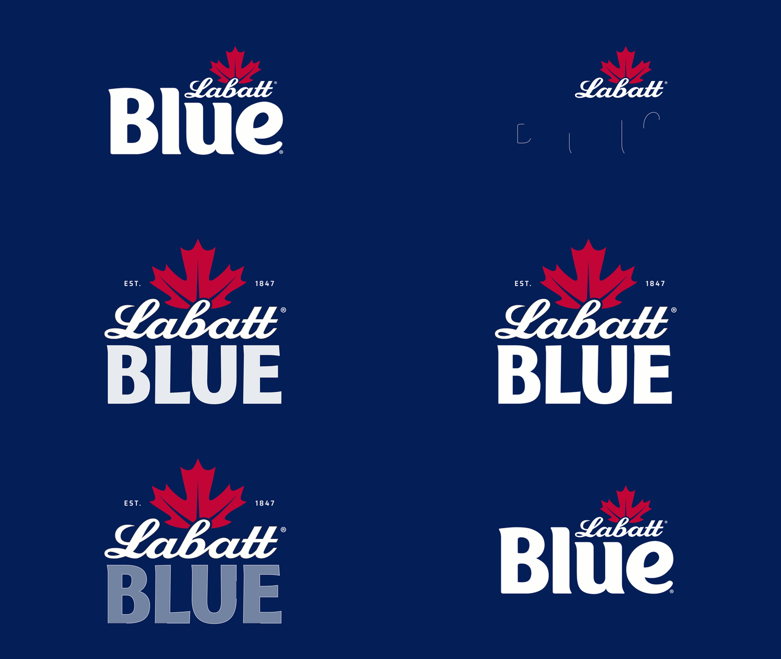
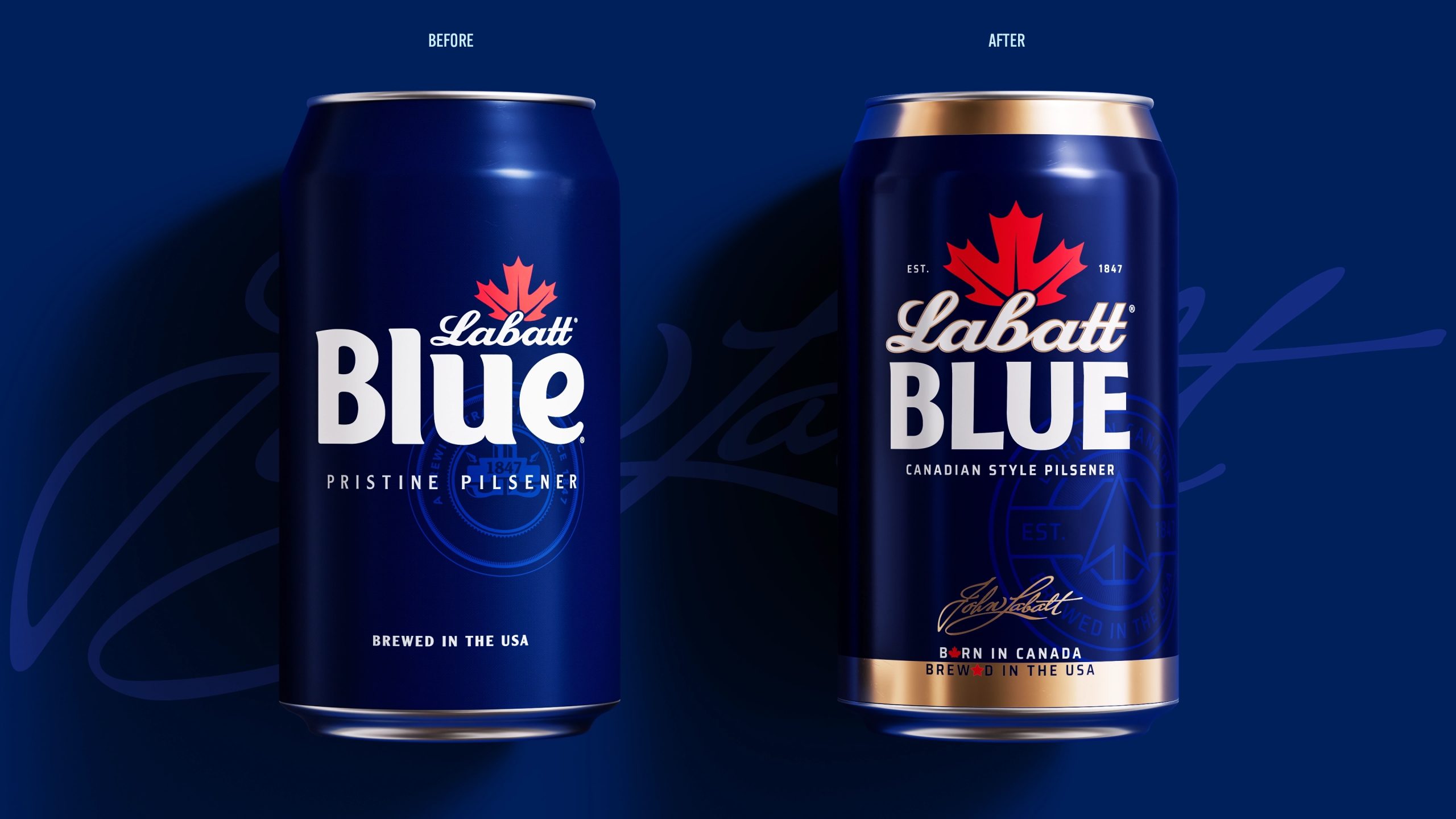
On pack, the Labatt name has been given greater prominence, while retaining the equity and recognition of the existing brand assets. The design introduces more heritage, warmth, and premium confidence through refined typography, gold detailing, the John Labatt signature, and a more deliberate use of red and maple leaf symbolism.
A diagonal graphic device, inspired by the italic angle of the Labatt logo, runs through the wider system as a subtle expression of borders, contrast, and connection. Across communications, this becomes a flexible tool for showing difference and unity, whether between Canada and the U.S., rival teams, opposing opinions, or the playful back-and-forth of everyday social moments.
“We elevated the prominence of the Labatt name across packaging and the wider identity system, while embracing the brand’s position as dual citizen,” said Leigh Chandler, Founder and Executive Creative Director at Sister Mary. “That came to life through graphic devices inspired by borders, contrast, and connection, alongside a more playful and provocative tone of voice that reflected the dynamic between Canada and the U.S.A., but is also alive at the bar, the tailgate, around the grill, or anywhere people gather to compete, tease and roast each other. ”
The new system spans brand strategy, visual identity, packaging design, tone of voice, art direction, and guidelines, creating a more cohesive foundation for Labatt to own & stand out with.
“Labatt didn’t need to become something else,” Chandler added. “It needed to make sense of the things that were already there. Its Canadian roots, its U.S.A. presence, its blue equity, its sports culture, and its sense of humor. The refresh gives the brand a clearer story and a more confident way to show up.”
About Labatt USA
First brewed in 1847, Labatt is recognized for its clean, refreshing taste, light color, subtle hop aroma, and balanced, slightly fruity character. Labatt has become a leading Canadian-style pilsner across the Great Lakes region – born in Canada and brewed in the United States. Known for its quality craftsmanship and cross-border heritage, Labatt brings people together through great beer and great moments.
Labatt USA is owned by FIFCO USA. For more information, visit https://www.labattusa.com/ and follow Labatt on Facebook, Twitter and Instagram.
About Sister Mary
Sister Mary is an independent creative studio building brands that inspire devotion. Through strategy, design, and innovation, the New York–based studio partners with global companies and emerging founders alike. Clients include Diageo, FIFCO, and PepsiCo, as well as health and wellness startups such as Niteswim and Percy. Sister Mary is proudly women-owned and led. For more information, go to sistermary.nyc
Project Credits
Creative Agency: Sister Mary
Founder/Creative Director: Leigh Chandler
Head of Strategy: Emily Cristoforis
Typography: Luke Ritchie
Designers: Sonja Fritz, Rebecca Clarke Tear, Meg Vaughan, Richard de Cazelet
Photography: Cole Wilson
Models: Lucie Mouchet, Spencer Williams

 Derrick Lin
 monther al omari
 43oz
43oz lilyz design23
 Modern Theory
 Eighteen Brand Studio
 Bhumika Singh
 MohamedMashaly
 Pixels Studio
 Gulya
Gulya UPRISE
 Lizaveta Kharitonyuk
 Bonsanco Creative Studio
 DesignRepublic
 GIRAFA STUDIO
 PiotrWisniewski
 Sophiagdotcom
 CreativeWise
 SoreThumbStudio®
 Modern World Studio
 Palashcc
 Valérie Colace