

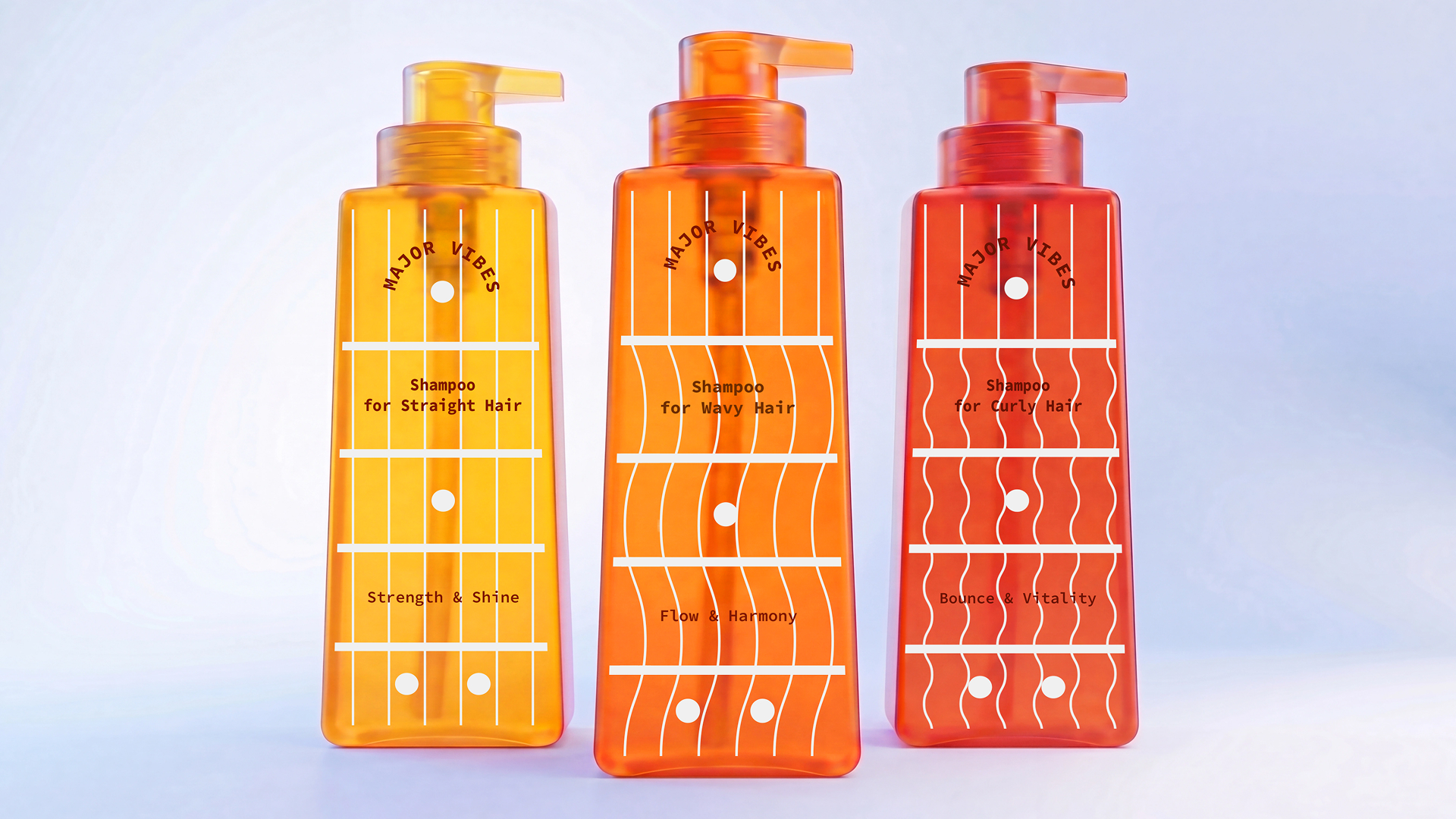
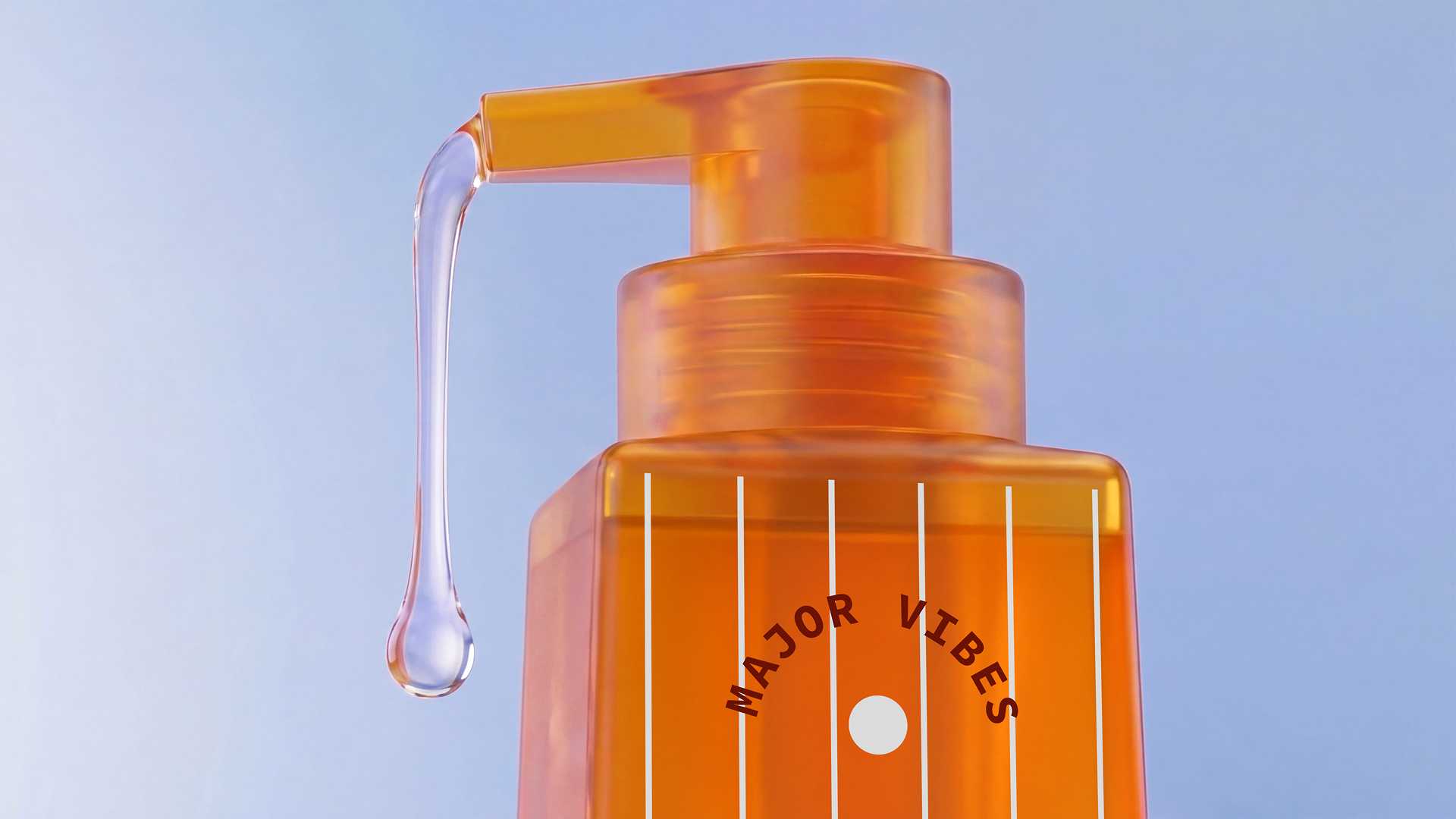
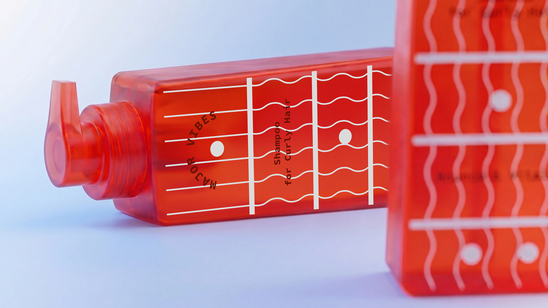
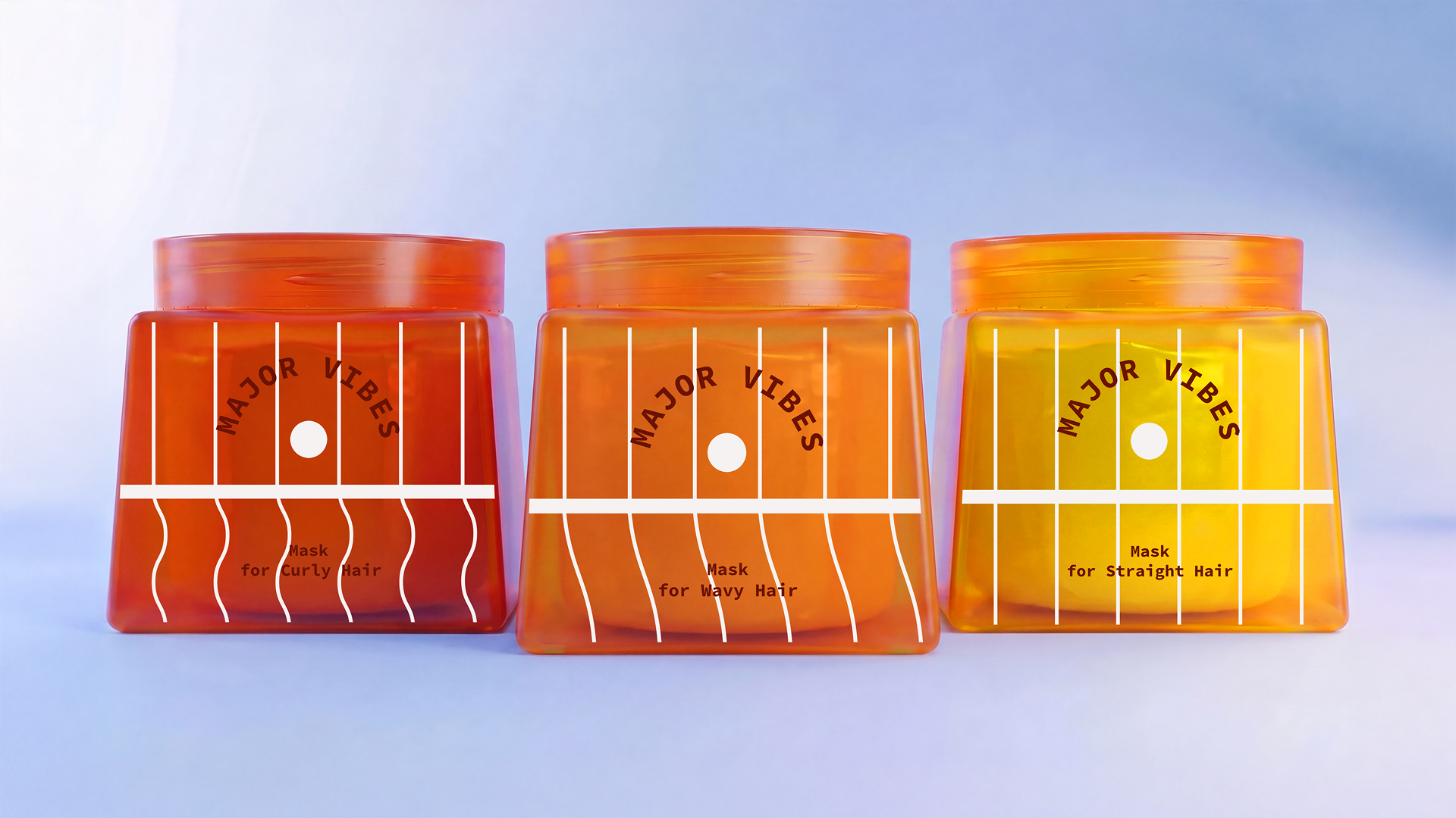
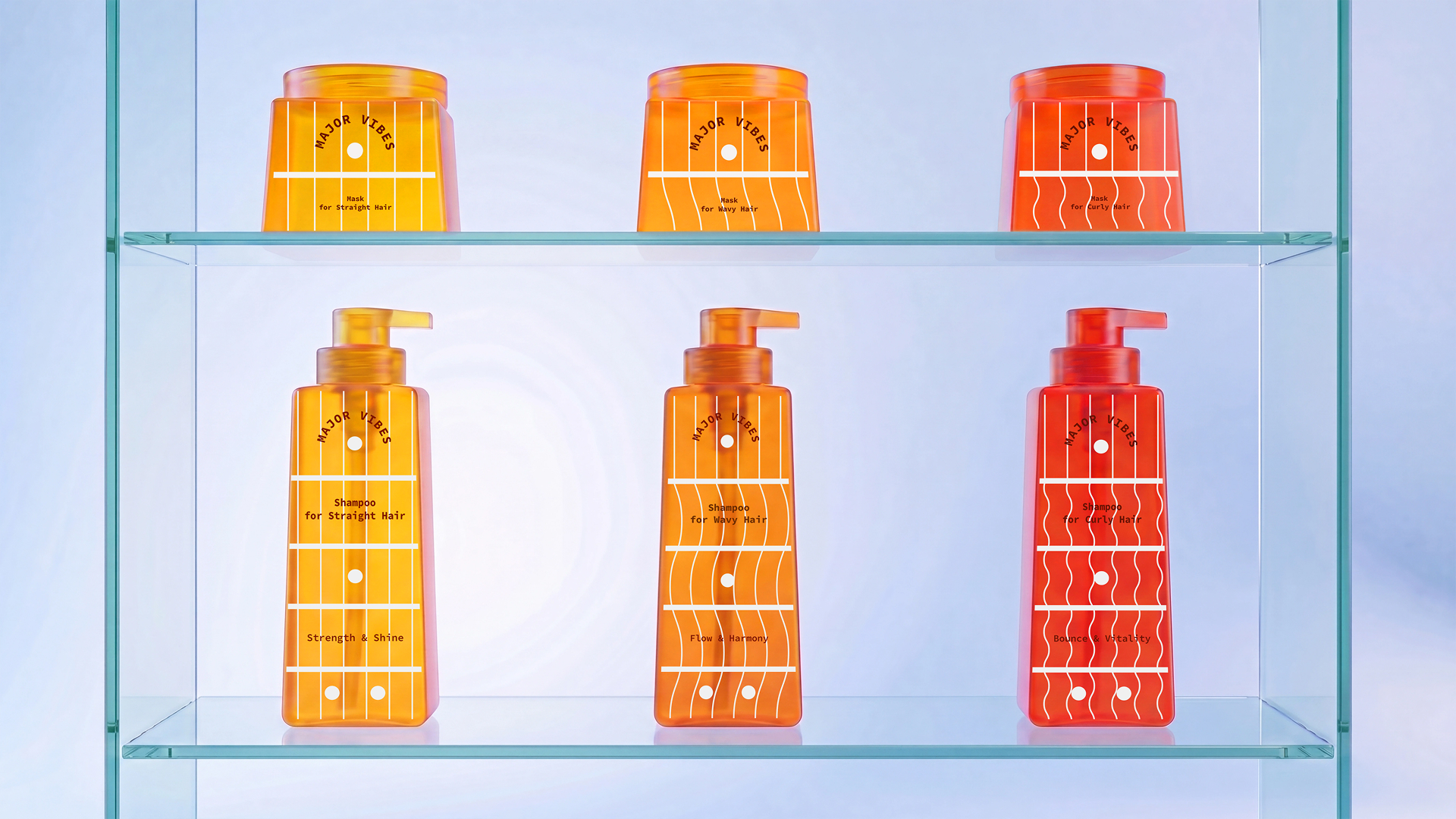
Major Vibes is a hair care product line where hair type forms the foundation of the brand’s visual system. The graphics are inspired by the shape and markings of a guitar fretboard: vertical lines and fret markers are adapted into a recognizable packaging pattern. The character of the hair is reflected in the line work—straight for smooth hair, wavy and curly for corresponding types. This approach creates clear navigation within the product line and emphasizes the individuality of each product.
Curator’s Insight
The fretboard reference does more than decorate the bottle. It gives each hair type its own line quality: straight lines for straight hair, gentle waves for wavy, tighter curls for curly.
That’s a simple idea, but it holds up under scrutiny, since the pattern itself communicates the product’s function before anyone reads a word. The warm gradient across the three bottles, moving from yellow to orange to deep red, adds another layer of differentiation without breaking the family resemblance. It’s a system that would still work if the labels were removed, which is a good test for whether a packaging idea is doing real work or just sitting on top of the bottle. If there’s a limit to the concept, it’s that the guitar reference is somewhat arbitrary relative to hair care as a category. But the execution earns its place regardless, since the visual logic (structure, rhythm, texture) maps cleanly onto what each product actually does.


 IDEOLOGO
 Open Strategy & Design
 cem kutlu
 monther al omari
 Bonsanco Creative Studio
 Confetti Design Studio
 古戈品牌
古戈品牌 Rare Ideas
 Studio Pistache
 Studio Tumpic/Prenc
 Atiq Alam
 bachir bachchar
 Akshita Agarwal
 Carreto Concepts Design Studio
 Hollóka Grafikai Műhely / Graphic Design Studio
 Arsen Avetisyan
 Derrick Lin
 Axiniya Knyazeva
 Hadi Samir
 Furt Goods
 宏洛图品牌设计HONGLT