

MANORA – Premium Brand Identity and Packaging Design
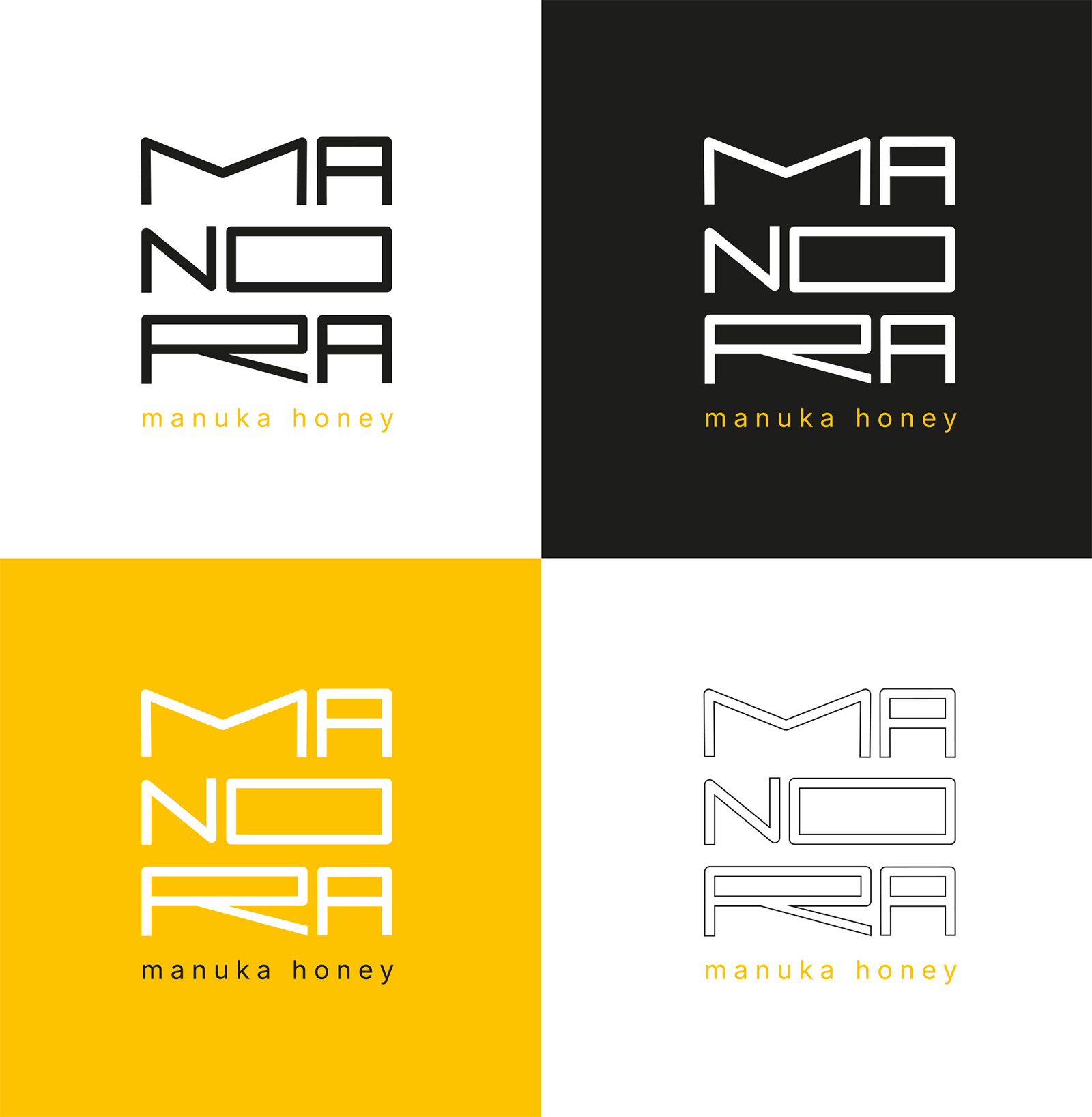
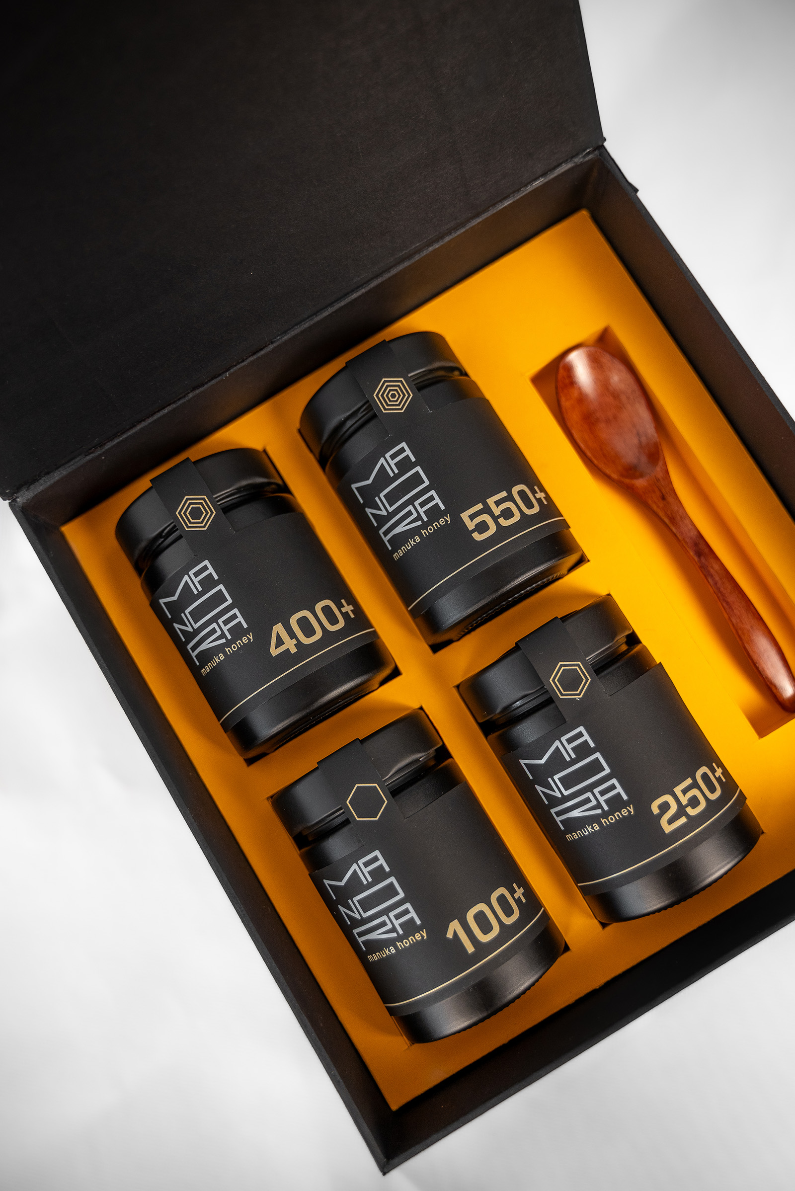
MANORA is a premium packaging concept created to express the rarity, purity, and exceptional value of Manuka honey through a refined visual identity.
Inspired by the unique origin and characteristics of Manuka honey from New Zealand, the project combines minimalist aesthetics with carefully selected materials and thoughtful details. The brand name merges Manuka with the Māori word ora, meaning “life” or “well-being”, reflecting the product’s natural origin and health-conscious qualities.
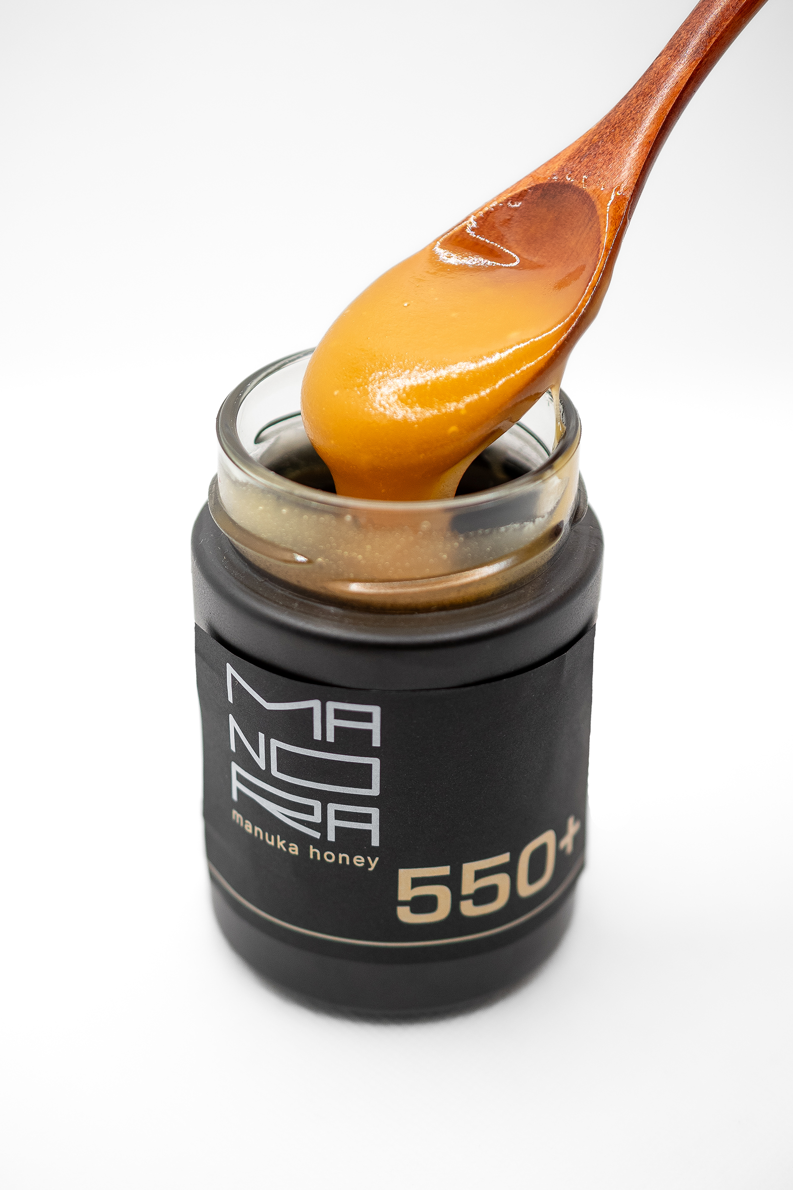
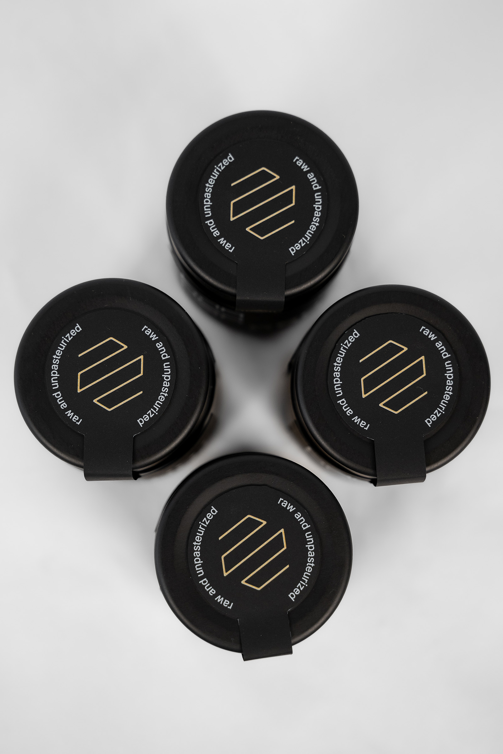
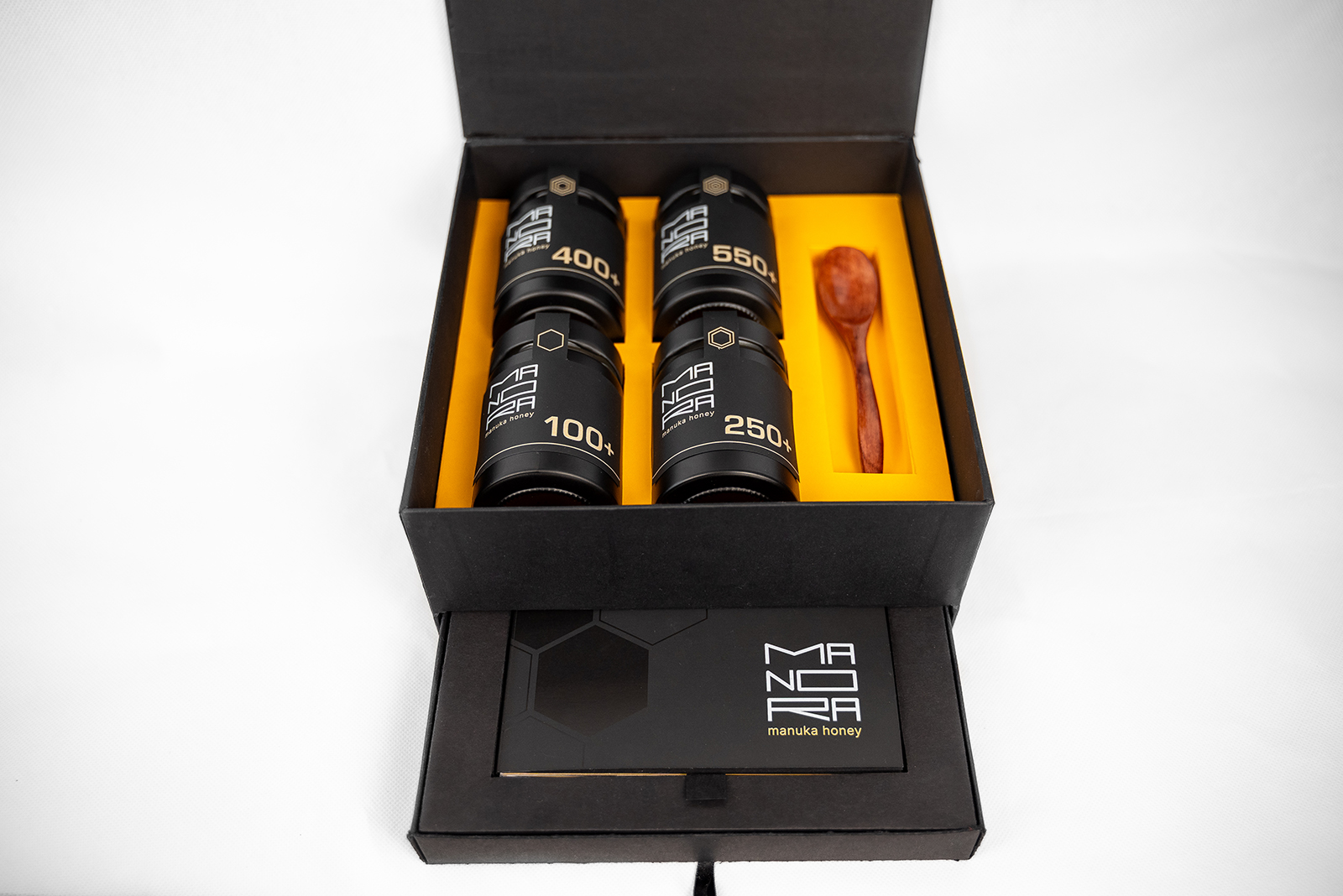
The packaging system is built around a dark glass jar that protects the honey from UV light while reinforcing its premium appearance. The labels are made from matte black paper, creating a refined and tactile surface. Digital gold printing was used for the MGO values and selected details, while the combination of four-color black printing and a glossy varnish effect creates a subtle interplay between matte and reflective surfaces. This contrast adds depth, sophistication, and a distinctive character to the minimalist visual identity.
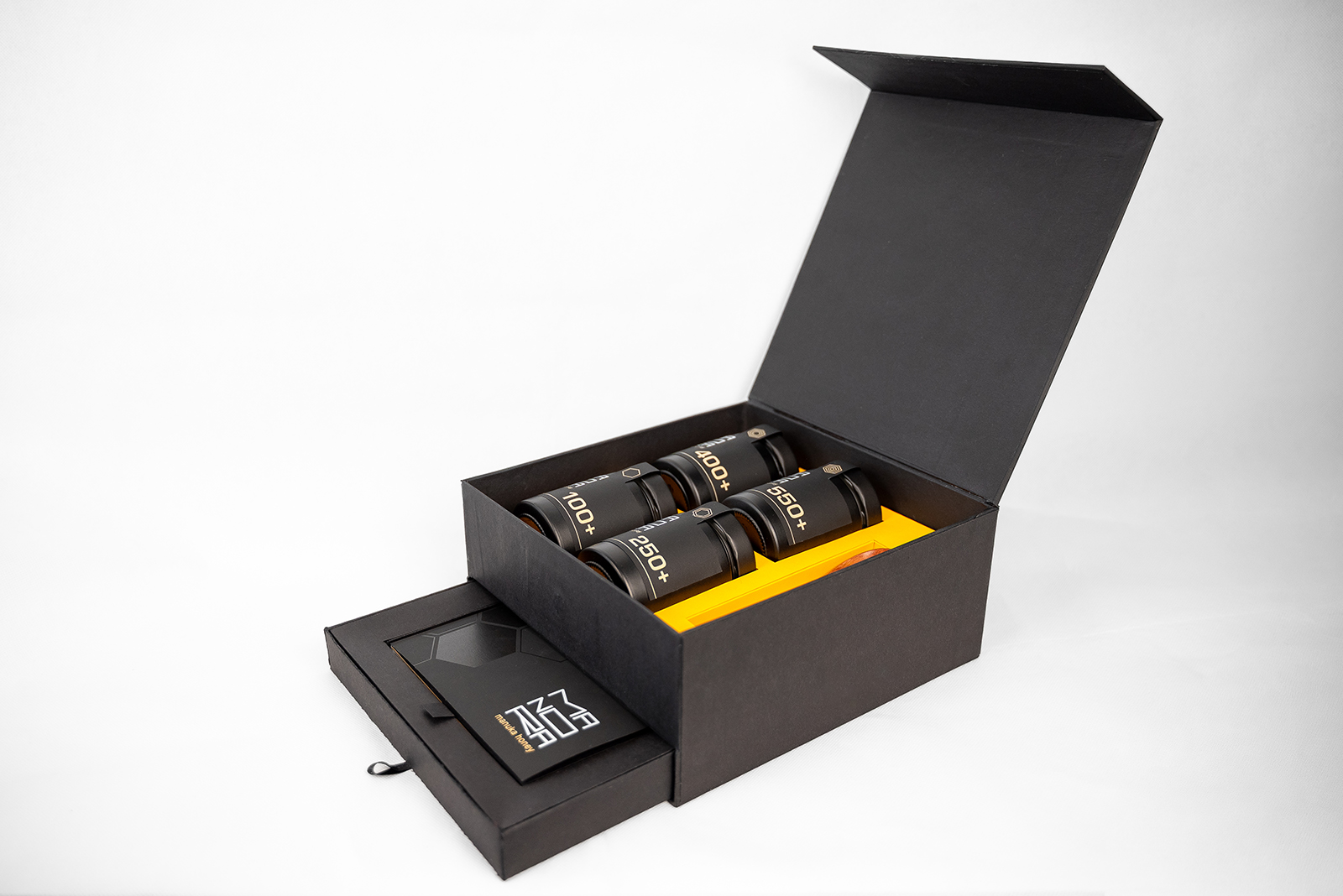
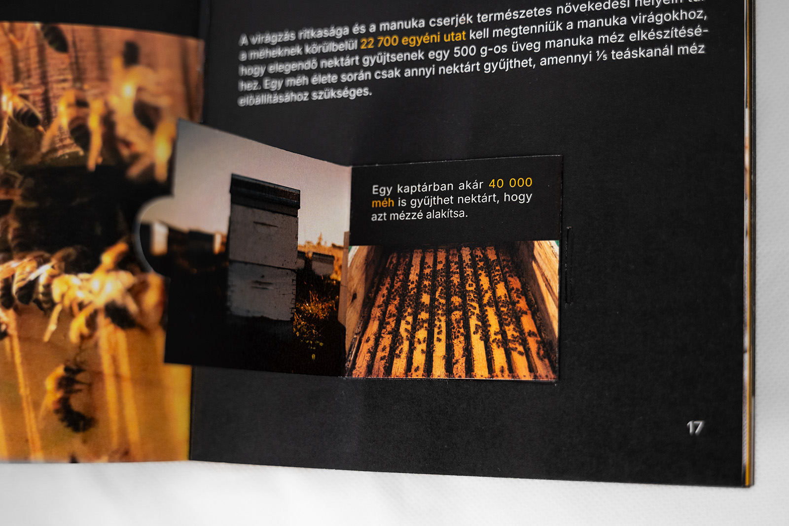
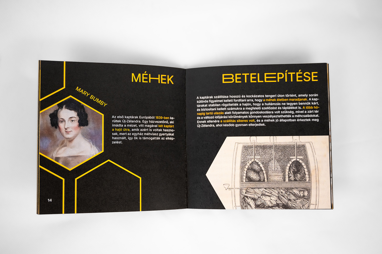
Beyond the primary packaging, the project includes a premium presentation box with a magnetic closure, designed to enhance the unboxing experience and protect the product. The packaging system is complemented by an informative booklet that introduces the origin, history, and unique characteristics of Manuka honey. Featuring interactive elements and tactile details, the publication encourages users to explore the story behind the product and creates a deeper connection between the consumer and the heritage of Manuka honey.
Designed as a Bachelor’s degree project in Graphic Design, MANORA explores how thoughtful packaging design can transform a natural product into a contemporary premium experience. The result is a visual identity that balances simplicity, functionality, and craftsmanship while communicating trust, quality, and authenticity.










 United Creatives Studio
 Kingdom & Sparrow
 Anastasia Bakhmatskaya
 CreativeWise
 Great and Golden
 Ximena Ureta Design Studio.
 Sorted Branding
 Lisa Sirbaugh Creative
 vitoramockup
 YQIAN
YQIAN Navegante
 Anastasia Cherepanova | xtramez
 Polaris Designs
 pavlyai
 Milena Kocharyan
 monther al omari
 Mohamed sherif midoo
 DESIGN CONCEPTS
 mmdesign
 markcreativestudio
 Rosario Lo Iacono