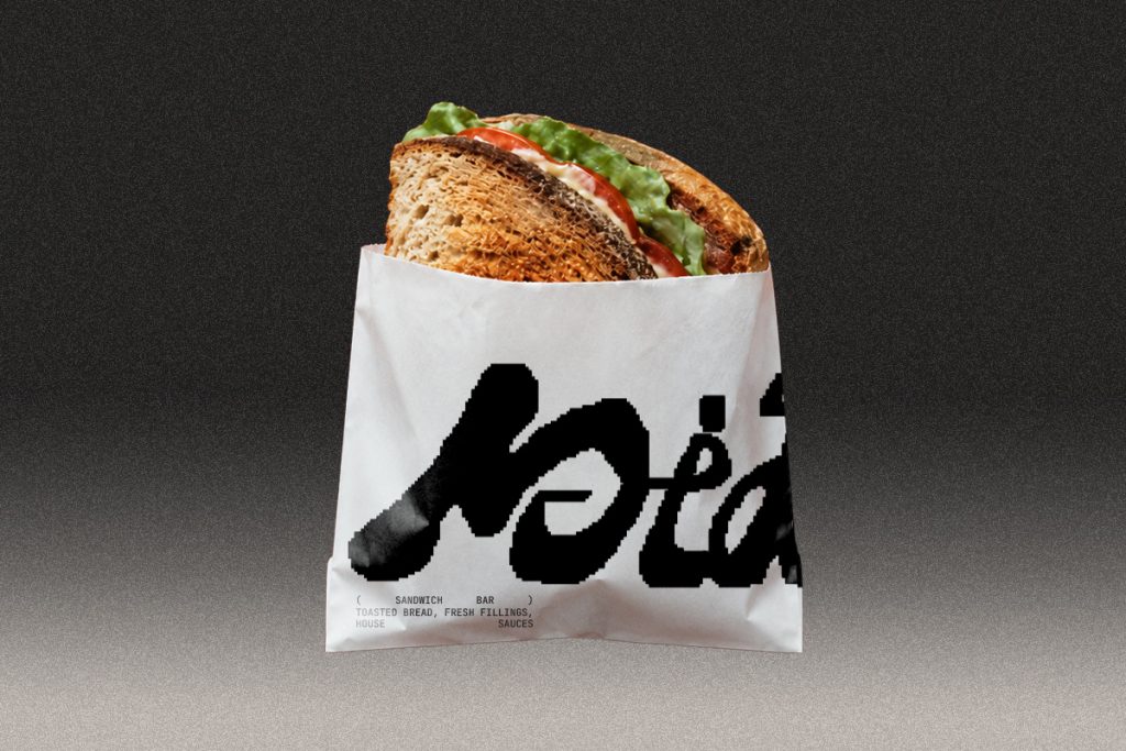

MIDDAY is a fresh sandwich bar made for the midday break a simple, casual food concept created for people looking for a clear, quick, and well-made lunch experience.
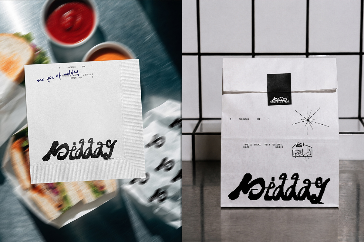
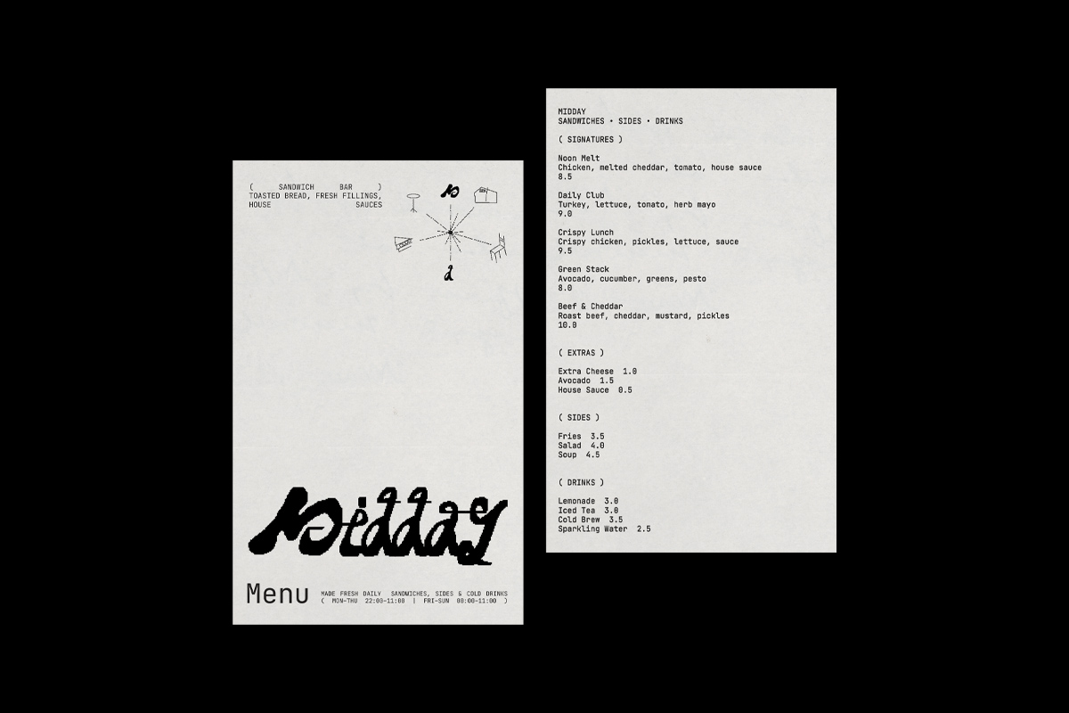
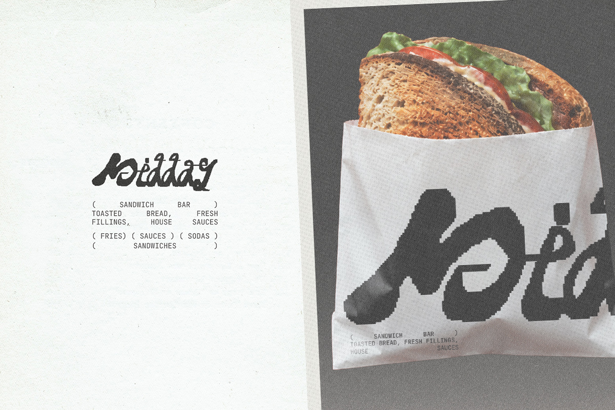
The identity is built around a hand-drawn wordmark designed to feel fresh, approachable, and easy to recognize. Instead of creating a loud or overly trendy visual system, the direction focuses on clarity, simple typography, and everyday takeaway culture. The brand language is inspired by sandwiches made daily, printed order labels, paper bags, menu cards, takeaway wrappers, and small food details that make the experience feel direct, practical, and memorable.
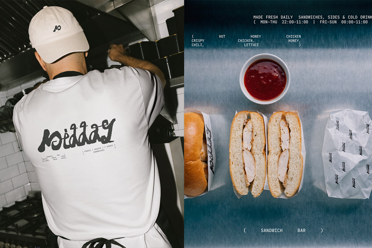
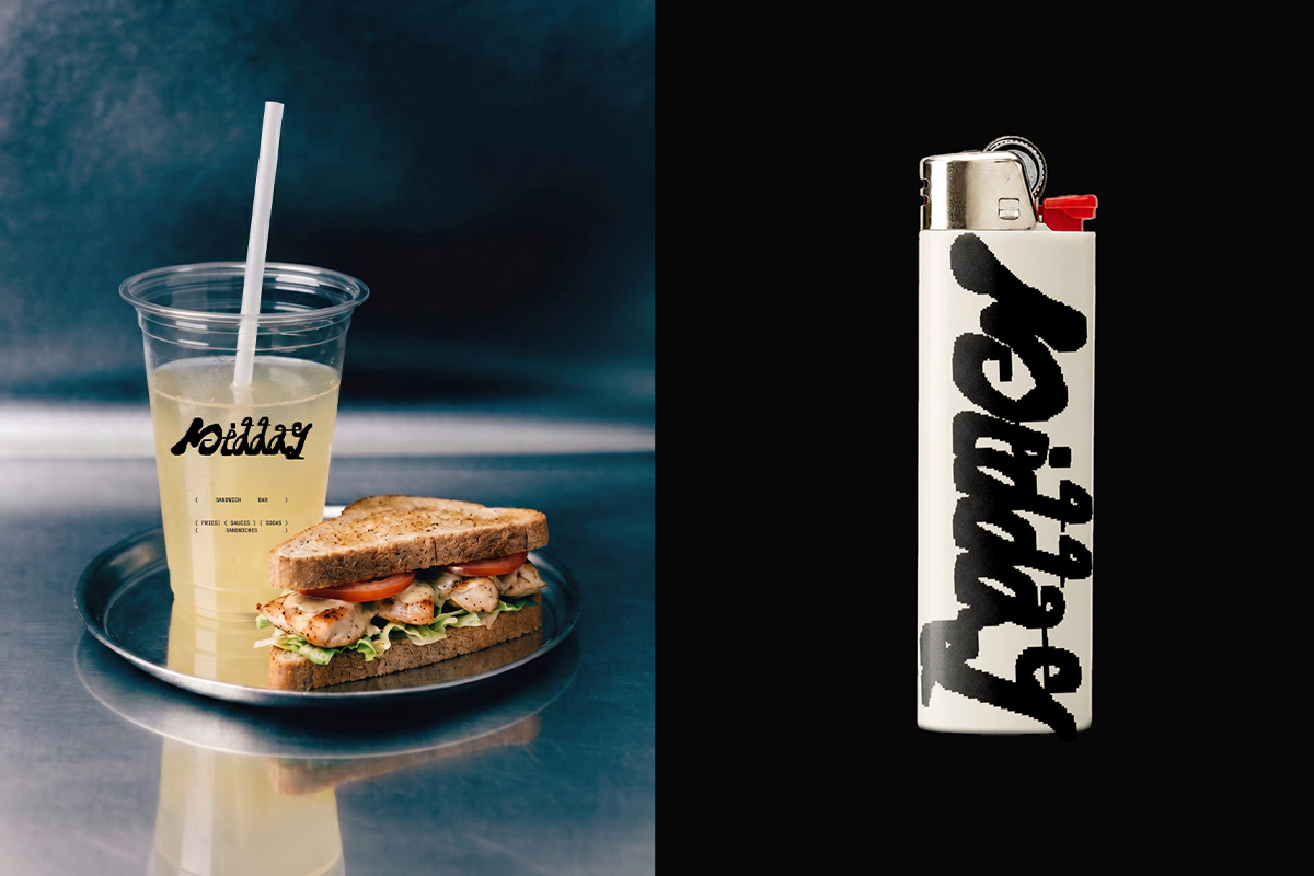
The visual system combines a casual handmade logo with clean layouts, minimal supporting graphics, and functional brand applications. Every element is designed to feel fresh, readable, and easy to use, while still carrying a crafted personality. The overall direction keeps the brand simple and modern without losing its warm, everyday character.
The project includes logo design, menu direction, takeaway packaging, wrapping paper, and printed brand details for a modern sandwich bar, creating a clear identity that works across both dine-in and takeaway moments.




 agarcia studio
 Wynand88
 Eva Chistyakova
 Maria Bukhtilova
 estudiomarciano
 monther al omari
 Thirst
 Maruf Nishat
 Gray Matter Studio
 Julia Jay
 Modern Theory
 Furt Goods
 Fluid
Fluid alchimistestudioParis
 Ancora
 Mostafa Abdelmawla
 MewKittyDraw
 Studio Shala
 43oz
43oz Lucid mk2
 Atiq Alam
 IDEOLOGO
 Open Strategy & Design