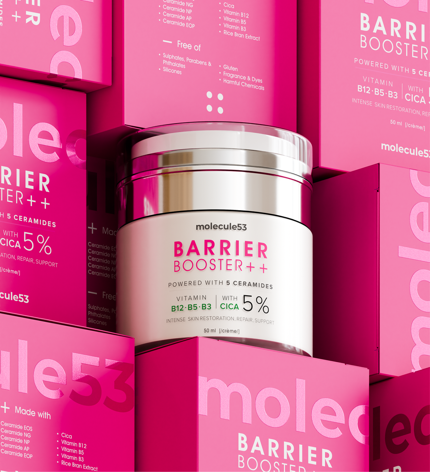

Introducing molecule53 Barrier Booster++
Barrier Booster++ is a premium skincare packaging concept developed for molecule53, a modern skincare brand focused on strengthening and restoring the skin barrier. The project combines strategic label design, packaging design, and photorealistic 3D visualization to create a product identity that feels clinical, contemporary, and premium.
Every design decision from typography and color hierarchy to materials, finishes, and realistic product rendering—was crafted to communicate efficacy while delivering a strong shelf presence across retail and digital platforms.
The Concept
Healthy skin starts with a healthy barrier.
Barrier Booster++ was designed around this simple idea. The visual identity balances scientific credibility with modern beauty aesthetics, allowing the product to feel trustworthy without sacrificing premium appeal.
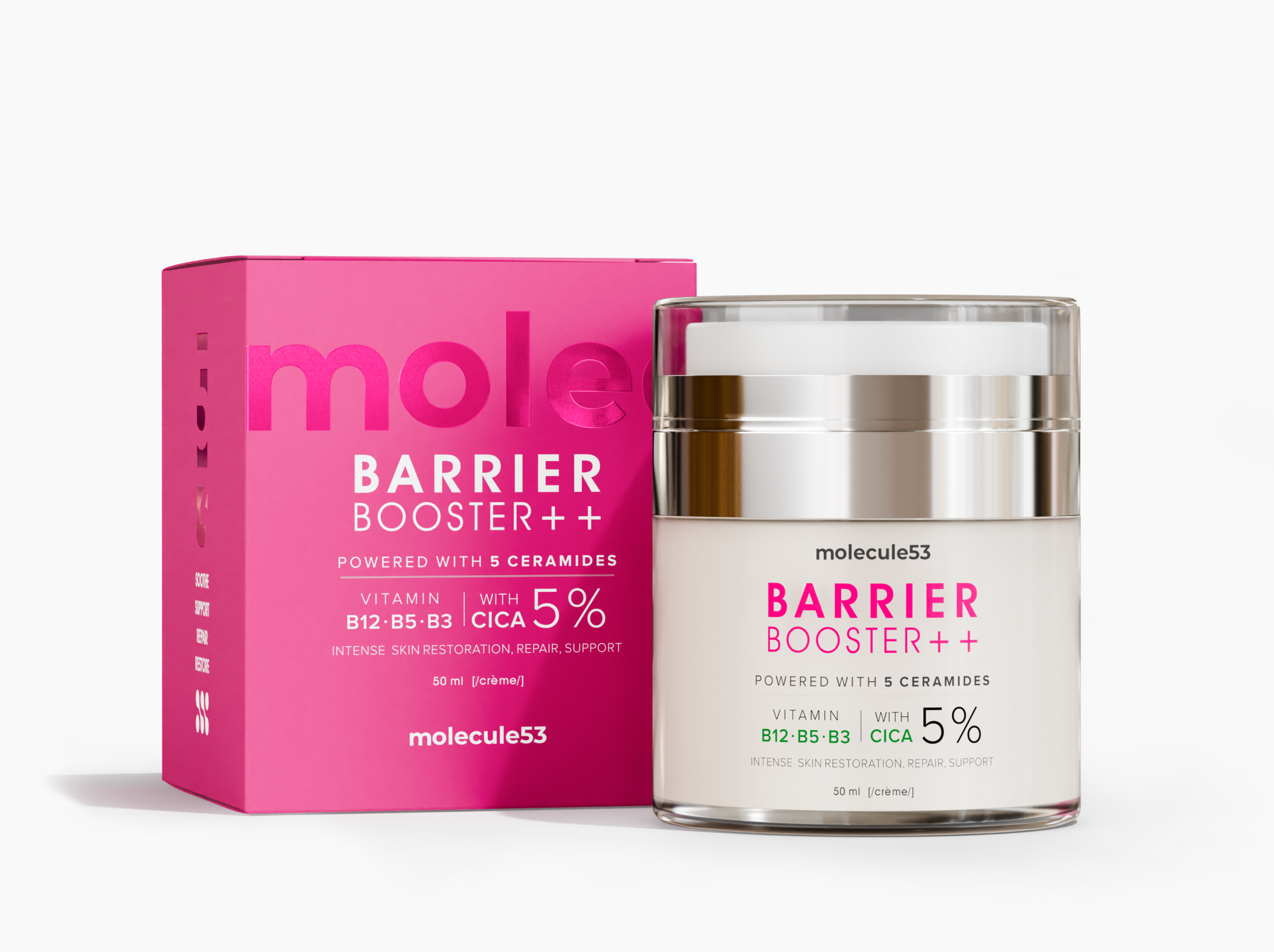
The vibrant pink packaging symbolizes repair, confidence, and vitality, while the clean white jar and metallic finishes reinforce the product’s dermatological positioning. Every element works together to create packaging that immediately communicates performance, quality, and sophistication.
Rather than relying on excessive graphics or decorative elements, the design focuses on clarity, balance, and confidence allowing the product itself to become the hero.
The Challenge
The skincare market is saturated with products making similar promises. Barrier repair has become one of the fastest-growing categories, making differentiation increasingly difficult.
The challenge was to create packaging that could instantly capture attention while maintaining the credibility expected from a science-backed skincare product. The packaging needed to perform equally well on retail shelves, eCommerce platforms, advertising campaigns, and social media, requiring every detail to be visually refined from every angle.
The Insight
Consumers today buy skincare with both emotion and logic.
They want products that look premium, feel trustworthy, and clearly communicate their benefits before they even read the ingredients.
By combining bold color blocking, minimal typography, premium materials, and realistic product visualization, Barrier Booster++ creates a packaging system that inspires confidence while remaining visually memorable.
The result is a product identity that feels luxurious without becoming overly complicated.
Design Execution
Our team handled both the label design and the complete 3D product visualization for the project.
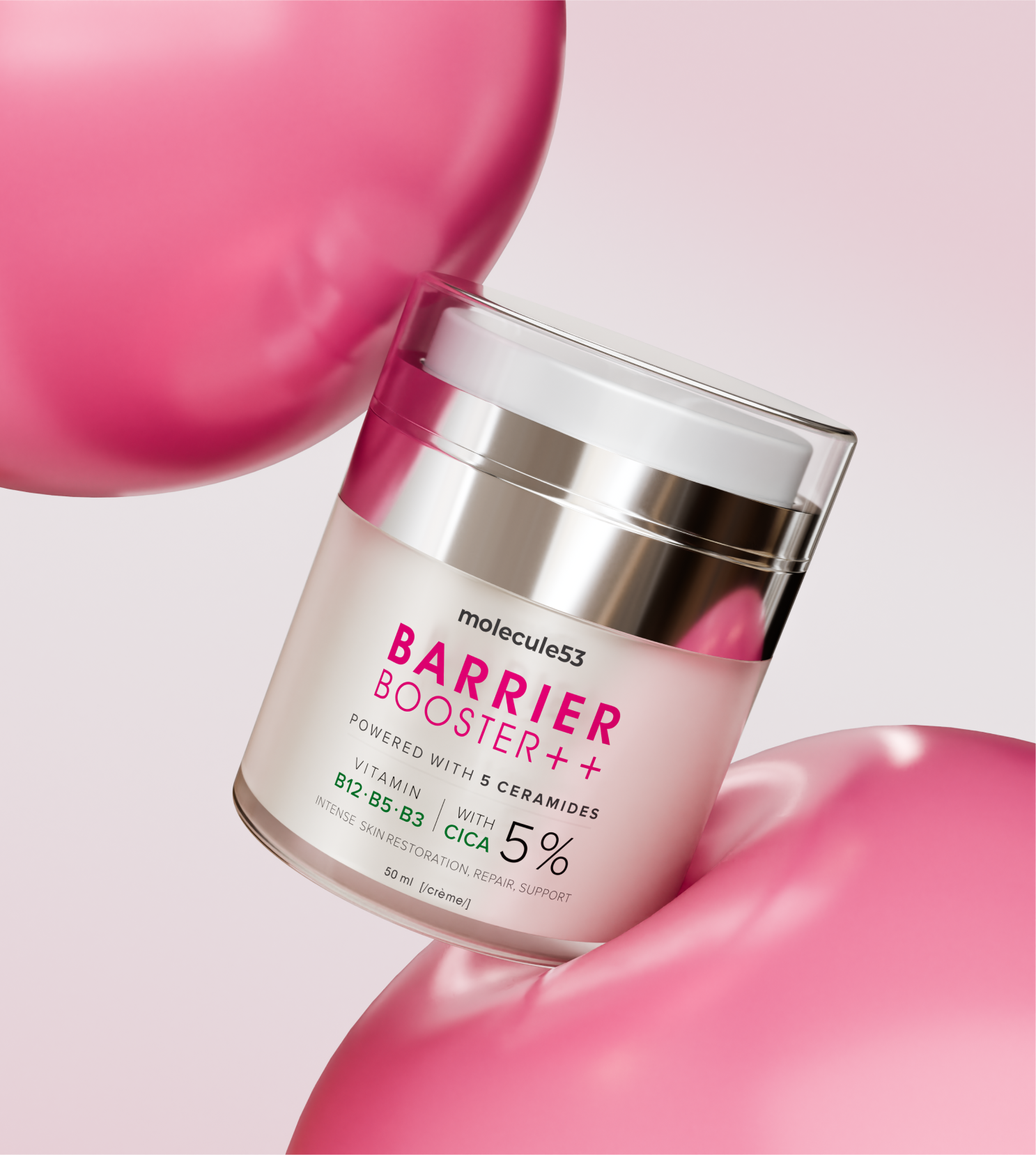
The labels were designed with a strong information hierarchy, ensuring ingredients, key benefits, and branding remain easy to read while preserving a clean aesthetic. The photorealistic 3D renders focus on realistic materials, reflections, lighting, and composition to accurately represent the final product and elevate its presentation across digital marketing, product launches, and eCommerce experiences.
Every render was carefully composed to highlight the packaging details while reinforcing the premium positioning of the brand.
Curator’s Insight
What makes Barrier Booster++ successful is the balance between bold visual impact and functional clarity. The vibrant packaging immediately attracts attention, while the restrained typography and structured information create trust and credibility.
The project demonstrates how thoughtful packaging design, label design, and high-end 3D visualization can work together to create a product that feels equally premium on the shelf, in digital campaigns, and across online marketplaces. Rather than relying on visual trends alone, the design builds a timeless identity that communicates quality, performance, and modern skincare innovation.
 agarcia studio
 Wynand88
 Eva Chistyakova
 Maria Bukhtilova
 estudiomarciano
 monther al omari
 Thirst
 Maruf Nishat
 Gray Matter Studio
 Julia Jay
 Modern Theory
 Furt Goods
 Fluid
Fluid alchimistestudioParis
 Ancora
 Mostafa Abdelmawla
 MewKittyDraw
 Studio Shala
 43oz
43oz Lucid mk2
 Atiq Alam
 IDEOLOGO
 Open Strategy & Design