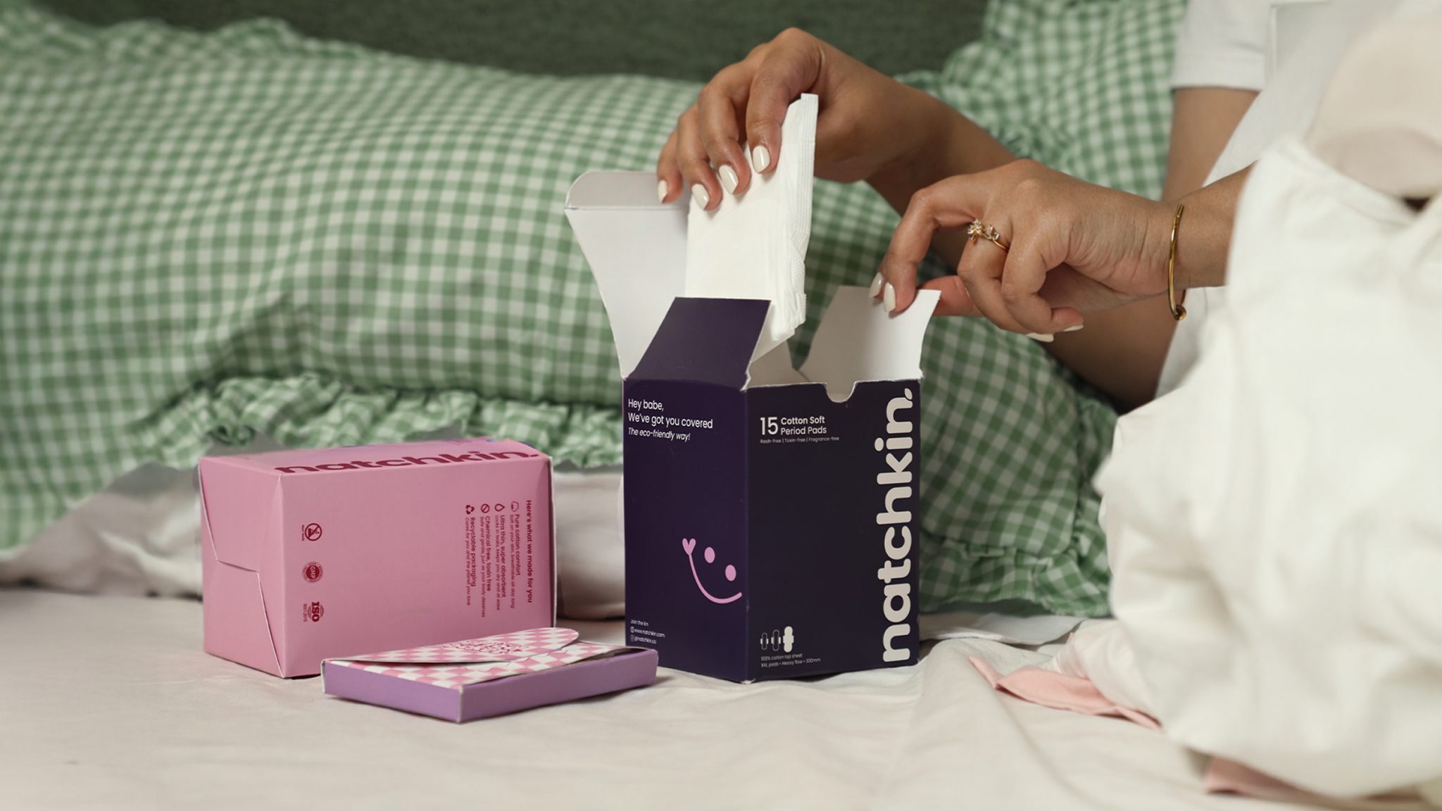

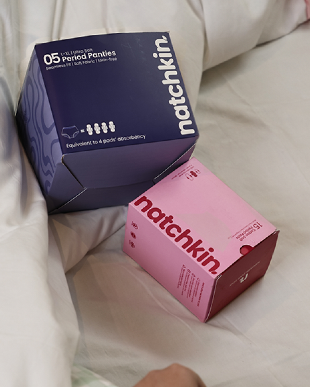
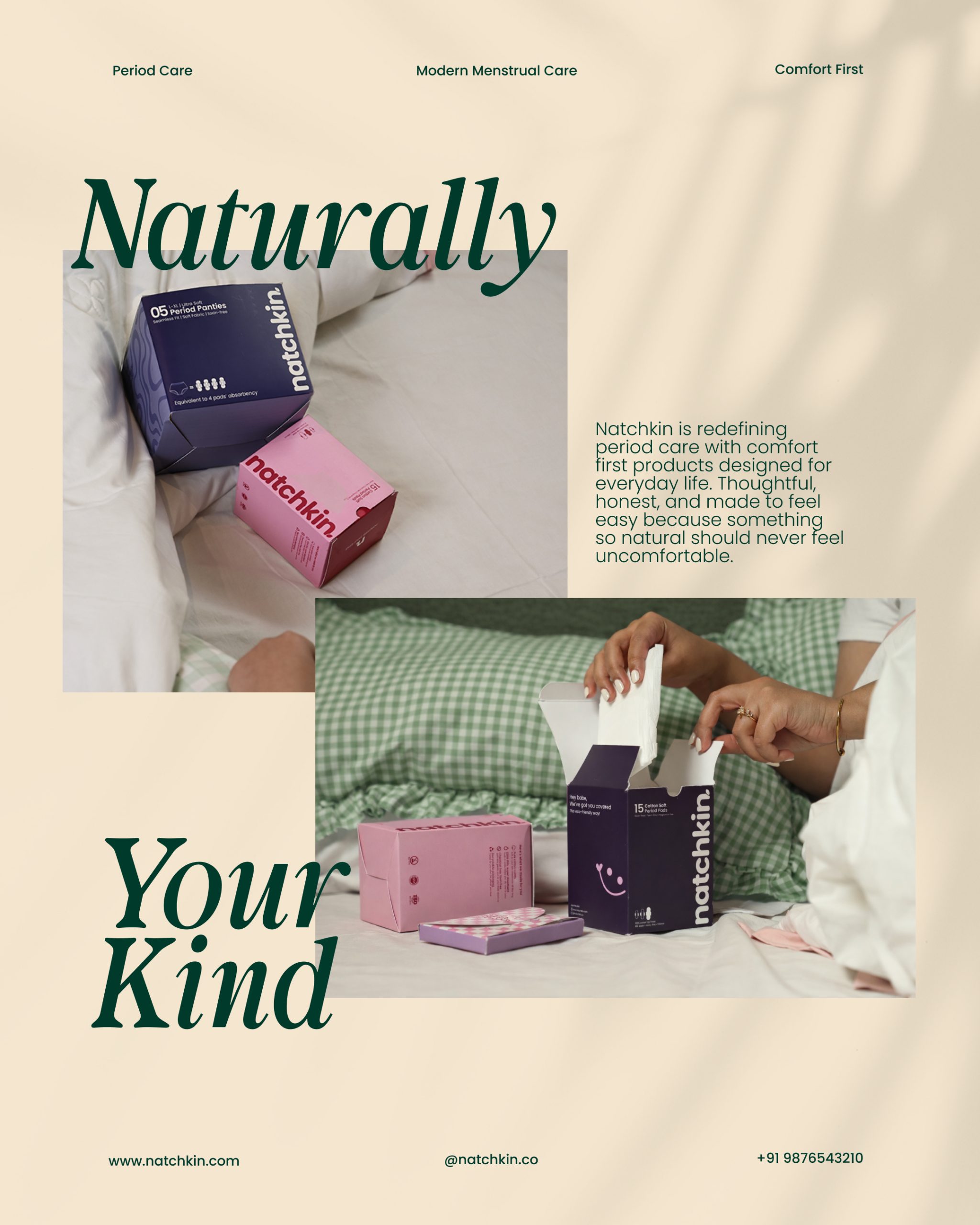
Natchkin is a modern period care brand created to redefine the way young women experience and perceive menstrual products. In a category often dominated by clinical, conventional packaging, the brand embraces a softer, more approachable identity that encourages confidence instead of concealment.
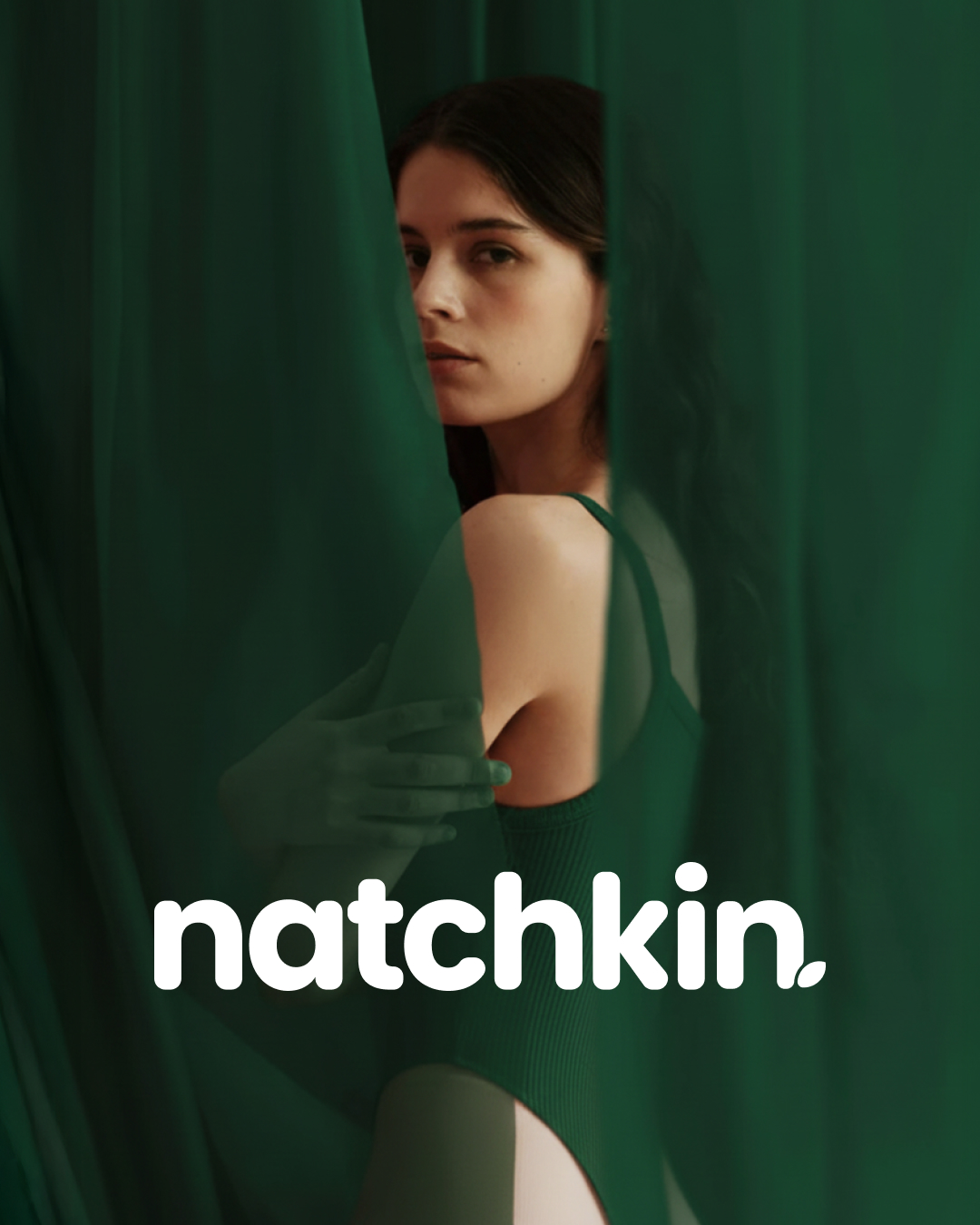
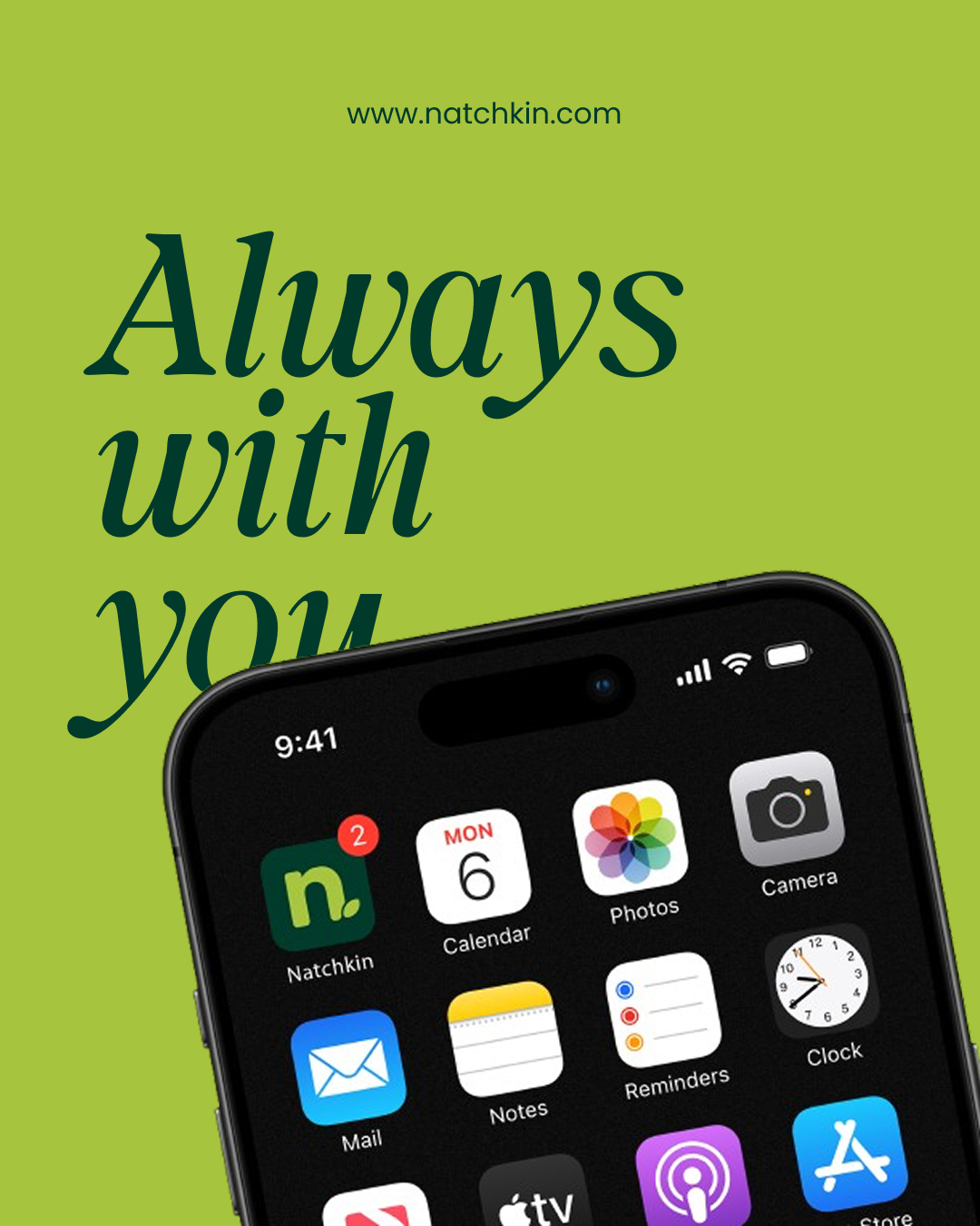
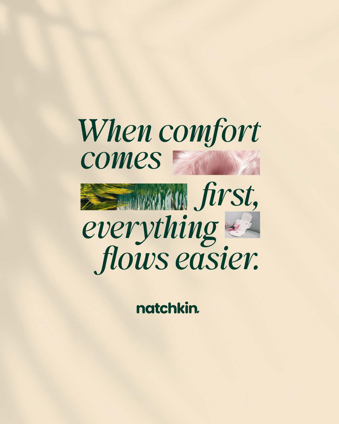
The visual identity combines playful illustrations, calming colors, and thoughtful typography to create a brand that feels warm, comforting, and relatable. Every touchpoint was designed to make period care feel less intimidating and more like an extension of everyday self-care.
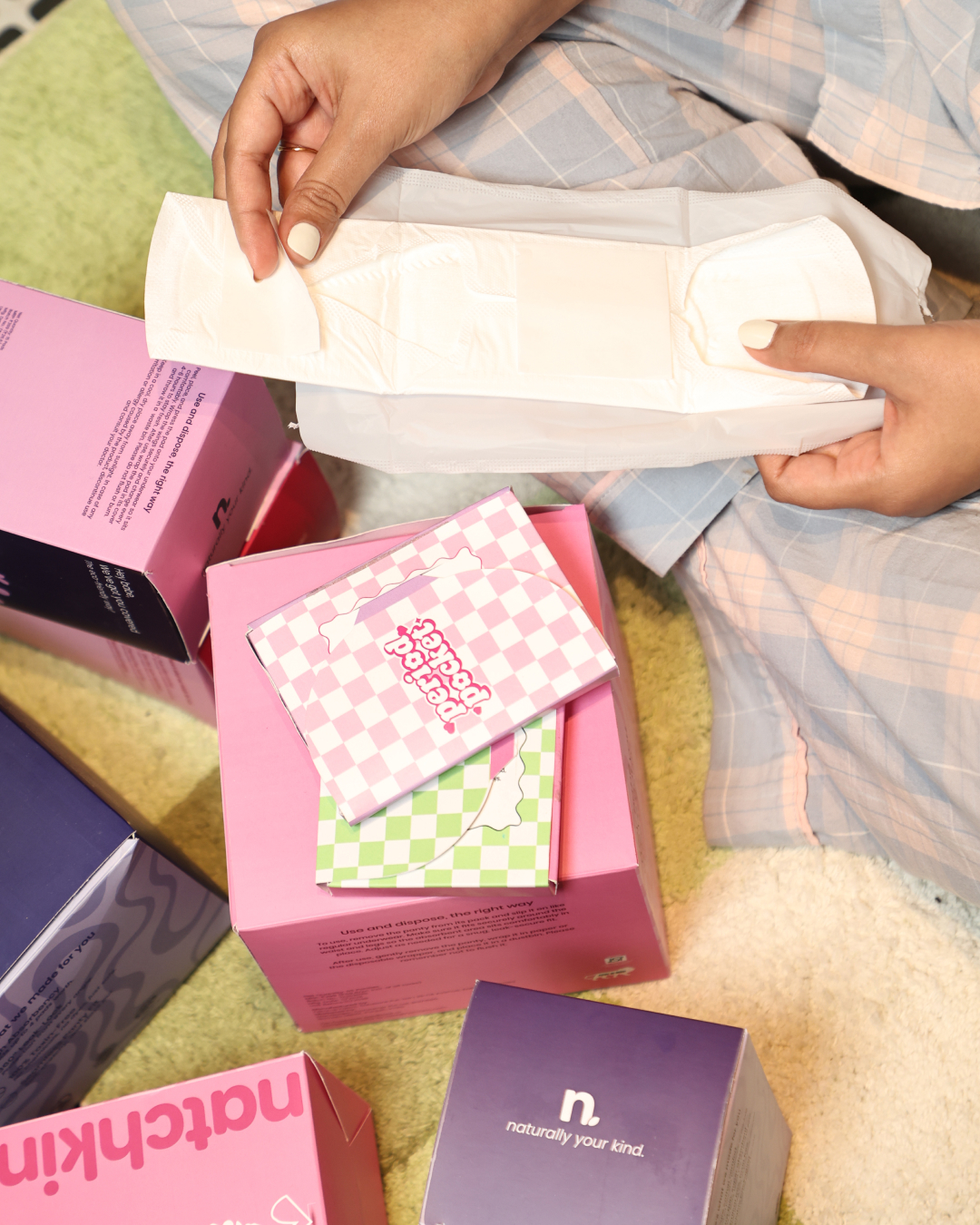
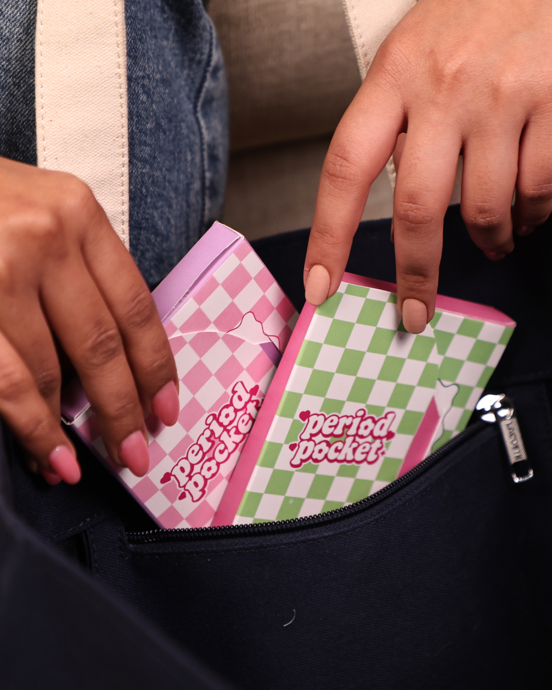
The packaging system was developed to stand out on shelves while building an emotional connection with its audience. A key extension of the brand is Period Pockets, compact pouches designed to carry period products discreetly while making them feel like an accessory rather than something to hide.
Originally, the brand was positioned around biodegradable period products, with sustainability influencing the initial branding direction. Although the product positioning evolved later, the core design philosophy remained unchanged: creating a period care brand that feels modern, approachable, and empowering for a new generation.
 MID-AIR STUDIO
 Heramb Arora
 monther al omari
 Tríona O'Donoghue • Design
 Cocoon Prague
 alchimistestudioParis
 hugo zapata
 Bonsanco Creative Studio
 parawaradesign
 UPRISE
 Brand Society
 Que Cálido Studio®
 Richest Branding Pvt. Ltd.
 STRATEDGY
 Shapers Studio
 Platon Ivantsov
 WPA Pinfold
 giselepereiradesign
 ShalaSketches
 05Creation
 Voit Studio
 SSTO
SSTO