

Alkem: The Kombucha That Refuses to Finish What It Started
Every kombucha on the shelf looks the same. Soft pastels, watercolor botanicals, the same borrowed wellness script. Alkem was built to walk out of that room entirely.
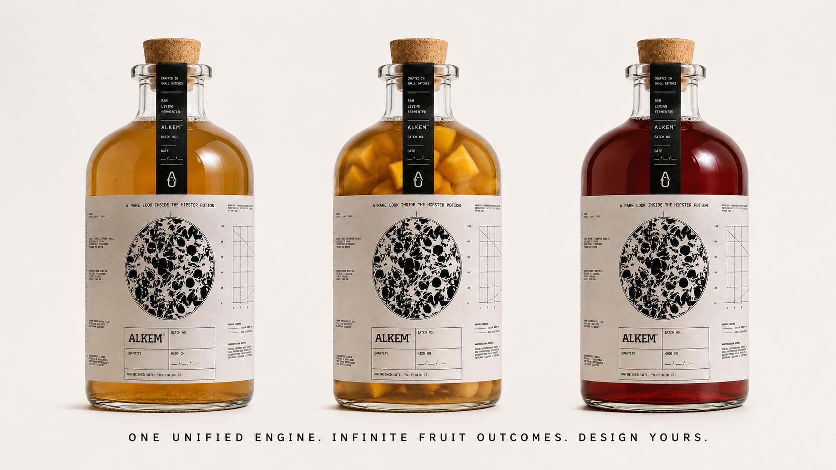
The product gave us the opening. Alkem is a ready to flavor kombucha, sold only through its first fermentation, a raw, living culture with no fruit, no added sugar, none of the flavor decisions made for you. The second fermentation, where actual flavor and character get built, is handed to the consumer. They add their own fruit, control their own sugar drop, shape their own result. Some have gone on to bottle and sell kombucha lines using Alkem as their base. We don’t sell a finished beverage. We sell the starting point of one.
That decision, selling something deliberately unfinished, shaped two archetypes that don’t usually share a shelf: the Outlaw and the Sage. The Outlaw refuses the category’s performance of wellness. The Sage replaces that performance with real information. The packaging system runs on one tension: strike it down, then show your work.
The Outlaw: Crossing Out the Category’s Own Language
Kombucha packaging trains shoppers to expect a script: “detoxifying,” “non alcoholic,” “living fizz,” “shelf stable,” “zero sugar.” In a raw, actively fermenting product like Alkem, several of these claims are simply false. The culture is alive and changing daily, sugar is being consumed in real time, and the product is explicitly not stable. That instability is the point.
So we printed those exact words on the pack, the same words every competitor uses, and struck through every one. Bold, oversized editorial type states each claim, then a heavy line cuts it down, turning the back panel into a public correction of the category’s own marketing. It reads less like a label and more like an evidence board. The crossed out claims dissolve at the bottom into scattered carbonation particles, as if the false language is being consumed by the process it tried to oversimplify.
The Sage: Turning the Label Into an Open Fermentation Manual
Where the Outlaw tears down dishonesty, the Sage replaces it with transparency. Instead of hiding the science behind soft branding, we made the science the branding.
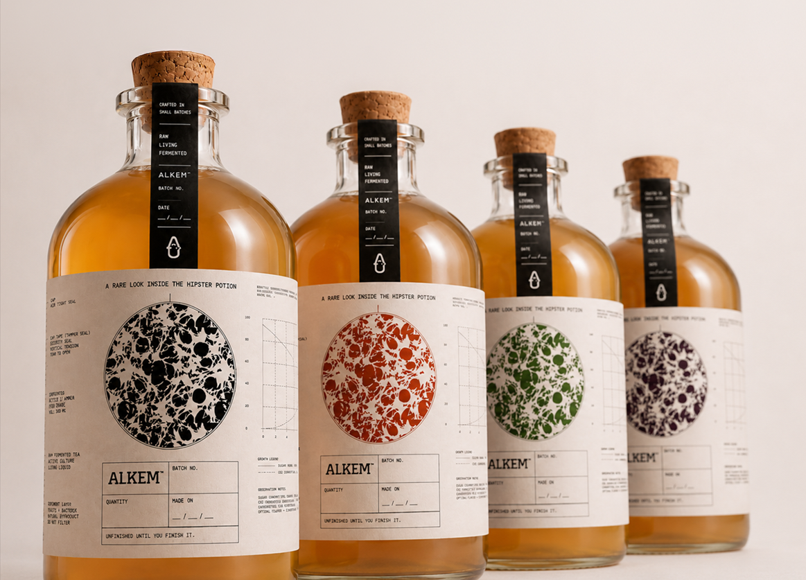
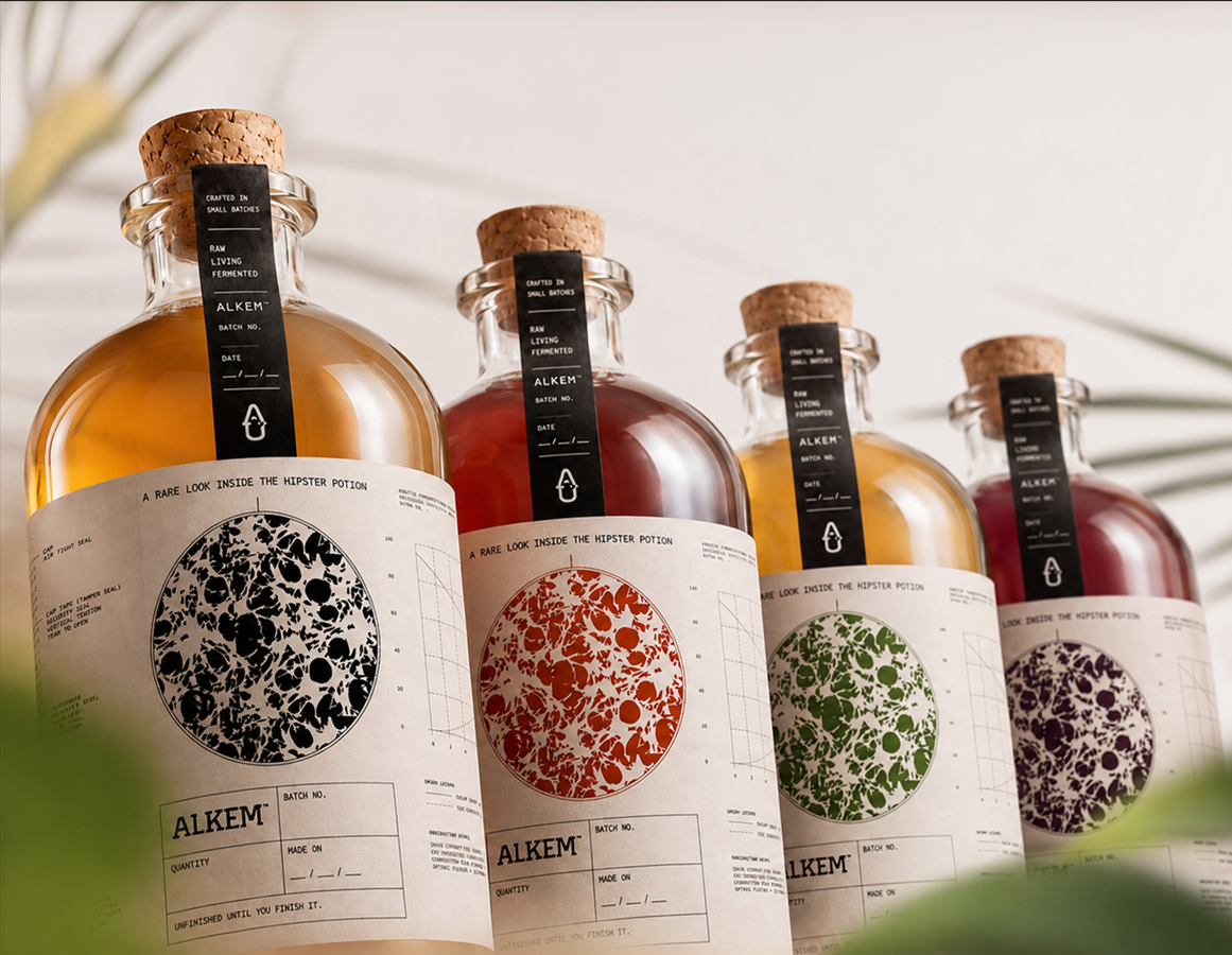
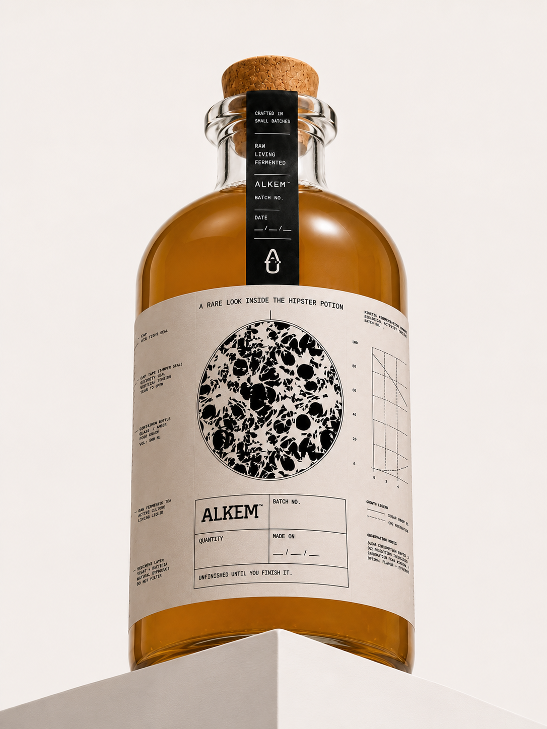
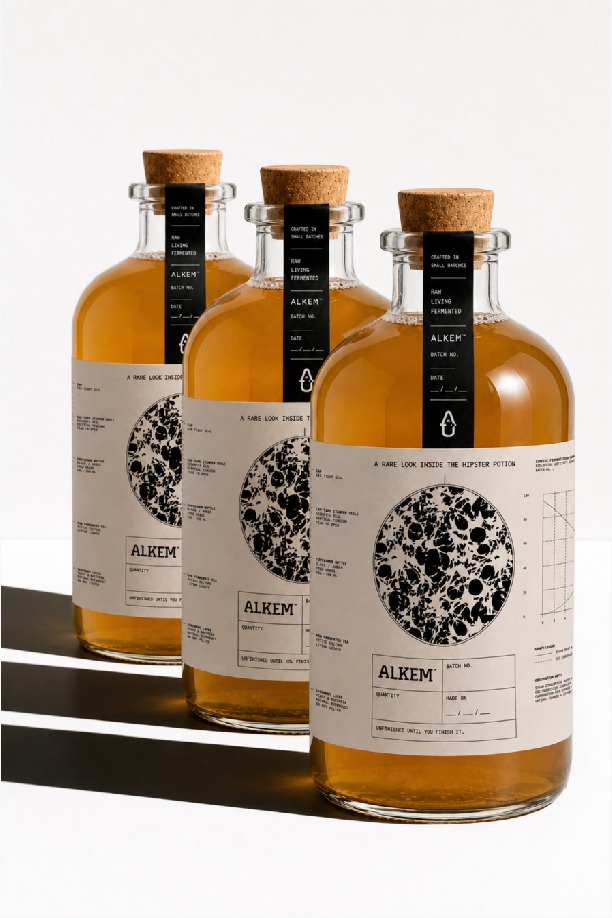
The front panel opens with a magnified rendering of the kombucha culture itself, shown at the scale most brands reserve for a hero product shot: unglamorized, honest, front and center. A side panel carries a labeled technical illustration of the bottle: cap, tamper seal, container glass, raw fermented tea, sediment layer, annotated like an assembly diagram, down to notes like “do not filter.” The final panel carries a kinetic fermentation graph plotting sugar drop against CO2 production over fourteen days, with observation notes flagging when sugar consumption accelerates and where flavor and effervescence peak together. It’s a working brewing guide printed on commercial packaging, R&D data most brands would keep private, offered instead as a gift to the person about to take over the process.
Together, the four faces read as a sequence: question the category’s false promises, then answer with the real biology.
Why This Is a Packaging Solution, Not Just a Design Choice
The problem was never making kombucha look different. It was figuring out how to signal, on the object alone, that this product is genuinely built differently: sold unfinished, biologically alive, handed over rather than delivered, in a category where every brand looks interchangeable.
Because the product’s value depends on the customer understanding something unusual before they even open it, packaging was our only real teaching moment. So it does three jobs at once. It discredits the category’s shorthand, documents the actual fermentation happening inside the bottle, and signals, through a warm off white ground, single color ink, and dense typographic and technical illustration with no gloss, that this is a brand made for people who read labels, not people who skim them.
That is deliberate positioning for a premium, fermentation literate buyer who is tired of vague wellness language and drawn to brands that treat them as collaborators. Alkem doesn’t ask for trust with softness. It earns it with information, and earns shelf attention simply by refusing to look like everything around it.
A Brand Designed to Be Outgrown
The most Outlaw thing about Alkem isn’t the strike through type. It’s the business model underneath it. A brand that sells the beginning of a process and hands the ending to its customers is, by design, teaching people to eventually build something of their own. The packaging holds that idea honestly: not a polished object to be consumed passively, but a working document, part manifesto, part lab notebook, for people who were always going to finish the story themselves.





 monther al omari
 Ximena Ureta Design Studio.
 vitoramockup
 Up-Brands
 Sophiagdotcom
 Peter said
 ayeidadezigns
 Tancybox
 宏洛图品牌设计HONGLT
 Modern Theory
 Dozen Agency
 Atiq Alam
 Olio Studio
 Ruchi S. Joshi
 mmdesign
 awaiskhadim
 Octasoft
 United Creatives Studio
 Kingdom & Sparrow
 Anastasia Bakhmatskaya
 CreativeWise
 Great and Golden