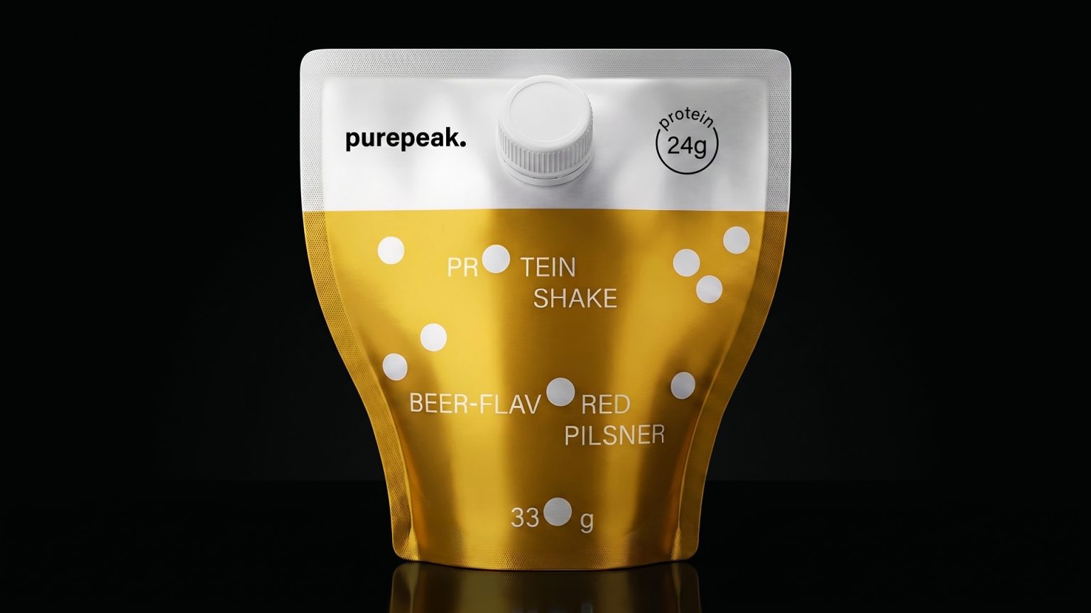

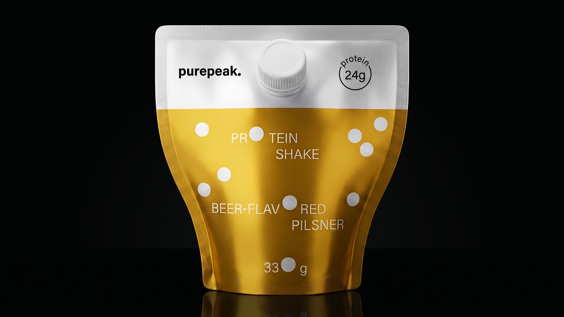
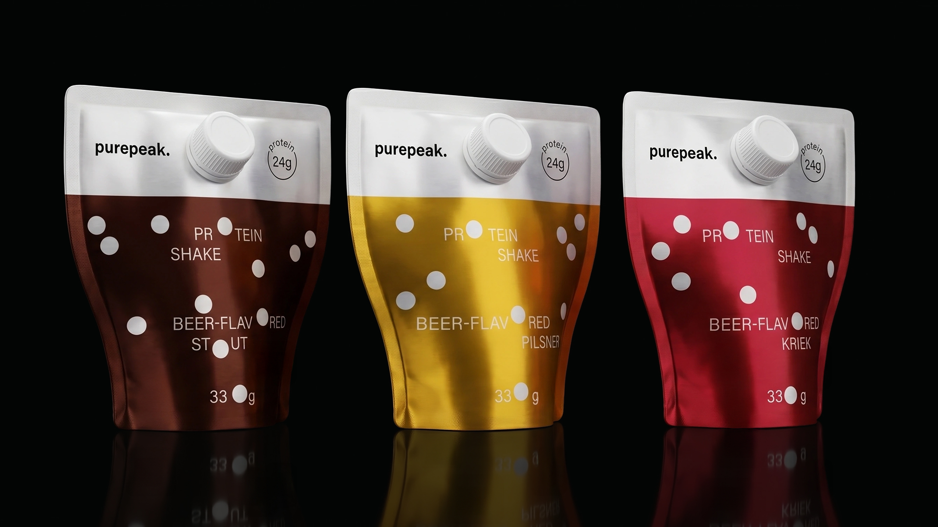
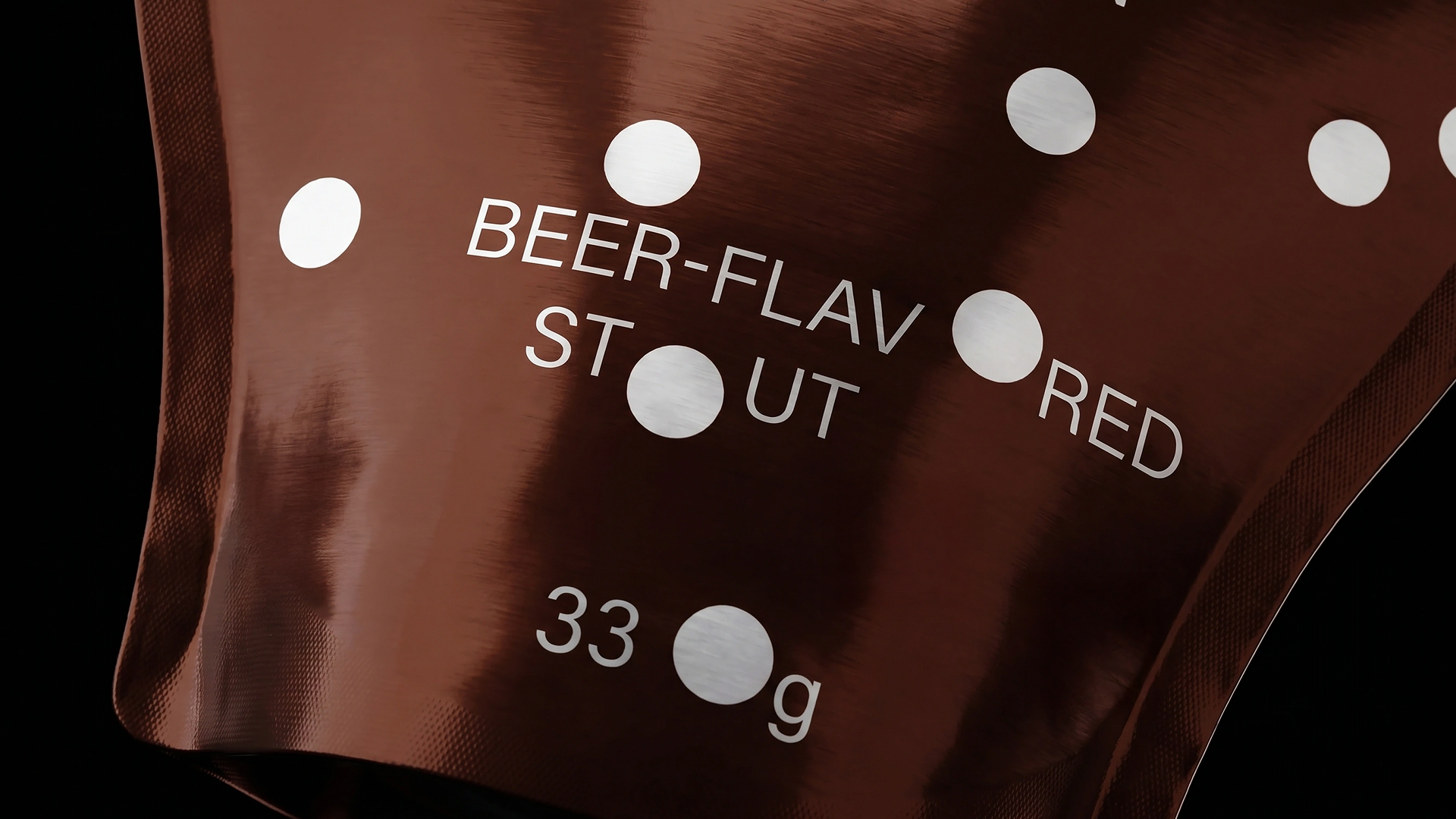
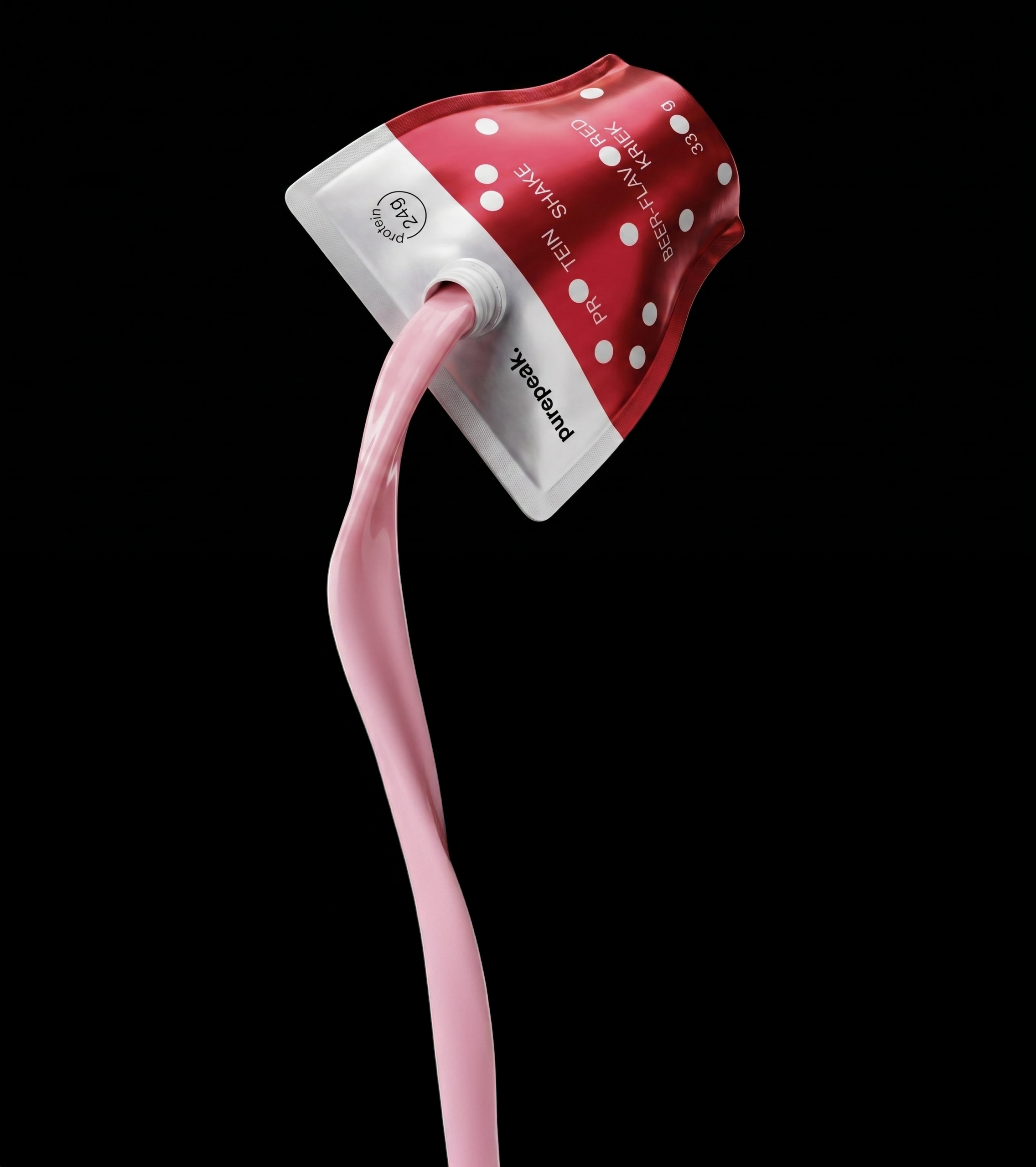
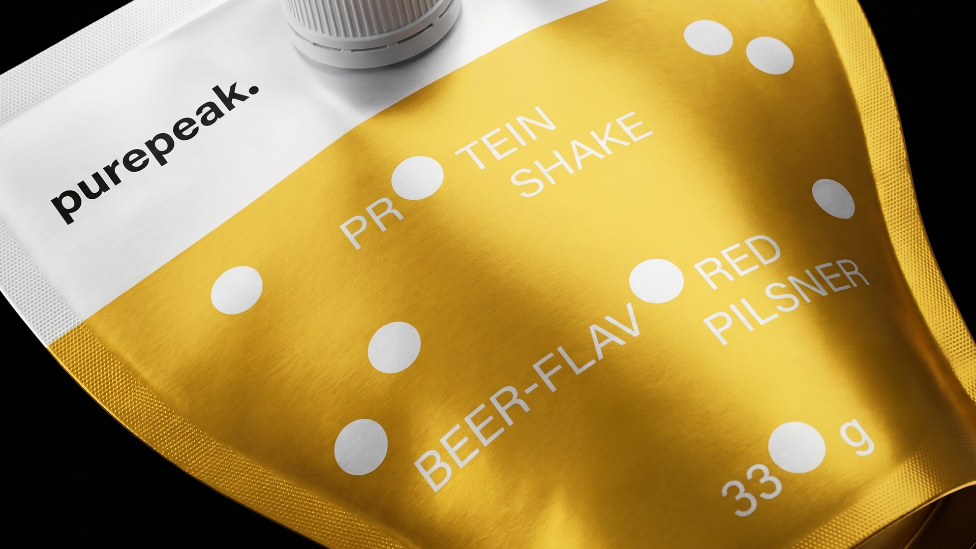
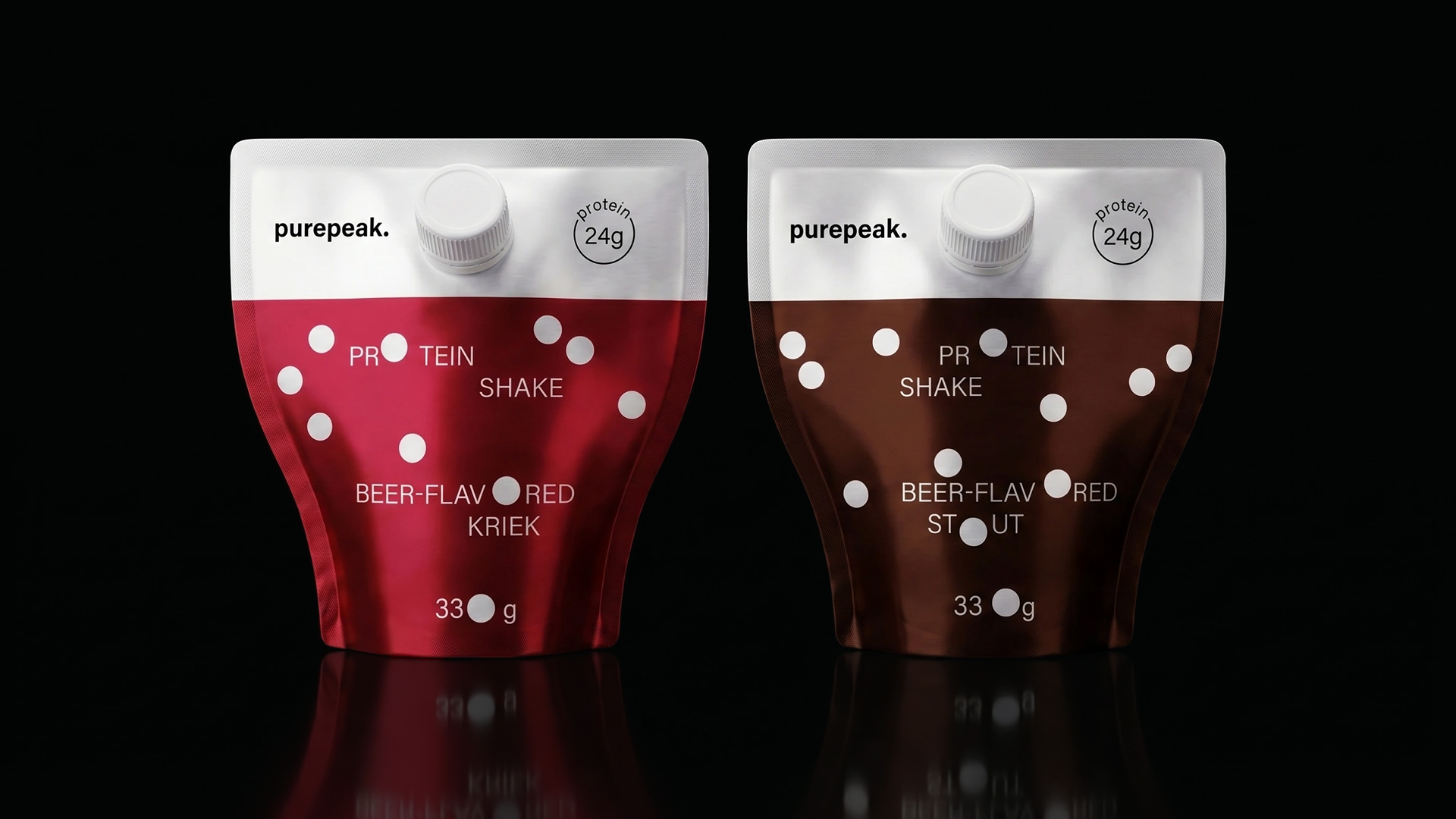
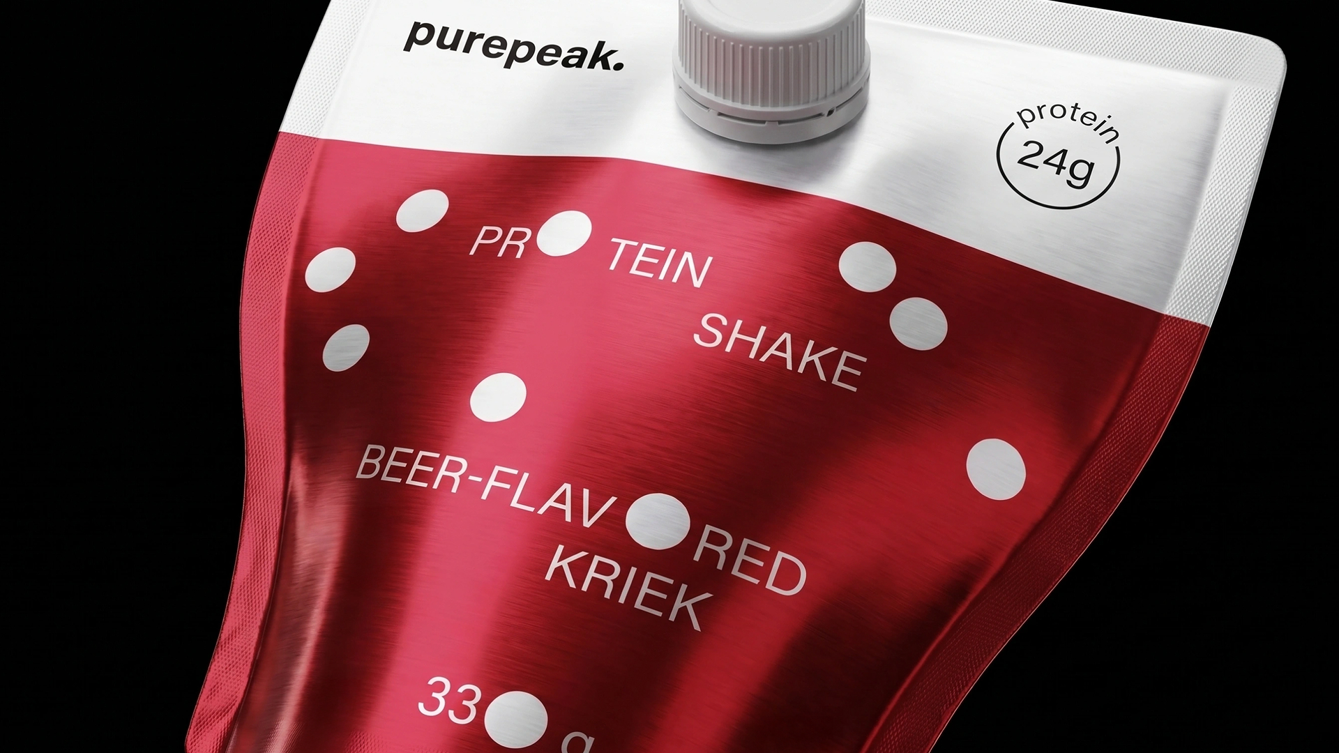
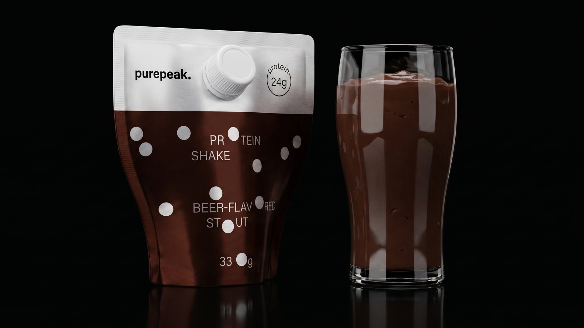
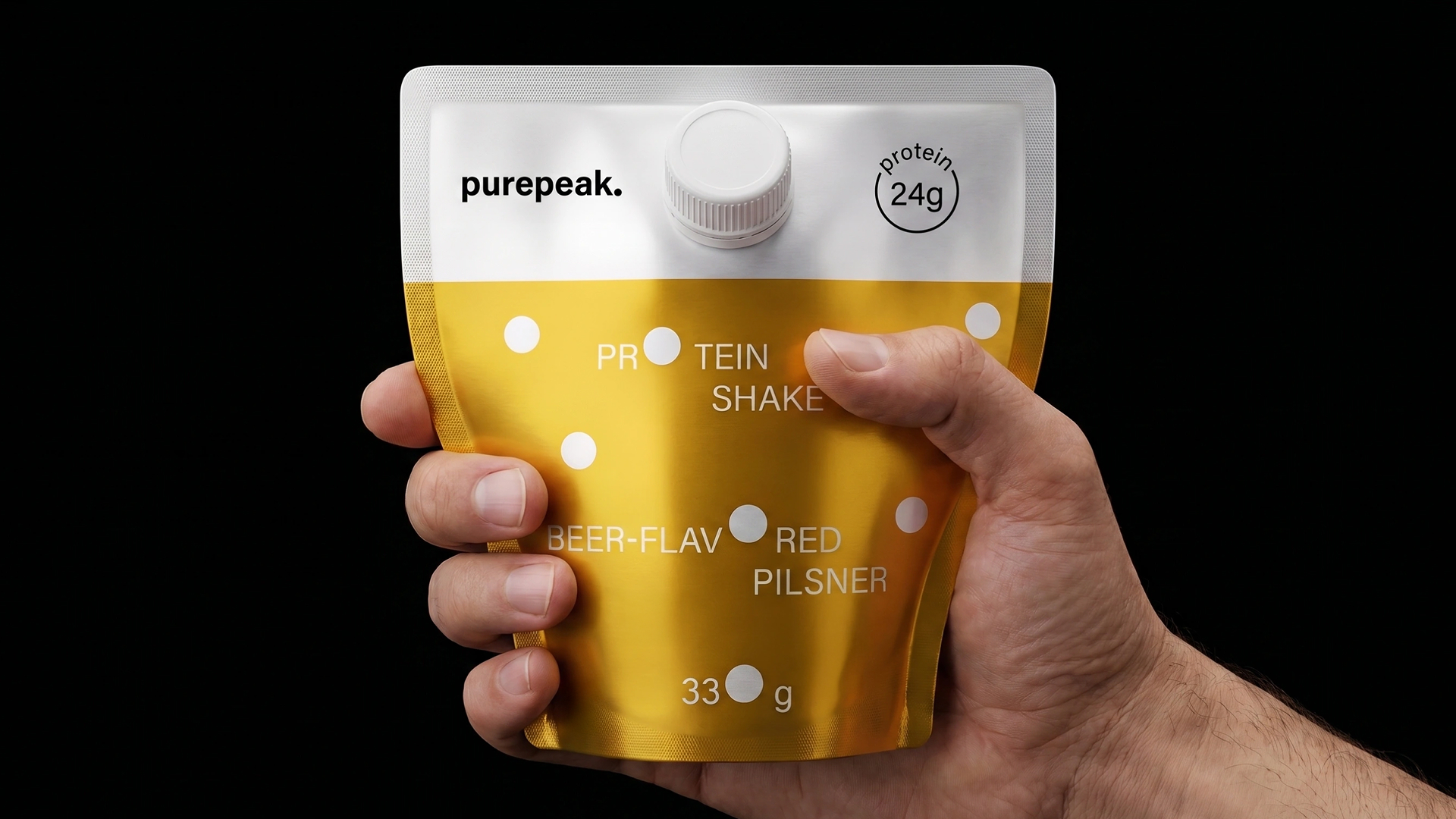
The packaging of Purepeak protein shakes with stout, pilsner, and cherry kriek flavors is designed in the form of a beer glass, emphasizing the product’s unusual flavor concept. Beer bubbles become a key element of the visual identity and are integrated into the typography, replacing the letter “O” and the number “0”. Each SKU has its own bubble layout dynamics, while color differentiation helps easily distinguish flavors and creates a unique character for each package.
Curator’s Insight
The strongest move here is letting the pouch’s own geometry carry the joke, rather than relying only on graphics to sell the beer concept. The tapered shoulders and flat cap read as a pint glass in silhouette before a single word is printed, so the form itself is doing brand work.
Using the bubble motif as a functional typographic substitution, standing in for O’s and zeros, is a neat way to keep a single visual idea active across name, flavor, and gram count instead of confining it to one illustrated zone. It also solves a practical problem: dense nutritional text on a small pouch rarely gets to feel playful, and here it does without sacrificing legibility.
Color coding across the three flavors gives each SKU enough individual presence to work as a standalone shelf item, while the shared silhouette and bubble system keep the range legible as one family from a distance. That balance, distinct but unmistakably related, is often harder to pull off in a beverage-adjacent category where flavor variants tend to blur together.
 Puigdemont Roca
 marianaaworks
 bloomburo
 andreamarinnn
 Alina
Alina Saadmost
 Bruhken
 Maruf Nishat
 Richest Branding Pvt. Ltd.
 Sophiagdotcom
 saifullahmaslool
 Up-Brands
 Atiq Alam
 daniitenaa
 artworkbysofia
 monther al omari
 Valérie Colace
 Tianqii
 Anum
Anum anisameur
 tauqueer
 SOT B&D
 Palashcc
 Derrick Lin
 Biaa
Biaa