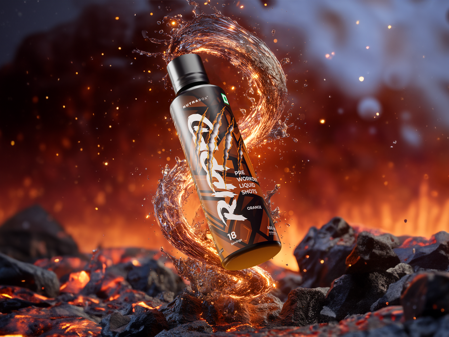

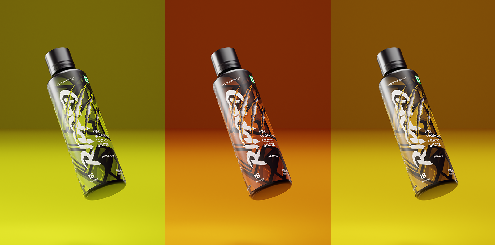
The packaging concept centers on raw power and aggression, using a bold claw-mark graphic slashed across the label to evoke the feeling of ferocity and explosive strength. The bottle uses a dark, matte black base with warm copper and orange gradients for the Orange flavor variant, creating a fiery, high-energy aesthetic that mirrors the product’s intended effect. The torn/slashed typography treatment on the “RIPPED” wordmark reinforces the brutal, no-nonsense positioning.
 Hi estudio
 43oz
43oz monther al omari
 Rosario Lo Iacono
 alchimistestudioParis
 Ebbi
Ebbi Maruf Nishat
 Mind Brand
 宏洛图品牌设计HONGLT
 Iyioluwanbelarami
 sahildoesartt
 Denis Ulianov
 Garry Veda
 arutza
 Lucid mk2
 MaheswariMadhu
 sanjnasnair
 POSH FMCG BRANDING
 Modern Theory
 Shubhashish Roy
 Affogato Brand Design
 Backbar Studios
 hello ocean
 Luciana
 Valérie Colace