

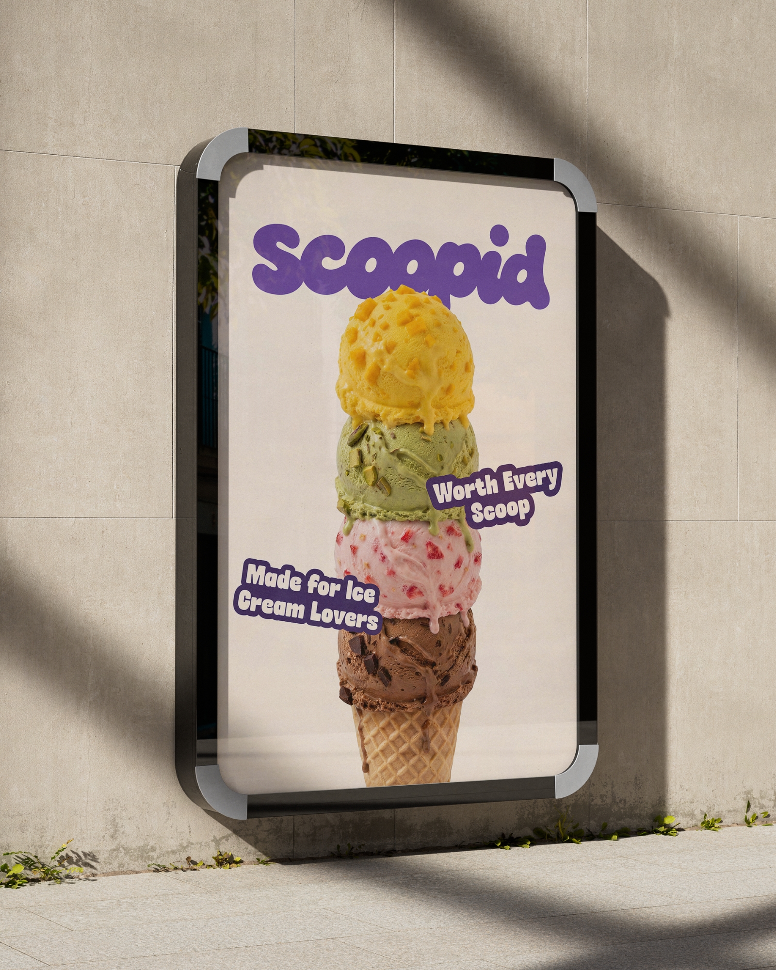
Scoopid is a conceptual premium ice cream brand built around one simple belief: every scoop should feel worth it. The project explores how a playful personality can exist alongside a clean, modern visual identity, creating a brand that feels memorable without losing its premium appeal.
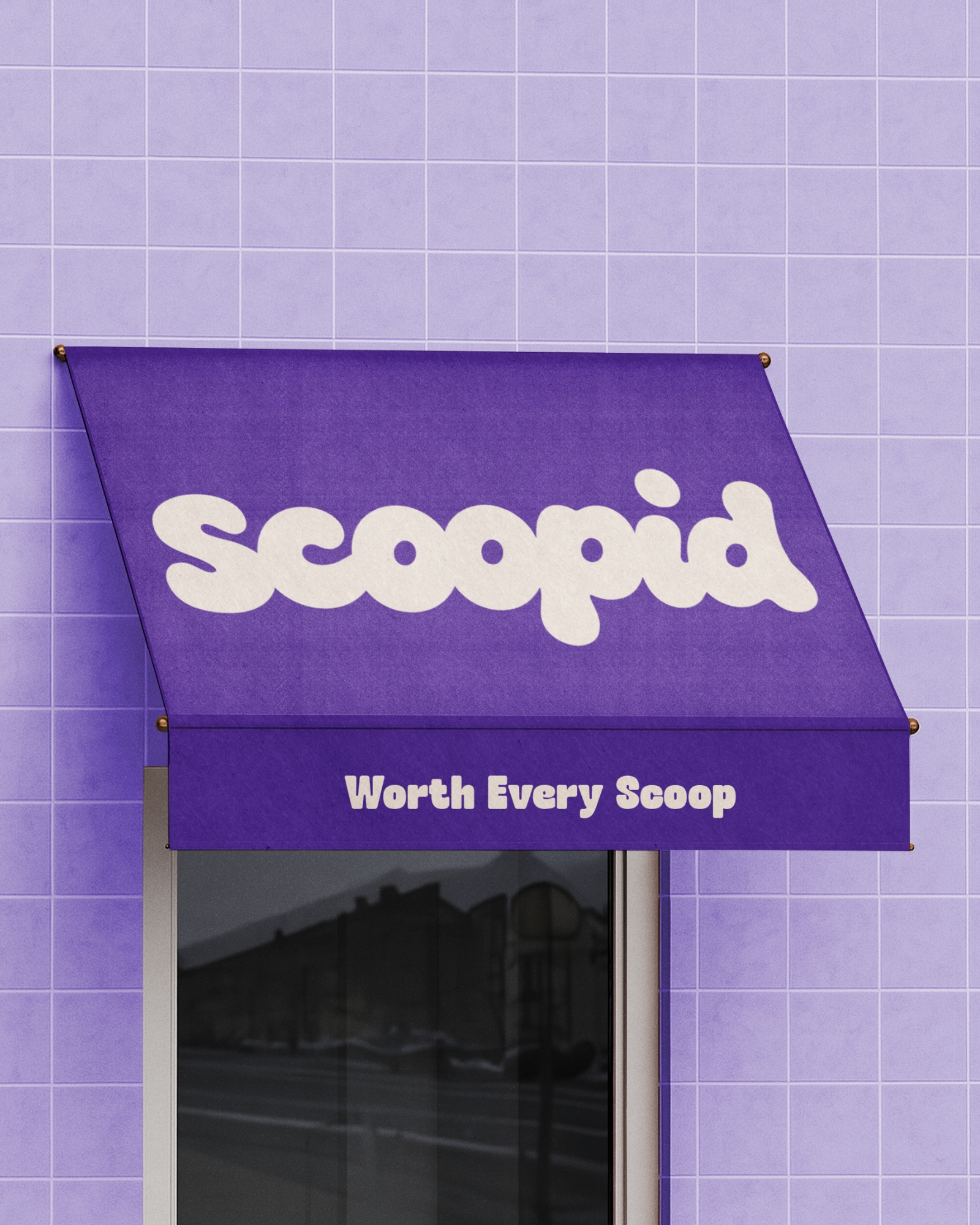
The identity begins with a custom rounded wordmark inspired by the smooth, creamy texture of ice cream. Rather than relying on decorative elements, the logo uses soft curves and a bold silhouette to create an approachable yet distinctive presence that remains recognizable across packaging, retail, and digital applications.
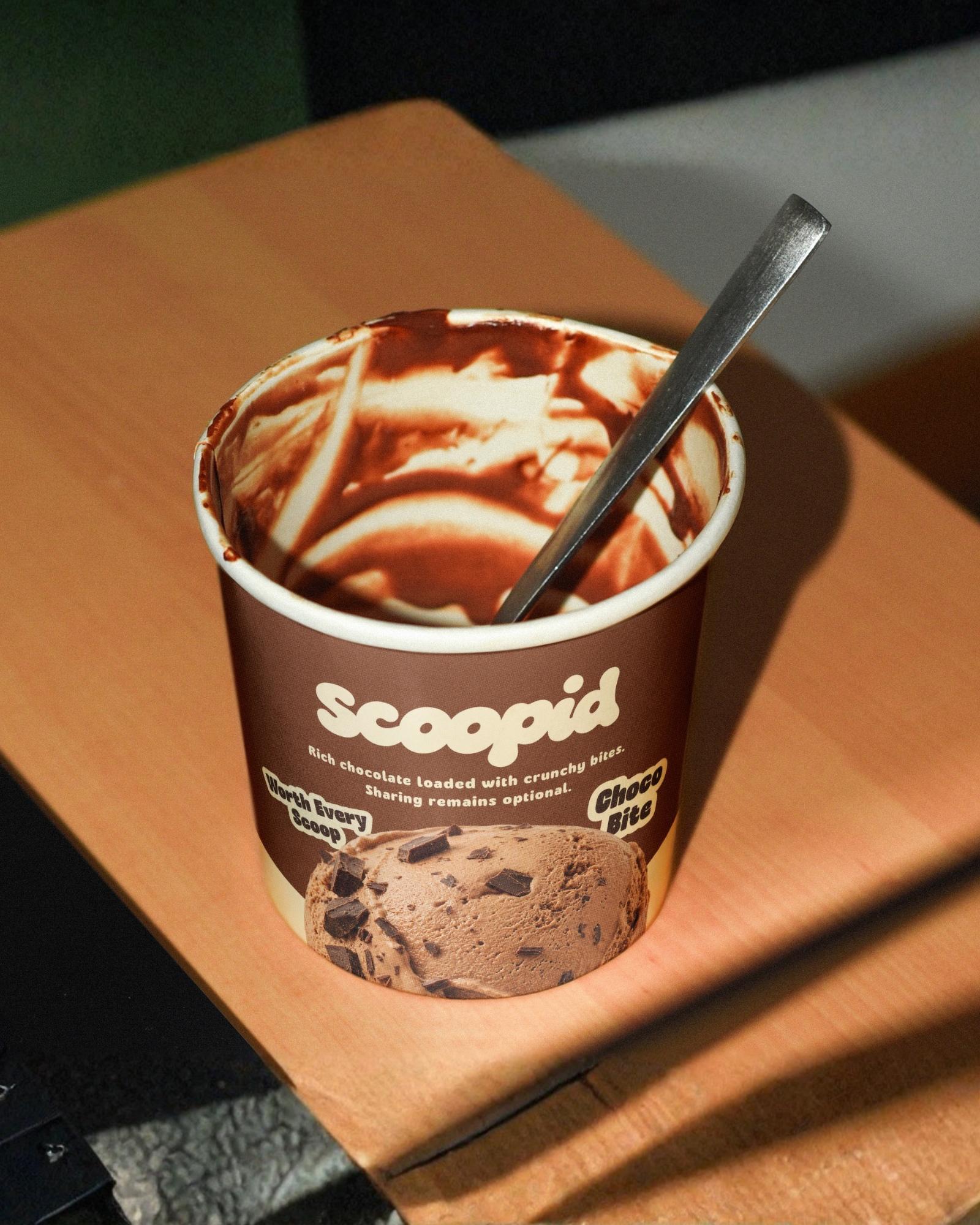
A flavor-first color system forms the foundation of the packaging. Each flavor is represented by a unique, vibrant color while sharing the same visual architecture, ensuring instant recognition without sacrificing consistency. Instead of using illustrations directly on the packaging, the product itself remains the hero, allowing the photography and flavor colors to communicate naturally. Illustrations were intentionally reserved for supporting brand assets such as cone wrappers, campaigns, and environmental applications, giving the broader identity its playful character while keeping the packaging clean and product-focused.
The project extends beyond packaging into a complete visual system, including cone wrappers, branded cups, outdoor signage, campaign visuals, lifestyle mockups, and retail applications. Every touchpoint follows the same design language, reinforcing the identity wherever the brand appears.
Scoopid was created as a branding exercise to explore how consistency, thoughtful design decisions, and a scalable visual system can transform a simple product into a memorable brand experience. Rather than designing individual assets in isolation, the goal was to build a cohesive identity where every element works together, all centered around one promise:
Worth Every Scoop.






 Natasha Spitsyna
 babyage
 GruppoSaida
 ahmedraoudgfx
 Hi estudio
 Nadezhda Gorelikova
 Studio Garces
 Brandsbylufo
 Rewot
Rewot alchimistestudioParis
 Asprey Creative
 kat bres
 Valérie Colace
 Atiq Alam
 Sara Communications
 David Hakobyan
 monther al omari
 Innovāt - Empowering Creative Innovation
 mmdesign
 Amjad Battal
 Hollóka Grafikai Műhely / Graphic Design Studio
 Palashcc
 ABC Design Communication
 ChrisSkarlatos
 Hedayat Hadavi
 Tia Nguyen