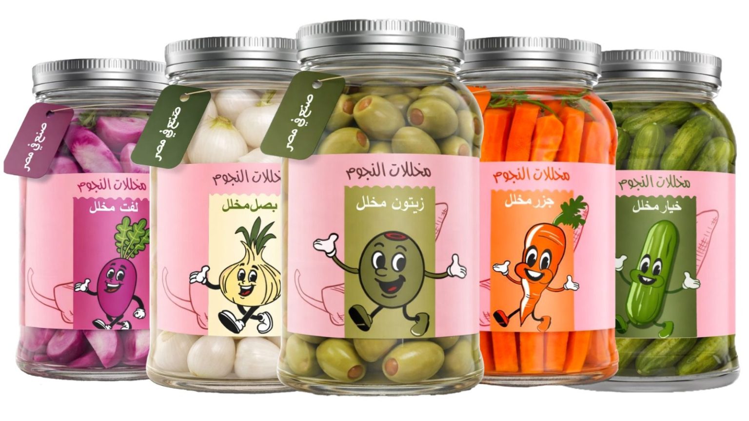

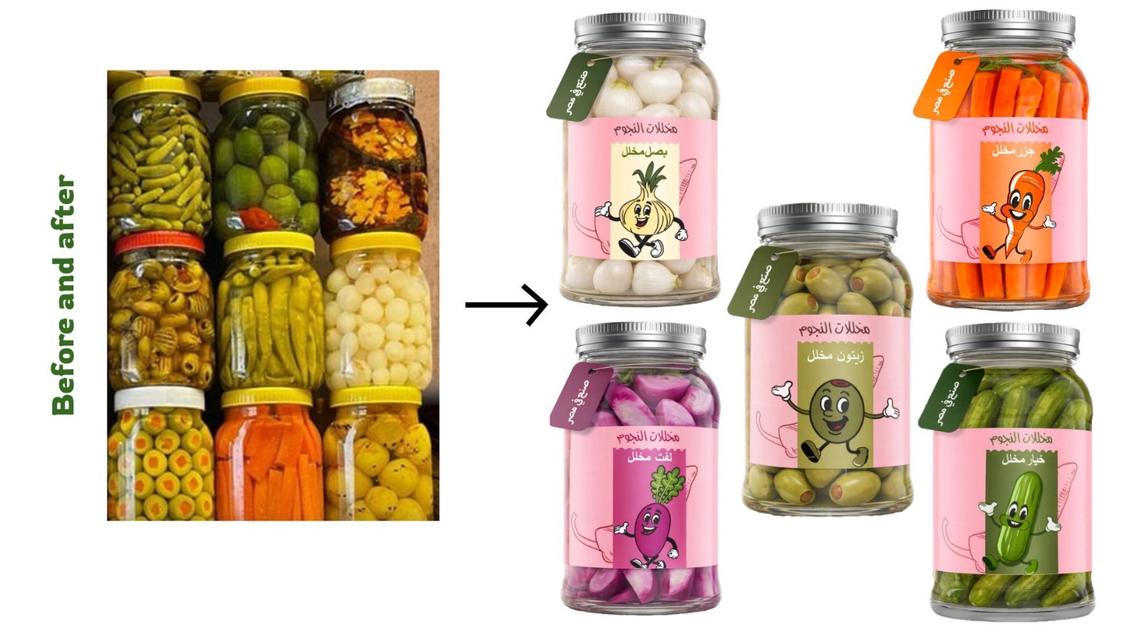
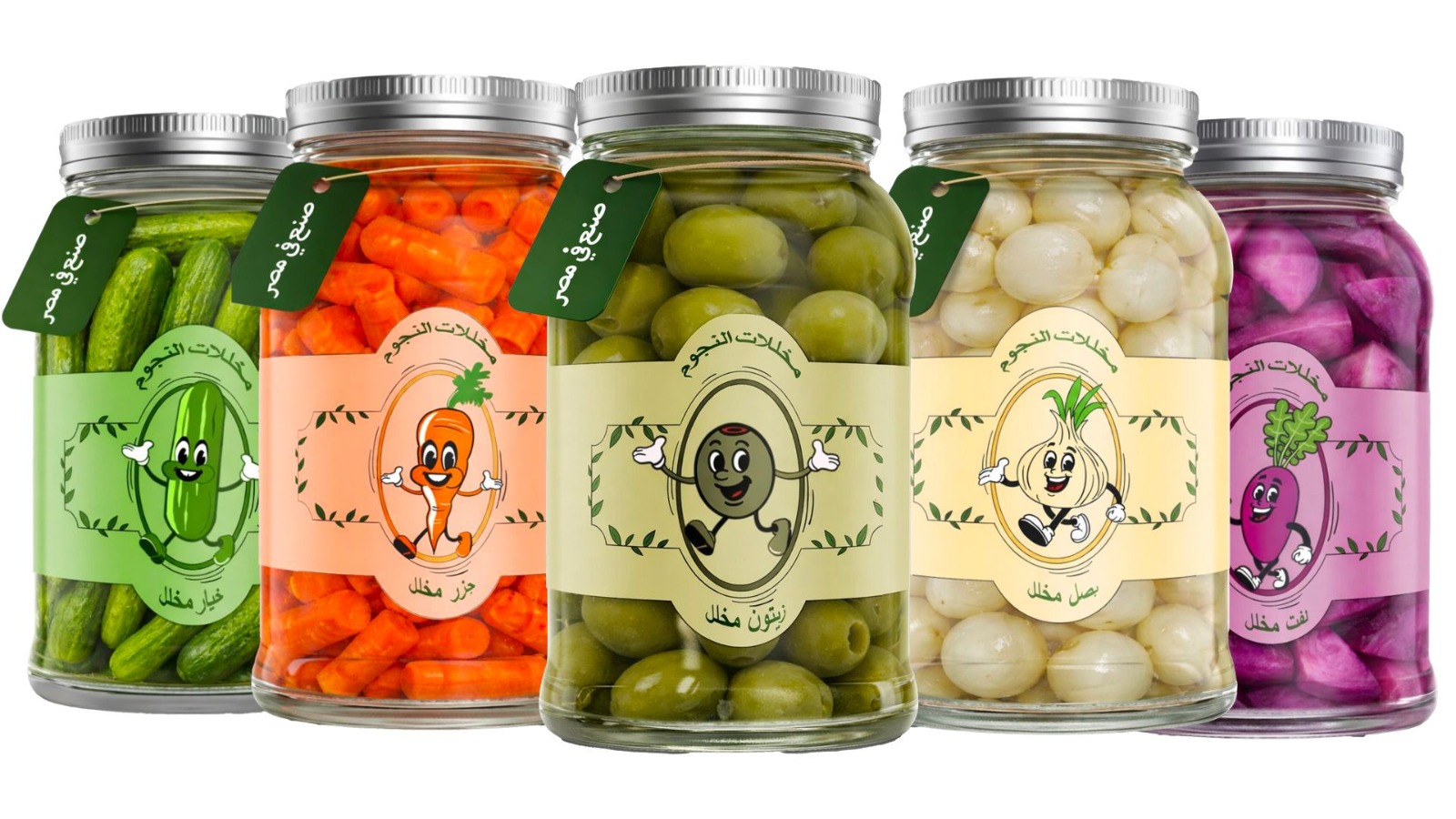
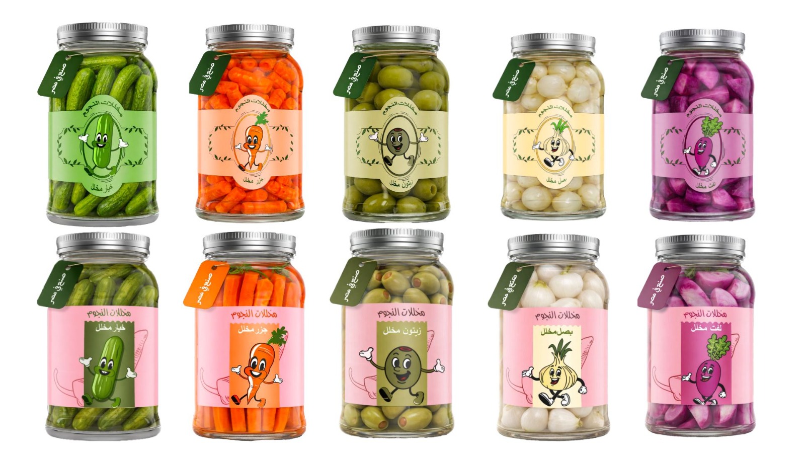
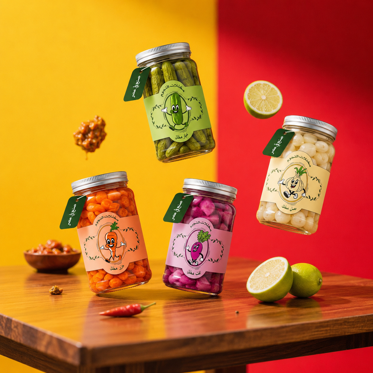
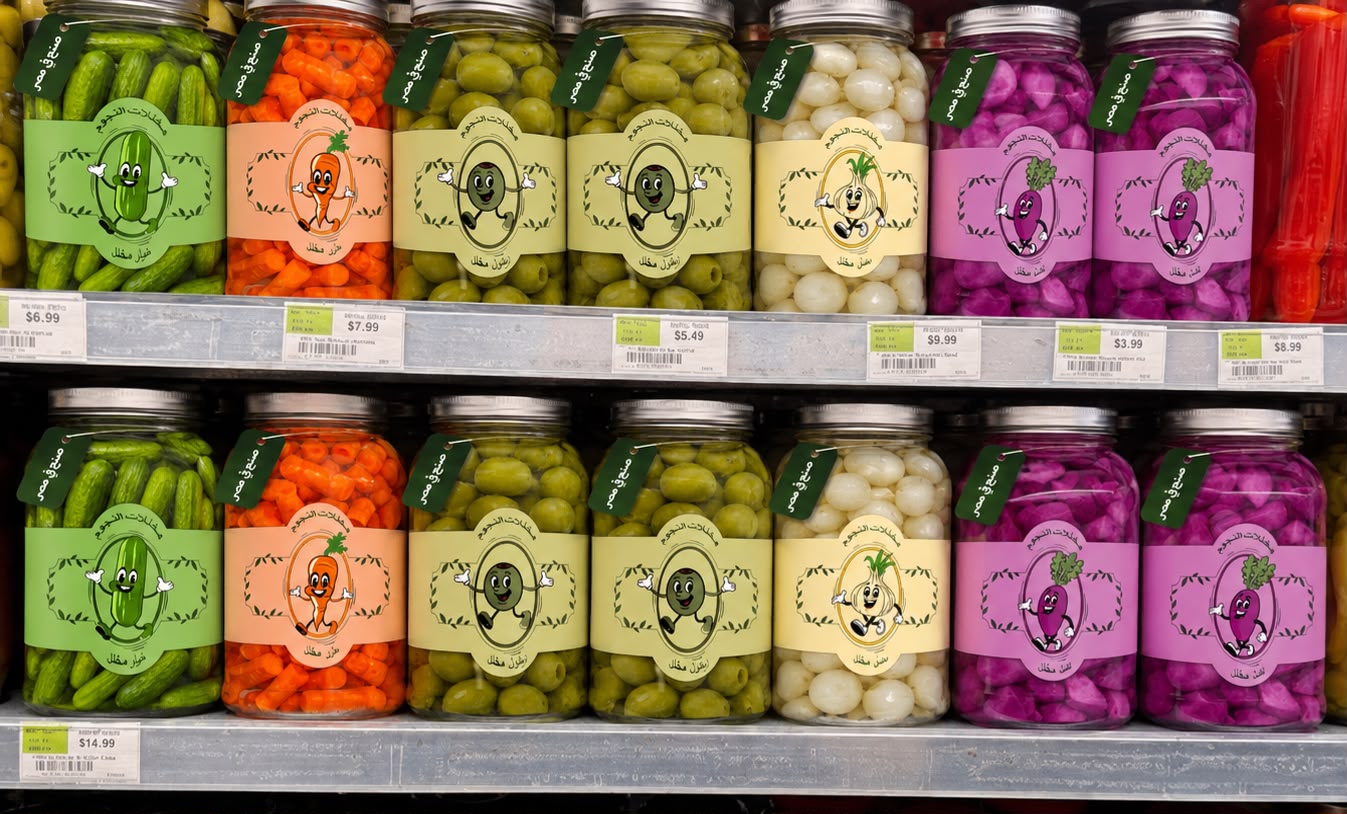
The concept behind this packaging is built around transforming traditional pickles into a modern, character-driven brand by turning each product into a “star” with its own personality. The idea reimagines everyday Egyptian pickles as playful, recognizable characters, creating an emotional connection with the user while maintaining a strong link to local culture. Through the use of bold, ingredient-based colors and friendly mascots, the brand becomes more engaging, memorable, and appealing to a younger audience. At the same time, the design preserves authenticity by using Arabic typography. This packaging targets pickle lovers, families, and everyday grocery shoppers who enjoy adding traditional Egyptian pickles to their meals. It also appeals to consumers who appreciate creative, eye-catching packaging and brands with a unique personality. By transforming each pickle into a recognizable star character, the design creates a fun and memorable experience that attracts both loyal customers and first-time buyers.
Visual design:
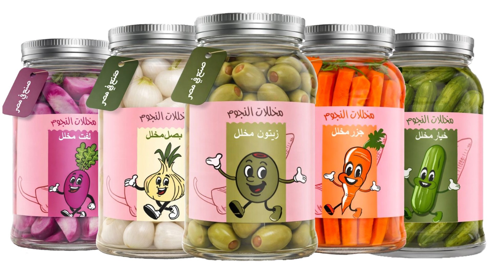
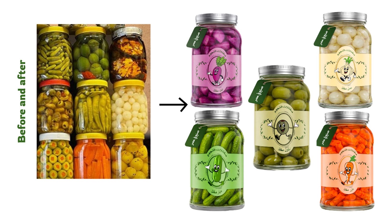
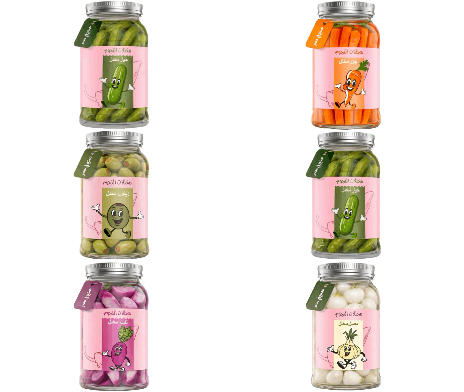
The visual design is built around creating a playful and recognizable identity through character-driven illustrations and a strong color system. Each pickle type is represented by a friendly mascot, giving the brand a unique personality and making it more engaging and memorable. The color palette is directly inspired by the natural colors of the ingredients, allowing for easy differentiation while maintaining overall harmony across the product range. Simple Arabic typography is used to ensure clarity and authenticity, while subtle decorative elements like leaves and soft frames add a fresh, slightly traditional touch. Overall, the visual direction balances fun, clarity, and cultural relevance in a modern way.
Structural Design:
The structural design is built on consistency, clarity, and product visibility. A transparent glass jar is used to showcase the pickles as the main visual element, making the product itself the hero and enhancing trust. The label follows a fixed, centered layout with a clear hierarchy that organizes the brand name, product type, and character illustration in a balanced way. This consistent structure is applied across all variants to ensure strong shelf recognition, while only colors and characters change depending on the product. Additionally, a hanging tag attached to the lid adds a premium, handcrafted feel and reinforces the brand identity without disrupting the overall clean and organized system.

 Studio Zak
 Ander Sanchez
 Atipus
 Widarto Impact
 hovski
 Ohmybrand
 CreativeWise
 Rauf Karaev
 Hooperstudio
 La Nube de Ideas
 Modern Theory
 Akim Melnik Design Studio
 preflightcreative
 Seyf El Haq Menouer
 Badraddine Attik
 Samriddhi Ravi
 Alessandro Ammaturo
 Amblr Studio
 vladlenalevit
 Sis Tsarukyan
 monther al omari
 alchimistestudioParis
 designsbysukaina
 About House of Ta
 Amjad Battal