

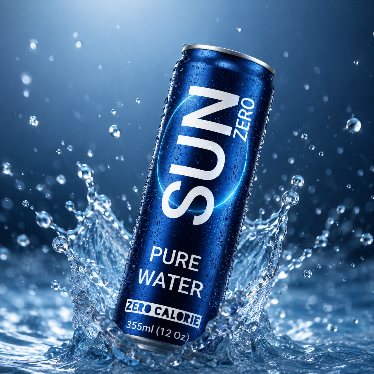
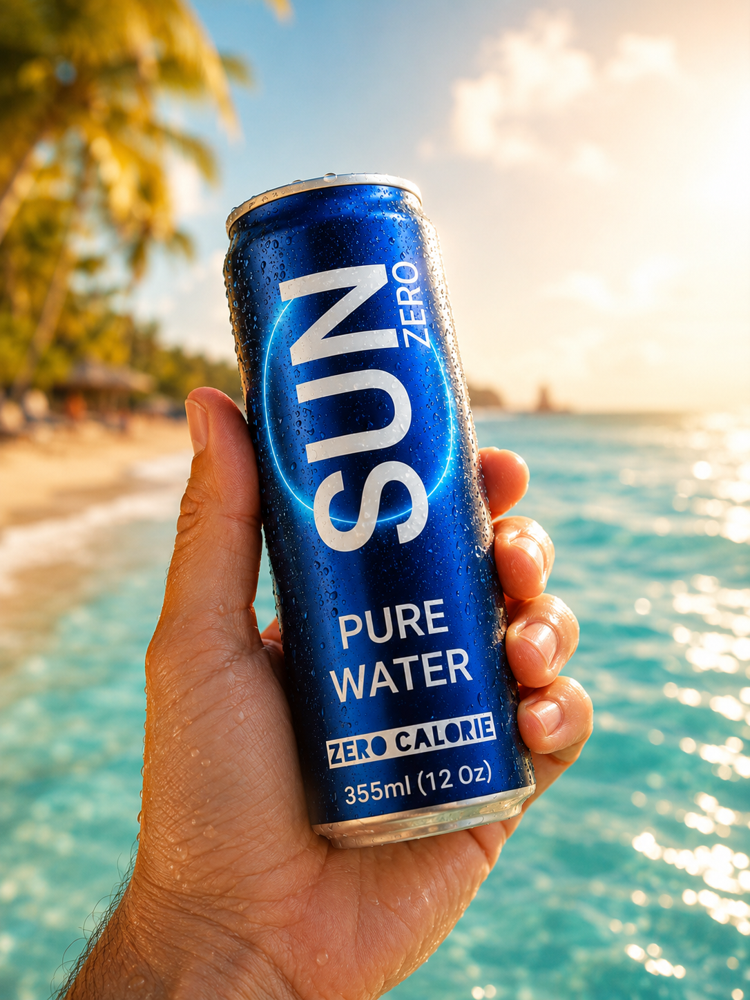
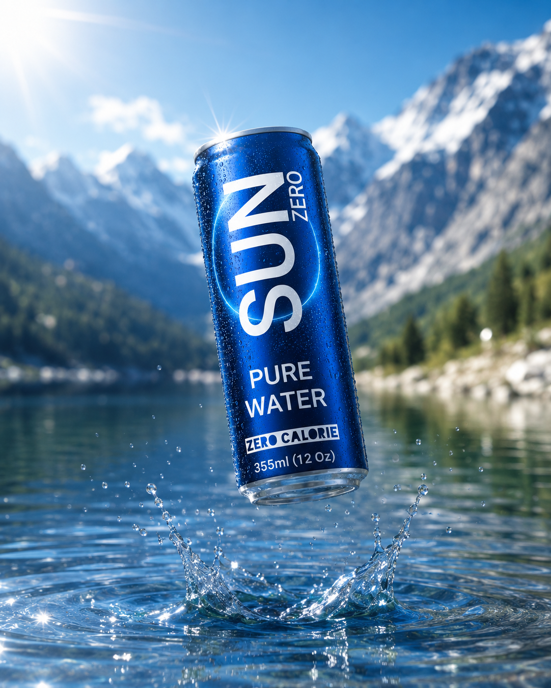
In a market where most bottled water brands look alike, SUN ZERO is a conceptual visual identity project that reimagines the idea of pure drinking water from a contemporary perspective.
The packaging evolves from being simply a container into a visual element that reflects a modern lifestyle, combining simplicity with sophistication.
The identity is built around a slim aluminum can finished in a deep cobalt blue, symbolizing coolness, purity, and depth. A glowing circular graphic represents energy, the continuity of life, and the clarity of water.
The design relies on clean typography and a minimalist visual composition, giving the brand an immediate presence that is distinctive, memorable, and easy to recognize.




 Eclectic M
 Katya Slobodskaia
 Евгения Береснева
 CreativeWise
 宏洛图品牌设计HONGLT
 erandy
 Abbas Sayyed
 Ollie
Ollie Moço Wine Branding
 khadijaaljifri
 Abdulrahman Taha
 Juana Sarabia
 Modern Theory
 Oksana
 Minim Brand Design
 Asmaa Mohamed
 Aidearte
 Navy Creative
 GIRAFA STUDIO
 Tia Nguyen
 Logoclub99
 monther al omari