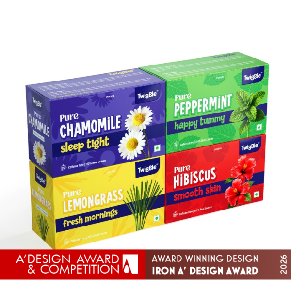

TWIGGLE – Herbal Infusion Tea Packaging Design ABOUT
Twiggle was created to transform herbal tea from a medicinal routine into an enjoyable daily ritual. The challenge was to design a packaging system that could communicate the functional benefits of each herbal infusion while remaining playful, approachable, and visually engaging for modern consumers.
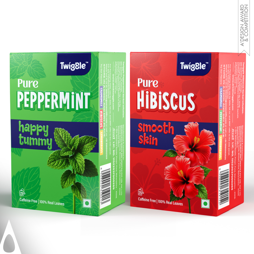
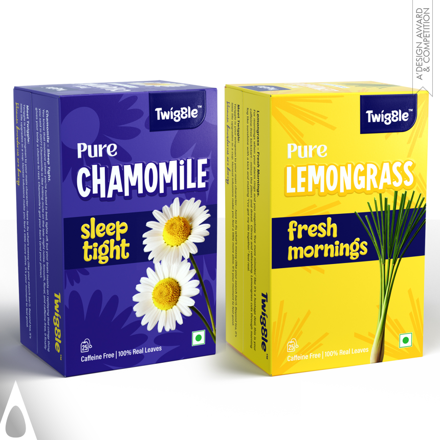
Unlike conventional herbal tea packaging that often relies on muted colors and pharmaceutical aesthetics, Twiggle embraces optimism, personality, and emotional wellness. Each blend was designed around a specific everyday benefit and mood: Peppermint for digestive comfort, Hibiscus for skin wellness, Chamomile for restful sleep, and Lemongrass for refreshing mornings.
The packaging was developed to make consumers choose their tea not only by flavor but also by the feeling and experience they seek throughout the day.
CONCEPT
The central idea behind Twiggle was “Drink Your Mood.”
Each herbal blend becomes a companion for a specific moment in life rather than merely another tea variant on a shelf. The visual language translates wellness benefits into instantly recognizable emotions and experiences:
Happy Tummy for Peppermint Smooth Skin for Hibiscus Sleep Tight for Chamomile Fresh Mornings for Lemongrass
This emotional positioning creates an immediate connection between the consumer’s need and the product’s purpose.
SOLUTION
To simplify product navigation and improve shelf impact, every variant was assigned a bold monochromatic color universe inspired by its natural ingredient:
Vibrant green for Peppermint Rich red for Hibiscus Deep calming violet for Chamomile Energetic yellow for Lemongrass
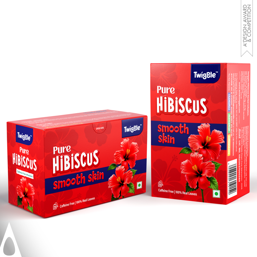
Large ingredient typography ensures instant recognition from a distance, while oversized botanical illustrations reinforce authenticity and natural origins.
A consistent dark blue band unifies the entire product family and creates a strong visual anchor across all SKUs, allowing the packaging to maintain a cohesive identity while giving every flavor its own personality.
DESIGN TECHNIQUE
The design combines high-contrast typography, color psychology, botanical imagery, and emotional storytelling into a simple yet memorable packaging architecture.
The illustrations were intentionally kept clean and bold to maximize visibility on retail shelves and digital platforms alike. Tonal botanical patterns integrated into the background add depth and richness without compromising readability.
The packaging structure was designed to perform equally well in both vertical and horizontal carton formats, ensuring consistency across different retail requirements and merchandising environments.
WHAT MAKES IT UNIQUE
Most herbal tea brands sell ingredients.
Twiggle sells moments, moods, and everyday wellness experiences.
Rather than asking consumers to understand the medicinal properties of herbs, the packaging communicates benefits in a universally understandable language of emotions and lifestyle aspirations.
This creates an intuitive purchase decision and makes herbal infusions more accessible to younger audiences and first-time consumers.
The bold colors, playful copywriting, and benefit-first communication challenge the traditional visual codes of the herbal tea category and create a shelf presence that feels contemporary, energetic, and memorable.
RESULT
The result is a packaging system that successfully balances functionality, education, and emotional engagement.
Twiggle transforms herbal tea from a product consumers occasionally consume into a collection they can integrate into different moments of their daily routine.
The visual identity creates strong shelf differentiation, encourages variant exploration, and establishes a scalable system capable of accommodating future herbal infusion extensions while preserving brand consistency.
Ultimately, Twiggle demonstrates that wellness products do not need to feel clinical or serious. They can be vibrant, expressive, and joyful while still communicating authenticity and trust.
“Because sometimes choosing a tea is not about choosing a flavor — it’s about choosing how you want to feel.”

 Lisa Pokrovskaya
 Simple Studio
 Studio Unbound
 David Byerlee
 M&A CREATIVE AGENCY
 alchimistestudioParis
 monther al omari
 Studio Be Design
 LogoSayLove
 agenciabud
 Shustova p
 mutta
mutta @Allenarts13
 Sirka Agency
 Atiq Alam
 Dozen Agency
 j.substance
 SCD
SCD Cristian Lepore | crilep Copia
 Chris Creative Works