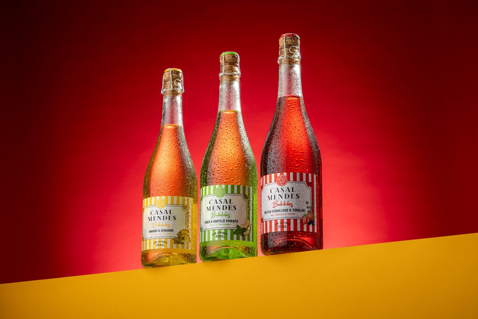

A packaging concept designed to capture the energy of spring and summer before the bottle is even opened.
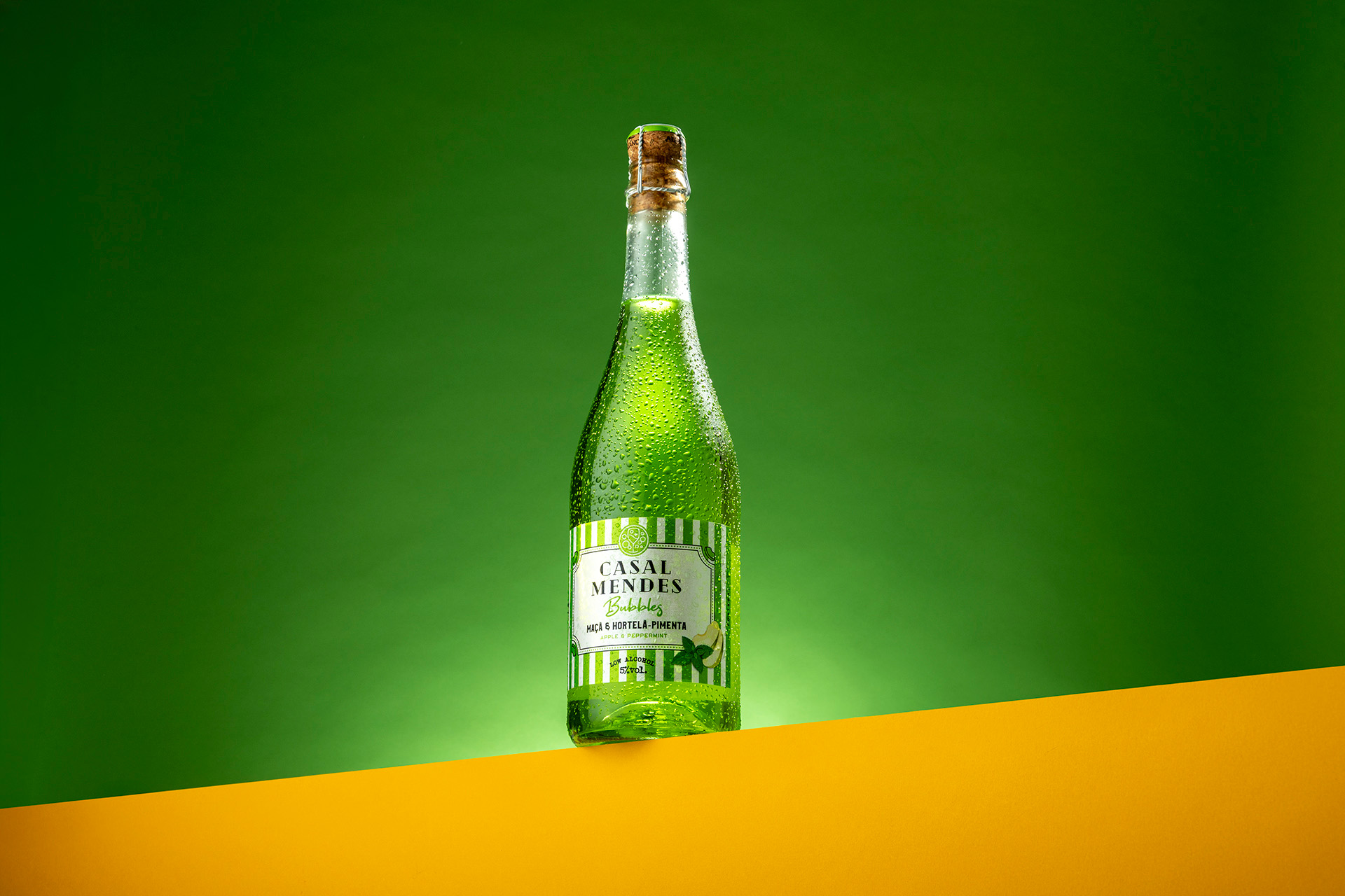
For Casal Mendes, we wanted to create a visual identity that immediately communicates freshness, optimism and a sense of celebration. The starting point was simple: colour should become the main ingredient. Rather than simply complementing the product, it became the driving force behind the entire packaging experience.
Inspired by the vibrant energy of spring, the warmth of summer and the atmosphere of unforgettable festivals, we developed a bold and expressive visual language designed to connect with a new generation of consumers. The objective was to move away from conventional wine packaging and create something more dynamic, contemporary and instantly recognisable.
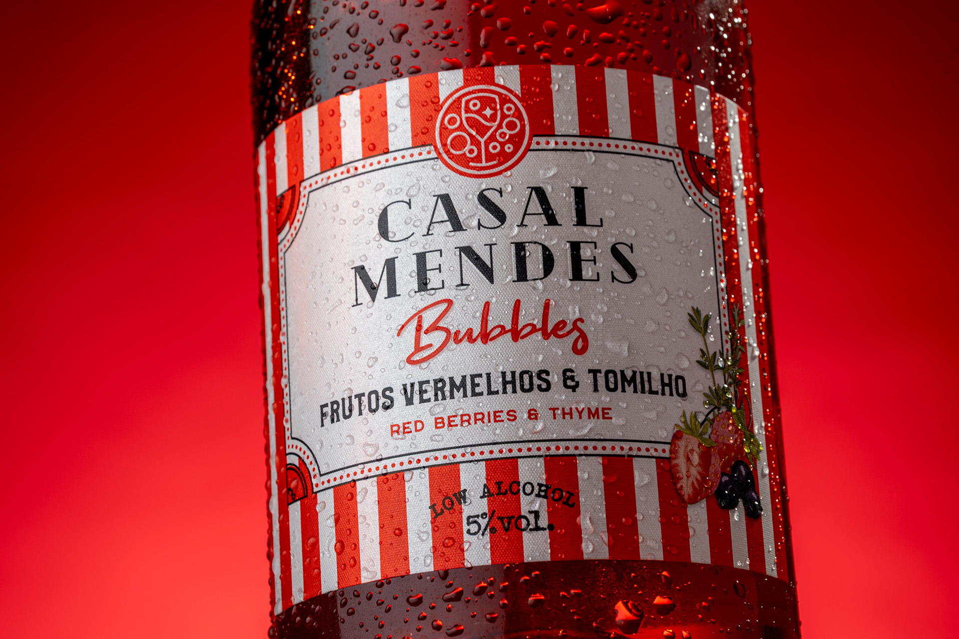
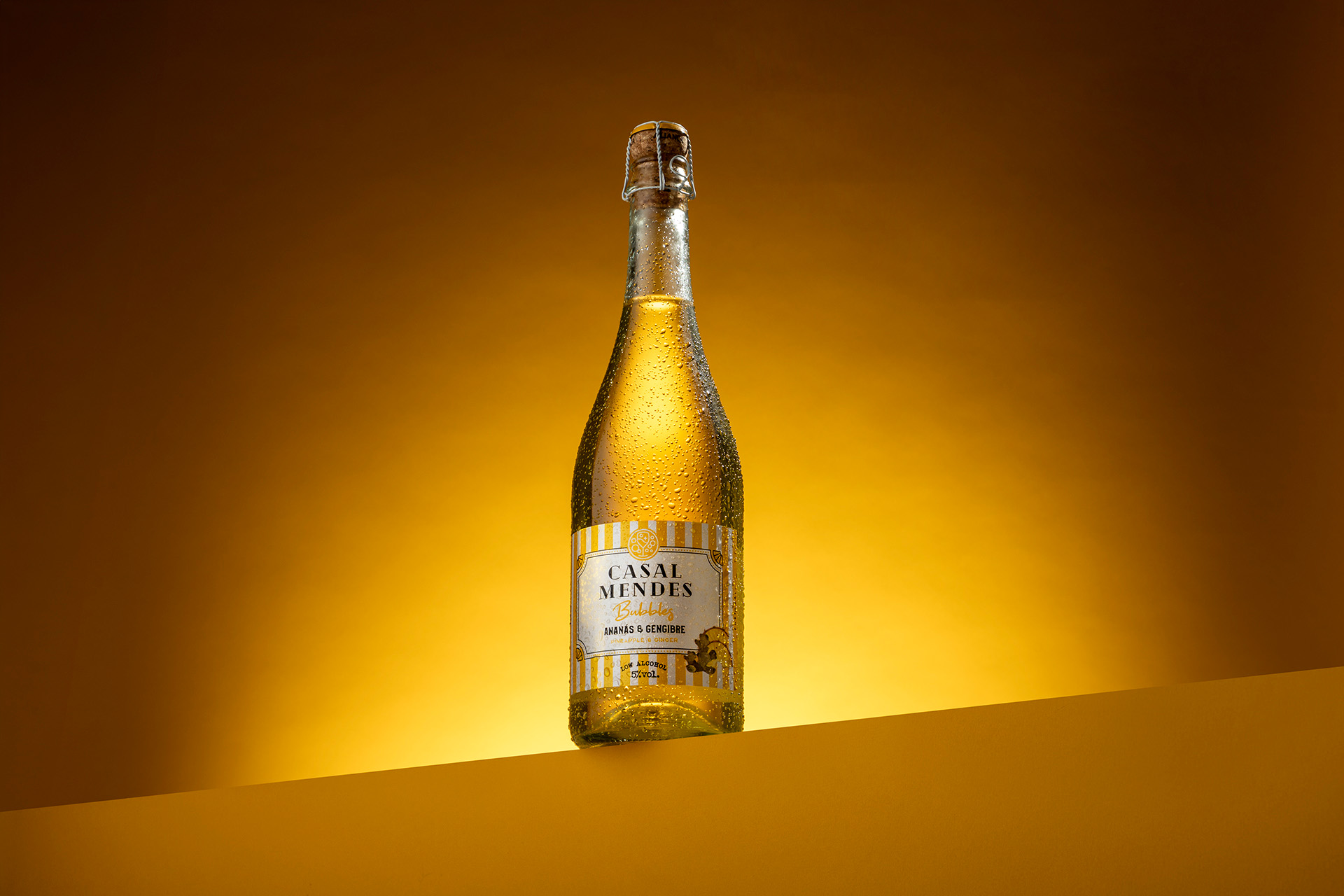
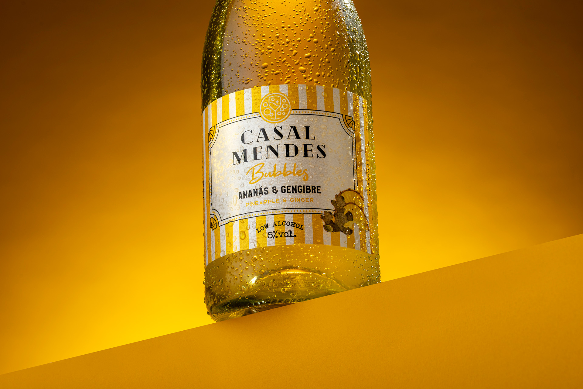
Each flavour was given its own distinctive personality through a carefully selected colour palette and graphic treatment. The result is a collection that feels cohesive as a family, while allowing every bottle to stand confidently on its own. The colours work as visual cues, helping consumers quickly identify each flavour while creating a strong and memorable presence both on the shelf and in social environments.
The design was created to reflect the occasions in which Casal Mendes belongs: spontaneous gatherings, long summer afternoons, music, festivals, outdoor celebrations and moments shared with friends. It is packaging that does more than identify what is inside the bottle, it sets the tone for the experience that comes next.
From the bold colour contrasts to the energetic composition, every detail was considered to create an immediate emotional response. The visual impact is playful without losing sophistication, contemporary without becoming overly complex, and expressive enough to feel at home in both retail environments and highly shareable social moments.
We also considered how the packaging would perform beyond the physical shelf. In a world where products increasingly become part of the visual language of social media, the design needed to be instantly recognisable through a photograph, a story or a shared moment. Its strong colours and distinctive personality give Casal Mendes a natural ability to stand out on camera, turning the bottle itself into part of the experience.
The result is a packaging system built around colour, personality and connection, a fresh and vibrant expression of Casal Mendes that reflects the spirit of a new generation.
A celebration of colour, designed to be seen, shared and remembered.


 Derrick Lin
 Biaa
Biaa Petitmoulin Studio
 White Bear Studio
 Eva Chistyakova
 monther al omari
 Atipus
 alchimistestudioParis
 oneandother
 bloomburo
 helocrene
 Shapers Studio
 Denver Design
 Aidearte
 andrew.huerta
 softmachine
 airobtq
 Buzz & Co.
 Ruby
Ruby themythographer
 IDNB Inc.
 viktorflr
 Zenpack