

Artisan French Chocolatier Brand Identity
Maison Thierry Bornier: Taste as Silent Art
Sculptural, poetic, and deeply reverent. Maison Thierry Bornier is an ultra-luxury chocolate house founded by French artist and chocolatier Thierry Bornier in Yunnan, China. The brand serves as a cultural bridge, the museum-inspired design transforms chocolate into edible art through architectural monogramming and refined typography.
The Concept: Galerie d’Art
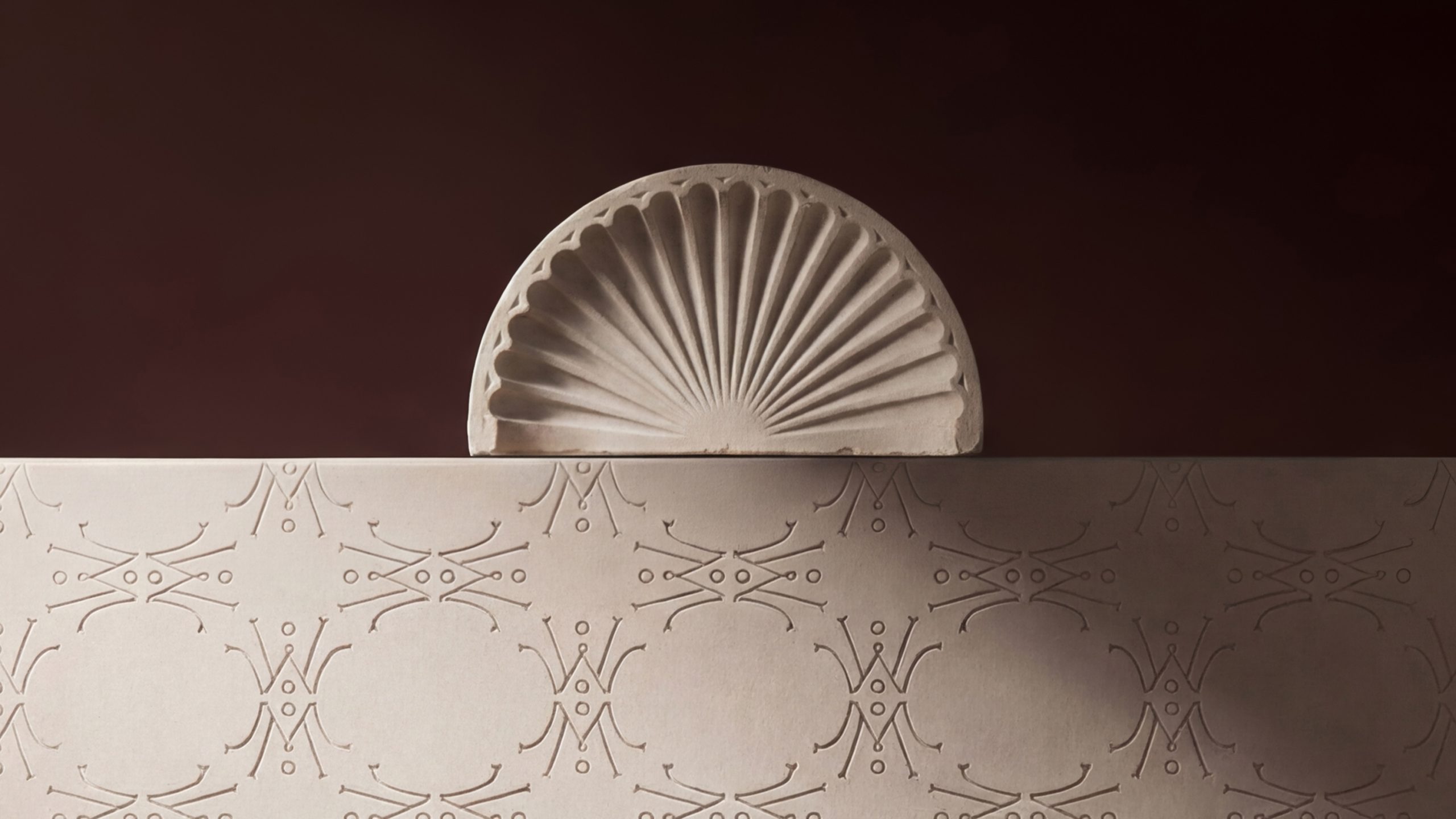
Artistic, minimalist, and hushed. The visual direction, Galerie d’Art, treats each chocolate as a sculptural masterpiece to be admired. Drawing inspiration from classic museum vitrines and the architecture, the identity transforms the act of unwrapping into an intimate ritual of discovery.
The Symbol: The Crown Monogram
Symmetrical, iconic, and symbolic. The core of the identity is an elegant “MTB” monogram drawn with delicate strokes that echo ornate gallery moldings. When repeated in a four-way signature pattern, the mark reveals a crown-like form—a subtle nod to Chinese heritage and symbolism that provides rhythm and quiet sophistication to every brand surface.
Typography: Sculptural Poise
The typographic system pairs Drummond, a serif with soft curves used for titles and key brand moments, with the clean, modern shapes of Gabarito for body text. This combination reflects the brand’s dual nature: the timeless elegance of a gallery balanced with warm, accessible clarity.
Color Palette: Earthy Sophistication
Immersive, tactile, and understated. The palette is anchored by Bitter Ganache and Almond Cream, mirroring the rich materiality of fine chocolate and architectural museum interiors. Deep secondary tones like Cocoa Husk and Cherry Liqueur add sensory depth, while accents of Silver Foil provide a subtle touch of light and quiet luxury.
Services: Creative Direction, Brand Identity & Packaging Design



 Eva Chistyakova
 Puigdemont Roca
 marianaaworks
 bloomburo
 andreamarinnn
 Alina
Alina Saadmost
 Bruhken
 Maruf Nishat
 Richest Branding Pvt. Ltd.
 Sophiagdotcom
 saifullahmaslool
 Up-Brands
 Atiq Alam
 daniitenaa
 artworkbysofia
 monther al omari
 Valérie Colace
 Tianqii
 Anum
Anum anisameur
 tauqueer
 SOT B&D
 Palashcc
 Derrick Lin