
Client Bare Fruit
Industry Food & Beverage
Scope Brand Strategy Brand Identity Packaging Design Pattern Design Packaging System Mockups & Art Direction
Challenge
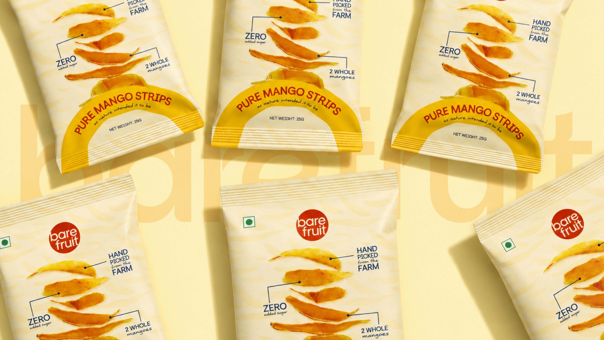
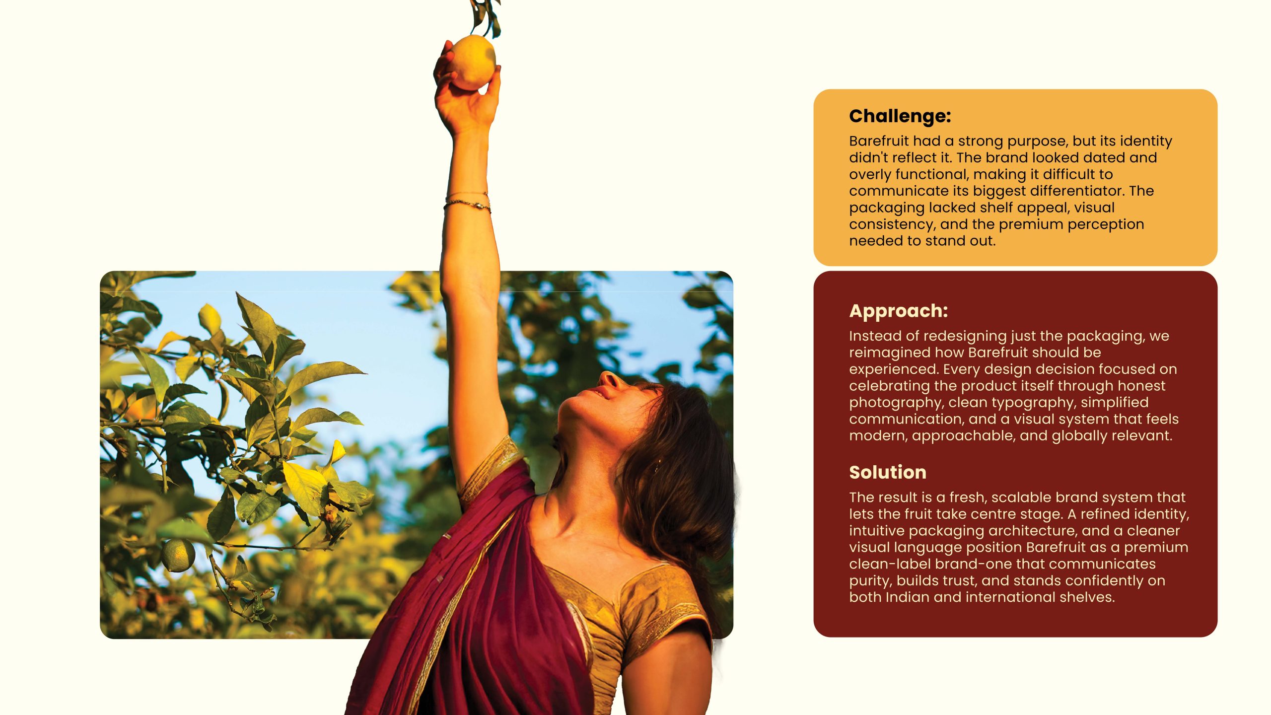
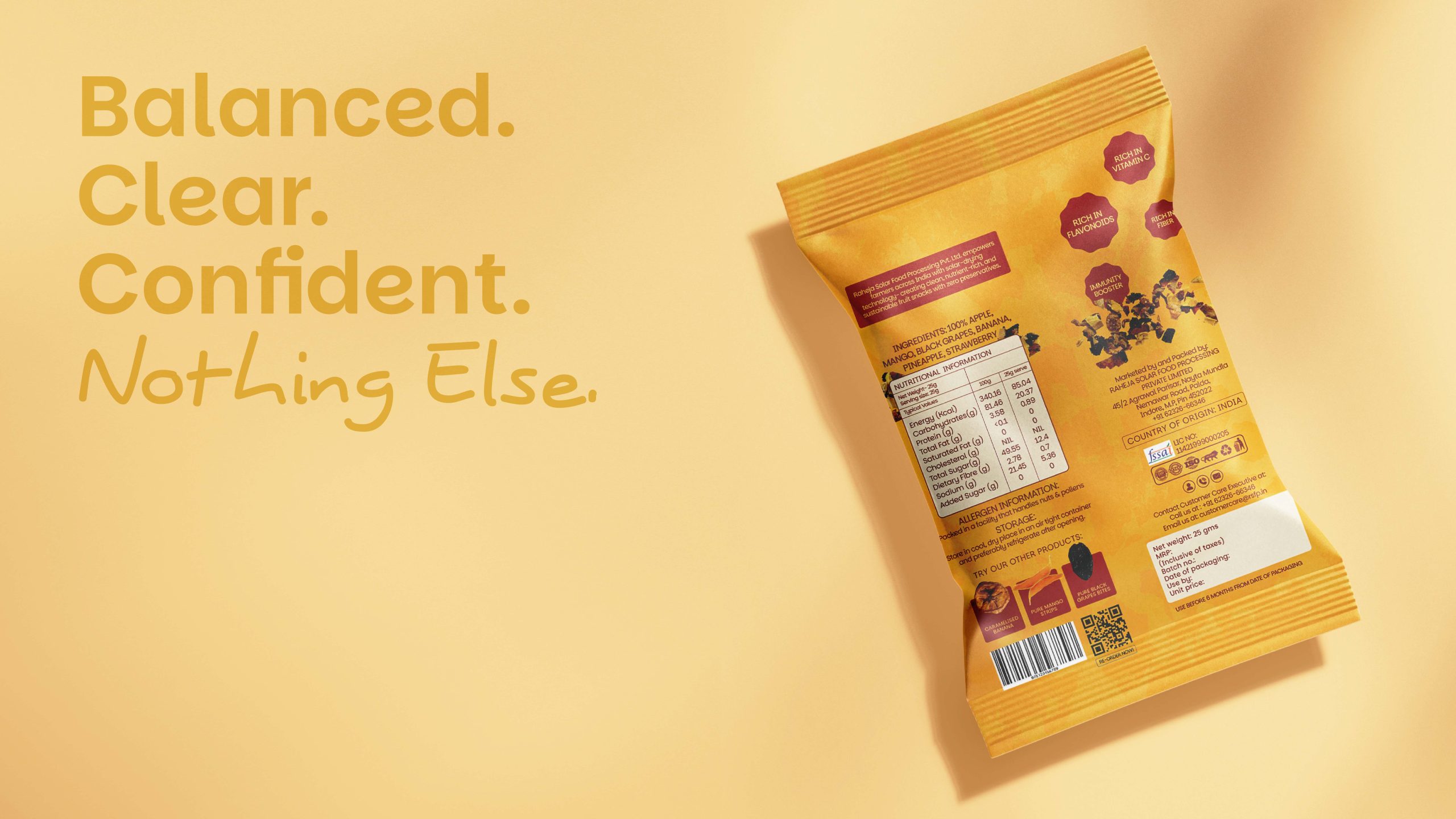
The existing packaging lacked shelf presence and appetite appeal. It relied heavily on information rather than emotion, making the brand feel corporate instead of natural, honest, and fruit-first.
Our Approach
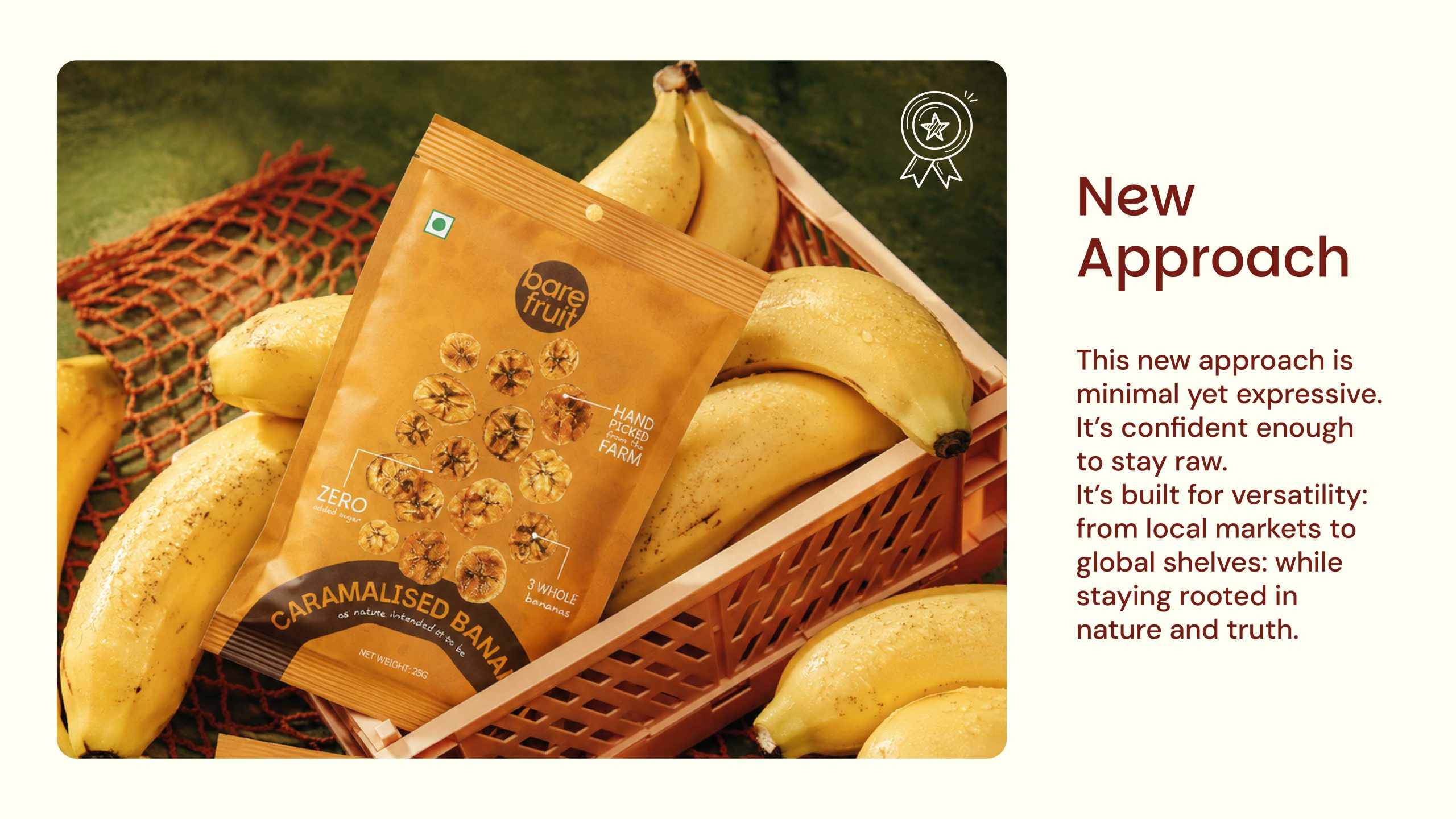
Rather than designing around flavours, we designed around real fruit. Every decision was driven by the idea of bringing consumers closer to the ingredient in its most natural form.
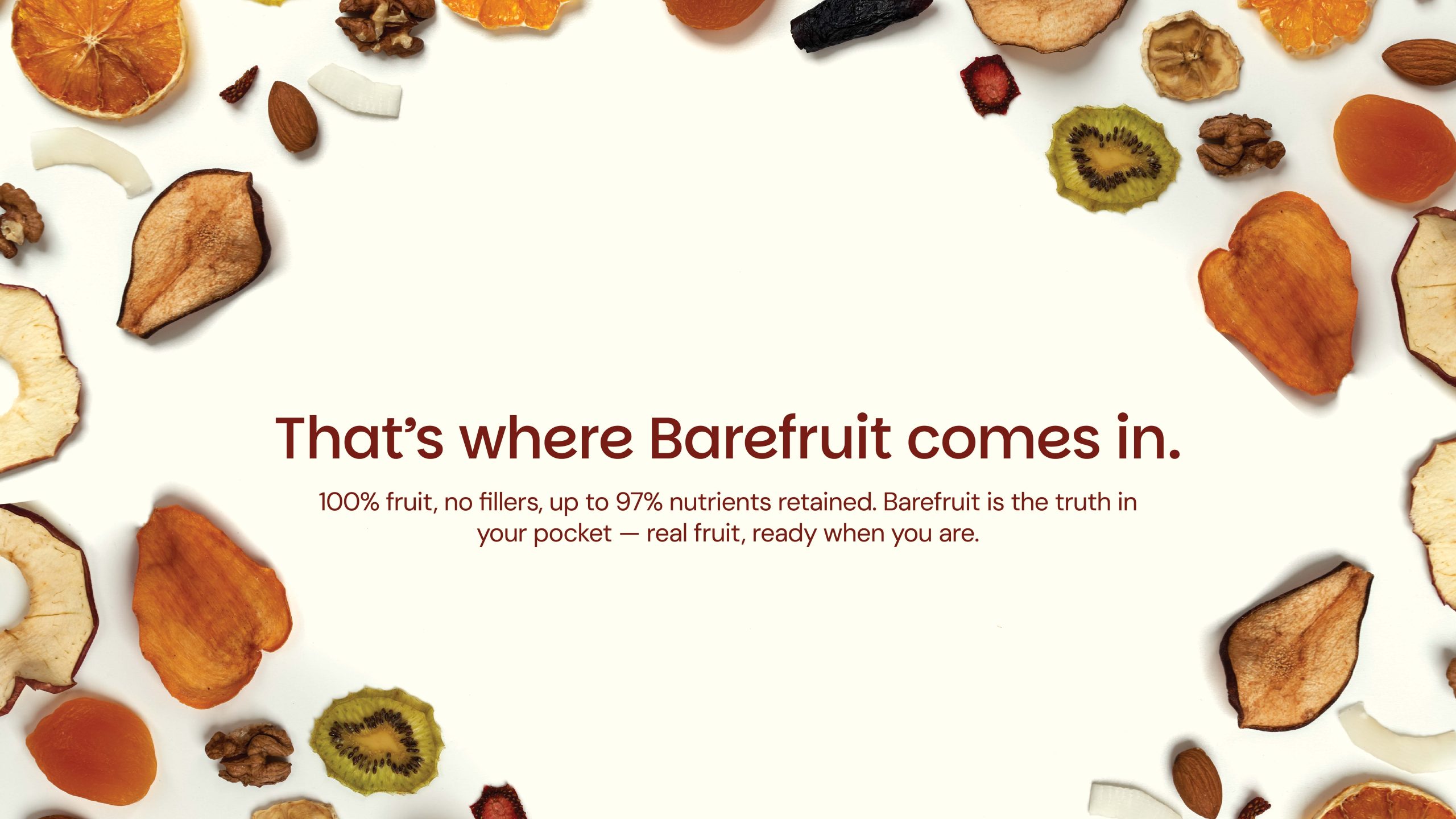
- Strategy Fruit First Real fruit becomes the hero of every pack, creating immediate appetite appeal and reinforcing transparency.
- Nature First Inspired by the journey from farm to pack, the visual language embraces natural textures, handcrafted patterns, and an honest ingredient-led aesthetic.
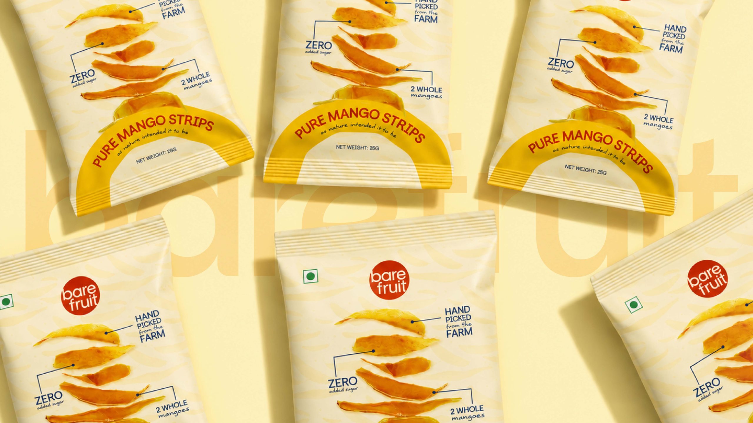
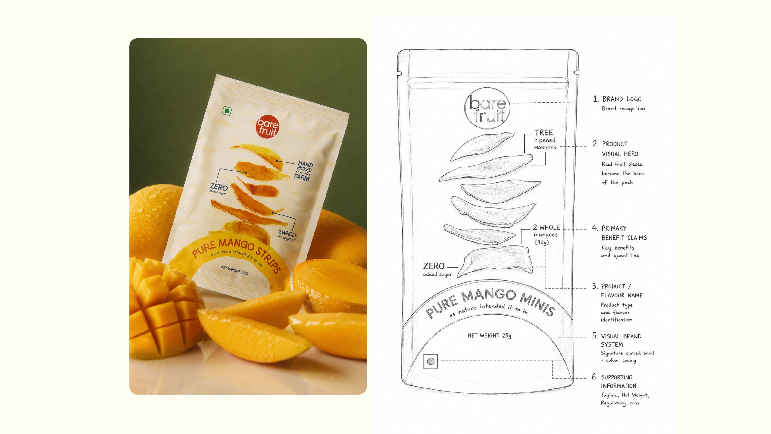
- Simplicity First A clear packaging hierarchy ensures consumers understand the product within seconds—brand, fruit, flavour, and benefits, without visual clutter.
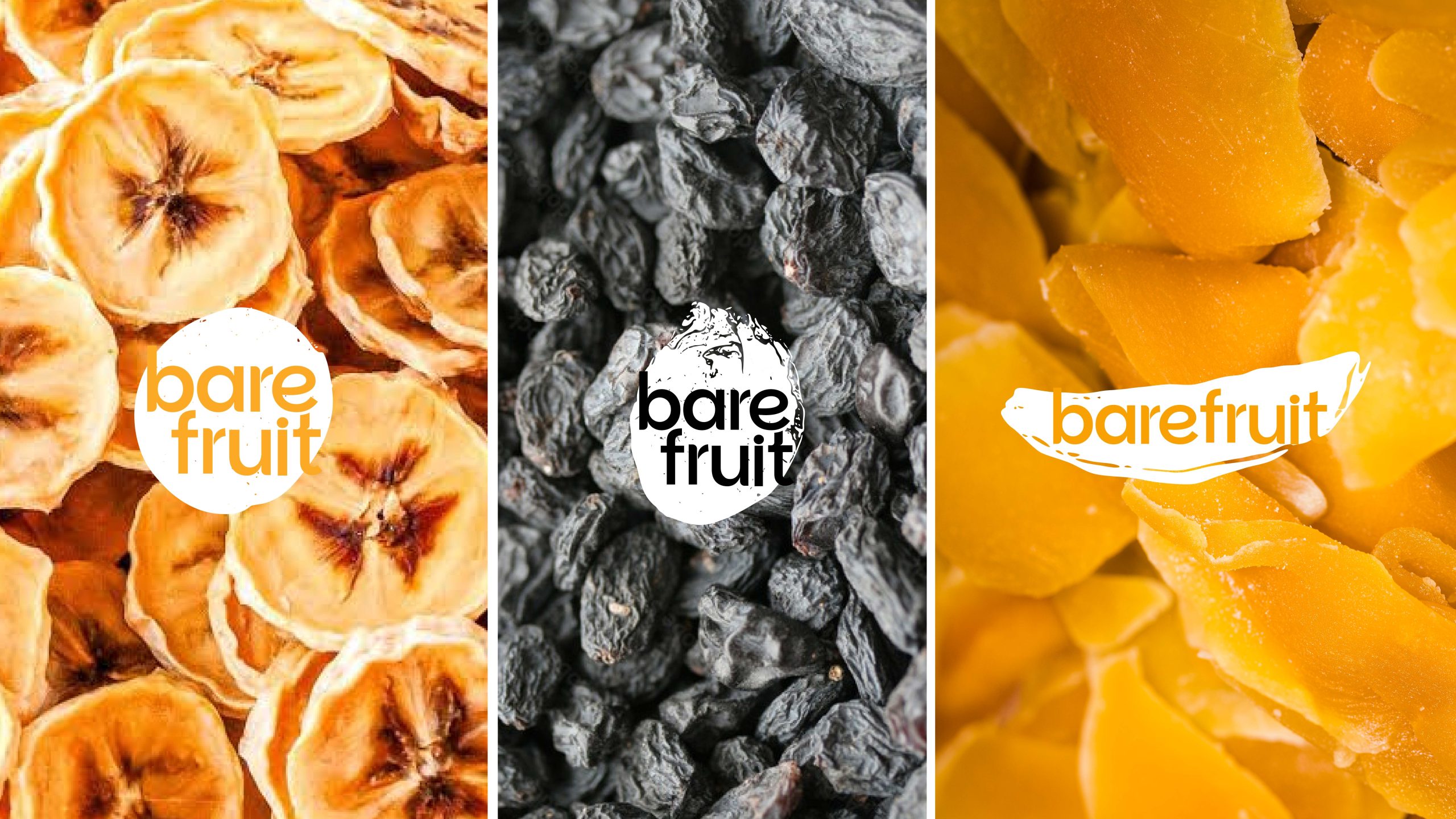
Design Principles Real Ingredients Over Illustrations – Show the actual product instead of stylised graphics.
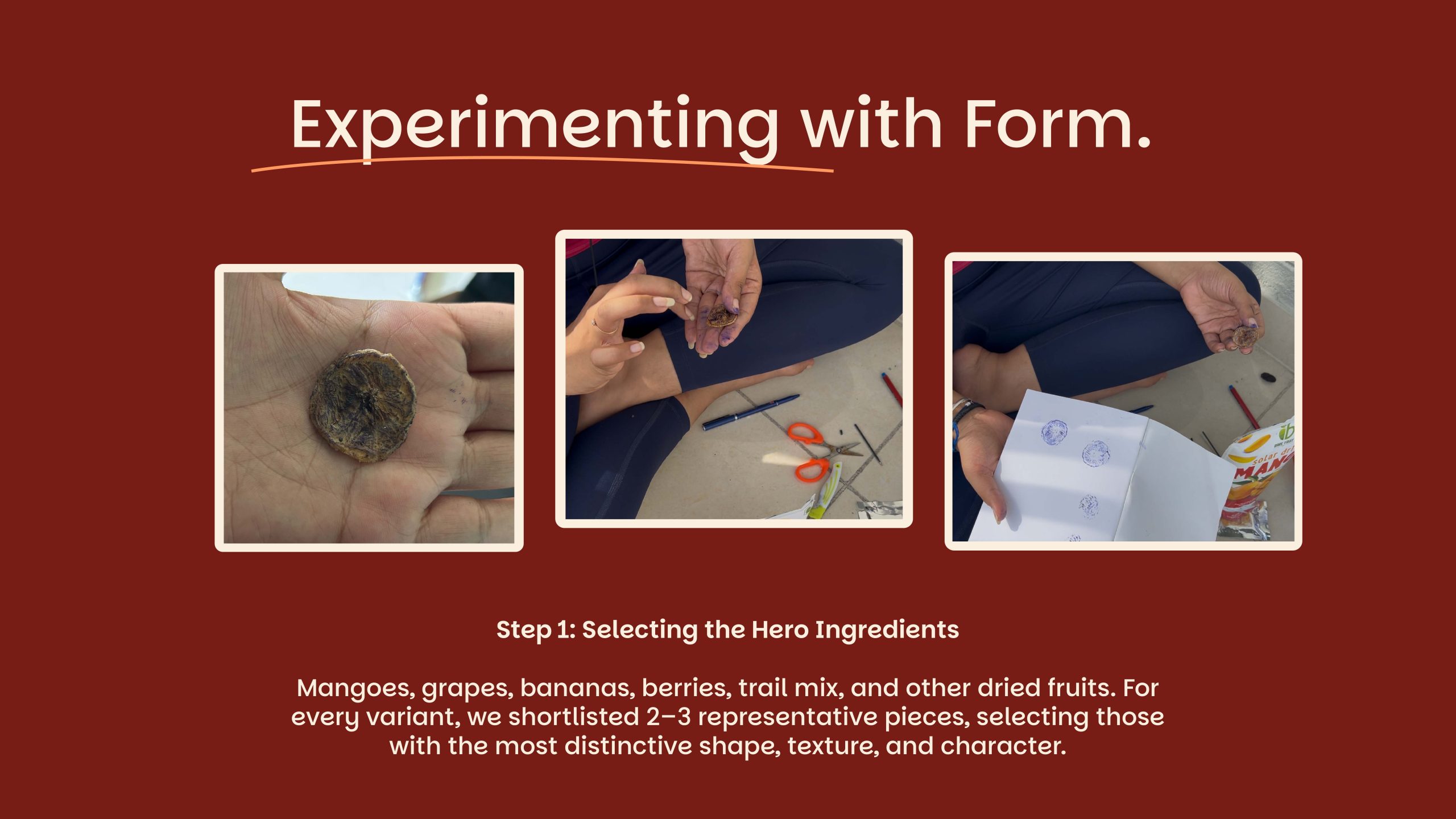
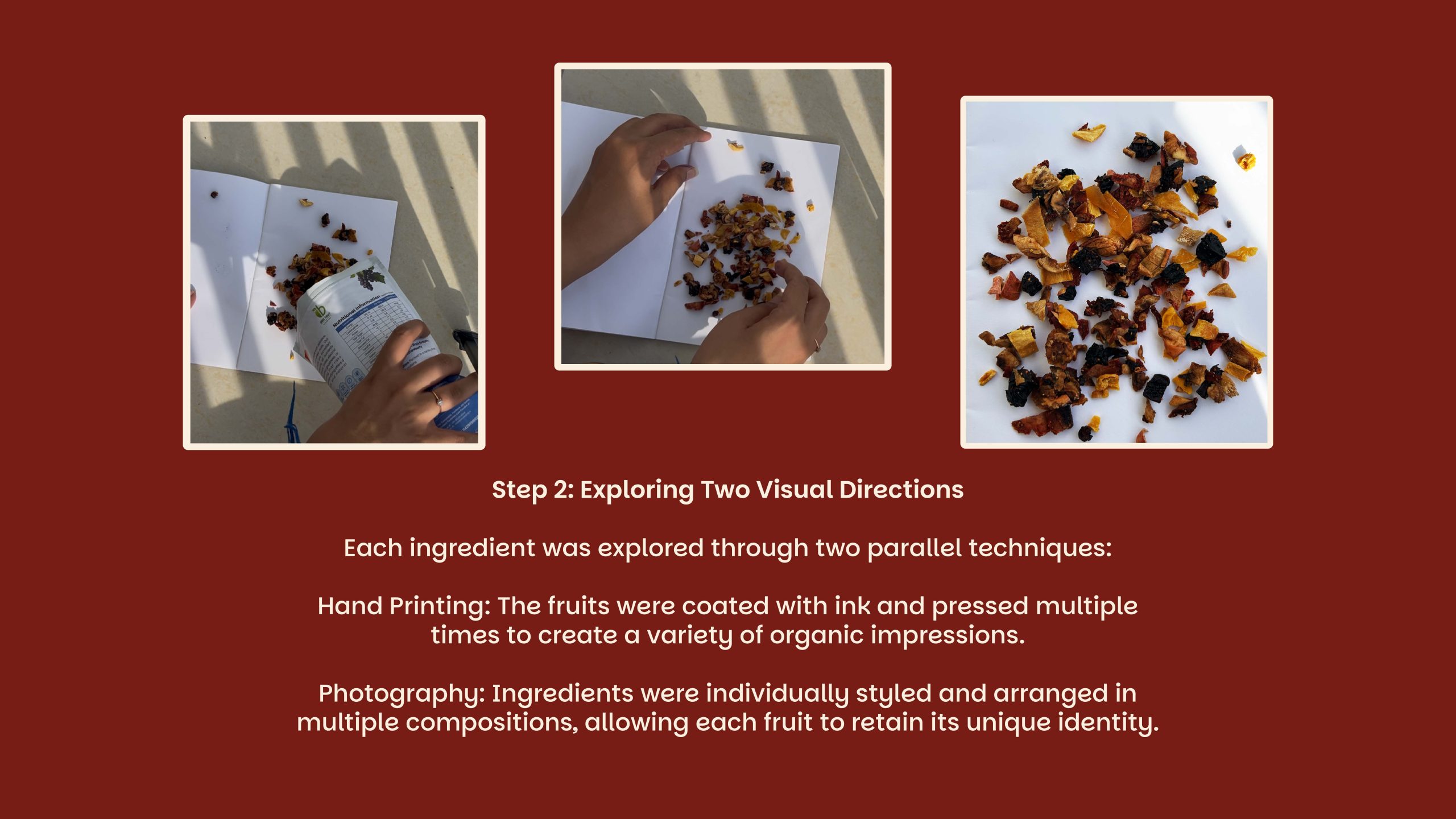
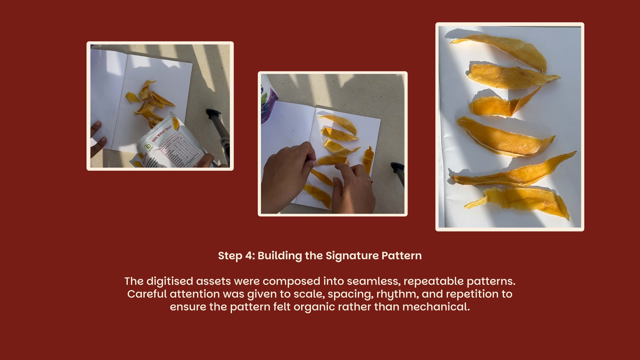
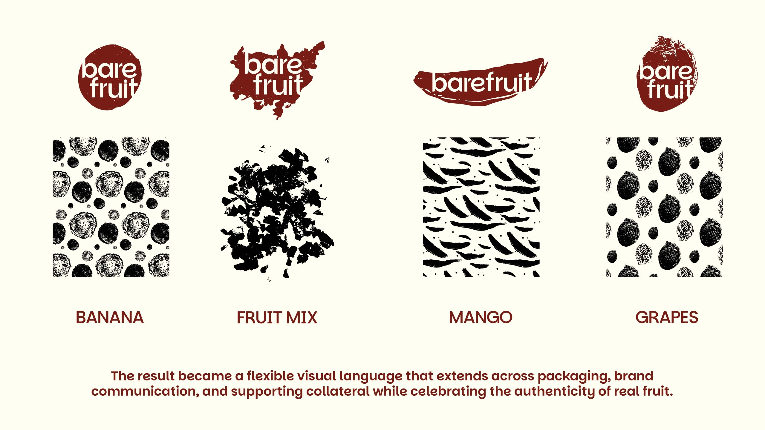
Nature as a Visual Language – Patterns, colours, and textures are derived from the fruits themselves. (process shown below)
One Unified System – A consistent architecture allows every SKU to feel unique while remaining unmistakably Bare Fruit.






 lunapanda
 Tridimage
 Analoguecreative
 lettera7
 alchimistestudioParis
 Lana B
 Colossal
 Pivot Studio
 M&A CREATIVE AGENCY
 monther al omari
 Anastasia Cherepanova | xtramez
 Hollóka Grafikai Műhely / Graphic Design Studio
 BOLD branding
 Antonia Skaraki
 Pâmella Lorrany
 Z9BKAdsgn
 Francesco Paternoster
 b1studio.ro
 Chris Creative Works
 Boordon
 Dmitriy Kuzovlev
 Brand Society
 yasharpic