

Long-term collaborations are rarely about repeating successful ideas. Instead, they are about allowing a design system to evolve while preserving the identity that made it successful in the first place.
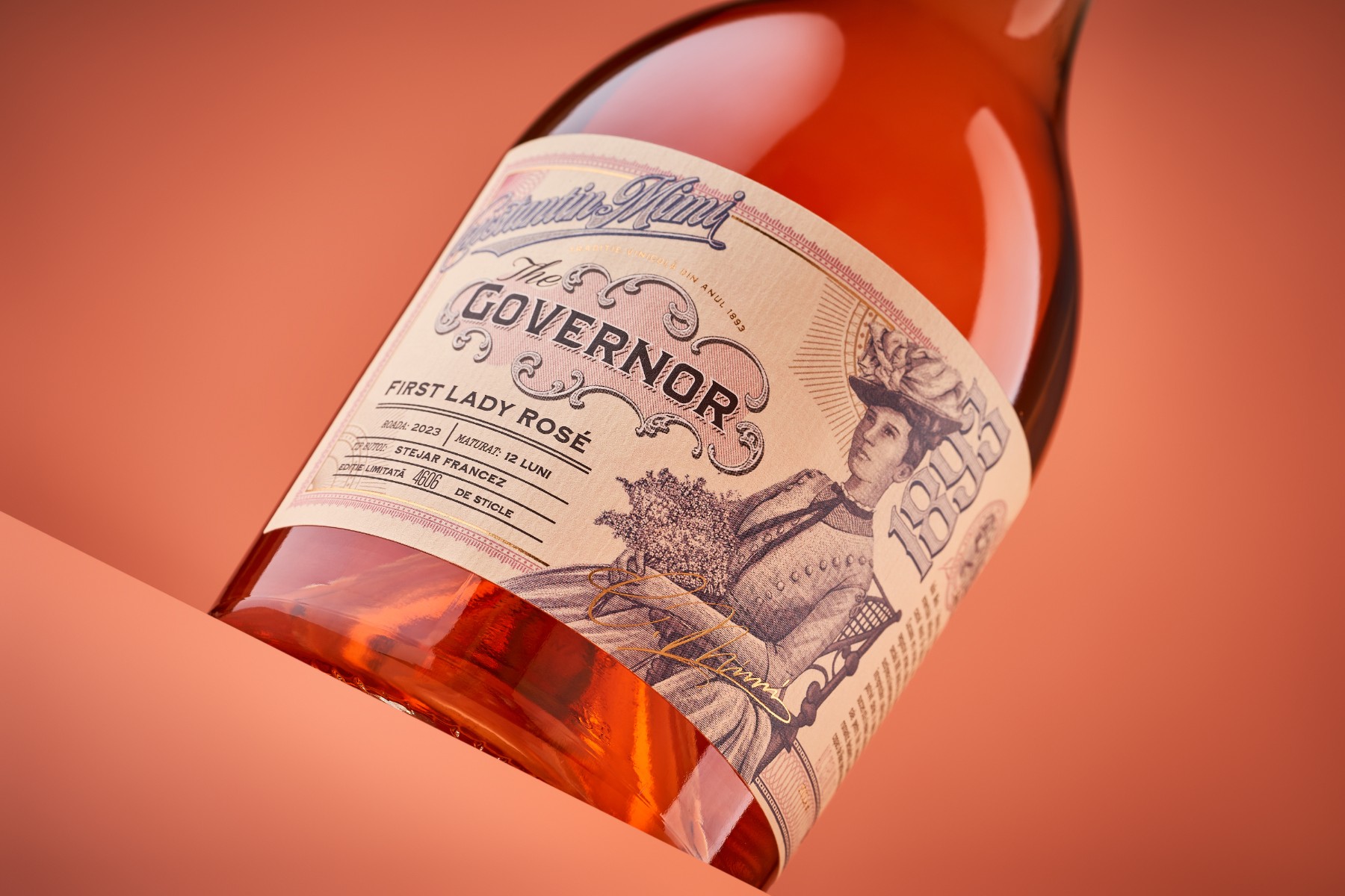
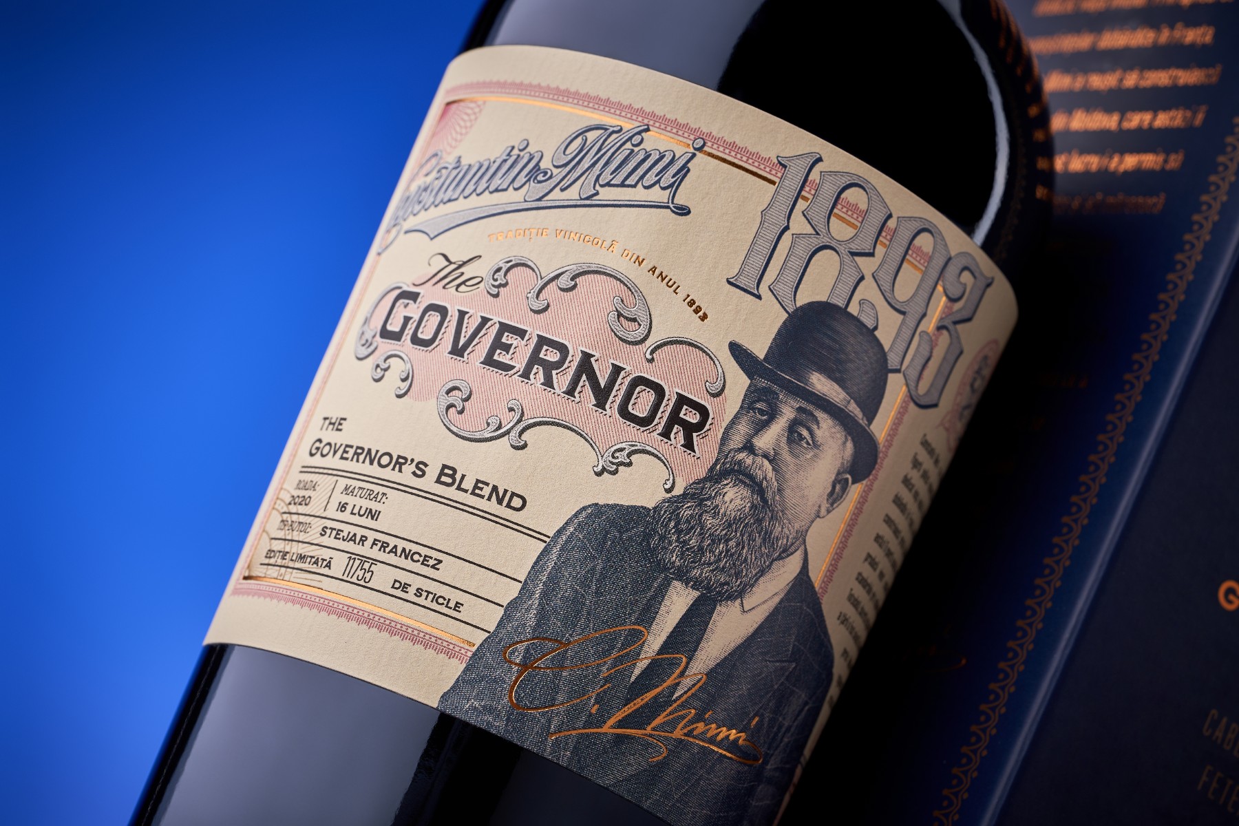
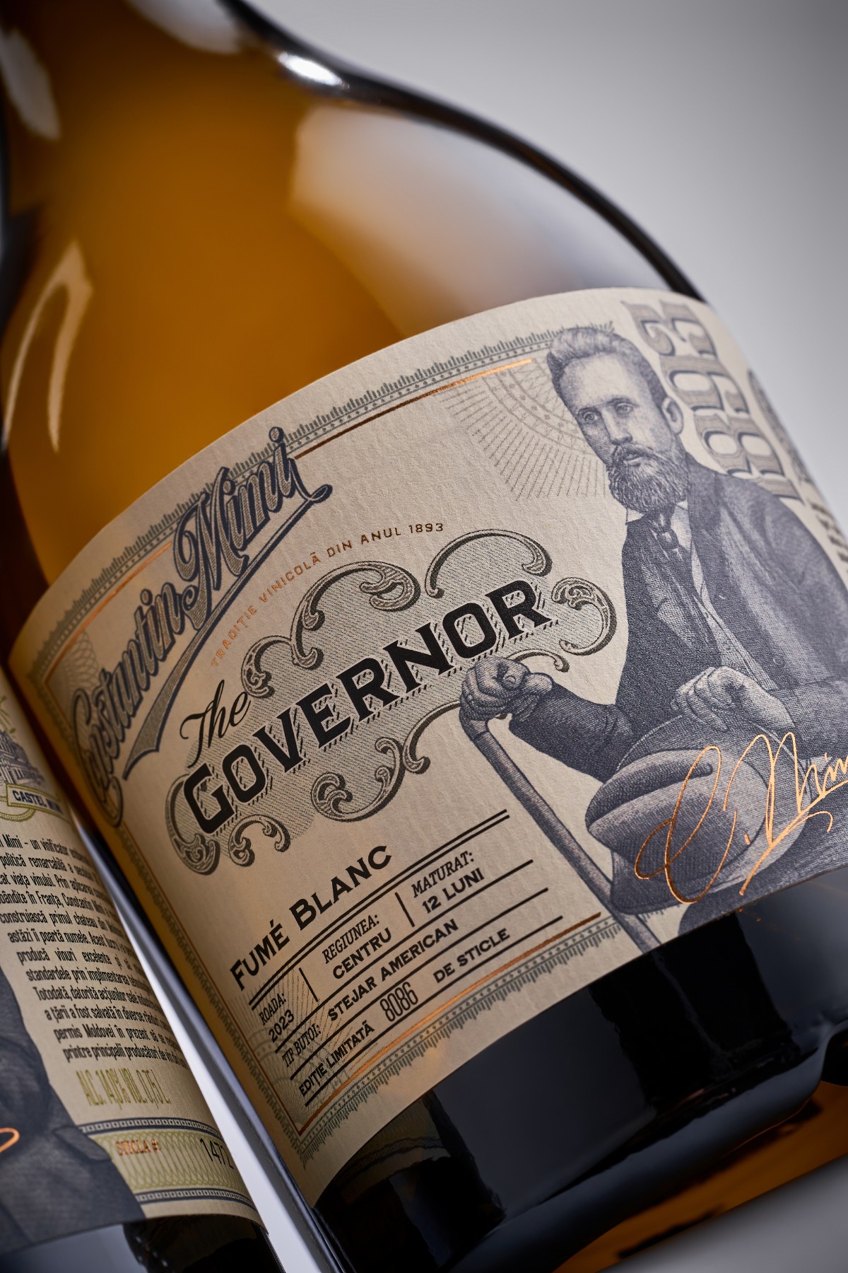
Our partnership with Castel Mimi is a perfect example. Over the years, The Governor collection has steadily expanded, with each new release becoming another chapter in a visual story inspired by the winery’s heritage and the legacy of Constantin Mimi.
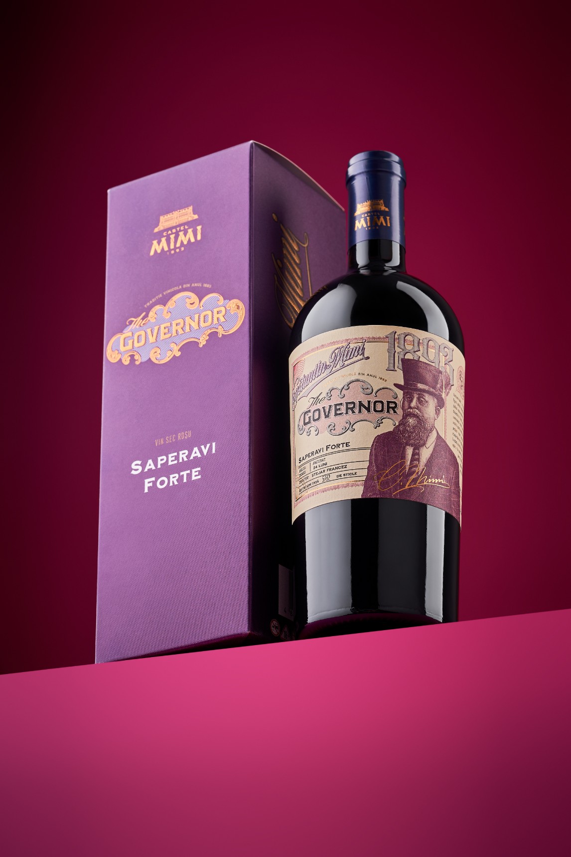
The newest addition, Saperavi Forte, called for more than simply extending the range. The wine itself is produced using custom-made barrels with a Forte toast level, created specifically for this release, making it a distinctive expression within the collection. This evolution was reflected in the design through a carefully refined central illustration that strengthens the visual narrative while remaining unmistakably part of The Governor family.
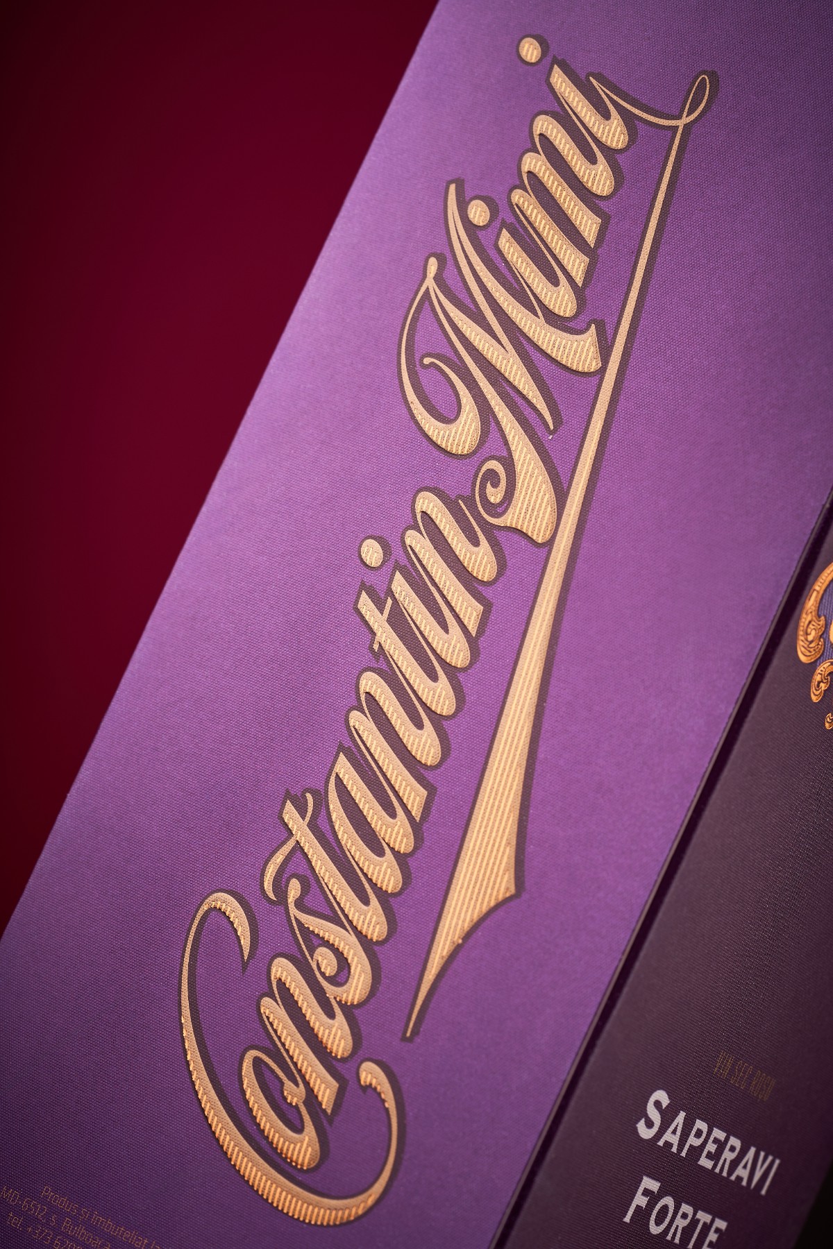
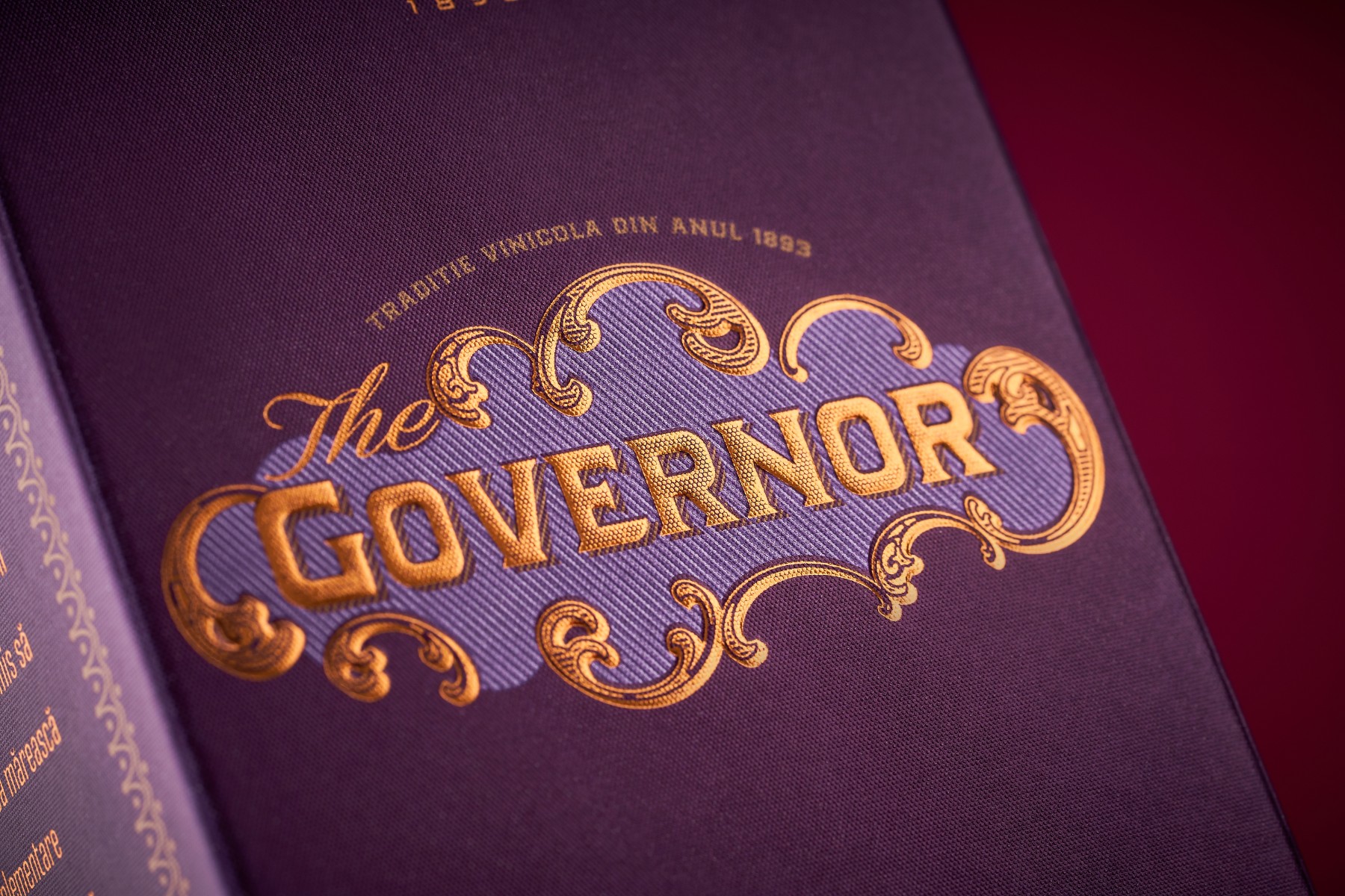
The presentation is completed with a premium gift box produced using refined printing and finishing techniques, creating a tactile and elegant experience that matches the character of the wine inside.
Projects like this demonstrate the value of long-term partnerships. Rather than reinventing a collection with every release, they allow it to mature naturally, growing richer and more coherent over time.
Curator’s Insight
The hardest part of a long-running collection isn’t launching it, it’s knowing how much to change with each new release. Too little variation and every bottle blurs together on the shelf. Too much and the collection stops feeling like a collection at all. The Governor series threads that needle by keeping its structure fixed (the portrait, the ornamental frame, the antique typographic treatment) while letting the illustration itself carry the differentiation.
Look at what actually shifts across the three labels. The Governor’s own portrait stays central to the original expression, but the First Lady Rosé swaps in a different figure entirely, dressed and posed to suit a lighter, more feminine wine, while still living inside the same decorative border and dateline system. That’s a smart way to signal range within a family: change who is being depicted, not how they’re depicted. The viewer instantly understands these bottles belong together and are telling different parts of the same story.
The gift box for Saperavi Forte extends that logic outward. Rather than introducing new visual elements, it takes the existing purple and gold language and gives it more surface area and better material finishing, so the packaging escalates in perceived value without expanding its vocabulary.
The transferable idea here: consistency and freshness aren’t opposites in a collection system, they’re a division of labor. Let the structure hold steady so the content, whether that’s a new figure, a new varietal, or a new format, has room to do the differentiating.










 43oz
43oz Lisa Pokrovskaya
 Simple Studio
 Studio Unbound
 David Byerlee
 M&A CREATIVE AGENCY
 alchimistestudioParis
 monther al omari
 Studio Be Design
 LogoSayLove
 agenciabud
 Shustova p
 mutta
mutta @Allenarts13
 Sirka Agency
 Atiq Alam
 Dozen Agency
 j.substance
 SCD
SCD Cristian Lepore | crilep Copia
 Chris Creative Works