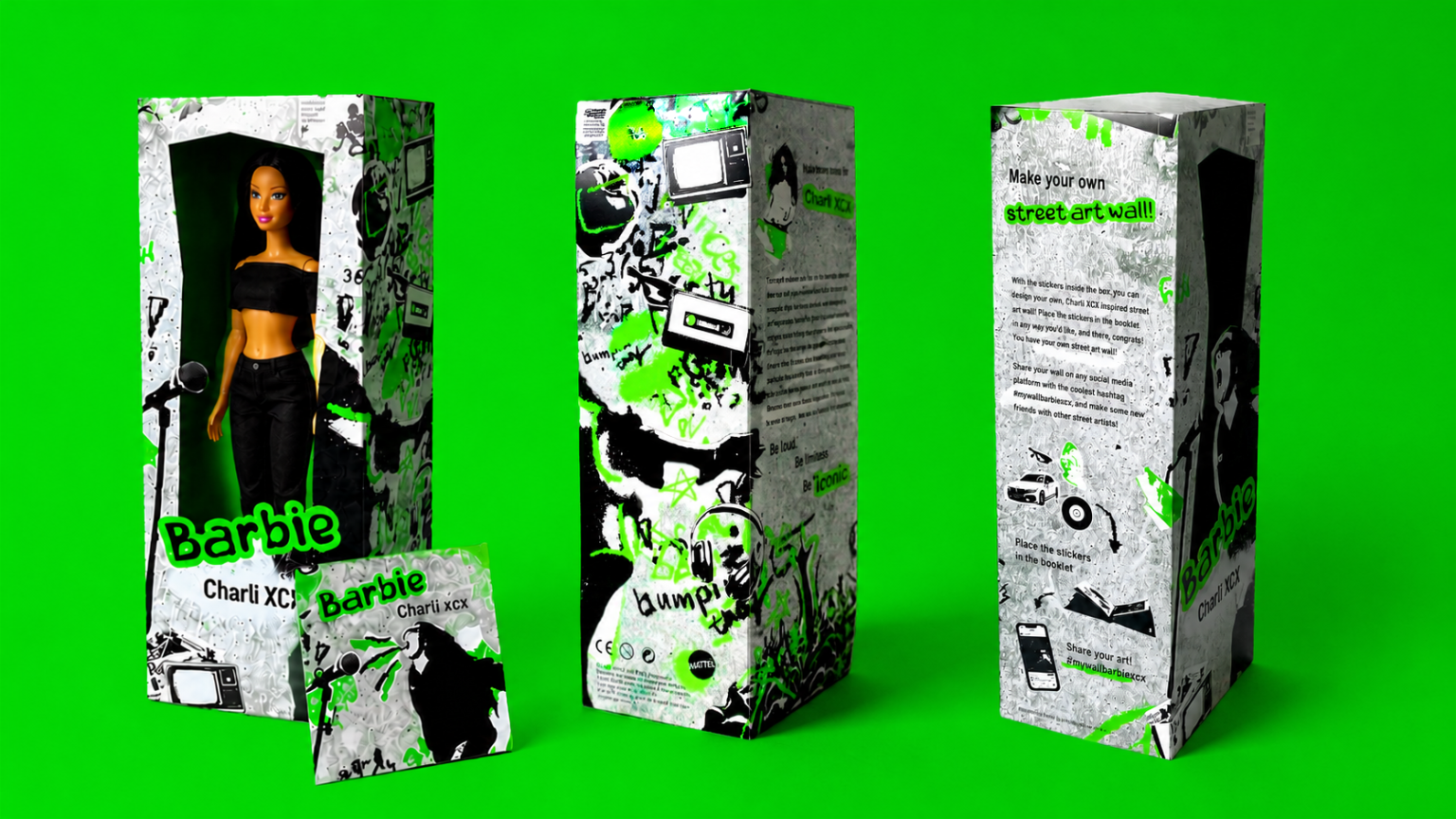

Concept: Brat Meets Barbie — Where Plastic Perfection Gets Messy
At the heart of my packaging design lies a collision of two seemingly opposite worlds: Barbie’s polished, aspirational plastic-fantastic universe and Charli XCX’s raw, DIY, hyper-pop “brat” aesthetic. Rather than smoothing that tension away, I leaned directly into it: the result is a package that feels torn from a wall in an urban alley rather than pulled off a toy-store shelf.
I drew my core visual language directly from street art, stencil work, spray-can tags, wheat-pasted posters, and the layered, half-destroyed look of a wall that’s been painted over a hundred times. That’s the DNA underneath everything else: a scratchy, distressed concrete-grey backdrop (standing in for raw city concrete) layered with spray-paint drips, torn-poster textures, and hand-scrawled tags, all electrified by a single, unapologetic acid green, the exact shade drawn straight from Charli’s brat album, whose stripped-back, aggressively minimal cover art made that green instantly iconic. I chose it as the packaging’s only accent color so the connection to the album would be immediate and authentic, not just a random pop of color.
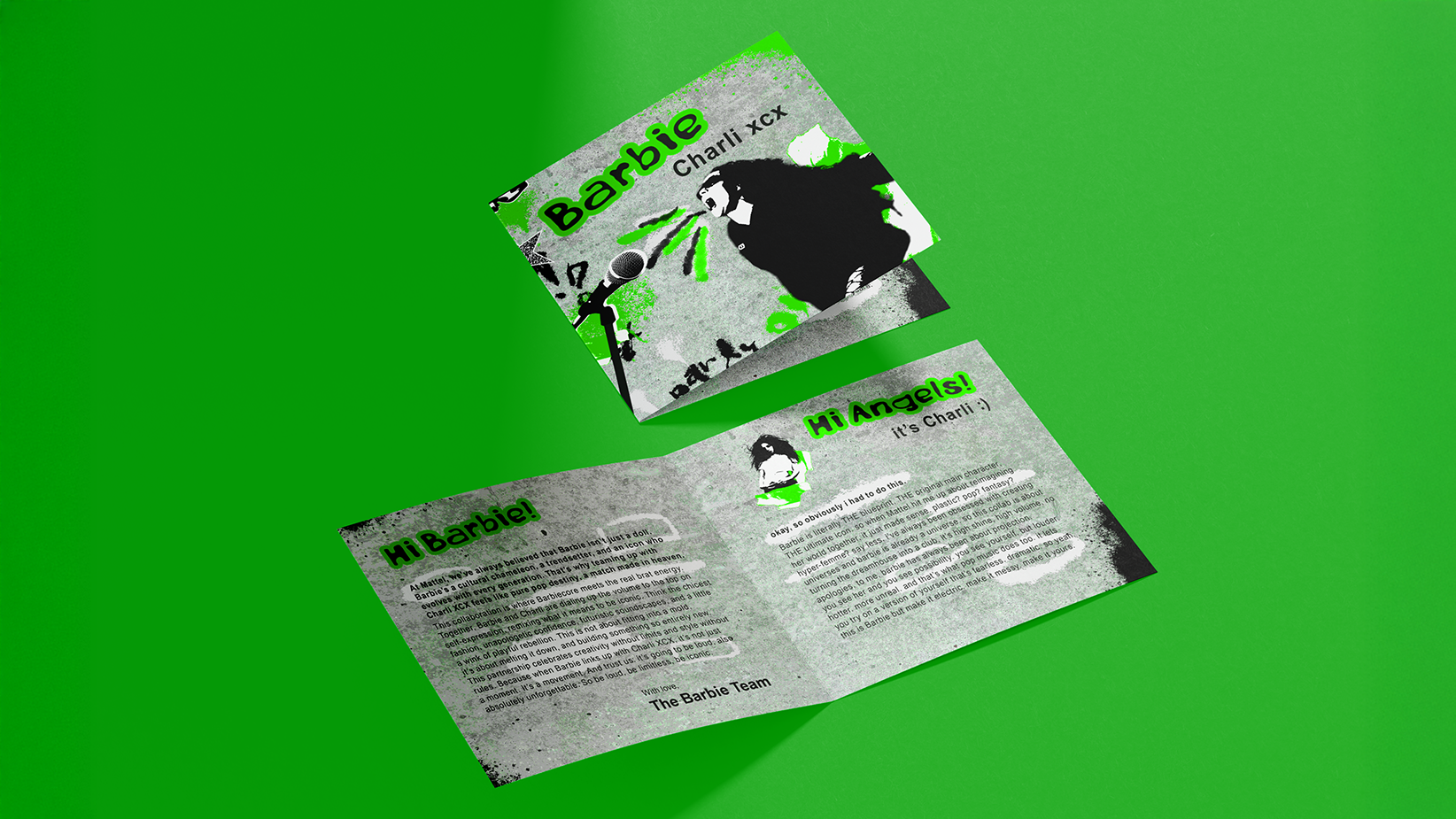
The illustrated figure of Charli mid-scream into a mic is rendered as a stencil-style street art portrait — the kind you’d find spray-painted on a shutter or underpass wall — rather than a polished product photograph, reinforcing that street art logic across every panel.
I carried that same street-art energy into the typography: I translated the raw, stripped-down, almost deliberately “careless” lettering associated with brat’s visual identity onto the packaging, giving it the loose, tagged-wall quality of spray-can graffiti. Even the Barbie logotype I redrew as a loose, spray-can scrawl, breaking away from the brand’s usual glossy script. That gesture signals that this is Barbie stepping outside her own mythology, out onto the street, not just wearing someone else’s costume.
Structure and Materials
The primary structure is a tall, narrow window box: a nod to classic Barbie packaging conventions, but I cut the window itself irregularly, like a poster ripped off a wall mid-tear, revealing the doll standing mid-performance in all-black stage wear. Every panel of the box carries a different piece of the story, and every surface continues the street art treatment:
The front panel delivers the reveal: doll, logo, and torn-poster window.
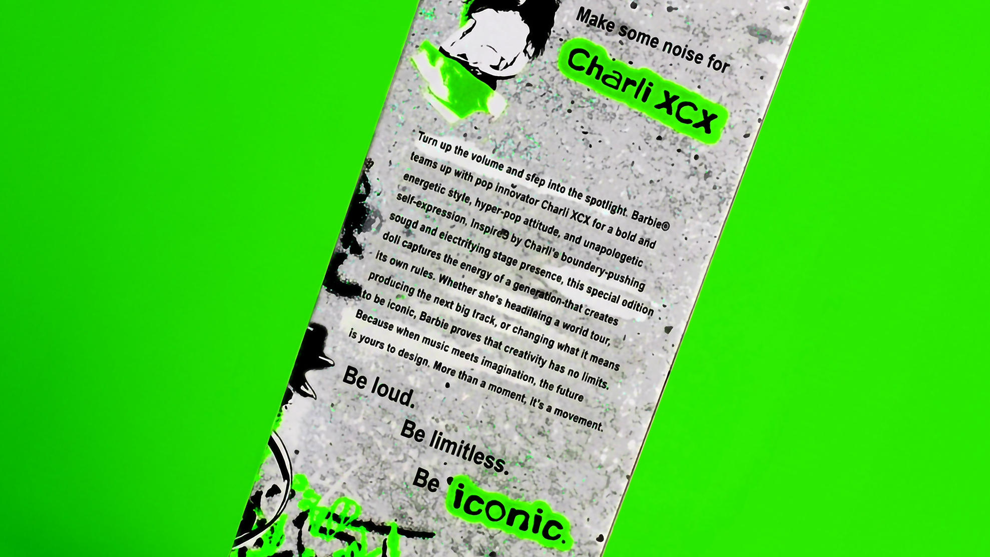
The side panel carries the brand copy. “Be loud. Be limitless. Be iconic.”, paired with a short manifesto that frames the collaboration as a meeting point between two eras of pop culture reinvention.
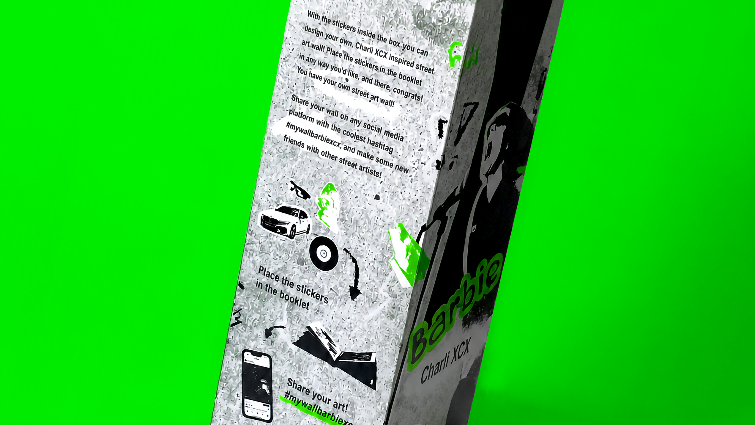
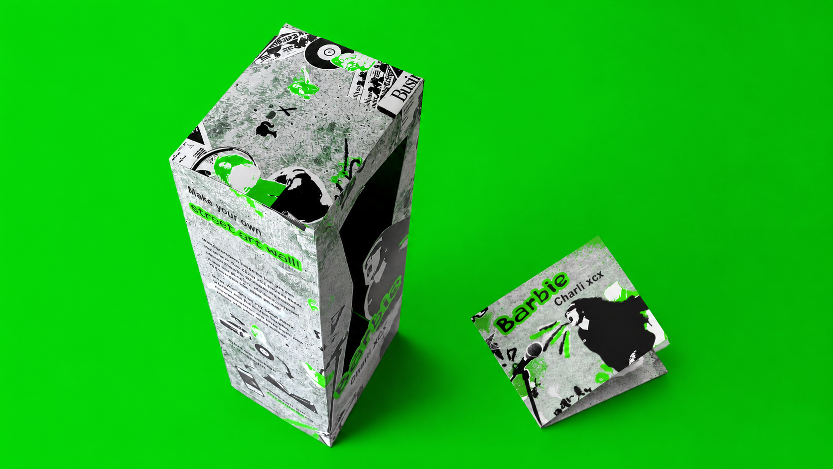
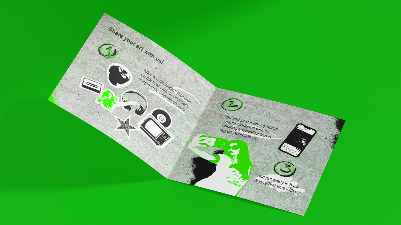
The back panel turns the box into an activity: “Make your own street art wall,” inviting the buyer to use an included sticker sheet to build their own miniature street-art collage, then photograph and share it under the hashtag #mywallbarbiexcx.
This transforms the packaging from a disposable container into a piece of participatory merchandise: the box doesn’t get thrown away after unboxing, it becomes the canvas, literally putting street art creation into the buyer’s hands.
The Insert: A Zine, Not a Manual
Instead of a standard instruction insert, I designed a fold-out booklet styled like a cassette-tape liner note or an indie zine: another artifact of DIY street and subculture printing. It opens with two “in-character” letters, one from the Barbie brand team welcoming Charli into the Barbie universe, and one from “Charli” herself, written in her own irreverent voice, riffing on the strangeness and thrill of reimagining pop’s ultimate icon. This device does double duty: it gives the collaboration a narrative voice instead of corporate copy, and it rewards collectors who go beyond the shelf-appeal of the box.
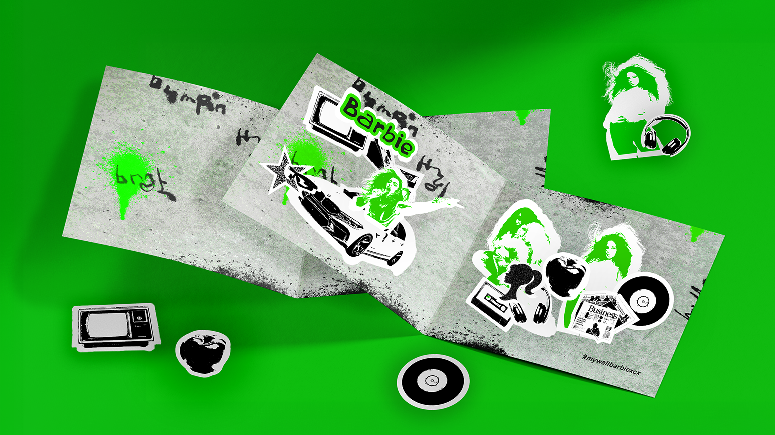
The centre spread of the booklet walks buyers through the activity itself, step by step: decorate your wall, share it, and get ready to have a very brat time with us. I included a sheet of die-cut icon stickers: a boombox, cassette, headphones, vinyl record, star, sports car, sunglasses, apple, and newspaper clipping, all rendered in the same black/white/acid-green, stencil-cut street art style as the box, drawn from recurring motifs associated with Charli’s visual world so fans can recognize the references as they build their collage.
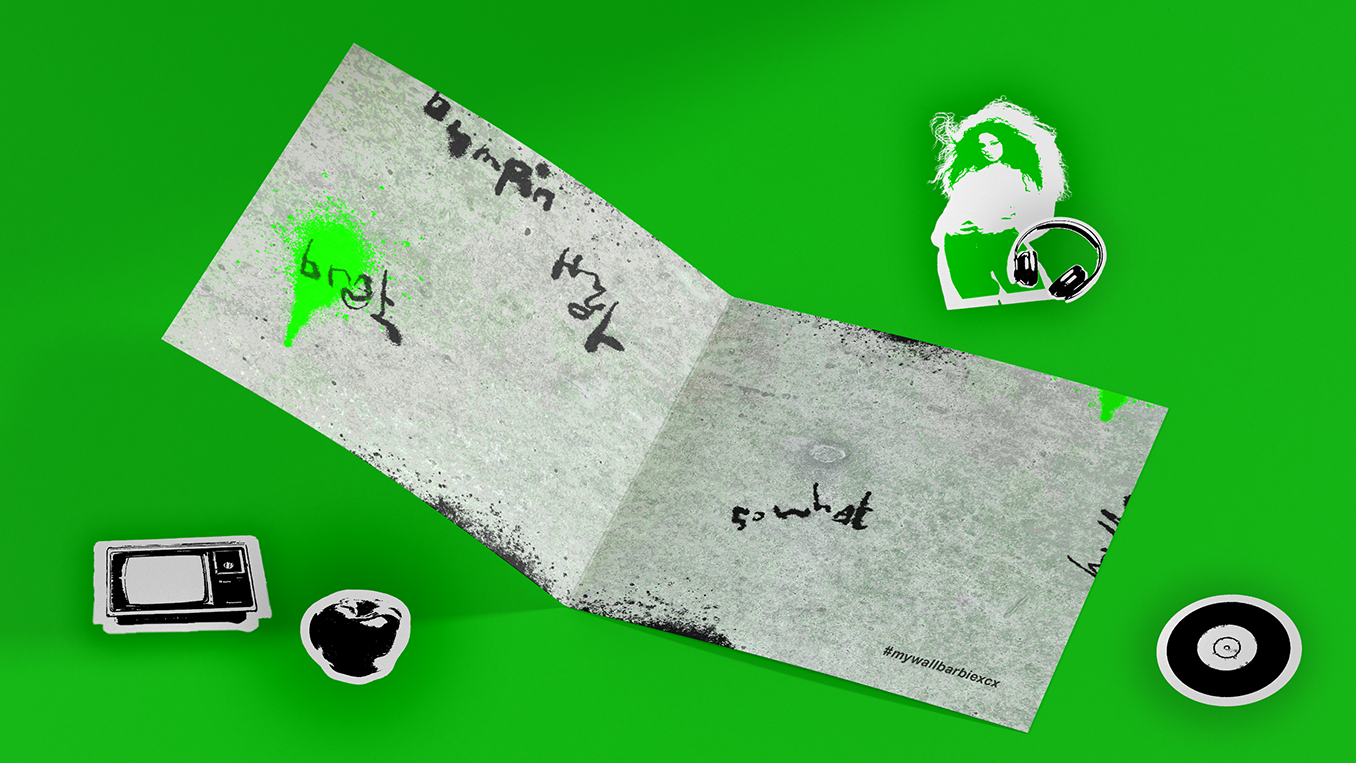
Crucially, I left the very last page of the booklet completely blank — an empty textured concrete “wall” with nothing on it. This blank page is the whole point: it’s the buyer’s own canvas. Using the included Barbie-branded stickers, they can design and arrange their own personal street art wall however they like, no two the same. Once it’s finished, they’re invited to photograph their wall and post it to social media under the hashtag #mywallbarbiexcx, turning every purchase into a personalized, shareable piece of content and connecting buyers with other “street artists” in the Barbie x Charli XCX community.
Design Rationale
Three principles drove every decision I made:
Authenticity over polish. Traditional collector packaging tends toward glossy, art-directed perfection. I deliberately pulled from street art’s raw visual grammar, torn edges, spray drips, stencil silhouettes, scratchy tagged typography, to signal to a Gen Z audience that this isn’t a sanitized corporate tie-in, but a genuine crossover with its own point of view.
Packaging as social object. The blank final page and sticker mechanic turn the box from single-use packaging into a content-generation tool, echoing how real street art spreads: created, photographed, and shared. Every personalized wall becomes a piece of user-generated marketing, extending the product’s life and reach well past the unboxing moment via the branded hashtag.
Dual fandom, one object. I had to satisfy two collector audiences simultaneously: Barbie completists who want shelf-display value, and Charli XCX fans who want something true to her aesthetic rather than a licensing formality. The window-box format preserves the traditional Barbie collector ritual, while every graphic surface speaks fluently in the combined visual code of brat and street art.
Why It Matters
Limited-edition collaboration packaging so often defaults to a “logo mash-up on a nice box” solution, two brand marks side by side, a premium finish, and little else. I instead treated the packaging itself as the site of collaboration, using street art as the connective visual language between two very different worlds: the box doesn’t just announce that Barbie and Charli XCX have teamed up, it behaves like something the two of them might actually have sprayed onto a wall together: scrappy, participatory, and unmistakably of the moment.



 lunapanda
 Tridimage
 Analoguecreative
 lettera7
 alchimistestudioParis
 Lana B
 Colossal
 Pivot Studio
 M&A CREATIVE AGENCY
 monther al omari
 Anastasia Cherepanova | xtramez
 Hollóka Grafikai Műhely / Graphic Design Studio
 BOLD branding
 Antonia Skaraki
 Pâmella Lorrany
 Z9BKAdsgn
 Francesco Paternoster
 b1studio.ro
 Chris Creative Works
 Boordon
 Dmitriy Kuzovlev
 Brand Society
 yasharpic