

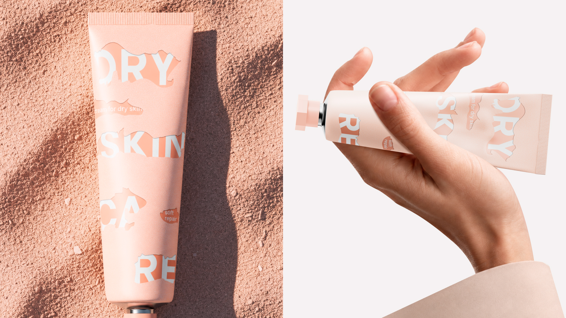
Diana Zabolotnaya has developed the packaging of DRY SKIN CARE peeling cream
DRY SKIN CARE is a skincare line developed for dry and flaking skin, designed to restore comfort, softness, and the skin’s natural balance. The range includes products tailored to different skin conditions, from the first signs of dryness to intensive care for severe flaking and a compromised skin barrier.
The visual identity is based on the process of skin renewal. The graphic system reflects the nature and severity of flaking, directly linking the appearance of the packaging to the intended use of each product. This approach transforms a physiological characteristic of the skin into a clear visual language, helping consumers quickly identify the level of care they need and easily navigate the product range.
The concept is built around turning a common skin concern into a tangible visual experience. The peeling layers on the packaging serve as a metaphor for dryness and barrier damage, while their varying intensity represents the level of treatment required. This creates a clear and intuitive hierarchy within the product line, making the differences between products instantly recognizable. A minimalist color palette and tactile-inspired graphics reinforce the cosmetic nature of the brand while keeping the focus on its core message — skin recovery, nourishment, and care.
Curator’s Insight
The challenge in a multi-product skincare range is sorting severity without leaning on color codes or numbers, both of which ask the customer to stop and decode. This system solves it by letting the surface itself carry the information: the torn, layered patches read as damage, and the amount of tearing scales with how compromised the skin condition is meant to be. A shopper doesn’t need to read “deep repair” to sense which tube is for the worse case, the packaging already looks more distressed.
What makes it work is that the typography isn’t just sitting on top of this pattern, it’s interrupted by it. Letters get cropped where the torn shapes cut across them, so the discomfort being described is enacted in the mark itself rather than illustrated beside it.
The takeaway for range design: when severity or intensity needs to differentiate products within a line, material behavior (torn, cracked, worn) can do faster, more intuitive sorting than a color key ever will.




 agarcia studio
 Wynand88
 Eva Chistyakova
 Maria Bukhtilova
 estudiomarciano
 monther al omari
 Thirst
 Maruf Nishat
 Gray Matter Studio
 Julia Jay
 Modern Theory
 Furt Goods
 Fluid
Fluid alchimistestudioParis
 Ancora
 Mostafa Abdelmawla
 MewKittyDraw
 Studio Shala
 43oz
43oz Lucid mk2
 Atiq Alam
 IDEOLOGO
 Open Strategy & Design