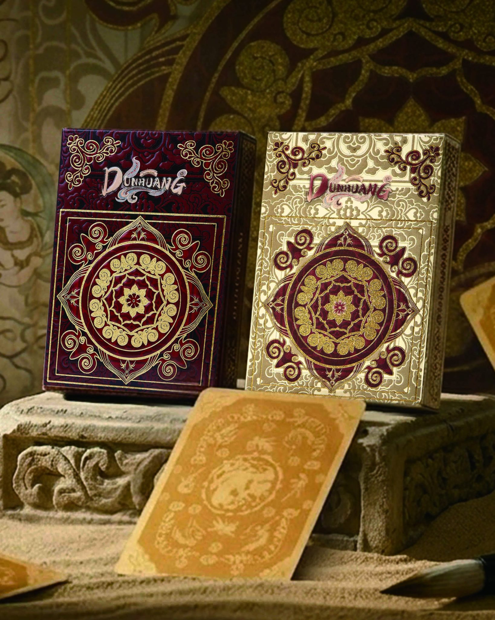

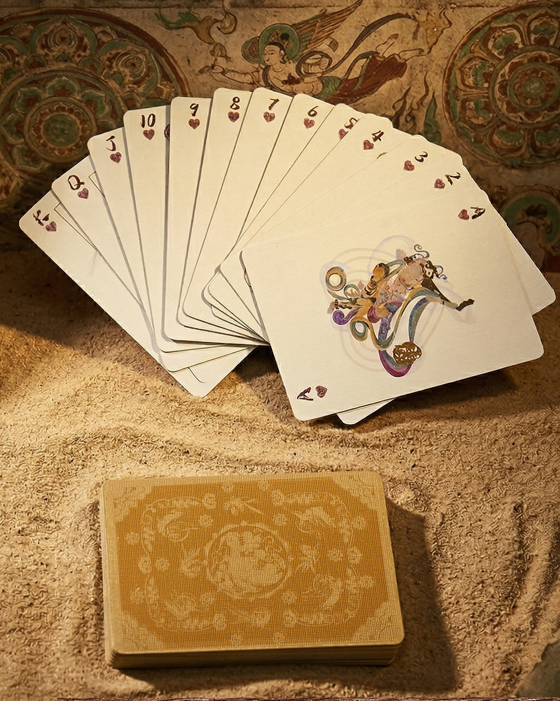
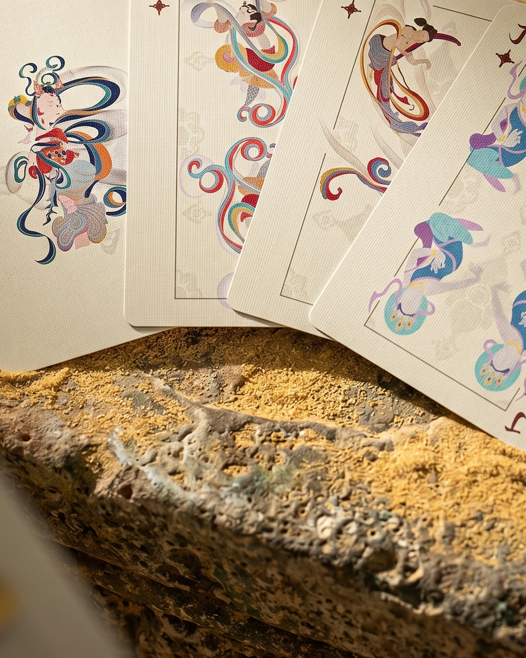
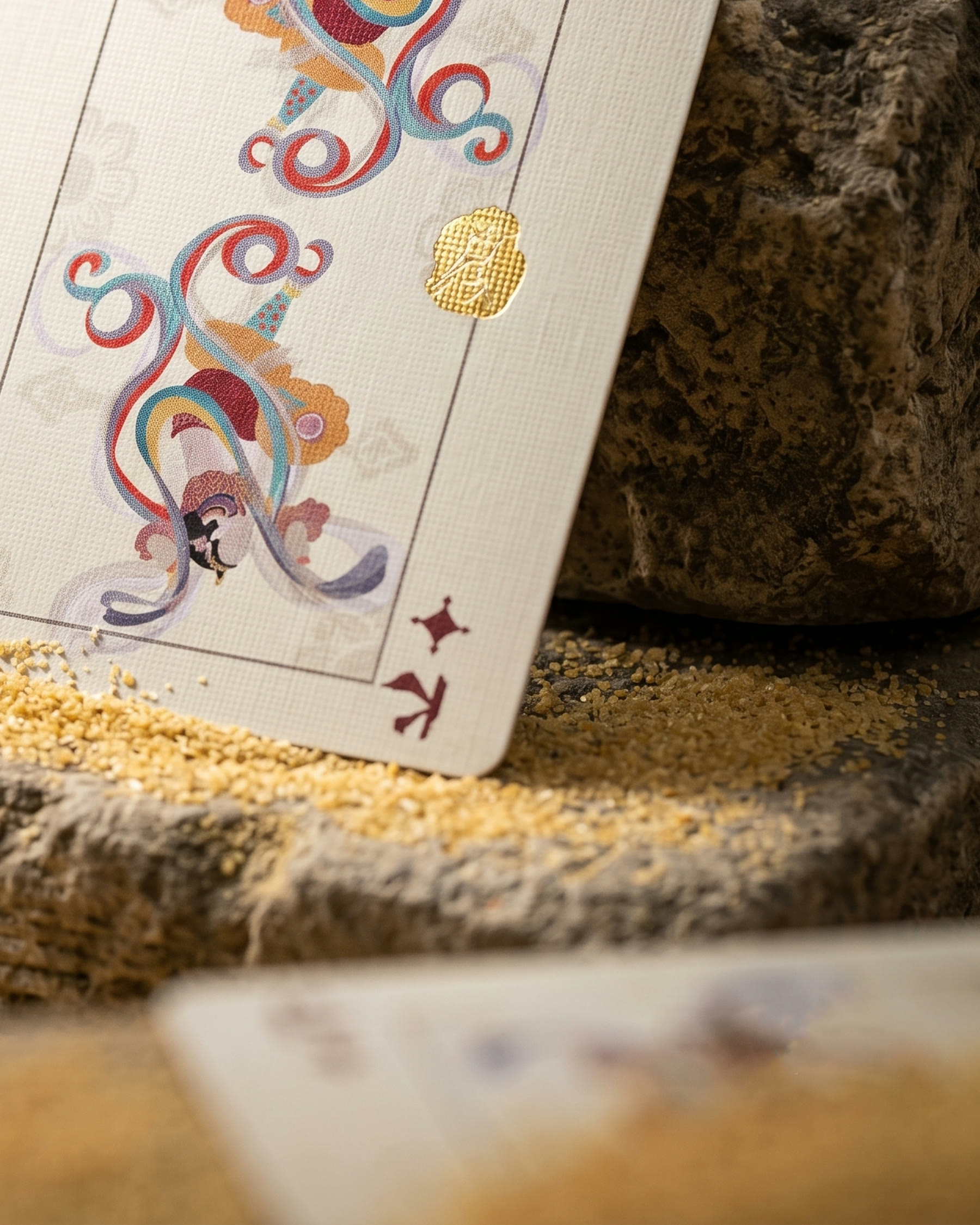
Dunhuang Flying Apsaras Playing Cards Vol. II is a packaging redesign for an illustrated deck inspired by the visual language of the Mogao cave murals. The cards themselves remain unchanged; the work focuses on how the same deck is introduced, protected and displayed through two tuck boxes and a collector presentation box.
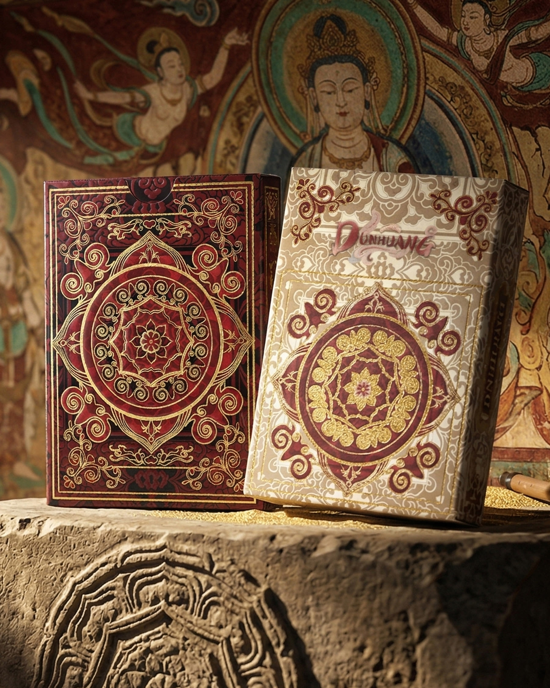
Crimson Red and Pure White are not different decks. They are two entrances to the same object. Crimson Red uses a dark, warm field to give the central medallion and scrolling lines a ceremonial presence. Pure White places the same family of motifs against a quieter, lighter ground, allowing the ornament to read with more space. Repeated geometry, cloud-like curves and the circular centre keep both boxes recognisable as one system.
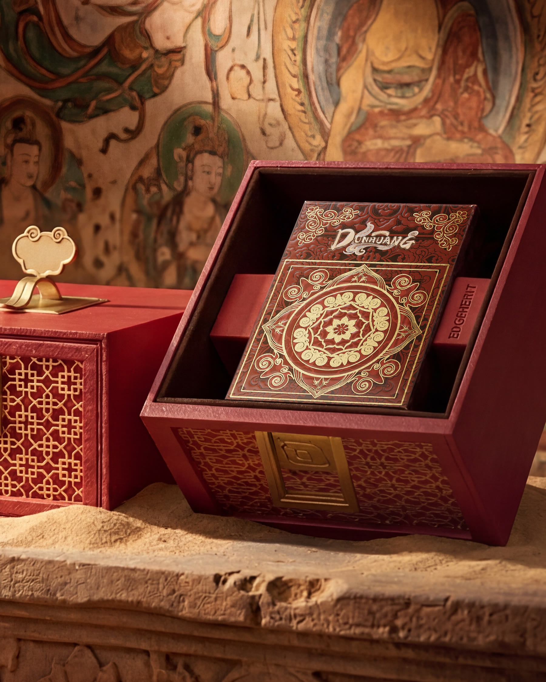
The Crimson collector packaging extends that visual language beyond the tuck box. Its layered structure frames the deck when opened and lets the package work as both storage and display. The outer box uses the same red-and-gold-coloured rhythm, so the transition from presentation box to tuck box feels continuous.
The goal was not to turn mural imagery into surface decoration. It was to build a contemporary packaging hierarchy—collector box, tuck box and cards—in which each layer carries the same cultural atmosphere while remaining clear in use.
 habiba hatem
 Up-Brands
 sayadworks
 Kingdom & Sparrow
 furtgoods
 Si me preguntas
 Narrow House Packaging Branding & Design
 Clever Branding
 About House of Ta
 Hossam khalifa
 Valentyna Hradova
 Backbar Studios
 Holy Studio
 Prime
Prime Naeema Raashid
 Buddy Creative
 ezgidesignstudio
 Minim Brand Design
 Nenad Došen Studio
 Atyan
Atyan Massimo Lo Cascio
 Carreto Concepts Design Studio
 Charles Mason
 Pinot Agency