
Every deep ocean holds a story.
This one begins with a fish.
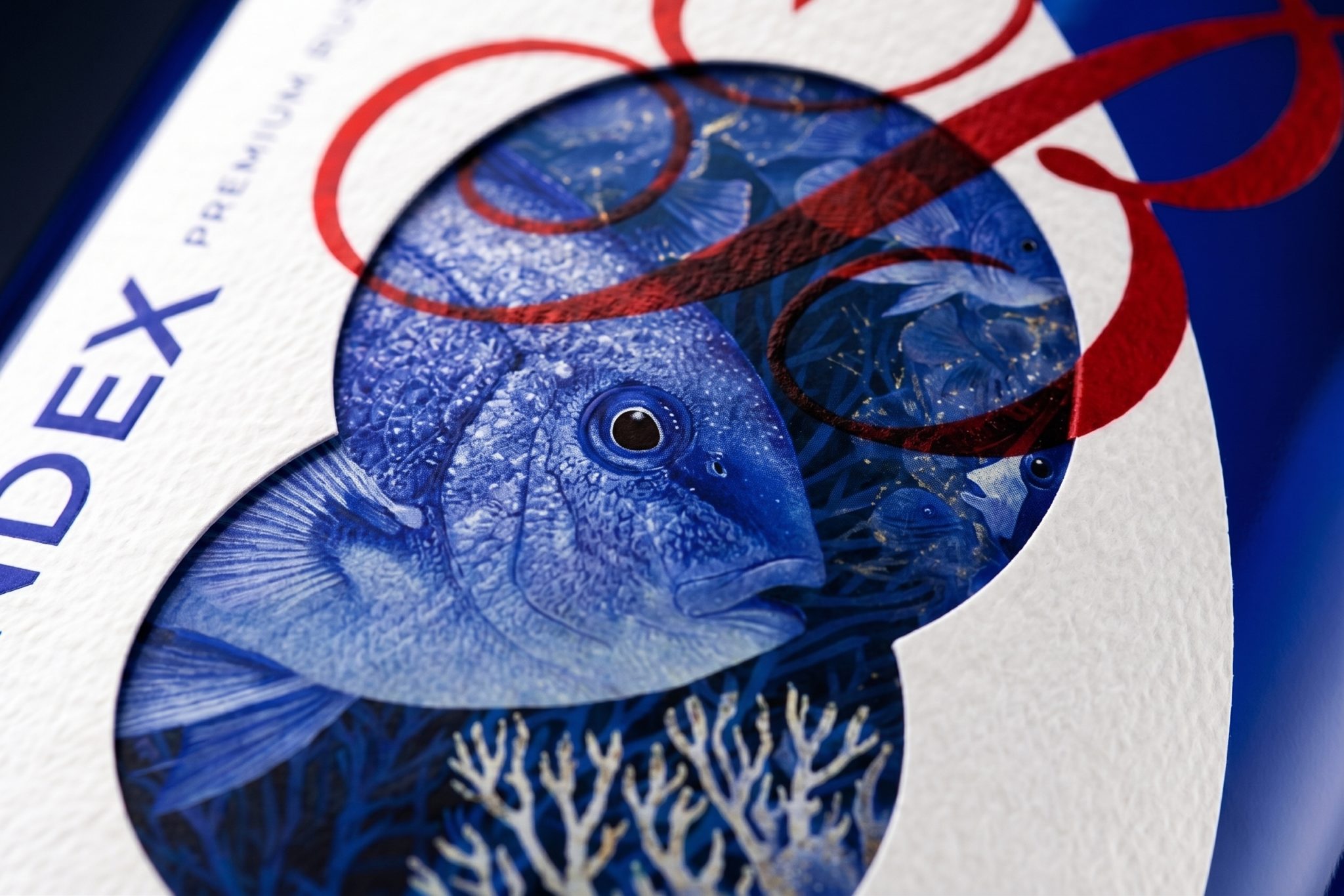
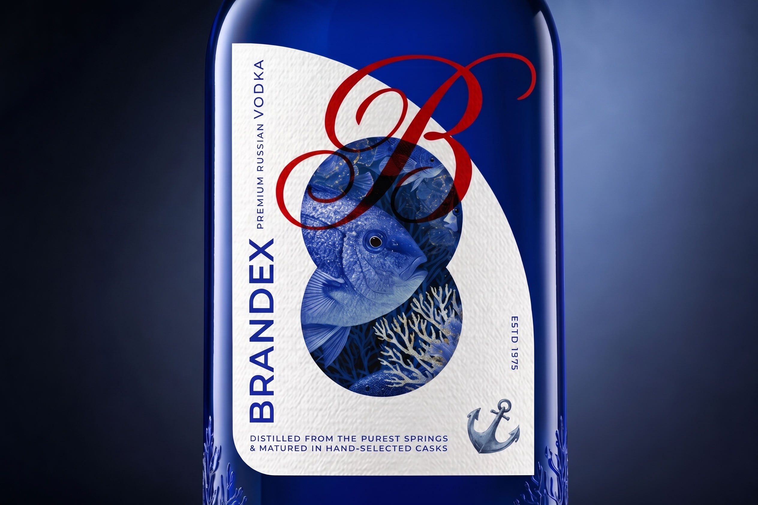
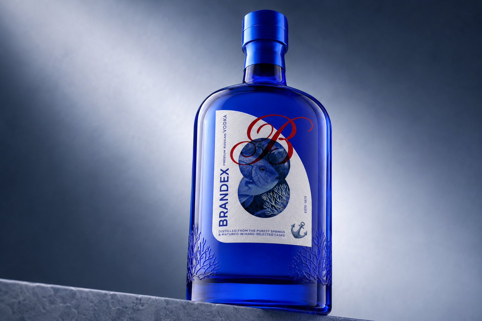
Hidden inside the layered circles of the BRANDEX label, the fish is not simply an illustration. It is the central character of the packaging a symbol of movement, curiosity, and the mysterious life that exists beneath the surface.
At first glance, only fragments are visible.
A fin appears through one circle. Coral grows through another. Textures overlap, disappear, and return.
The full image is never revealed immediately, encouraging the viewer to move closer and discover the composition piece by piece.
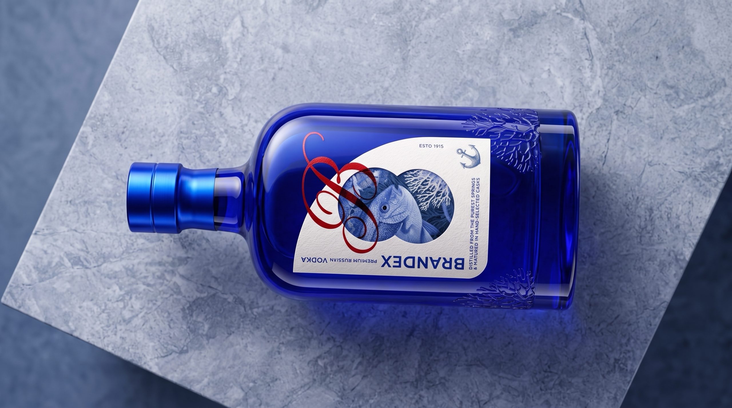
Just as a fish changes direction beneath the water, the packaging transforms with every angle.
The cobalt blue glass creates the feeling of looking into the ocean at its deepest point. Light travels across the bottle like sunlight beneath the surface, shifting between brilliant blue, soft transparency, and almost complete darkness.
Within this changing environment, the fish remains the visual guide.
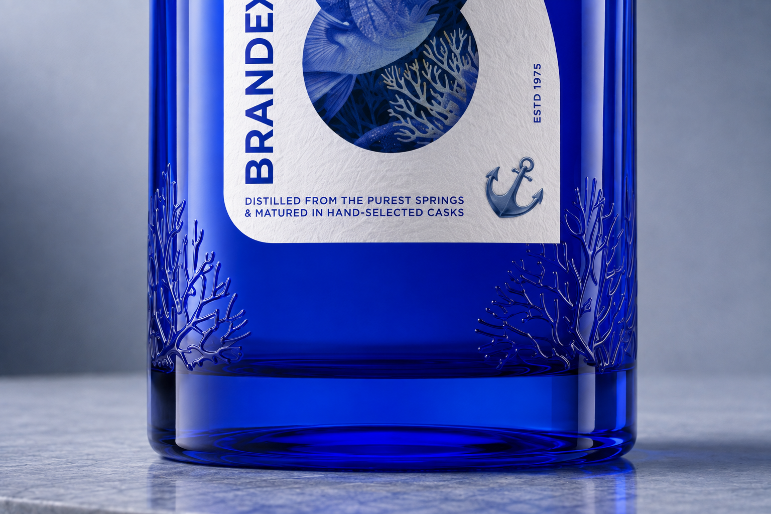
Its detailed illustration brings life to the structured geometry of the label, while the surrounding coral creates a world for it to inhabit. These marine elements continue beyond the printed surface through coral formations embossed into the lower glass.
The story is no longer limited to what can be seen.
It can also be touched.
A flowing red monogram moves across the fish and circular forms like a current passing through the composition. Its expressive movement contrasts with the disciplined vertical typography, bringing together freedom and structure within one identity.
From a distance, the bottle feels bold and mysterious.
Up close, the fish begins to emerge.
Every circle reveals another detail. Every reflection changes the atmosphere. Every angle offers a different interpretation of the world contained within the blue glass.
The fish was chosen because it never stands still.
Neither does this packaging.
BRANDEX is designed to move with the viewer to reveal itself slowly and reward those who choose to look beneath the surface.
Because some stories are not meant to be understood at first glance.
They are meant to be discovered.
Curator’s Insight
The label’s central move is withholding the image rather than presenting it. The fish, coral, and surrounding marine texture are cropped into a stack of intersecting circles, so no single shape contains a complete picture. Only in combination, and only when the eye moves across them, does the illustration cohere. That’s a compositional choice, not a decorative one: it turns a static label into something read sequentially, closer to how the eye actually scans a bottle on a shelf.
The red monogram earns its place by working against that structure rather than inside it. Where the circles are geometric and contained, the signature line sweeps diagonally across all of them in one continuous stroke, ignoring the boundaries the fish illustration respects. That contrast (contained versus unbound) is what keeps the mark from reading as a stamped logo. It behaves more like a gesture caught mid motion, which suits the swimming subject underneath it.
Extending the coral into embossing on the glass itself, rather than stopping at the printed label, is the detail that separates this from a purely 2D exercise. It shifts the marine world from something depicted to something the bottle physically holds, so the concept survives contact even when the label’s colors shift under different light.
 Eva Chistyakova
 Puigdemont Roca
 marianaaworks
 bloomburo
 andreamarinnn
 Alina
Alina Saadmost
 Bruhken
 Maruf Nishat
 Richest Branding Pvt. Ltd.
 Sophiagdotcom
 saifullahmaslool
 Up-Brands
 Atiq Alam
 daniitenaa
 artworkbysofia
 Valérie Colace
 Tianqii
 Anum
Anum anisameur
 tauqueer
 SOT B&D
 Palashcc
 Derrick Lin
 Biaa
Biaa