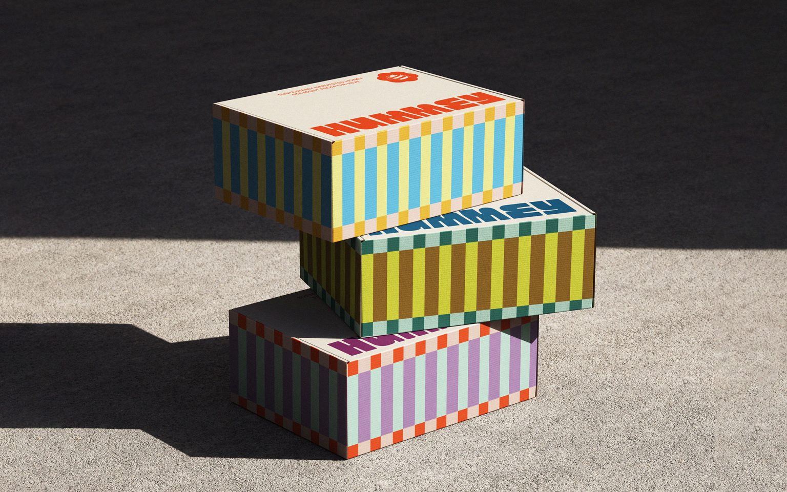

Honey has always been one of nature’s purest sweeteners, so why not give it a fresh perspective? Rather than reinventing the product itself, the project explores how thoughtful branding and packaging can transform a familiar pantry staple into something playful, contemporary, and full of personality. Built around locally sourced, sustainably harvested honey, Hummey celebrates natural ingredients while introducing unexpected flavor twists through its collection of Pure, Citrus, Smoky, and Spiced honeys.
The goal was to create a brand that feels as warm, approachable, and vibrant as the product itself. Inspired by the friendly character of bumble bees, the identity balances softness with structure, creating a visual system that is instantly recognizable while remaining simple and flexible.
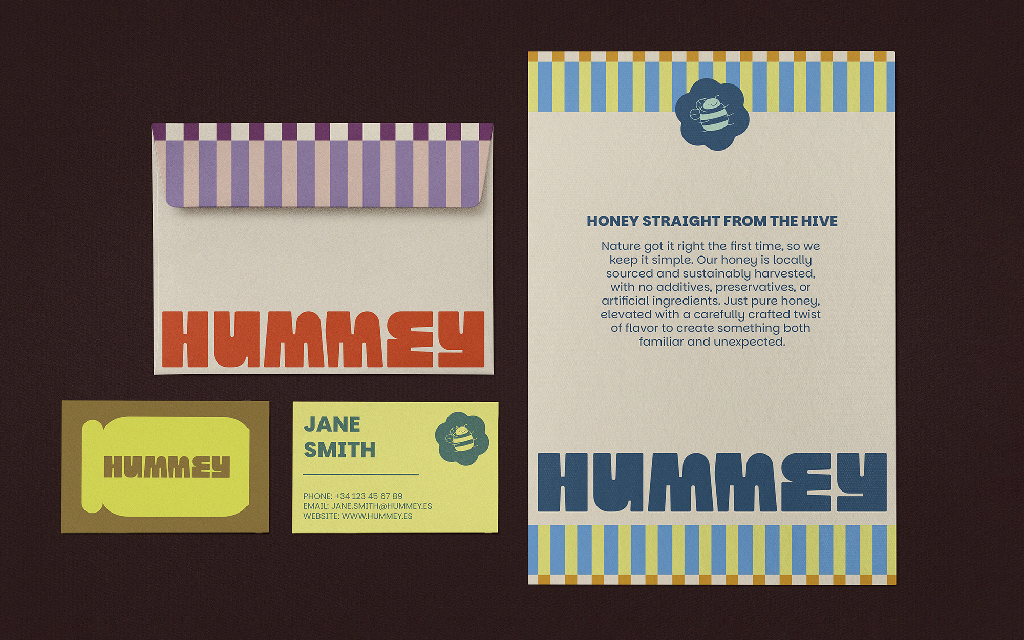
The logo is based on the contrast between the fluffy, rounded silhouette of a bumble bee and the clean geometry of a honeycomb. Soft curves meet straight lines, creating a mark that feels both natural and fun. This same visual language extends throughout the identity, allowing every element to feel connected while maintaining a strong and memorable presence.
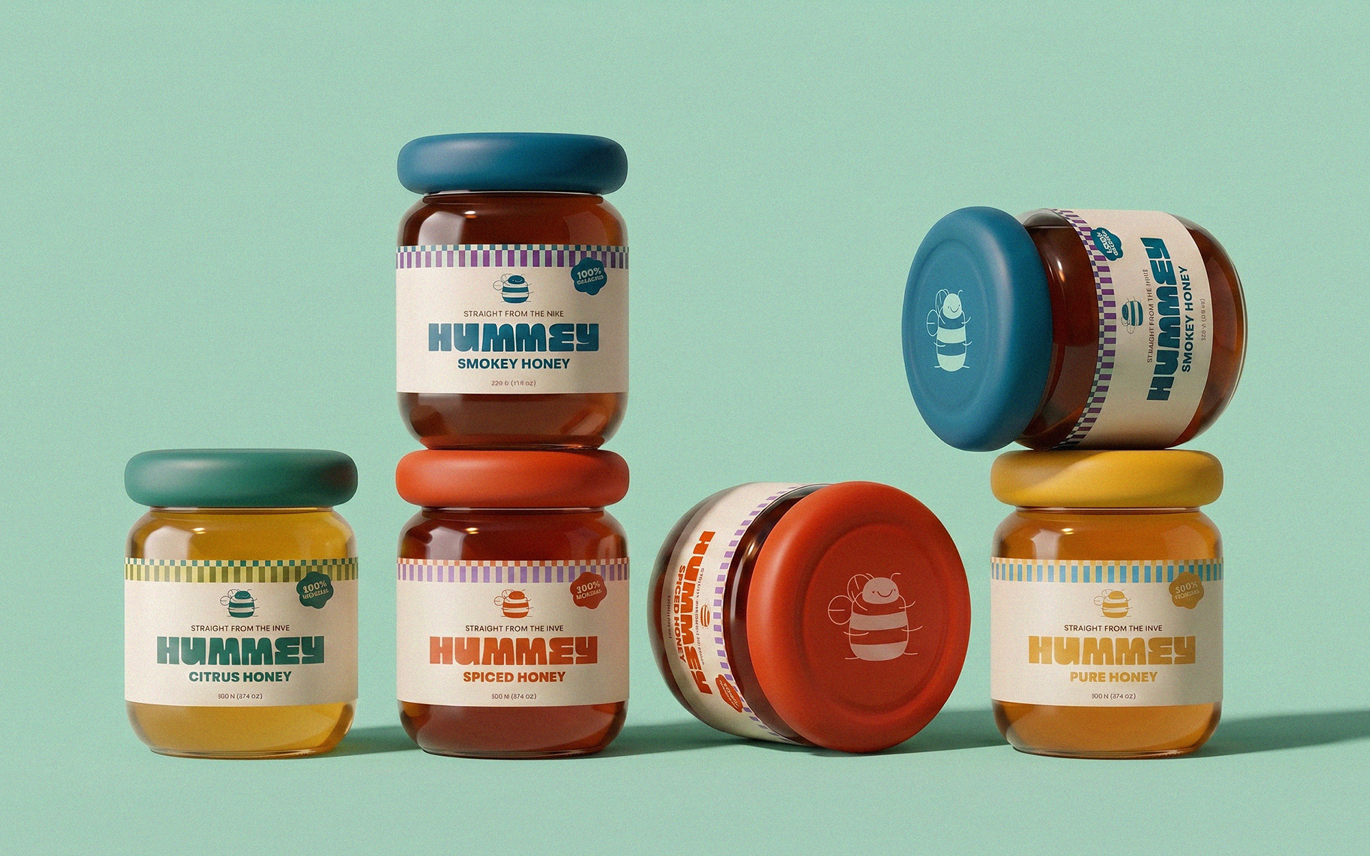
The packaging for Hummey was inspired by the soft, rounded forms of bumble bees. This idea first came to life through a custom mascot, designed with the same fluffy, chunky proportions that make bumble bees so cute. That visual language then influenced the shape of the jars, giving them a softer silhouette than what’s typically found in the honey category. As the project evolved, the relationship became reciprocal: the mascot inspired the packaging, while the packaging reinforced the mascot, creating a cohesive identity where every element feels naturally connected.
The packaging system brings together three core graphic elements: the logo, the mascot, and a series of bold stripes inspired by the distinctive markings of bees. Combined with a palette of warm, vibrant colors, these elements create a collection that feels energetic and easy to navigate across the four flavor varieties. Each product maintains its own personality while remaining unmistakably part of the same family.
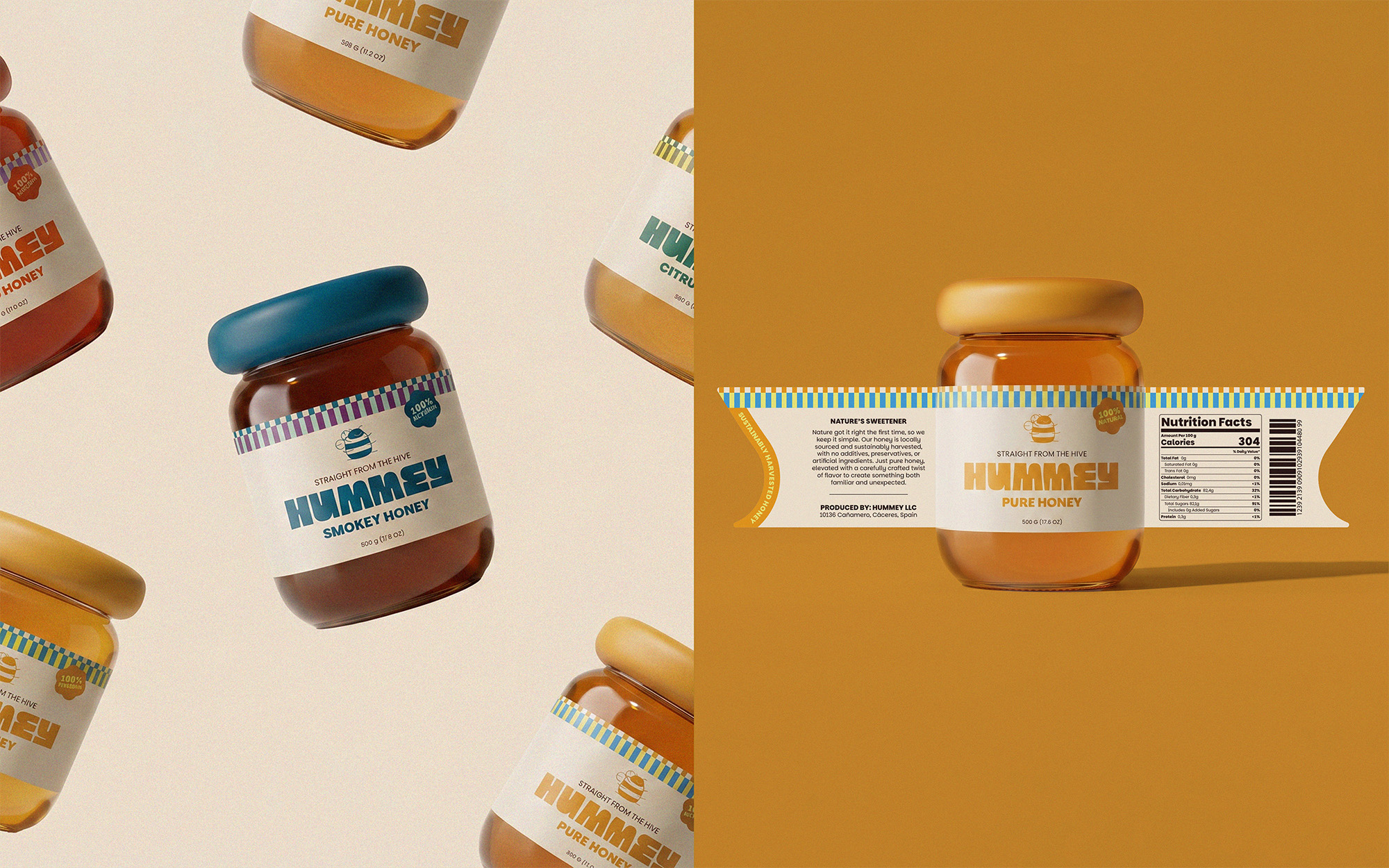
The identity also communicates the values behind the product. Messaging throughout the packaging emphasizes locally sourced honey, responsible harvesting practices, and the absence of additives, preservatives, or artificial ingredients. Rather than competing with nature, Hummey celebrates it, adding only a thoughtful twist to an ingredient that has been loved for generations.
Hummey is an invitation to rediscover a familiar product through a more playful, contemporary lens. By combining a distinctive visual identity with an approachable tone and expressive packaging, the project transforms everyday honey into an experience that feels memorable and full of character.





 Natasha Spitsyna
 babyage
 GruppoSaida
 ahmedraoudgfx
 Hi estudio
 Nadezhda Gorelikova
 Studio Garces
 Brandsbylufo
 Rewot
Rewot alchimistestudioParis
 Asprey Creative
 kat bres
 Valérie Colace
 Atiq Alam
 Sara Communications
 David Hakobyan
 monther al omari
 Innovāt - Empowering Creative Innovation
 mmdesign
 Amjad Battal
 Hollóka Grafikai Műhely / Graphic Design Studio
 Palashcc
 ABC Design Communication
 ChrisSkarlatos
 Hedayat Hadavi
 Tia Nguyen