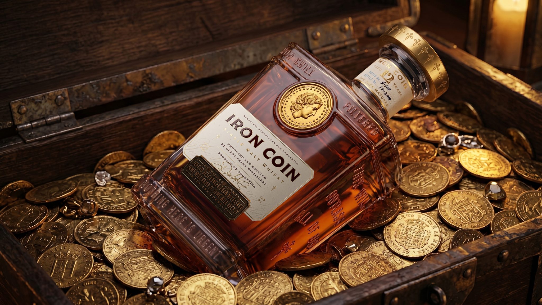

Iron Coin is a self-initiated premium whisky concept built around the idea that true value is not defined by price alone, but by weight, time, memory and inheritance. The project explores how packaging can transform a bottle into a collectible object, giving every component a role in the story and extending the experience beyond the liquid itself.
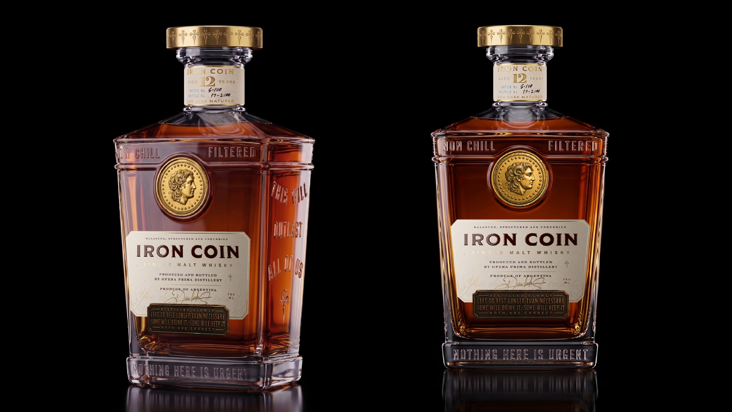
At the center of the system is the coin: both a physical artifact and a symbol of permanence. One coin is embedded into the bottle, while another becomes part of the opening ritual, reinforcing the sense that the product is meant to be kept, handled and passed on. The bottle combines heavy glass, warm amber tones, engraved details and metallic elements to create a visual language that feels industrial, ceremonial and timeless.
The outer case extends that experience through layered materials, distressed surfaces and references to old currency, machinery and archival objects. Rather than relying on decorative excess, the design builds character through texture, proportion and material contrast. Every decision—from the typography and embossed lettering to the magnetic coin, sculpted cap and metal base label—was conceived to make the packaging feel substantial and purposeful.
The identity was developed as a complete narrative system, connecting naming, typography, symbols, materials and structural details under one central idea. The result balances the familiarity of traditional whisky codes with a more object-driven and contemporary approach.
Iron Coin proposes whisky packaging as more than protection or presentation. It becomes part of the product itself: a vessel, a ritual and a lasting object shaped by patience, craft and symbolic value.



 Derrick Lin
 salutifg
 ADStudio
 WeAreDepot
 Manuvila
 Yellow Umbrella Creative
 Toka
Toka Studio Zak
 Atiq Alam
 monther al omari
 Modern Theory
 Sirka Agency
 DESIGN CONCEPTS
 Eva Chistyakova
 Puigdemont Roca
 marianaaworks
 bloomburo
 andreamarinnn
 Alina
Alina Saadmost
 Bruhken
 Maruf Nishat
 Richest Branding Pvt. Ltd.
 Sophiagdotcom
 saifullahmaslool
 Up-Brands