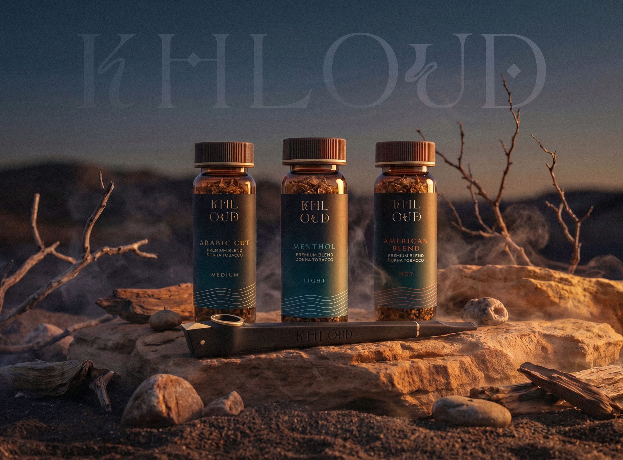

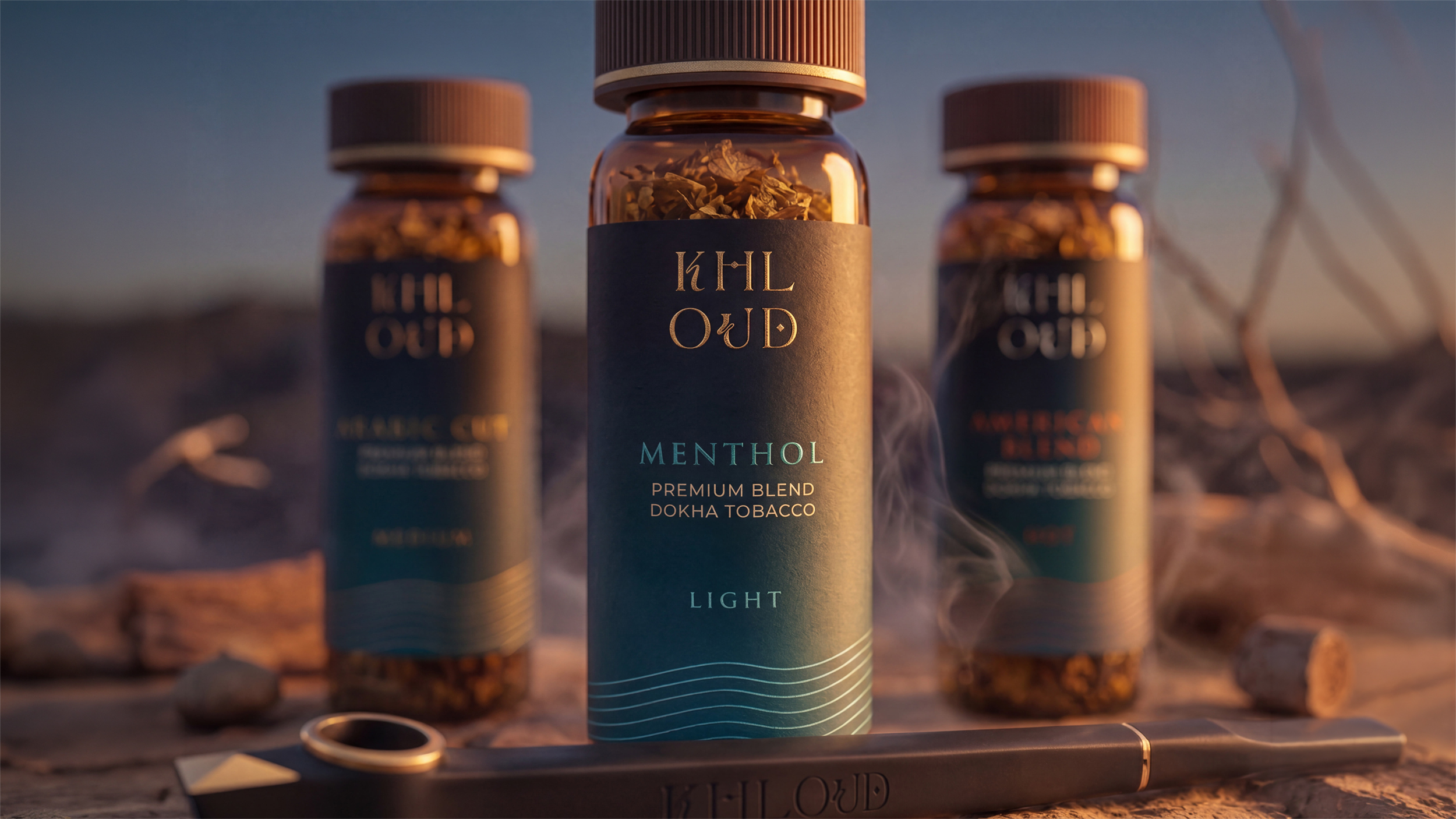
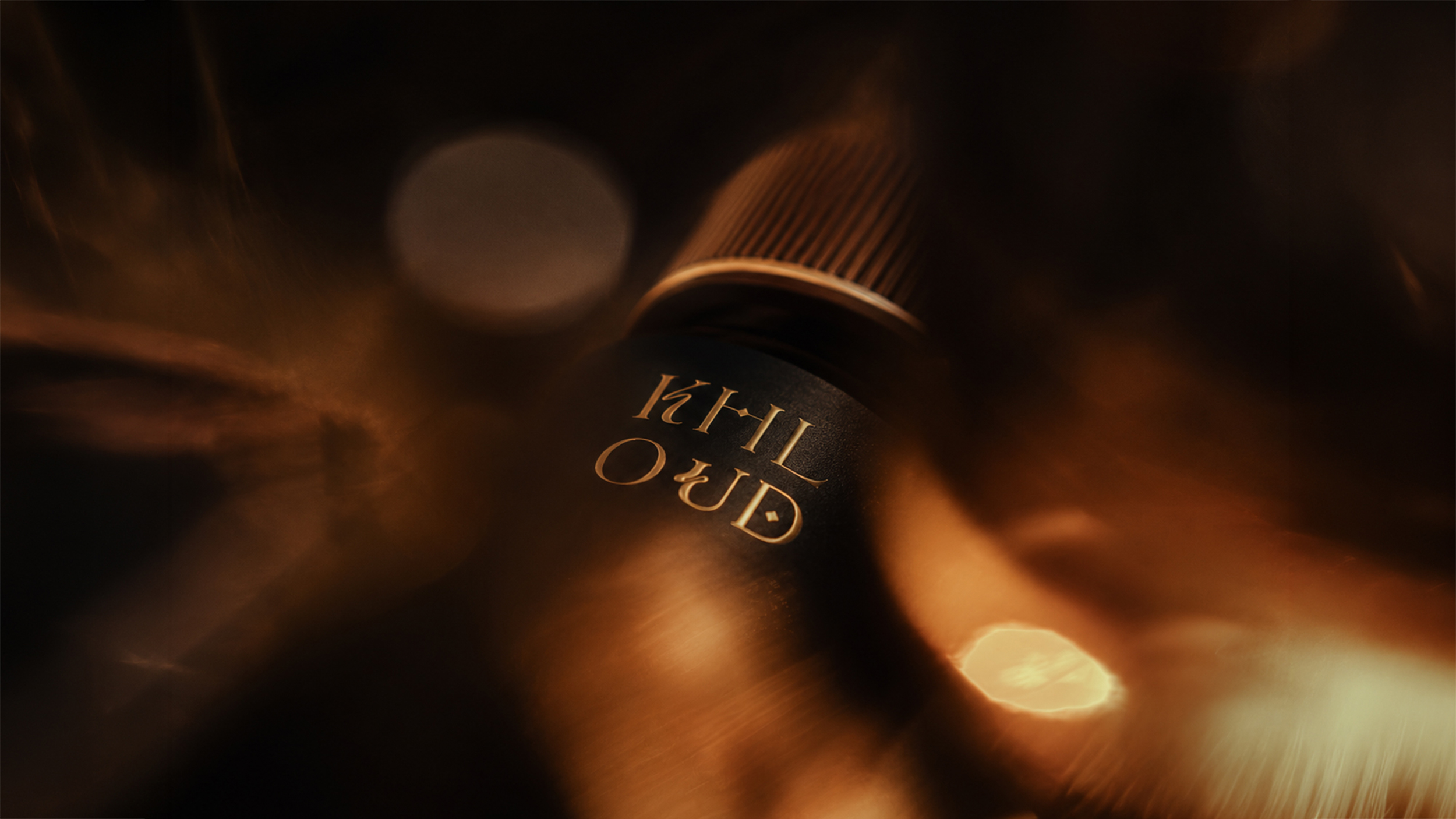
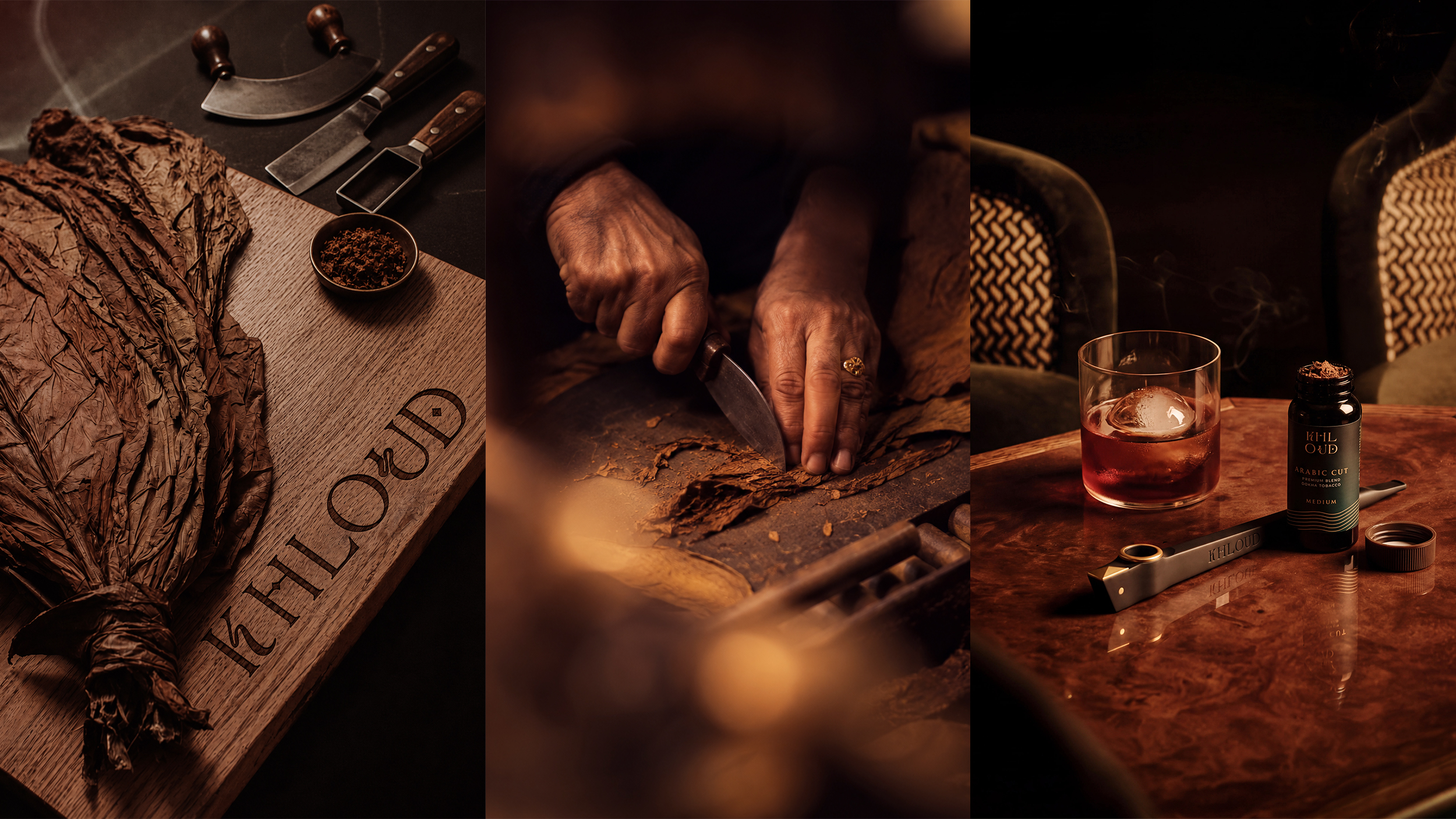
Khloud was built around a simple idea: true confidence doesn’t need to be loud. The challenge was to translate this philosophy into a distinctive packaging identity that would attract attention not through visual noise, but through clarity, restraint and character.
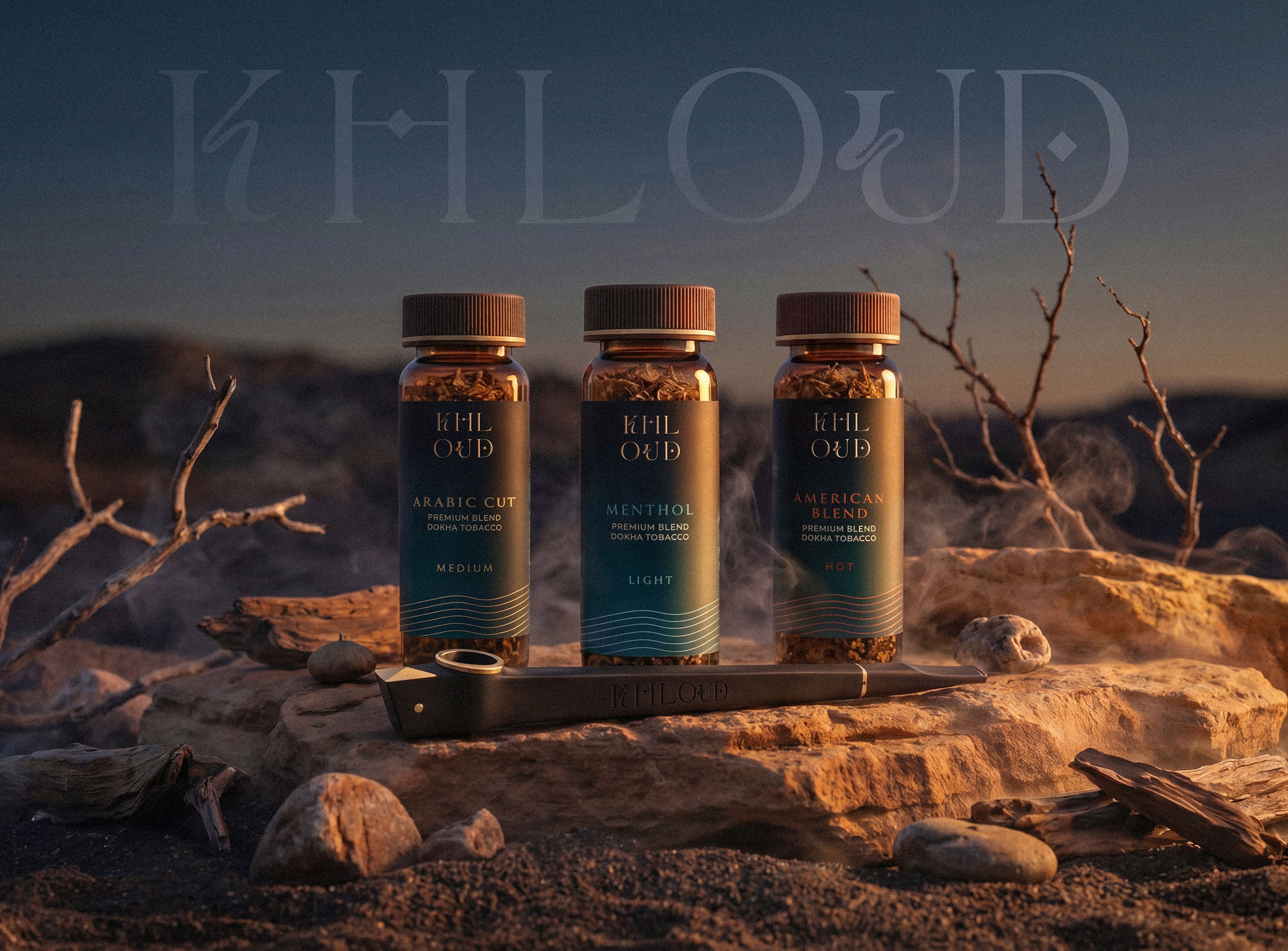
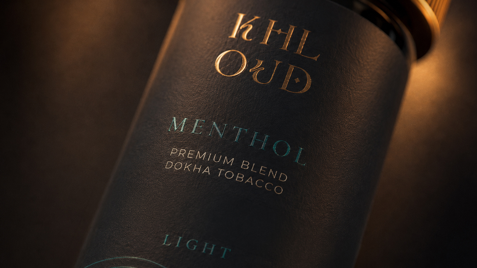
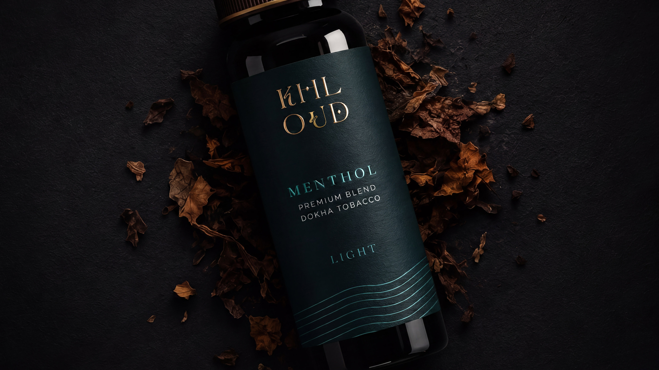
The creative concept is rooted in contrast. While the name suggests something light, soft and almost intangible, the brand needed a strong and recognizable presence. This tension became the foundation of the packaging system, using confident typography, carefully considered composition, color and negative space to create a contemporary and premium visual language. Every element has a reason to be there, with nothing added simply to fill space.
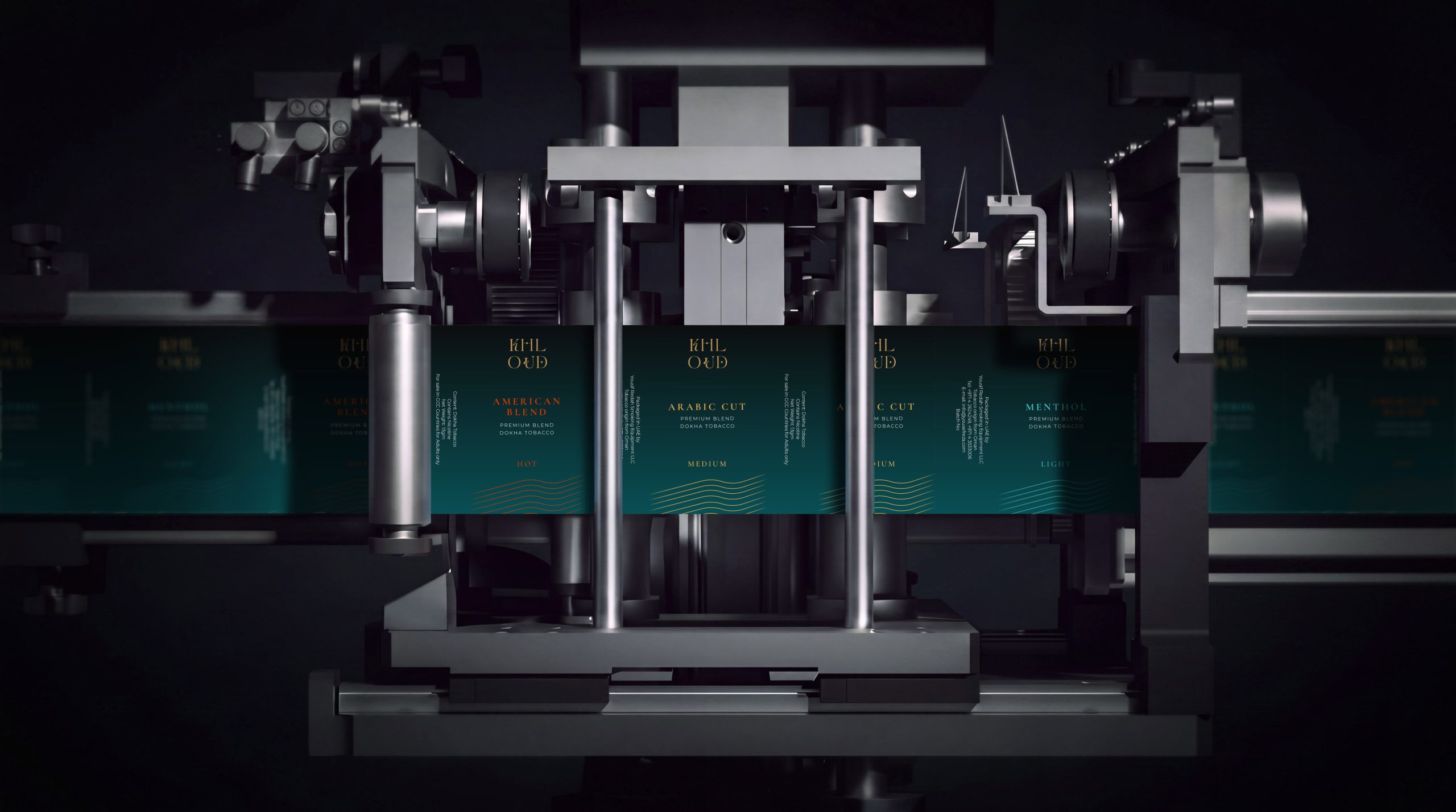
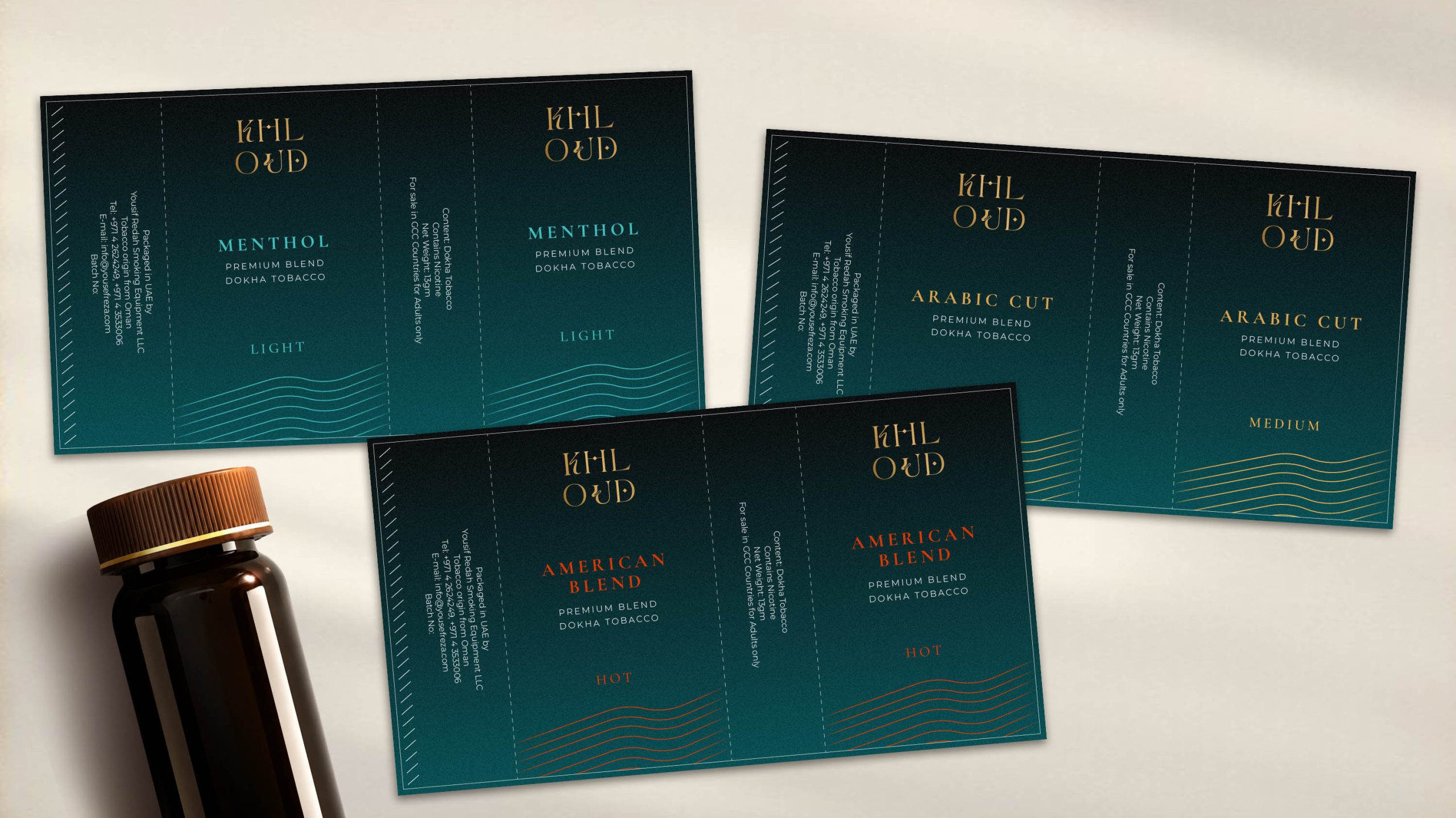
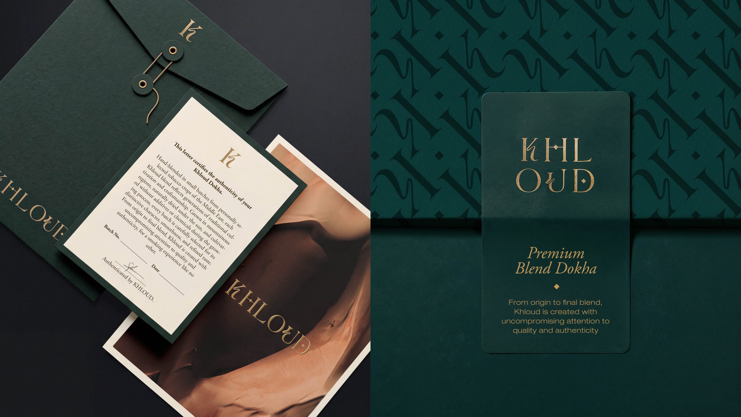
Rather than treating each package as an isolated design, the system was developed as part of a wider, coherent brand experience, ensuring recognition and consistency across the range and other brand touchpoints. By reducing unnecessary visual information, the identity itself becomes the hero, allowing typography, proportion and composition to carry the brand’s personality.
The result is a packaging identity that feels premium without being distant, contemporary without being trend-driven, and expressive without becoming excessive. Khloud challenges the idea that packaging needs to become louder in order to become more visible. It doesn’t ask for attention – its visual confidence earns it.





 Derrick Lin
 Biaa
Biaa Petitmoulin Studio
 White Bear Studio
 Eva Chistyakova
 monther al omari
 Atipus
 alchimistestudioParis
 oneandother
 bloomburo
 helocrene
 Shapers Studio
 Denver Design
 Aidearte
 andrew.huerta
 softmachine
 airobtq
 Buzz & Co.
 Ruby
Ruby themythographer
 IDNB Inc.
 viktorflr
 Zenpack