
A Modern Expression of Precision and Tradition
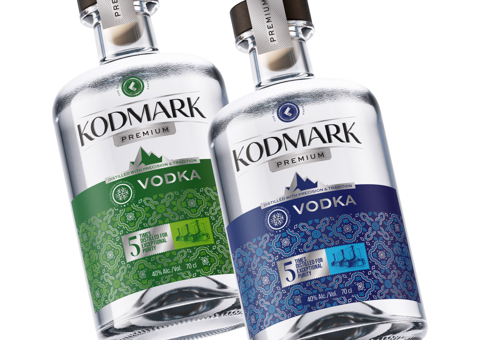
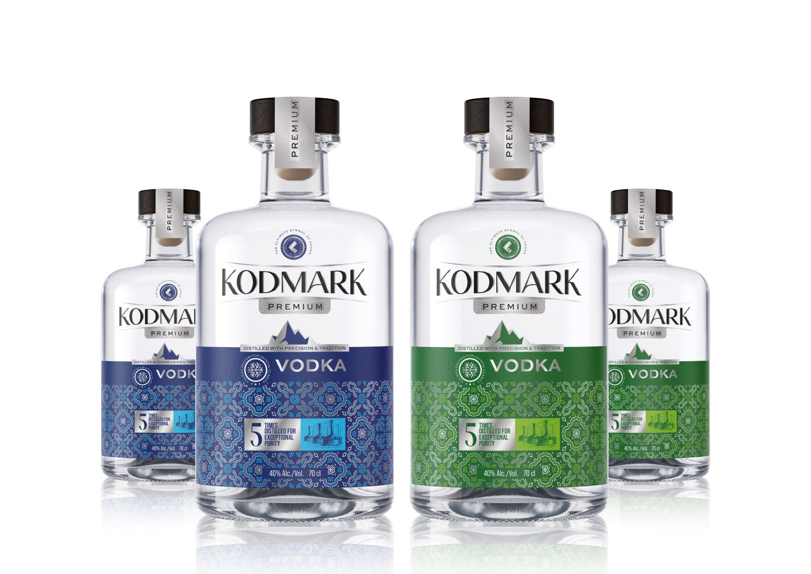
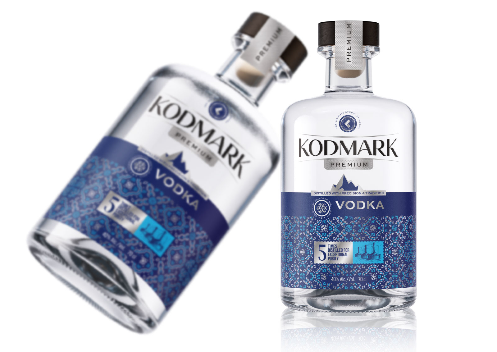
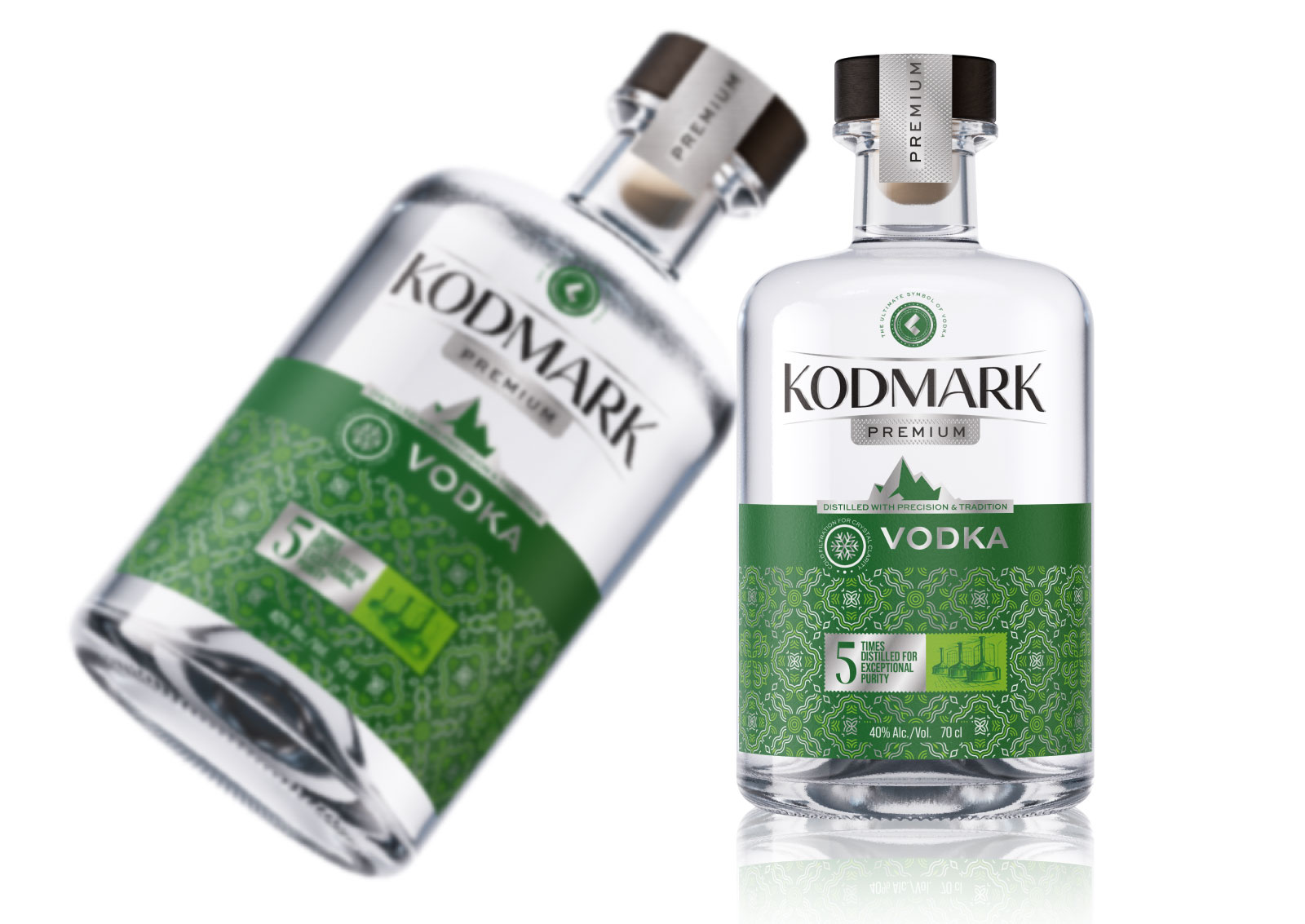
This project presents the packaging design concept for KODMARK Premium Vodka. The core approach of the design focuses on creating a balanced brand identity built upon purity, sophistication, and modern visual structure. The clean and strong form of the bottle is supported by a sharp and readable typographic hierarchy that reflects a confident premium character.
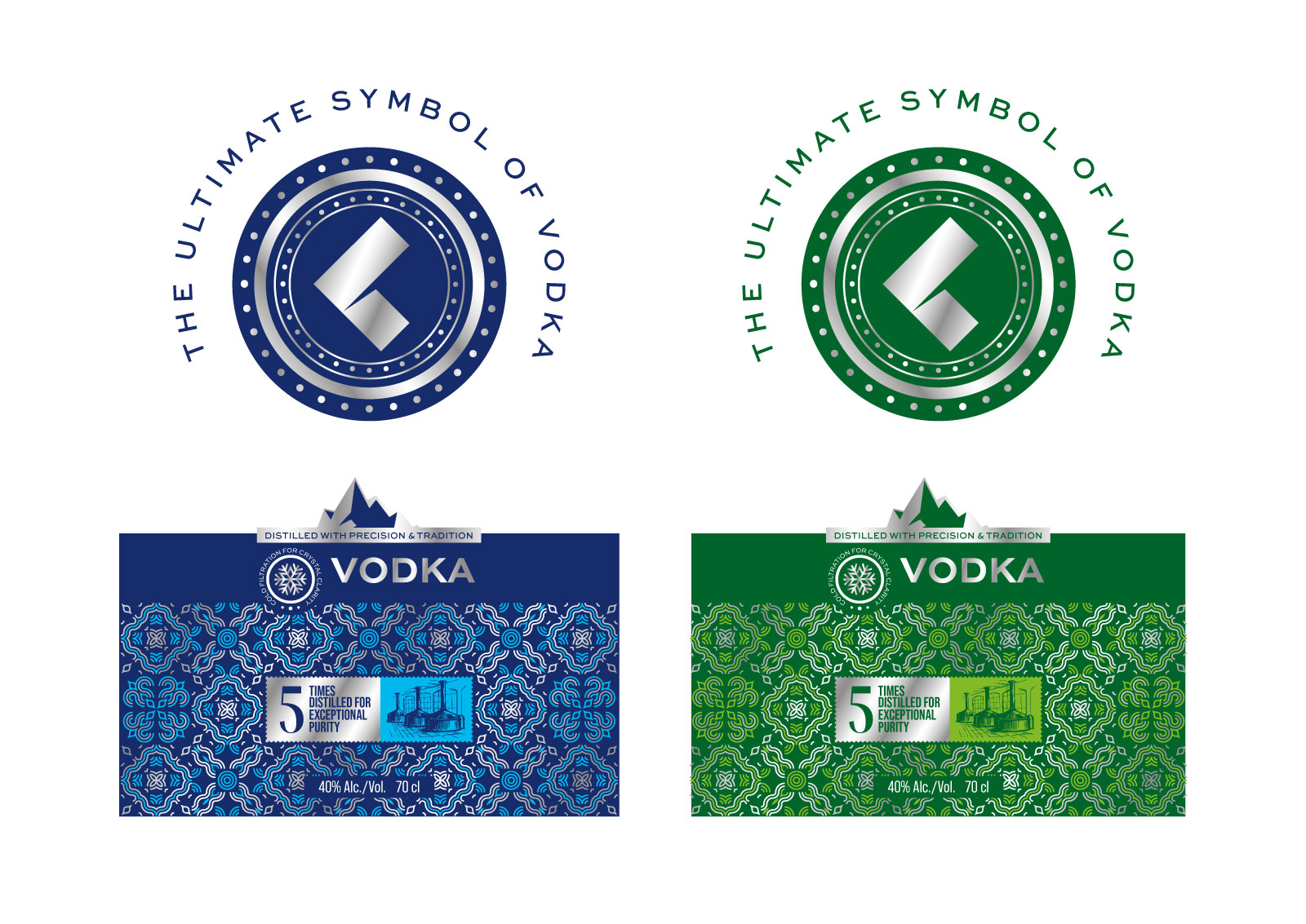
The mountain silhouette featured on the label symbolizes “cold clarity” and a sense of refined quality, while the detailed geometric pattern on the lower section introduces a contemporary interpretation of the traditional distillation craftsmanship. The green and blue color variations ensure product distinction within the same line while maintaining consistent brand integrity.
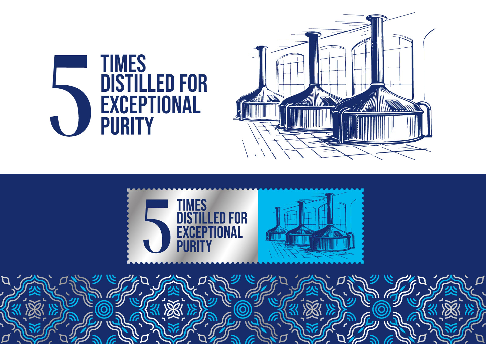
The prominently placed “5 Times Distilled for Exceptional Purity” statement highlights the technical superiority of the product and reinforces the perception of a premium taste experience. Transparent elements integrated into the label allow direct interaction with the glass surface, resulting in a seamless, modern, and visually clean overall aesthetic.

 monther al omari
 Shustova p
 mutta
 @Allenarts13
 Sirka Agency
 Atiq Alam
 Dozen Agency
 j.substance
 SCD
 Cristian Lepore | crilep Copia
 Chris Creative Works
 Aligned Design Co.
 CreativeWise
 Agence des Coteaux
 Ramyromeo2024
 Grain of Design ®
 Ebbi
 BFS Studio
 butterflyhunters
 Asprey Creative
 About House of Ta
 Up-Brands
 KJS CRAFT
 hello ocean
 PG Branding