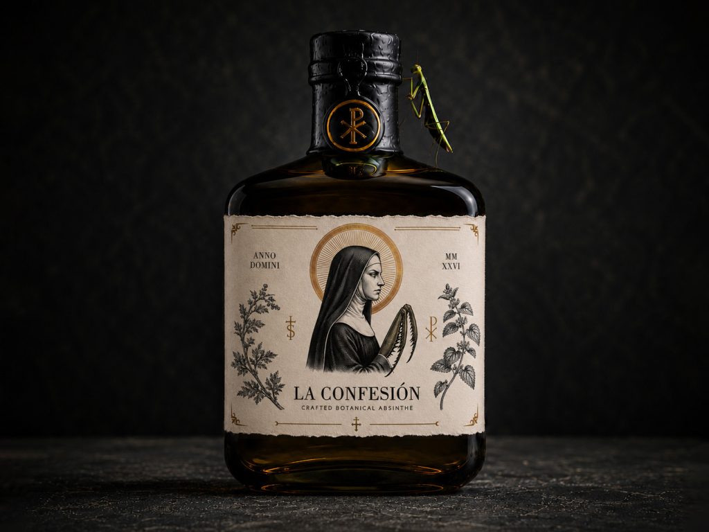

La Confesión is a premium botanical absinthe identity inspired by the tension between devotion and instinct. Distilled in small batches in Madrid, the spirit is crafted with grand wormwood, green anise, lemon balm and a selected blend of botanicals, combining the traditional absinthe ritual with a darker narrative.
THE ILLUSTRATION
At the centre of the packaging is a solemn nun whose praying hands transform into the forelegs of a praying mantis. The image creates a symbolic contrast between faith, restraint and concealed predatory instinct.
Botanical engravings, sacred iconography and antique-gold details extend this idea across the visual identity, giving the bottle the character of an aged devotional artefact.
MATERIALS & FINISHES
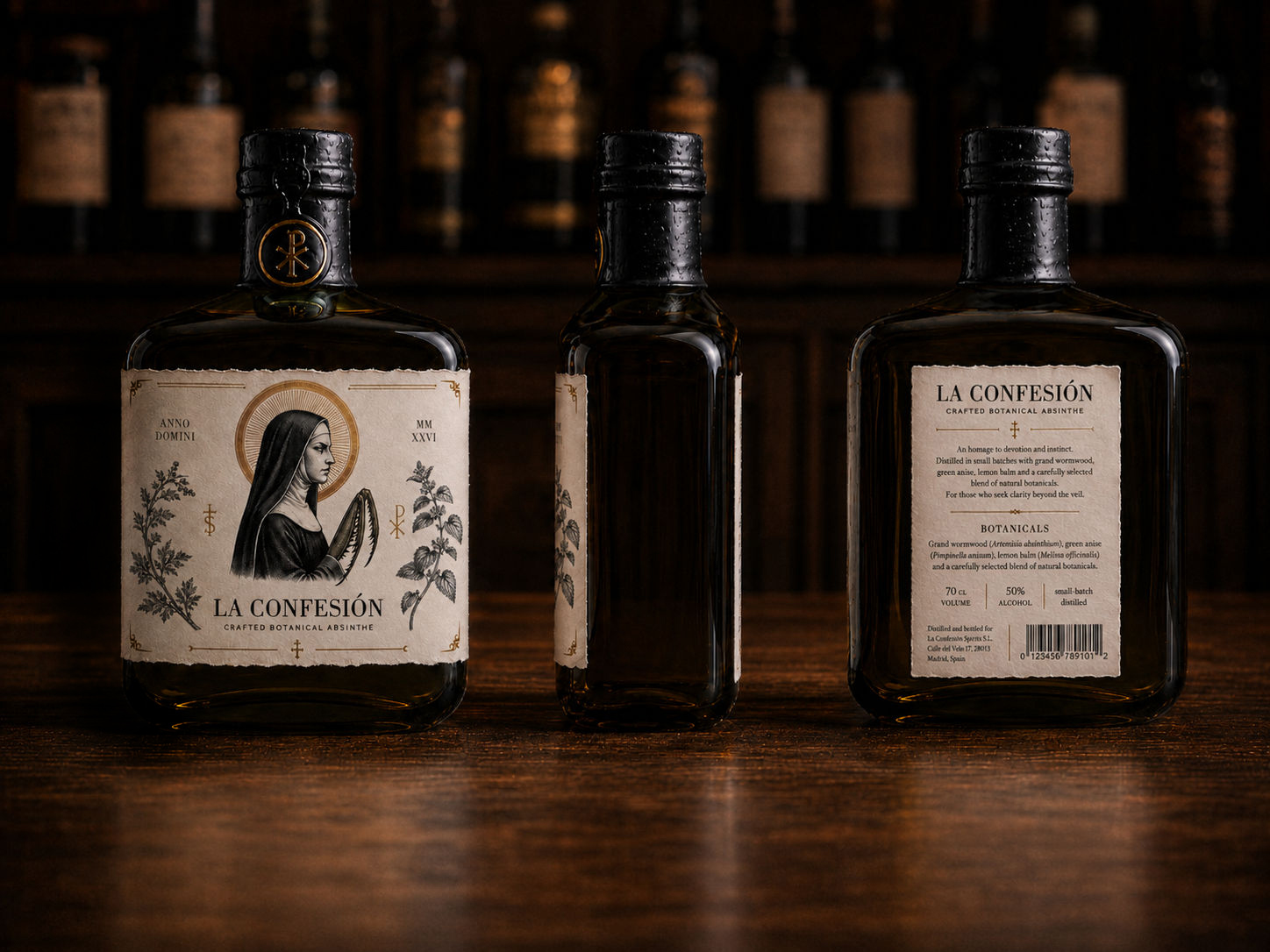
The label is presented on textured, fibrous paper with irregular deckled edges, while the bottle is finished with a black wax neck wrap and an embossed Chi-Rho medallion.
A restrained palette of parchment, ink black, botanical olive and antique gold reinforces the archival and ceremonial atmosphere.
THE PACKAGING SYSTEM
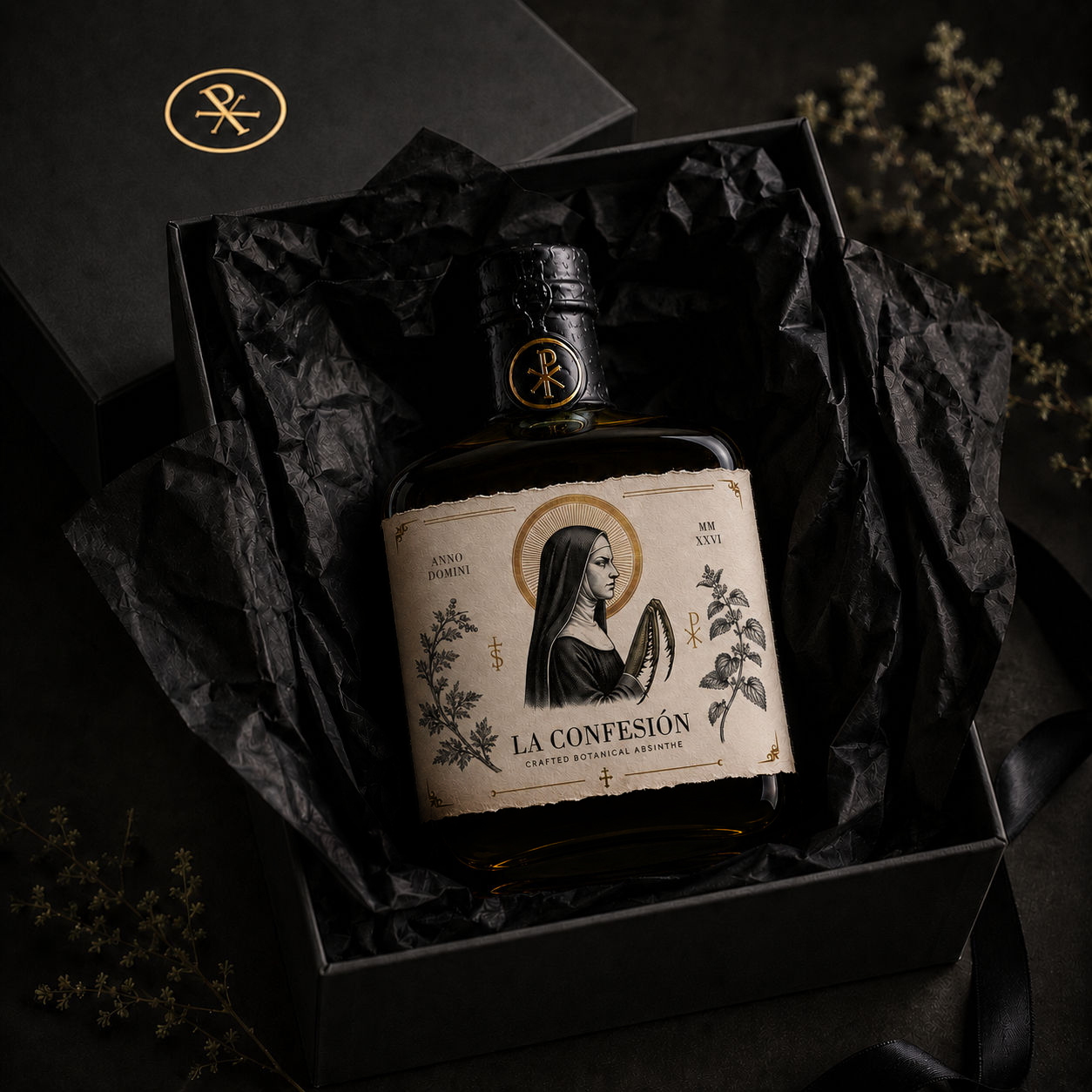
The packaging system includes the front and rear labels, bottle detailing, presentation box and a series of supporting graphic elements developed from the halo, Roman numerals, botanical engravings and mantis anatomy.
Each component contributes to a cohesive identity that feels tactile, mysterious and rooted in ritual.
THE ABSINTHE RITUAL
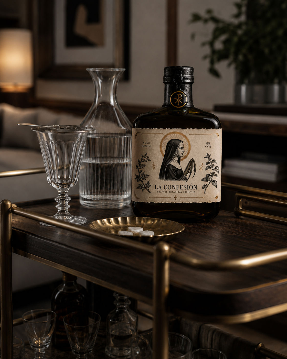
As chilled water passes slowly over a sugar cube, the clear botanical spirit transforms into a pale, opalescent louche.
This visible transformation reflects the central idea of La Confesión: something restrained and transparent gradually revealing a more complex and mysterious nature.
Curator’s Insight
What makes La Confesión work isn’t the shock value of a nun with insect limbs, it’s the discipline of where that image is allowed to appear. The mantis transformation is confined entirely to the hands, a single anatomical substitution inside an otherwise conventional devotional engraving. Everything else on the label, from the halo to the Roman numeral dating system to the botanical framing, plays it completely straight.
That containment is the actual design decision. A less confident system would have pushed the predatory motif into the typography, the box, the wax seal, anywhere it could get more mileage. Instead it appears once, at the point of highest symbolic tension, and lets the rest of the identity carry it through implication rather than repetition. The Chi-Rho medallion and the botanical engravings don’t reference the mantis directly, but once you’ve seen the hands, you read the whole label differently. Every quiet element starts to feel like it’s concealing something.
That’s a useful lesson for any identity built around a single conceptual twist: the twist earns more attention by appearing exactly once and trusting the surrounding system to carry its implications, rather than diluting it across every touchpoint.


 United Creatives Studio
 Kingdom & Sparrow
 Anastasia Bakhmatskaya
 CreativeWise
 Great and Golden
 Ximena Ureta Design Studio.
 Sorted Branding
 Lisa Sirbaugh Creative
 vitoramockup
 YQIAN
YQIAN Navegante
 Anastasia Cherepanova | xtramez
 Polaris Designs
 pavlyai
 Milena Kocharyan
 monther al omari
 Mohamed sherif midoo
 DESIGN CONCEPTS
 mmdesign
 markcreativestudio
 Rosario Lo Iacono