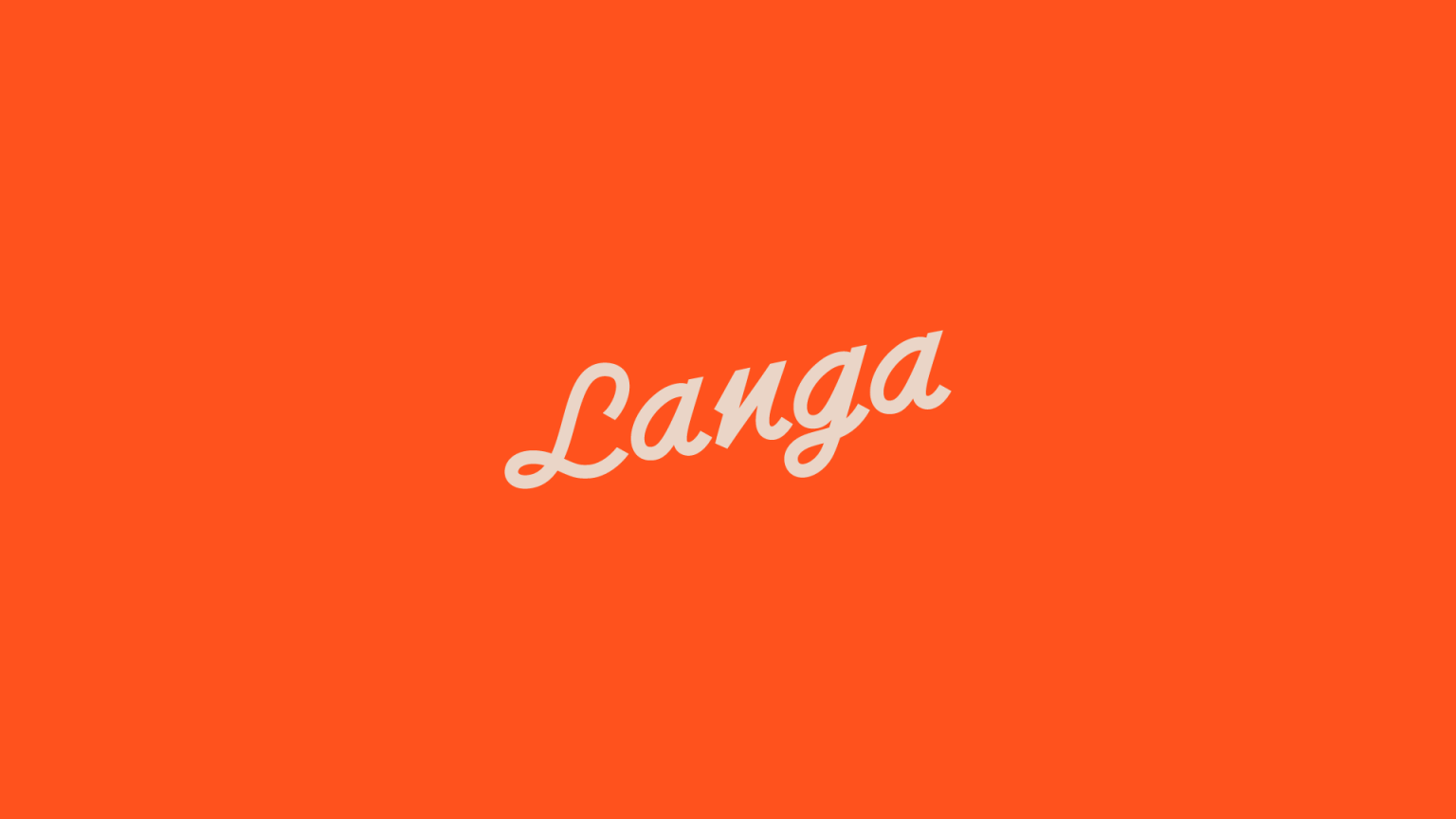

Langa is a new gastronomic concept built around one simple idea: a good milanesa sandwich doesn’t need much explanation. The brand embraces simplicity, honest ingredients and a reduced menu of classic recipes, turning an everyday Argentine favorite into a bold, contemporary experience. Its name comes from lunfardo, giving the project a popular, iconic and memorable personality.
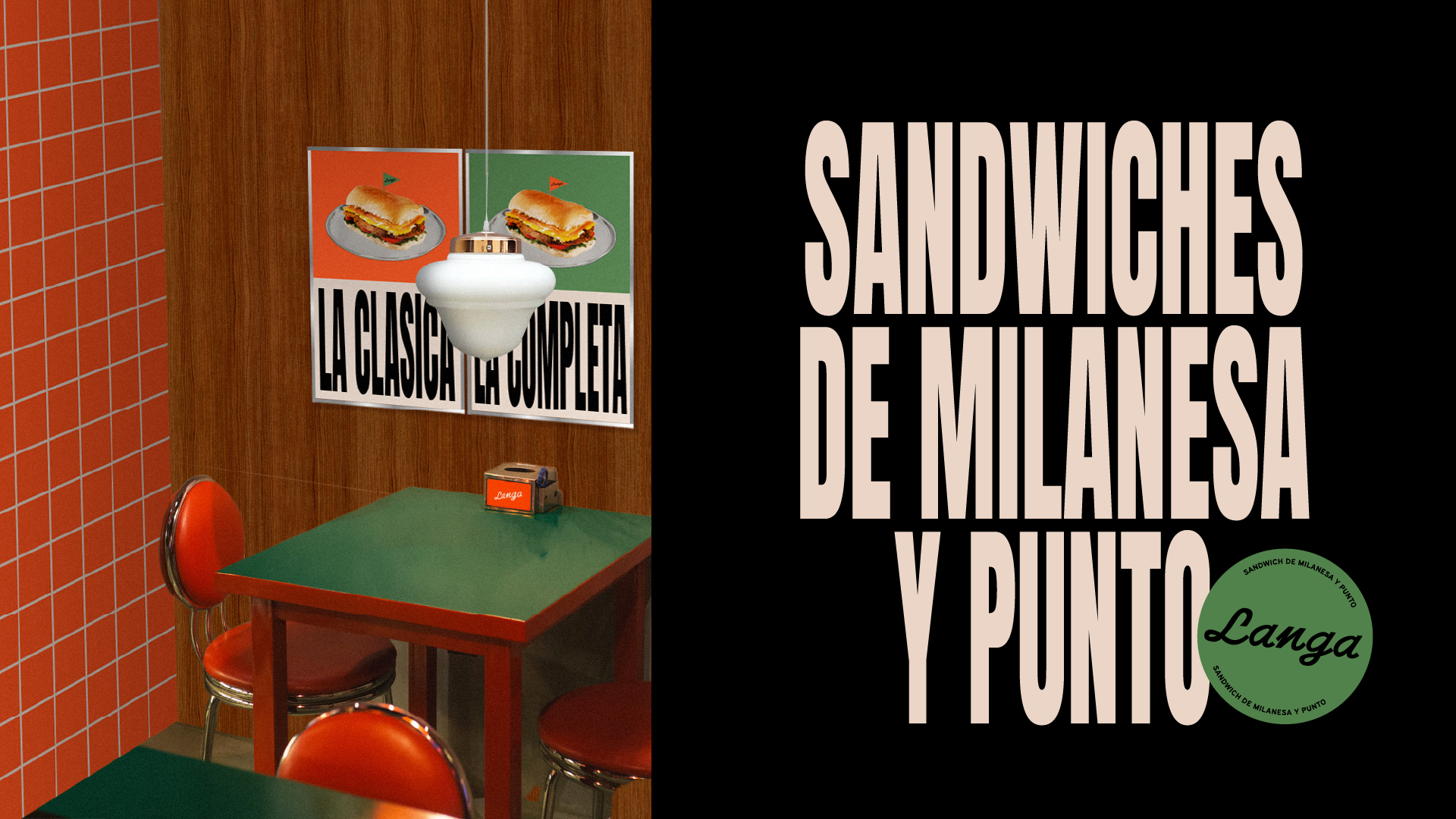
The visual identity translates that straightforward attitude into a striking system of stretched typography, warm orange, soft cream, green and black, combined with a handwritten logo that adds a more human touch.
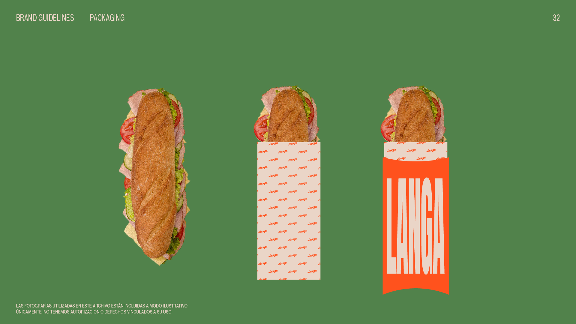
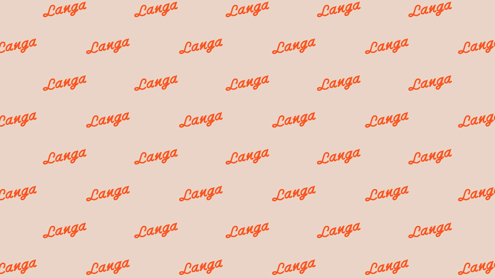
For the packaging, the system stays intentionally simple: repeating logo patterns, oversized typography and strong color blocking wrap the sandwich without competing with the product itself. The result is a packaging language that feels direct, recognizable and deeply connected to the spirit of Langa: sandwiches de milanesa y punto.
Que Cálido Studio is a branding and packaging design studio based in Buenos Aires, creating brands, packaging, and visual systems for restaurants, food brands, startups, and companies bringing new ideas into the world.


 MID-AIR STUDIO
 Heramb Arora
 monther al omari
 Tríona O'Donoghue • Design
 Cocoon Prague
 alchimistestudioParis
 hugo zapata
 Bonsanco Creative Studio
 parawaradesign
 UPRISE
 Brand Society
 Richest Branding Pvt. Ltd.
 STRATEDGY
 Shapers Studio
 Platon Ivantsov
 WPA Pinfold
 giselepereiradesign
 ShalaSketches
 05Creation
 Voit Studio
 SSTO
SSTO Abox Agency