
Introduction
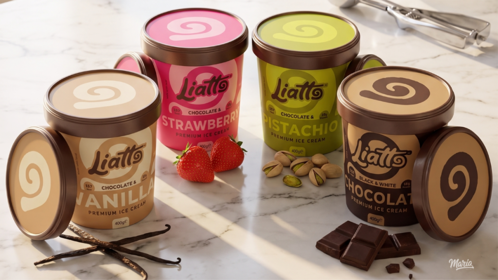
Liatto is a new premium ice cream brand that brings together the authentic taste of classic gelato with a modern, joyful aesthetic. This collection of four flavors—Chocolate & Pistachio, Chocolate & Vanilla, Chocolate & Strawberry, and Black & White Chocolate—offers an elevated dessert experience, captured through thoughtful packaging and vibrant photography.
Design Concept
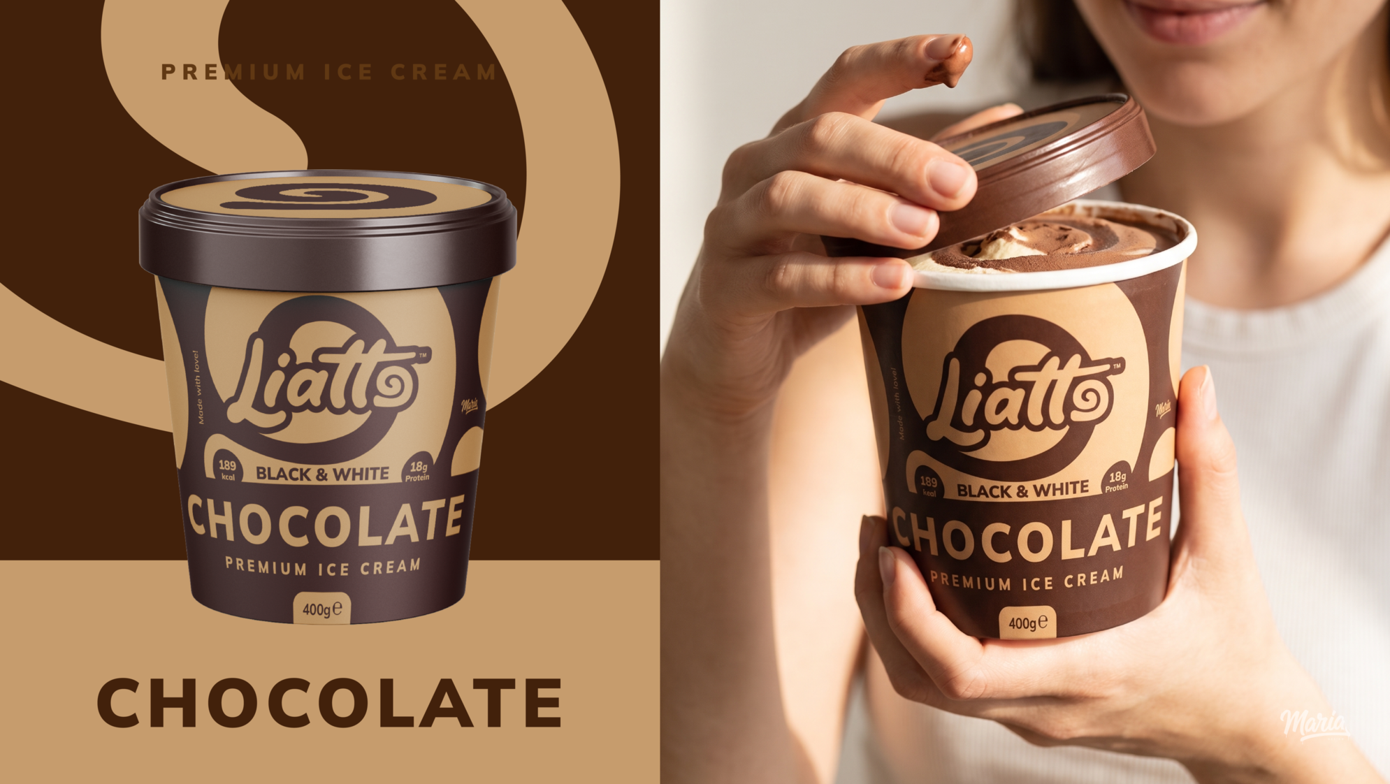
The core visual element of Liatto’s identity is the swirl. This spiral pattern is integrated both onto the lid and around the tub, mirroring the beautiful, mixed textures found inside each pint. The design is clean yet expressive, using clear typography and appetizing color palettes that correspond to each flavor combination.
The Packaging Experience
The 400g paper-based tubs are designed to be tactile and inviting. A key feature is the stylized motif that functions as a background design, symbolizing rich texture and a fresh start with every scoop. The visual elements provide a direct clue of the two flavors intertwined, creating anticipation for the first delicious spoonful.
Target Audience & Lifestyle
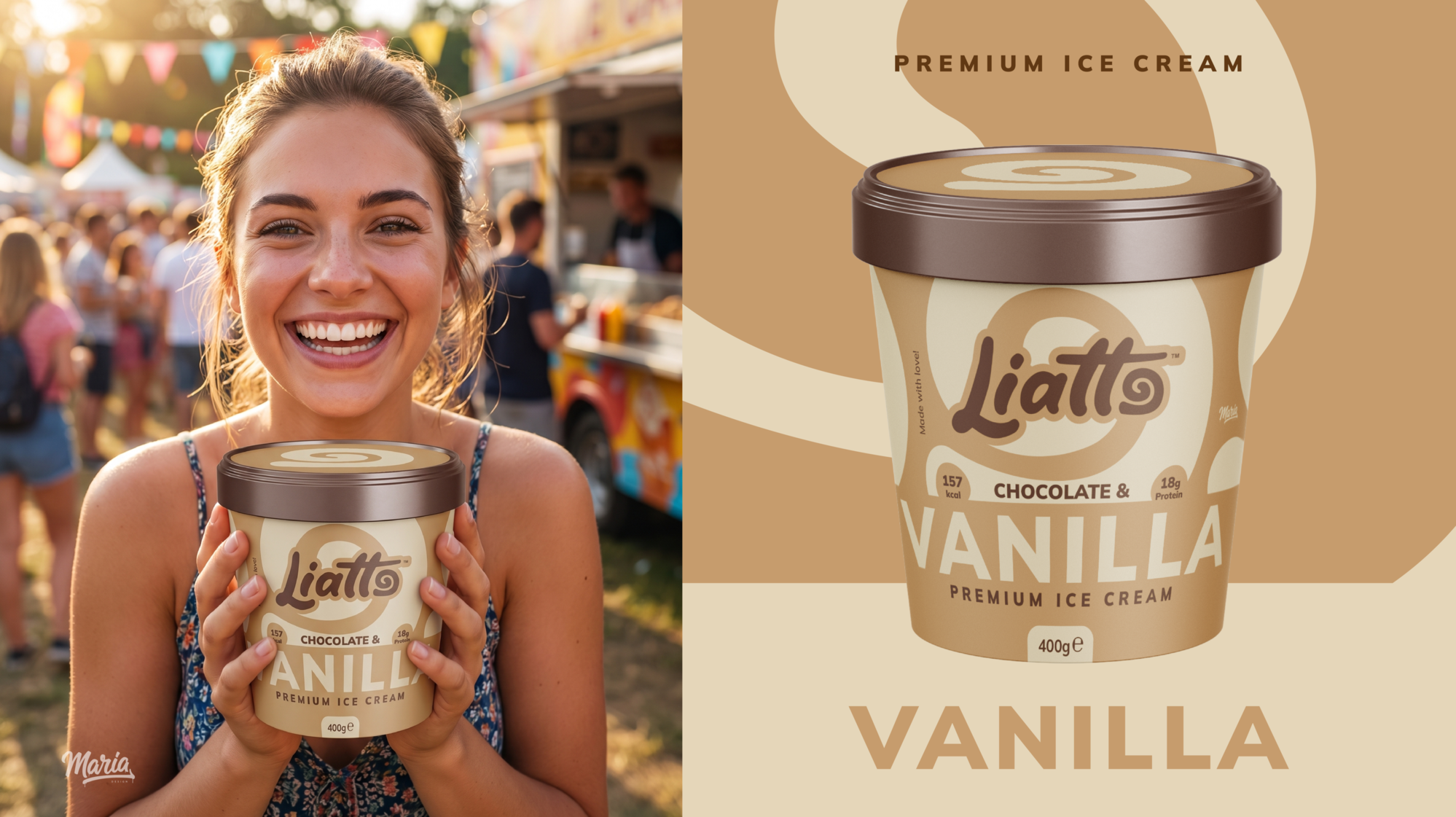
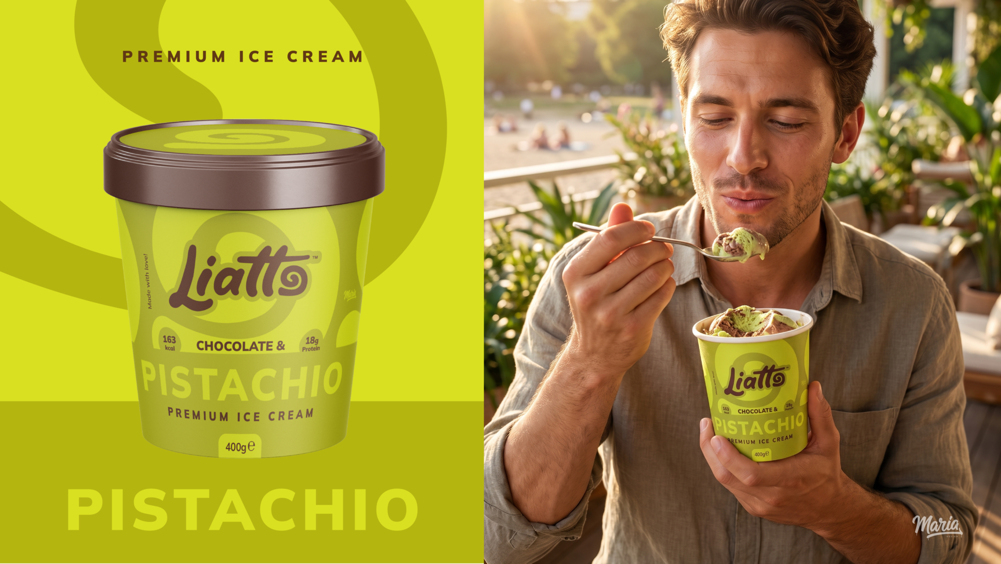
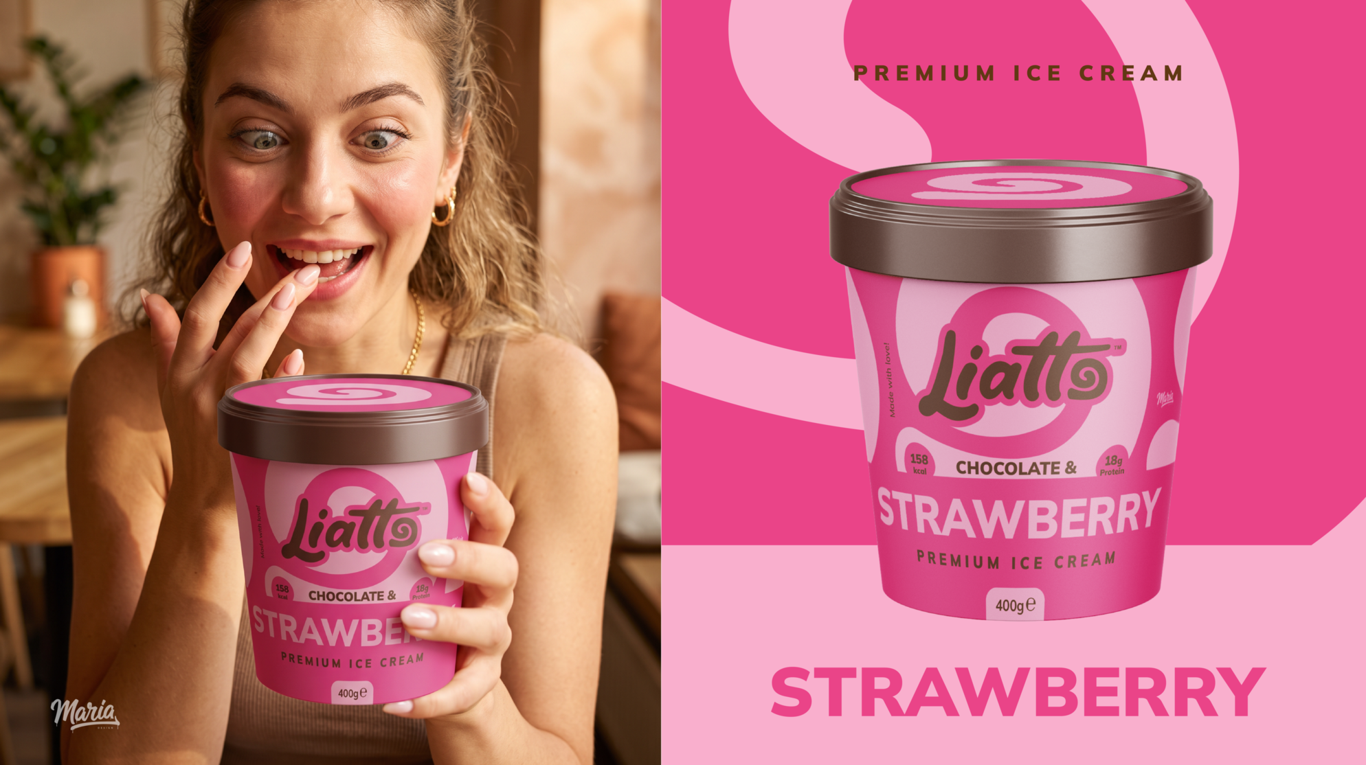
Liatto is designed for those who appreciate high-quality ingredients and a beautiful presentation. The photography showcases real people enjoying the ice cream in natural, warm settings, emphasizing that Liatto is more than a dessert—it’s a moment of authentic joy, shared with loved ones.
Conclusion
Liatto premium ice cream demonstrates that simple, well-executed design can make a classic treat feel new and exciting. The swirled visual identity creates a unique brand signature that is both appetizing and memorable.
 Eva Chistyakova
 vostorge
 alchimistestudioParis
 lettera7
 killeridea
 leekyeongyeob
 vitoramockup
 Akshay 11
 Deeez Studio
 Oksana
 M&A CREATIVE AGENCY
 宏洛图品牌设计HONGLT
 mattdoyledesign
 Up-Brands
 Semenova Ekaterina
 Valérie Colace
 Rosario Lo Iacono
 maud de pourpre
 Firstrein