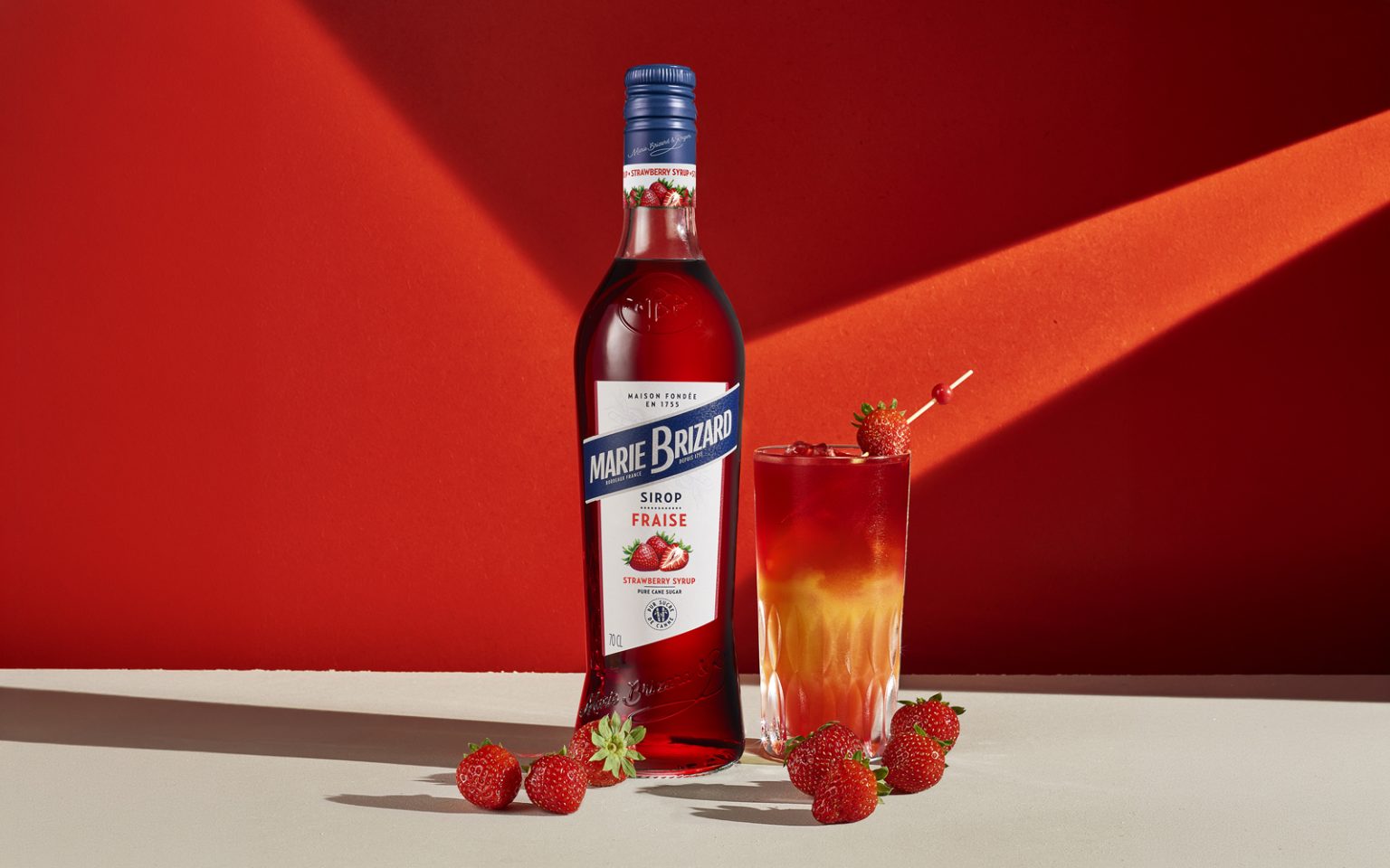

Marie Brizard Syrups – Redesigning an icon for a new generation
Marie Brizard has been part of French beverage culture since 1755. The redesign of its syrup range was driven by a clear ambition: modernize an iconic brand while preserving the heritage and distinctive codes that have shaped its identity for generations.
The project was approached as a complete redesign, encompassing bottle design, range architecture and visual identity.
The bottle was entirely reshaped with a slimmer, more contemporary silhouette, creating a stronger connection with the Marie Brizard liqueur range. Embossed details – including the historical medallion and the Marie Brizard signature – bring character and depth to the glass while reinforcing the brand’s heritage.
At the same time, the bottle was significantly reduced in weight, lowering the amount of glass used without compromising its presence or perceived quality.
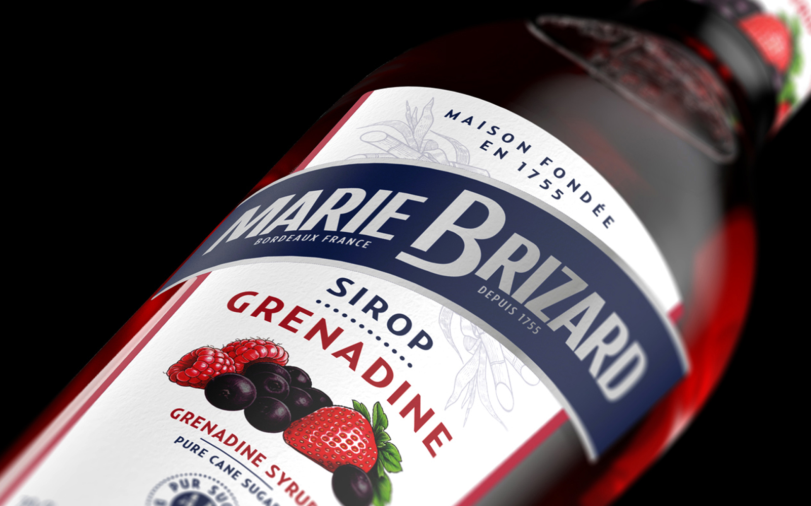
The graphic identity was also completely reconsidered. The iconic blue banner becomes more prominent, creating a strong and immediately recognizable brand signature across the range. Ingredient photography was replaced by botanical illustrations, bringing greater elegance, consistency and timelessness to each flavour.
The redesigned Marie Brizard signature and the prominent reference to 1755 further reconnect the range with the history and expertise of the Maison.
Across more than thirty references, the new system creates a clearer and more coherent range while allowing every flavour to retain its own personality.
More than a packaging refresh, the project gives Marie Brizard a renewed expression – balancing heritage and modernity, brand recognition and differentiation, design presence and environmental responsibility.


 Affogato Brand Design
 Backbar Studios
 hello ocean
 POSH FMCG BRANDING
 Luciana
 Valérie Colace
 marjusguza
 Z9BKAdsgn
 Lilith Sivolenko
 Daria Levina
 Masha Kulichkova
 monther al omari
 Yana Chernova
 Atiq Alam
 ezgidesignstudio
 Pips Marin
 Antonia Skaraki
 Ezi Brand Design
 Kanishka Chhajer
 Zachary Kent
 SOT B&D
 Normal studio
 Garry Veda