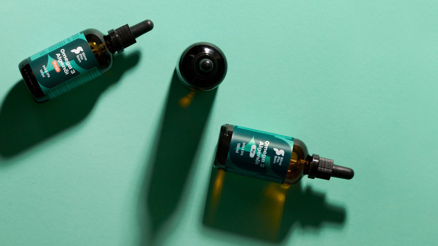

For 30 years, SinoPlaSan has been supporting people on their journey toward long-term well-being with high-quality supplements. The brand combines many years of scientifically research and a spirit of innovation.
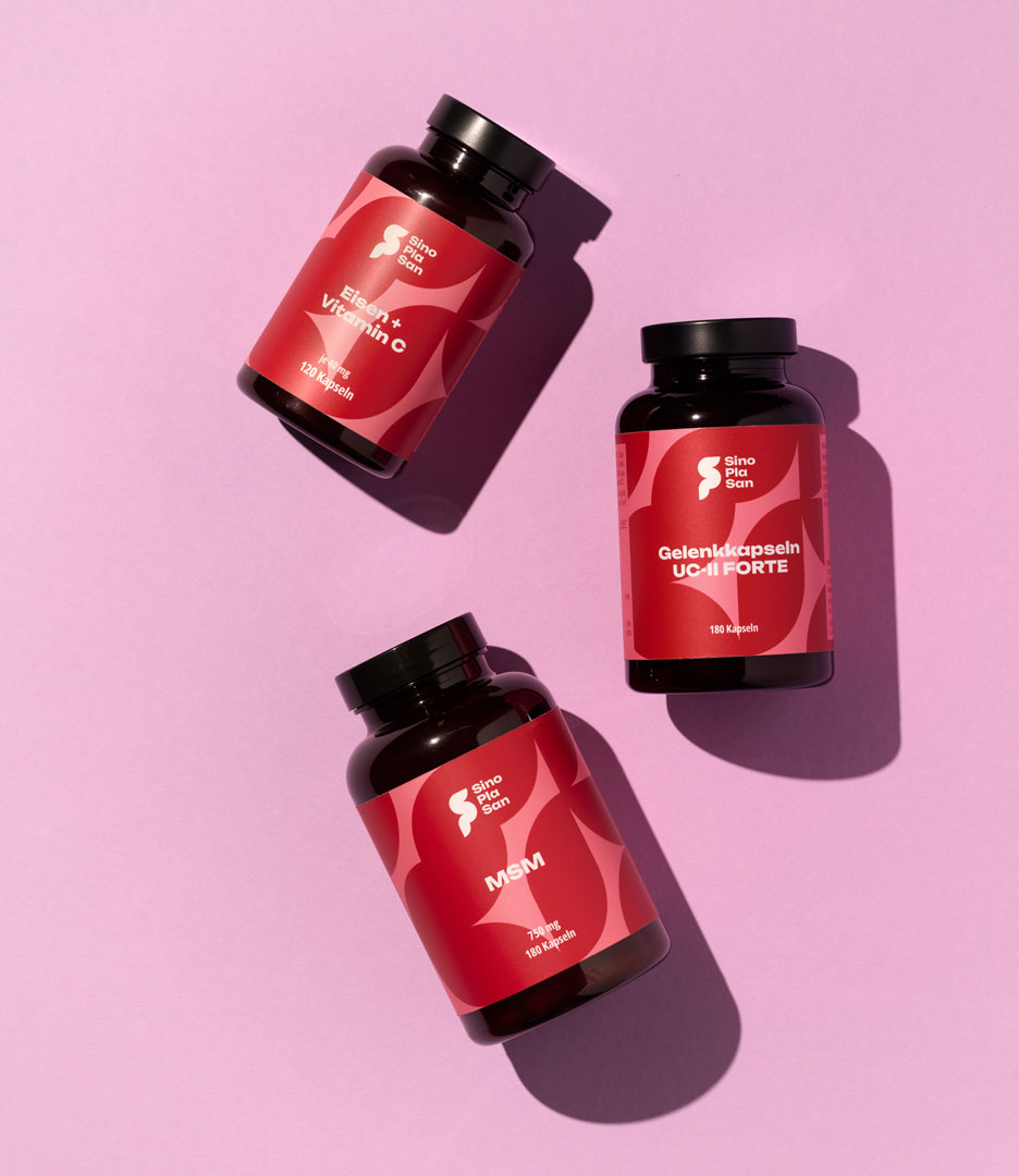
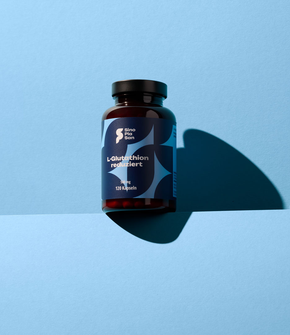
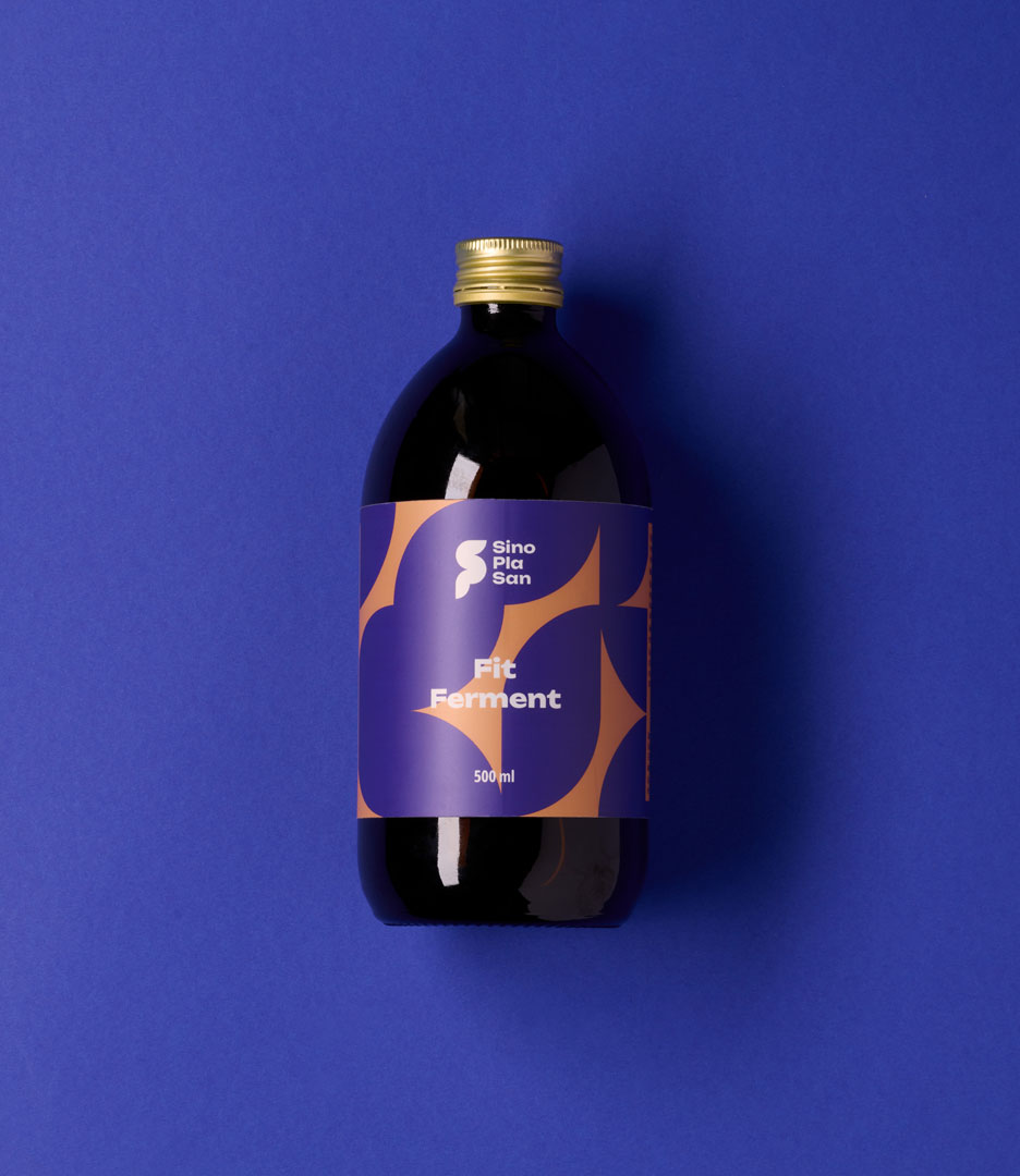
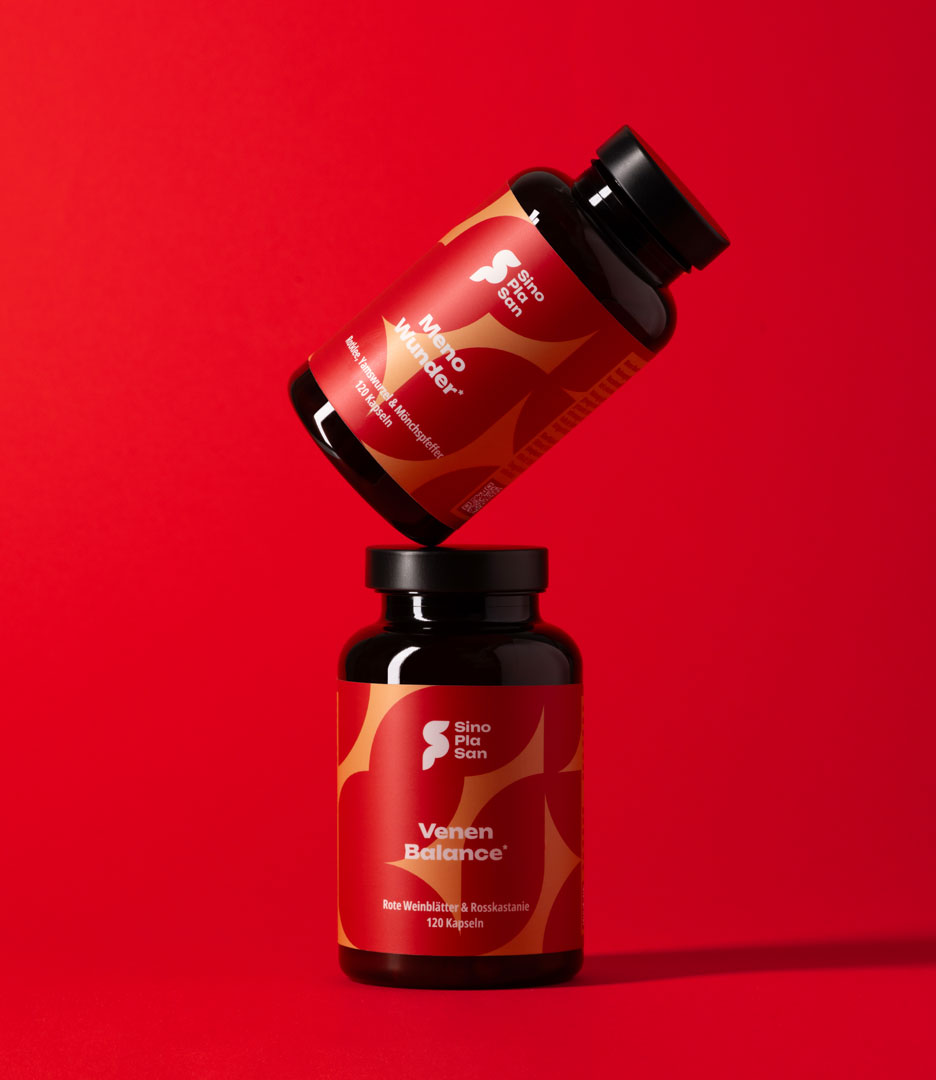
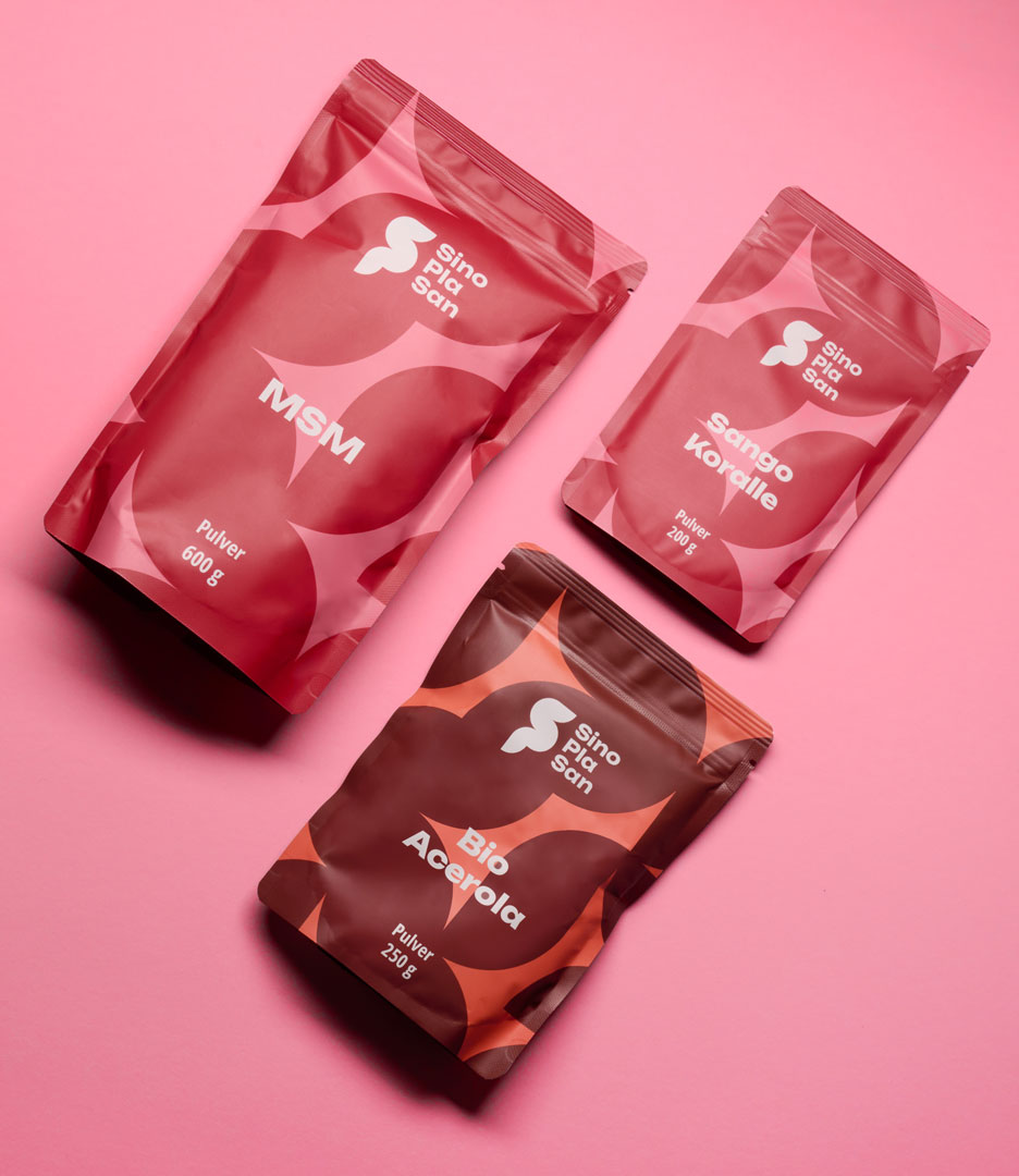
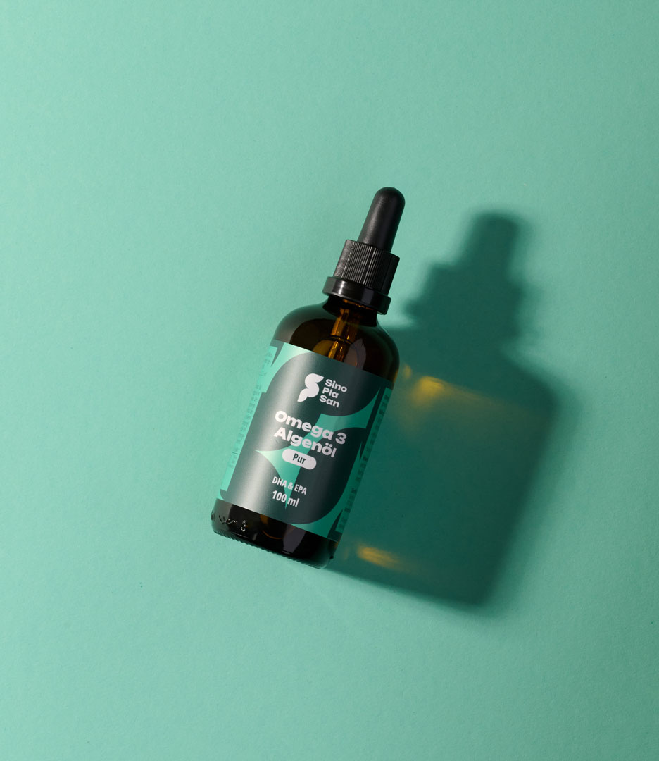
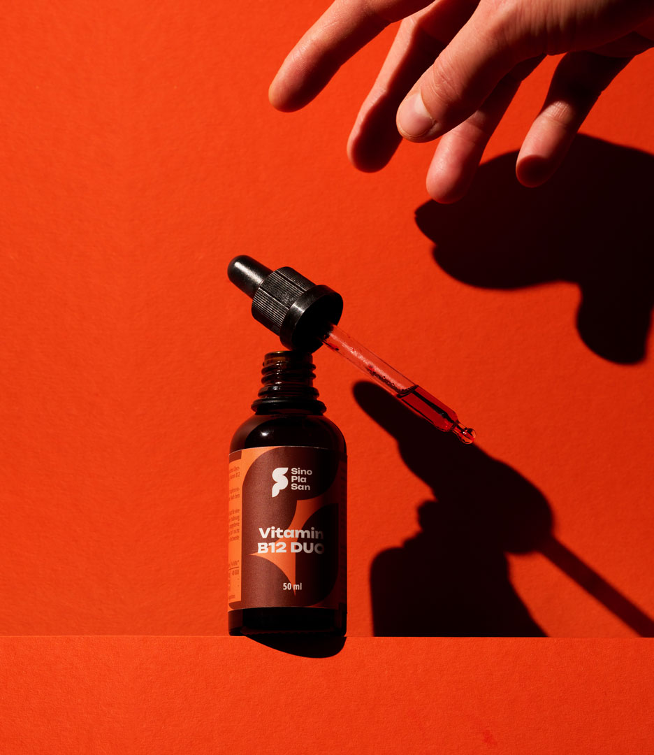
These values are also reflected in the new corporate design. At the center is a simplified flower, whose shape defines the logo. At the same time, this shape forms a distinctive pattern that functions as a central design element running throughout the entire corporate design and packaging.
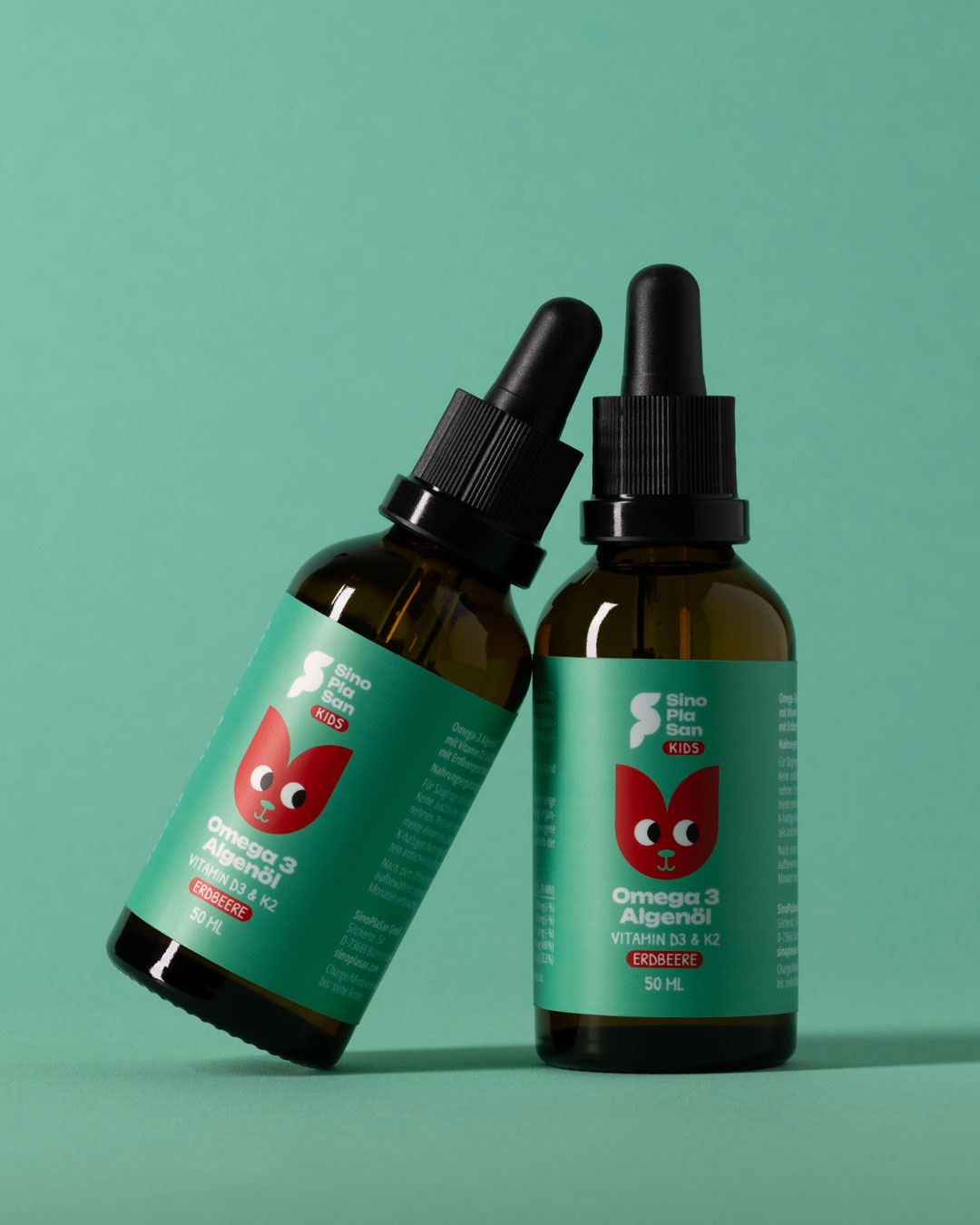
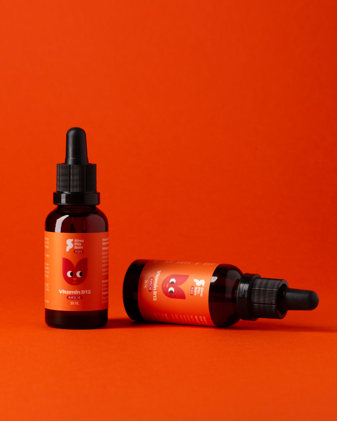
The key visual for the children’s products is also based on this shape and playfully translates the design system into an age-appropriate design language.
The organically structured typography consistently extends this design language, while the color palette provides visual guidance within the extensive product range.
The holistic design system ensures high brand recognition across all channels and contributes measurably to the brand’s success.


 habiba hatem
 Up-Brands
 sayadworks
 Kingdom & Sparrow
 furtgoods
 Si me preguntas
 Narrow House Packaging Branding & Design
 Clever Branding
 About House of Ta
 Hossam khalifa
 Valentyna Hradova
 Backbar Studios
 Holy Studio
 Prime
Prime Naeema Raashid
 Buddy Creative
 ezgidesignstudio
 Minim Brand Design
 Nenad Došen Studio
 Atyan
Atyan Massimo Lo Cascio
 Carreto Concepts Design Studio
 Charles Mason
 Pinot Agency