

OON Capsule Series|Packaging of the World
Design Studio:HONGLUOTU 宏洛图品牌设计
Project:OON Premium Nutraceutical Capsule Full‑pack Visual System
Category:Premium dietary supplement capsule bottles & outer cartons
Application Scenarios:High‑end supermarket shelf display, cross‑border e‑commerce, official brand website, mass‑production premium nutrition packaging
Project Background
OON positions itself as “Redefine the luxury standard of precision nutrition”, targeting global high‑end elite consumers. Its brand DNA comes from three keywords: Optimal Nutrition、Organic Origin、New Generation. Four product lines:ENERGY、MEMORY、HEPATIC、BRAVERY.
Nutrition supplements are no longer basic daily supply. Consumers are chasing higher‑quality life status. The brand philosophy is Science‑driven core, luxury as appearance. Our scope covered original logo design, bottle label graphics, outer carton structure, and unified digital visual guidelines for online touchpoints. We focused entirely on real‑world packaging execution — no product‑effect promotion, only commercial packaging design practice.
Brand & Visual Creative Thinking(重点|设计师实操思路)
很多品牌做 LOGO 只是做一个好看字符,我们这次直接把品牌三重基因埋进字形结构,把产品形态藏进符号,避免后期额外加一堆装饰图形。
Logo & Super‑symbol logic
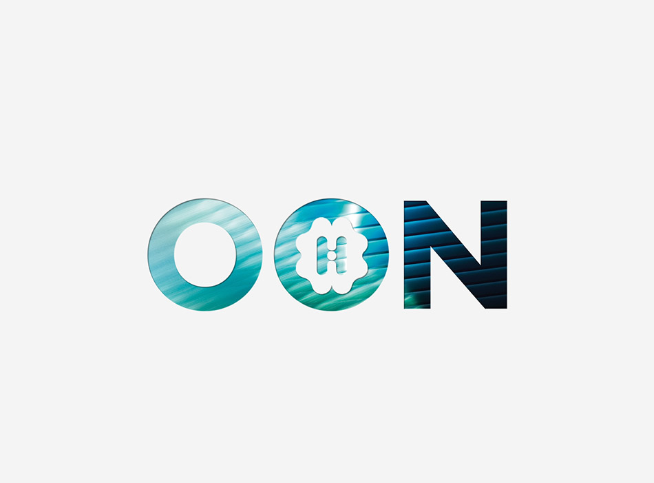
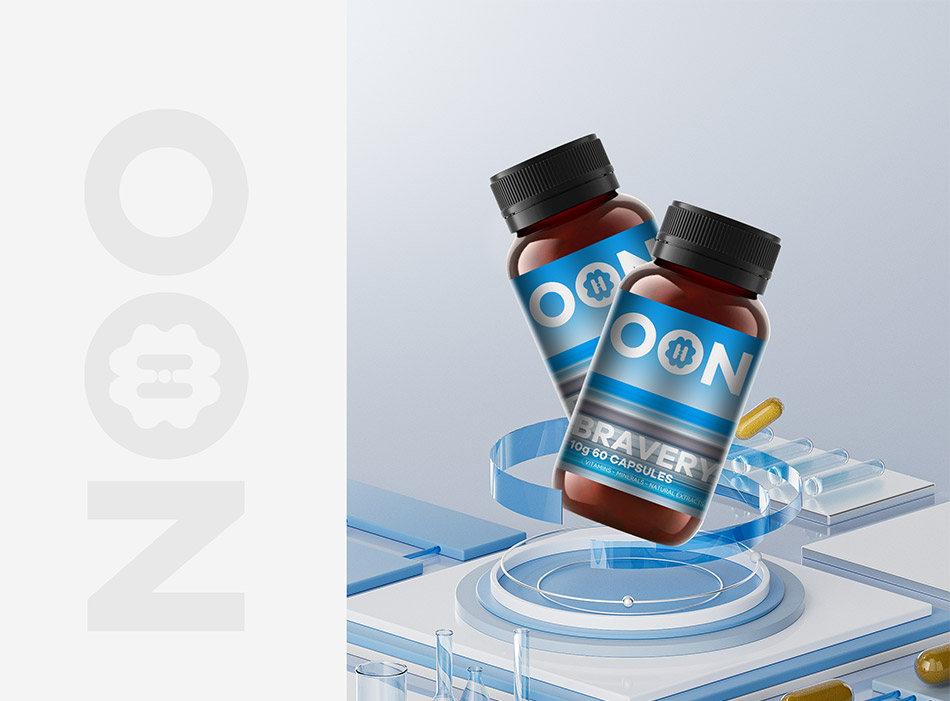
OON is derived from the initials of its three core brand genes. We treat the middle “O” as the exclusive super symbol of the whole brand.
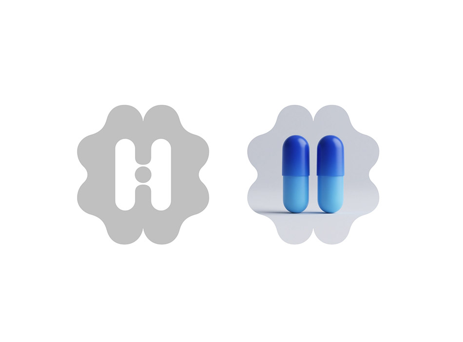
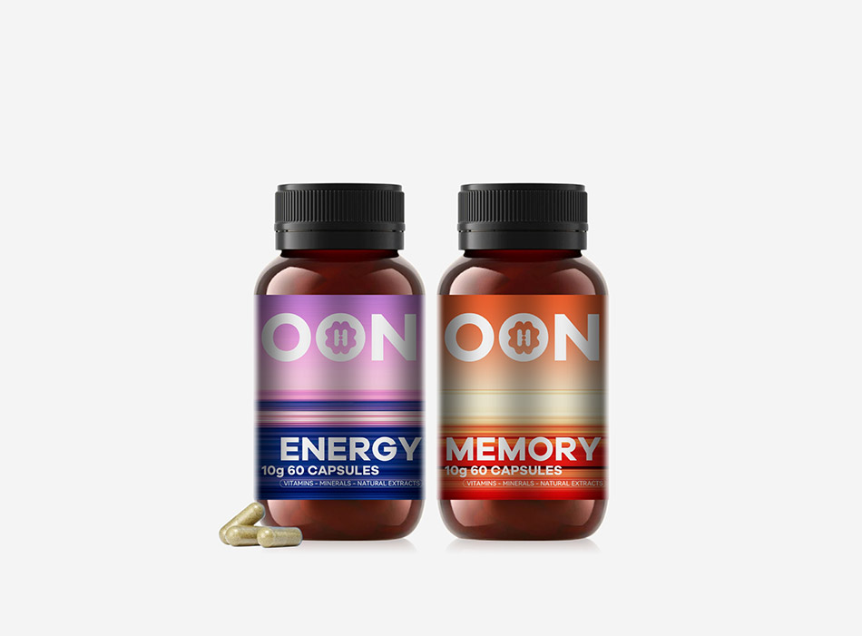
First O → Optimal Nutrition:closed perfect circle, symbolizing balanced, precise nutrition formula. Middle merged O → Organic Origin:outer soft petal contour represents natural organic source; inner hollowed‑out H shape directly references the double‑capsule physical form of the product itself. We intentionally soften hard industrial pharmaceutical feeling through curved organic outlines. Final N → New Generation:sharp geometric cut lines. Soft circular curves are balanced by tough geometric edges, delivering both natural origin and cutting‑edge technology in one mark.
宏洛图实操观点:大健康品类千万别疯狂堆砌外部装饰图标。能把产品本身形态内化进 LOGO 符号,是最高效的记忆手段,减少后期版面多余图形干扰。
Color‑system strategy:reject cheap solid‑color product‑line division
行业习惯:一条产品线给一个实底色,用颜色暗示功效。我们刻意避开这套逻辑。
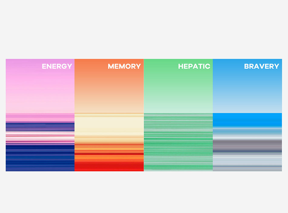
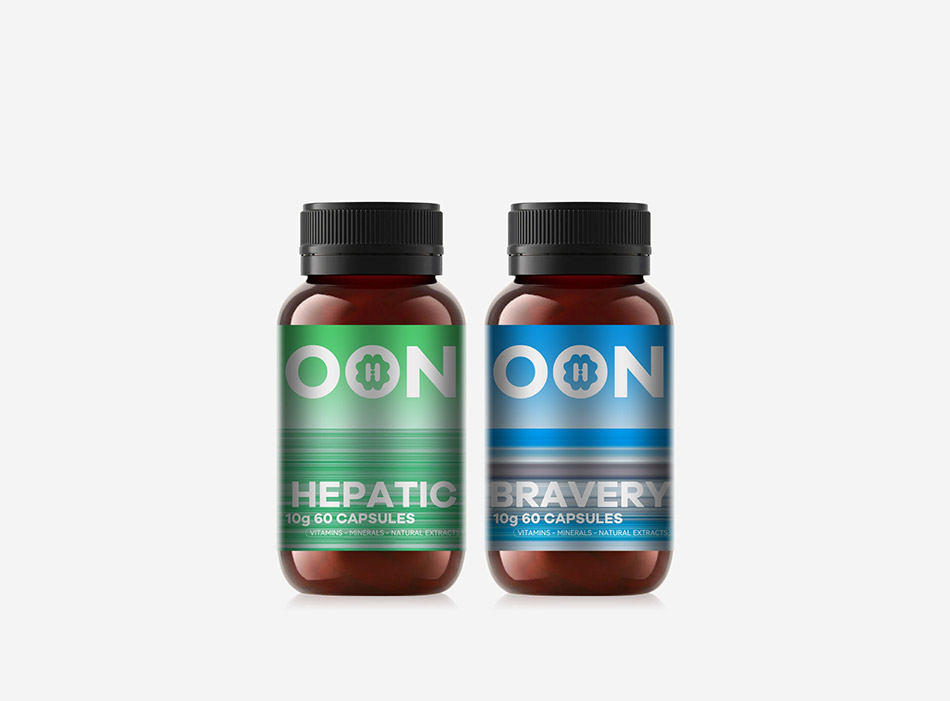
我们搭建一套 gradient flowing metallic band visual system:every product line gets its own custom gradient set, built in two fixed visual layers: soft vertical gradient background on top + horizontal brushed metallic texture band in the middle.
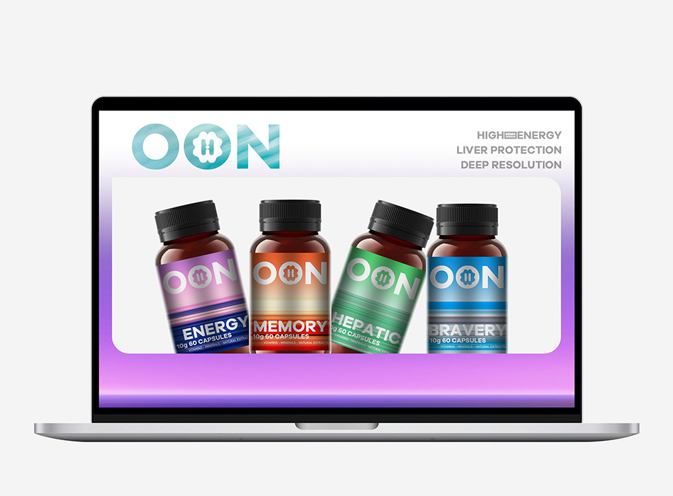
Four colour families: purple‑pink, warm‑orange, teal‑green, blue‑grey. Colors are only for visual differentiation, not functional hints. We strictly controlled saturation and value gap, so four bottles sit side‑by‑side on shelf without visual confusion.
The matte brushed‑metal texture runs through logo, bottle labels and carton tops. At early design phase we calibrated screen mock‑ups vs printing colour deviation, so online digital renderings and physical finished packs keep consistent luxurious feel, no visual fracture between digital and physical.
Omni‑channel unified visual strategy
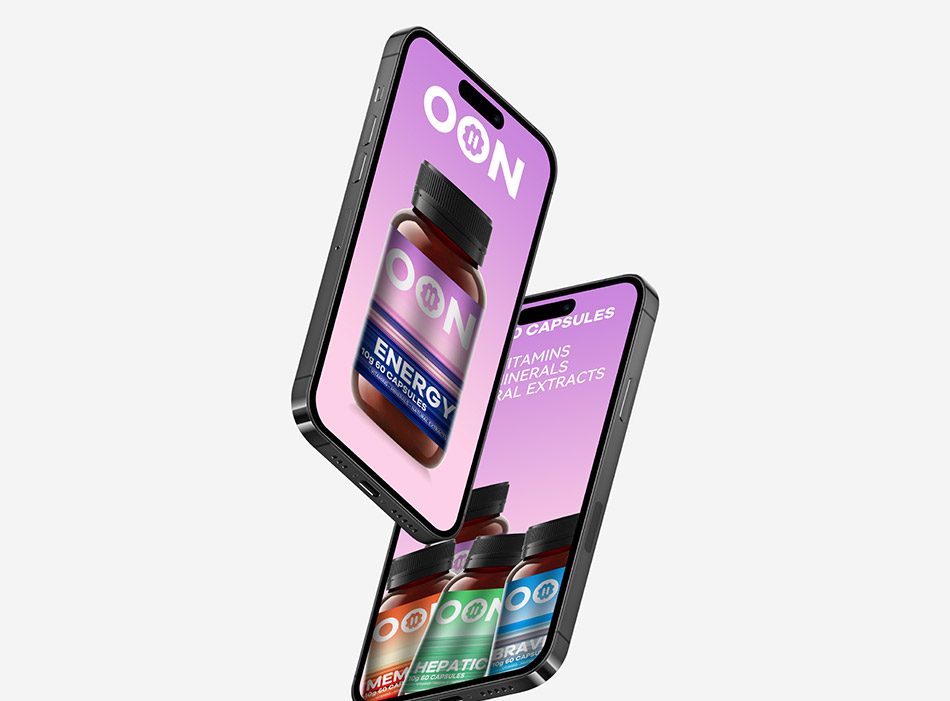
宏洛图坚持主张:Packaging itself is brand media。不要做两套割裂方案 —— 一套实物包装、一套电商页面。线下瓶标、彩盒和跨境电商详情页、移动端 marketing assets share identical logo, colour palette and brushed‑metal texture library.
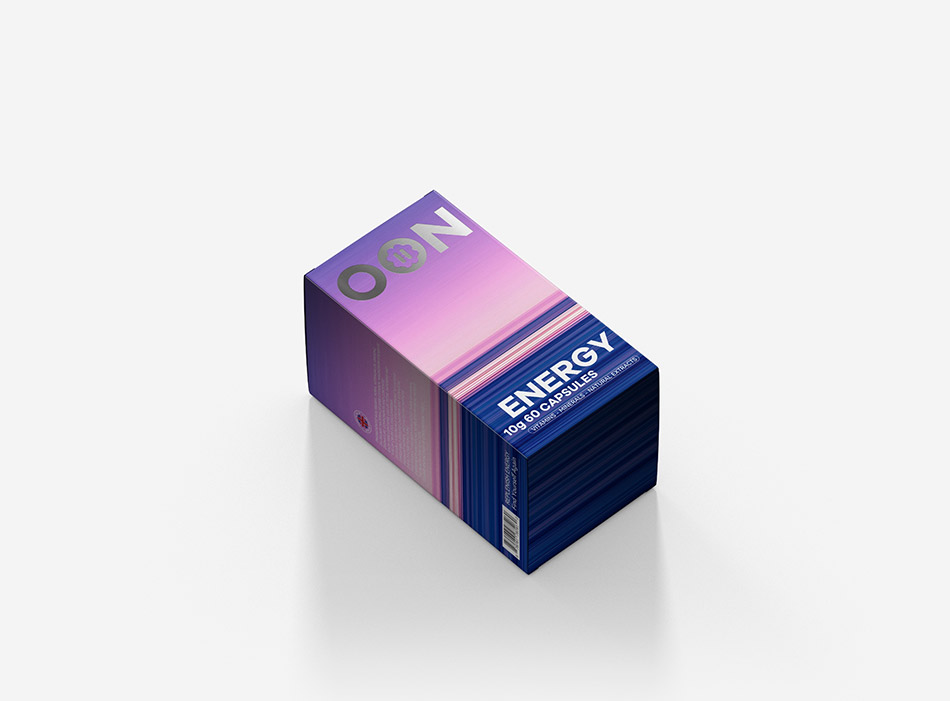
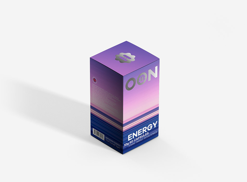
The petal‑H super‑symbol is embossed / hot‑silver stamped on bottle labels and carton tops only. We strictly limit where this symbol appears, avoid over‑using it on side panels or back panels which dilutes brand memory point. Adopt oversized minimal typography hierarchy. Product‑line names use heavy sans‑serif fonts as primary shelf‑recognition element. This solves two pain points at once: far‑distance reading on supermarket shelf and tiny thumbnail recognition on cross‑border e‑commerce platforms. Minimal decoration matches global elite aesthetic. Carton structure:luxury look without high mould‑opening cost
We chose standard vertical single‑flip carton rather than custom irregular special‑shaped box.
宏洛图落地观点:异形盒很容易拍出好看效果图,但会拉高开模、打样、批量损耗成本。差异化不一定来自盒型,更多可以释放到 surface printing and finishing craft. Standard carton structure guarantees stable mass‑production, while gradient print, hot‑silver and other post‑press processes deliver the brand “luxury as appearance” requirement. Balance commercial practicality and premium visual output.
Suitable Product Categories
This visual system works for premium product with small cylindrical glass / plastic bottle + vertical single‑flip outer carton, brands targeting high‑end elite track with multi‑SKU colour‑coding needs, requiring unified omni‑channel premium visuals for mass‑production:
Premium oral capsule / tablet nutritional supplement (core applied category in this case) Mini glass / plastic bottle powder, gummy, oral‑drop health FMCG Luxury skincare capsule / single‑dose ampoule outer boxes High‑portable can herbal‑extract solid‑drink packaging
Material Selection(瓶标 + 外包装|实操选型 & 淘汰理由)
Bottle label materials
Mass‑production pick: Matte‑silver PET synthetic film sticker (project specified)
It comes with fine matte metallic base, perfectly reproduces our brushed‑metal gradient effect. Four‑colour printing keeps smooth gradient transition. It is water‑proof and oil‑proof; resists ink fading and edge‑lifting under supermarket humid storage environment, maintains premium display quality for long‑term shelf placement.
High‑end upgrade option: Pre‑made brushed silver special sticker
Material carries built‑in horizontal brushed texture. Lower risk of gradient stripe break‑off caused by over‑printing halftone dots. Stronger metallic atmosphere, suitable for small‑batch premium sub‑lines.
What we ruled out: Coated art‑paper sticker
Paper substrate cannot reproduce metallic‑flowing gradient effect. Easily delaminate and ink‑bleed under moisture, cannot support premium positioning.
Outer carton paper stock
Mass‑production pick: 250g imported coated white cardboard (project specified)
Great stiffness, no cracking when folding single‑flip box. Smooth halftone transition for four‑colour gradient print. Compatible with matte lamination, hot‑silver, deboss / emboss post‑press finishing. White base maximises delicate gradient performance.
High‑end upgrade option:300g coated special silver card
Subtle silver base amplifies metallic luxury, reserved for limited‑edition gift‑box collection.
What we ruled out: Grey‑back duplex board
Grey base dulls saturation of blue / green / pink light‑toned gradients, washes out gradient layers and ruins premium visual effect.
Printing & Post‑press Craft Advantages(工艺实操)
Bottle label craft:4‑colour halftone gradient printing + matte‑silver PET protective lamination
Gradient layers are fully controllable. Horizontal brushed texture is achieved by adjusting halftone dot density. Four product‑lines share same printing equipment, reduces plate‑changing cost, friendly for multi‑SKU mass‑production. Matte‑silver lamination resists fingerprint and water stain. Pack won’t easily turn white or scratch on retail shelf. We get premium metallic look relying on material substrate itself, instead of large‑area hot‑foil stamping. Controls unit‑label processing cost.
Outer carton finishing:4‑colour gradient printing + matte film lamination + partial hot‑silver for petal‑H symbol on carton top
Matte lamination: eliminates harsh paper reflection, low‑saturation metallic gradients look restrained and sophisticated. Improves scratch‑resistance for logistics and transportation. Hot‑silver stamping on carton top: highlight exclusive super‑symbol. Recognition improves significantly even when cartons are stacked without sleeves. Reinforces three‑gene brand memory. Alternative low‑cost craft: blind emboss / deboss. Zero ink and metallic colour deviation risk. Pure physical texture, lower production waste rate, for cost‑sensitive runs while preserving premium minimal character.
Visual Style Control Standards(宏洛图原创 Minimal‑luxury tech‑gradient system)
Typography hard rule
One single sans‑serif font family across the whole packaging system. Strict 3‑level text hierarchy:
Brand name OON: extra‑bold weight, occupies >40% label width in upper visual zone. Product‑line name(ENERGY / MEMORY etc.): heavy bold weight, centre‑aligned below colour block — primary shelf recognition element. Auxiliary specification copy: regular weight, font size less than 1/3 of product‑line name, align to right / bottom. Never break the integrity of brushed‑metal gradient background.
Serif fonts or hand‑written decorative scripts are forbidden, to avoid dated cheap aesthetic common within health‑product category.
Gradient & texture constraints
Stick to fixed double‑layer composition: top soft vertical gradient background + middle horizontal brushed‑metal band. Brushed texture runs horizontally; stroke width kept between 0.1‑0.3 mm. Avoid coarse distracting stripes. Keep matte low‑glow metallic finish; reject cheap high‑saturation holographic rainbow effect.
White space discipline Bottle label keep 10 % blank margin on left‑right sides, colour block do not bleed full‑width. Prevent cluttered visual feeling. Carton front face keeps 30 % gradient empty area between logo and bottom product‑line title. No redundant icons or decorative patterns piled on surface.
Hongluotu core insight for premium nutrition FMCG packaging: Less ornament, strong colour‑coded family identity, oversized readable typography is the universal winning formula working both for e‑commerce thumbnails and distant shelf viewing. Excessive decoration dilutes premium minimal character and weakens instant recognition, which contradicts OON elite‑oriented brand narrative.
Differentiation from mainstream supplement packaging
Most competing supplement packs use solid‑colour backgrounds, fill layout with plant illustrations, human‑body graphics and functional icons, leading to heavy visual homogenization.
OON system builds competitive moat via dynamic metallic gradient palette, unified matte brushed texture and geometric sans‑serif typography. We completely drop figurative plant / medical illustrations. Product‑line separation purely comes from abstract colour‑gradient system, delivering restrained luxury, fitting international premium elite brand positioning.
Final Designer Conclusion
This project is our real‑world attempt to break the visual stereotype of high‑end nutrition supplement packaging. We do not chase flashy visual gimmicks. Every graphic decision traces back to brand DNA, shelf performance, omni‑channel consistency, material property and mass‑production cost. For premium health‑care packaging design, luxury is not only visual beauty — it also means controllable craftsmanship, predictable printing output and commercial viability.




 krrrrrllii
 babyage
 Deep
Deep monther al omari
 Atiq Alam
 TUERCA Studio
 neo creative studio
 Pinot Agency
 Pixels Studio
 Anastasia Cherepanova | xtramez
 awaiskhadim
 Studio Be Design
 Belova Oksana
 We Craft Studio
 ArtDesignByDIna
 Ananya Taran
 Nadezhda Gorelikova
 orhanirmaktasarim
 WillBe
 Hi estudio
 43oz
43oz Rosario Lo Iacono
 alchimistestudioParis