

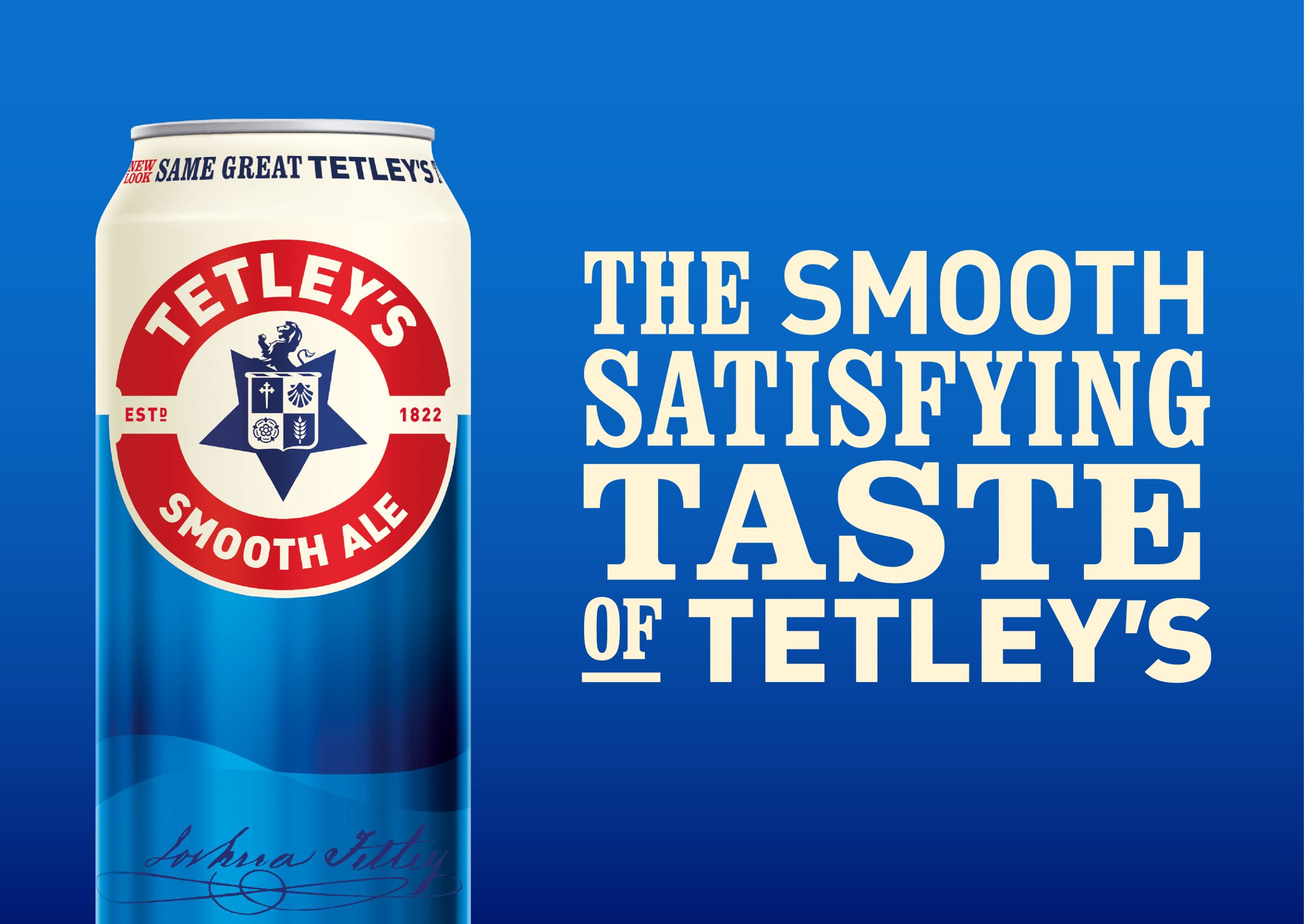
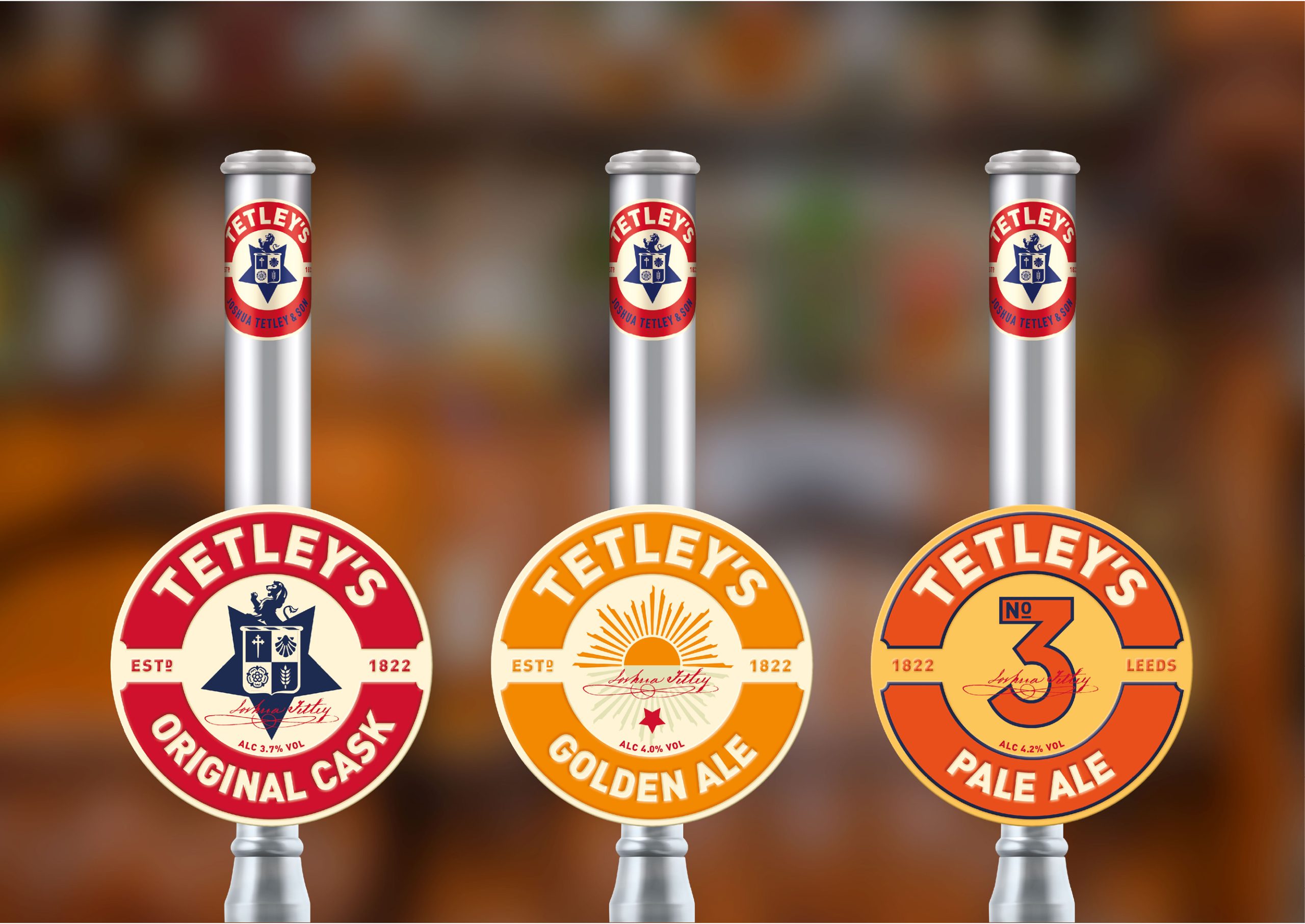
Tetley’s is one of Britain’s best selling ales. The brand and packaging needed reinvigorating to realign the brand with its core customer base, whilst making it relevant for today’s drinkers. The Huntsman had served Tetley’s well for nearly 100 years, however, we identified that a change of symbol would be key to creating a symbol of change for the brand. Tetley’s Cask, the flagship brand, was totally redesigned with an embossed metal pump clip that positions the ale as premium. We revived Tetley’s refreshing beers for the on-trade. We also introduced NPD for Tetley’s, based on their original recipe. The symbols in the new logo, derived from the original coat of arms, are inspired by the Tetley family’s previous business as Maltsters.



 lunapanda
 Tridimage
 Analoguecreative
 lettera7
 alchimistestudioParis
 Lana B
 Colossal
 Pivot Studio
 M&A CREATIVE AGENCY
 monther al omari
 Anastasia Cherepanova | xtramez
 Hollóka Grafikai Műhely / Graphic Design Studio
 BOLD branding
 Antonia Skaraki
 Pâmella Lorrany
 Z9BKAdsgn
 Francesco Paternoster
 b1studio.ro
 Chris Creative Works
 Boordon
 Dmitriy Kuzovlev
 Brand Society
 yasharpic