

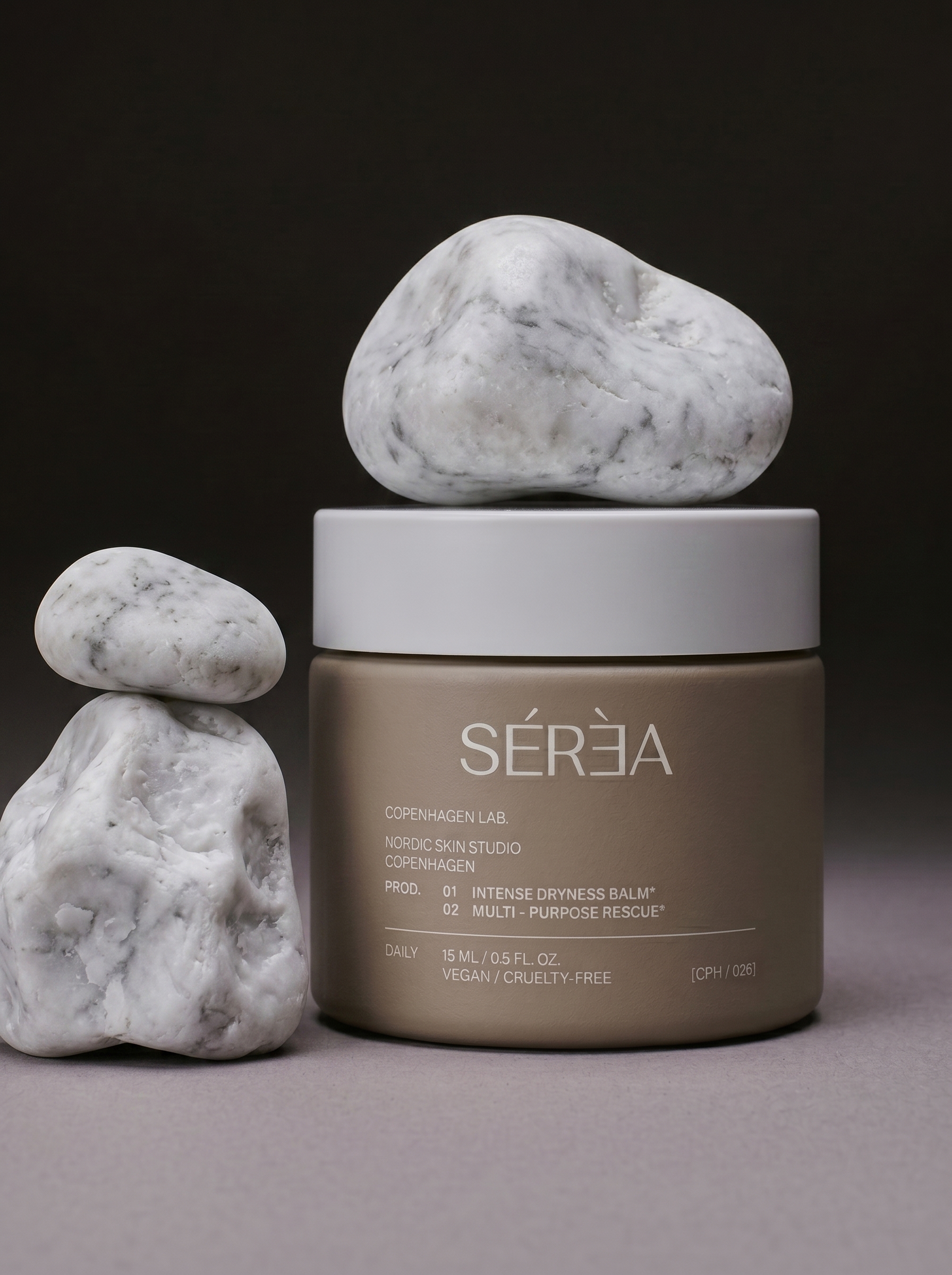
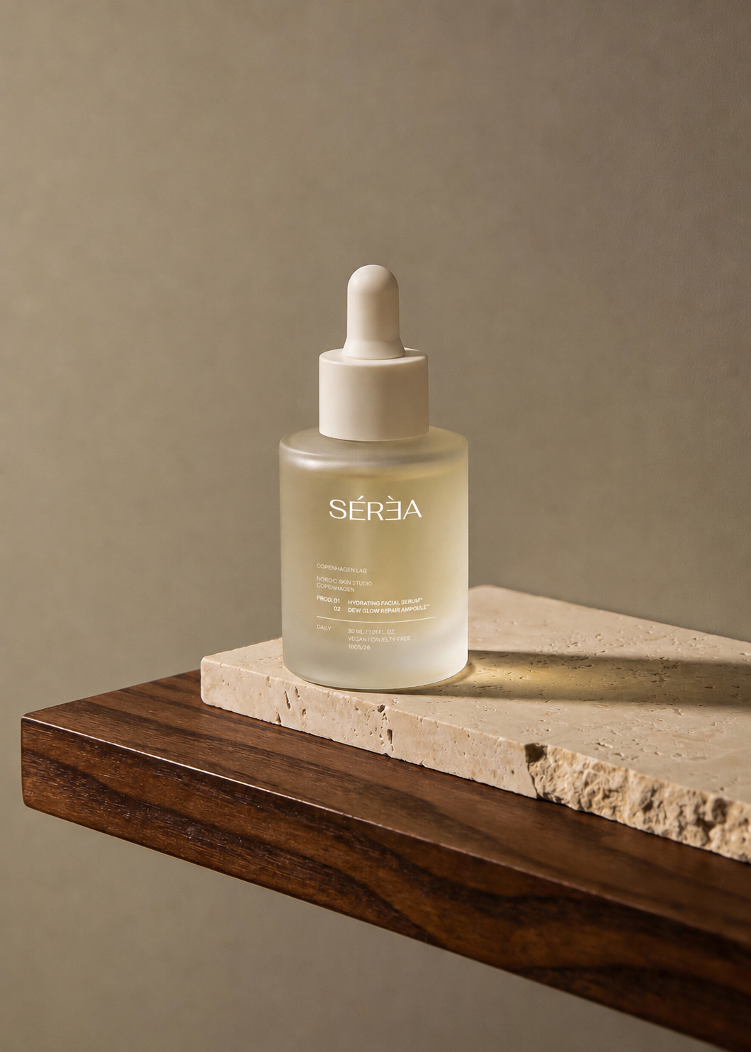
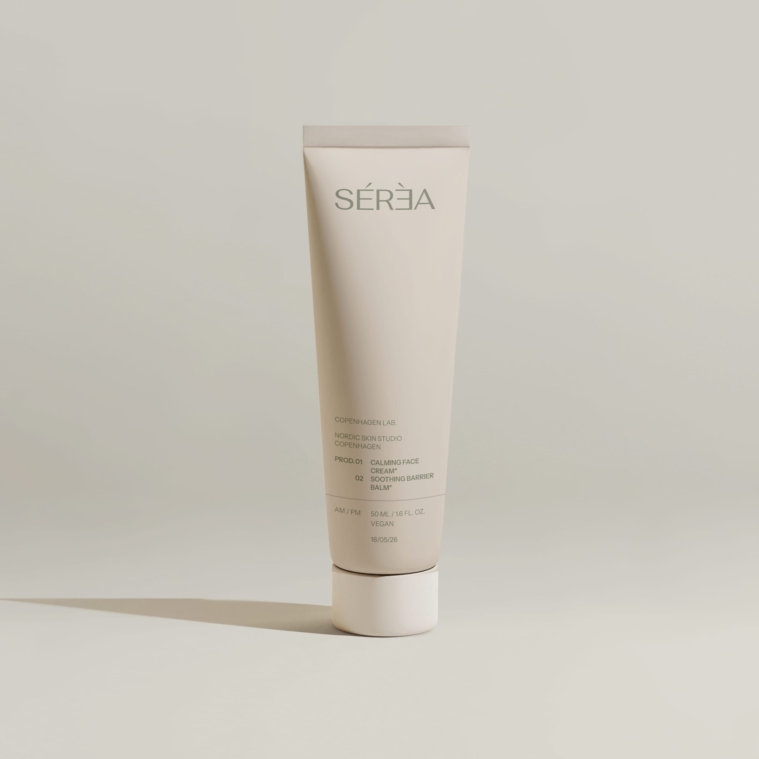
SÉRÉA is a self-initiated branding and packaging design project for a contemporary dermo-cosmetic skincare line created for sensitive and reactive skin.
The identity was developed around the idea of quiet luxury – where trust is communicated through clarity, proportion, materiality, and thoughtful restraint. Every design decision aims to create a calm visual experience that reflects the purpose of the products: supporting the skin through balance, care, and consistency.
The visual language combines refined typography, muted earthy tones, translucent materials, and generous negative space to create a timeless and sophisticated identity. Carefully structured layouts and subtle tactile finishes enhance the premium character of the brand while maintaining a clean and approachable appearance.
A minimalist typographic logo serves as the foundation of the identity, allowing the packaging system to remain flexible and cohesive across the entire product range. The consistent information hierarchy ensures clarity while giving each product its own distinct presence through carefully curated color variations and material choices.
Beyond functionality, the packaging was designed as an object of everyday living. The products are intended to integrate naturally into contemporary interiors, bringing a sense of calm, elegance, and permanence to daily skincare rituals.
SÉRÉA is a study of how graphic design can communicate confidence through simplicity, transforming everyday skincare into a refined sensory experience where aesthetics and functionality exist in perfect balance.






 softmachine
 monther al omari
 alchimistestudioParis
 airobtq
 Buzz & Co.
 Ruby
Ruby themythographer
 IDNB Inc.
 viktorflr
 Zenpack
 Wessam Hussien
 samarabdelmonem
 StudioMordius
 Polaris Designs
 Atiq Alam
 duha mohamed
 HassanEtman22
 agarcia studio
 Wynand88
 Eva Chistyakova
 Maria Bukhtilova