

Tusculum Novum is a self-initiated wine packaging project developed around a fictional red wine produced in Frascati, Italy.
The project began with an interest in Italian illuminated manuscripts and the idea of translating their visual language into a contemporary wine label. Rather than simply borrowing a medieval aesthetic, I wanted the label to work like a manuscript page itself, using its structure, ornament, lettering and material qualities as part of the design.
The name Tusculum Novum refers to the historical connection between Frascati and the ancient city of Tusculum, creating the narrative background for the project.
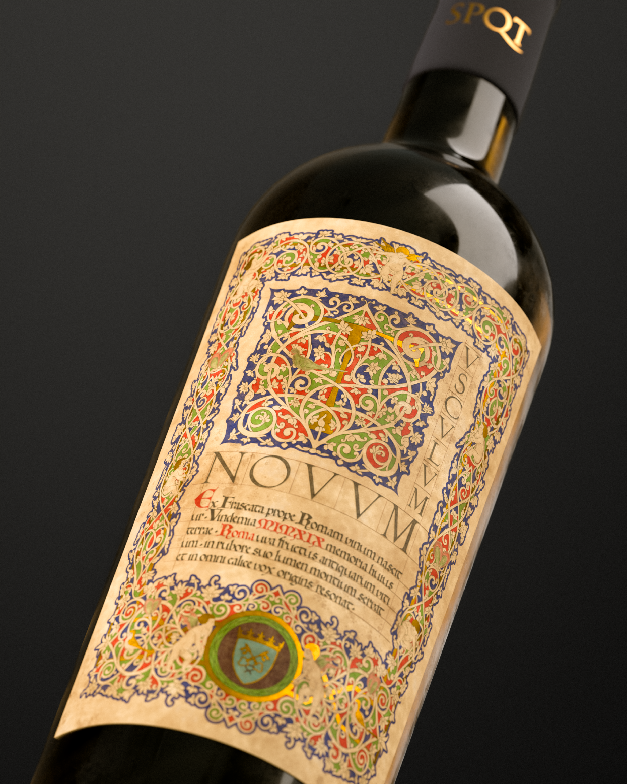
The label was conceived as an illuminated page wrapped around a wine bottle.
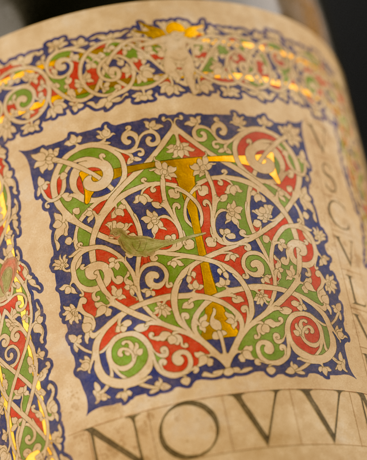
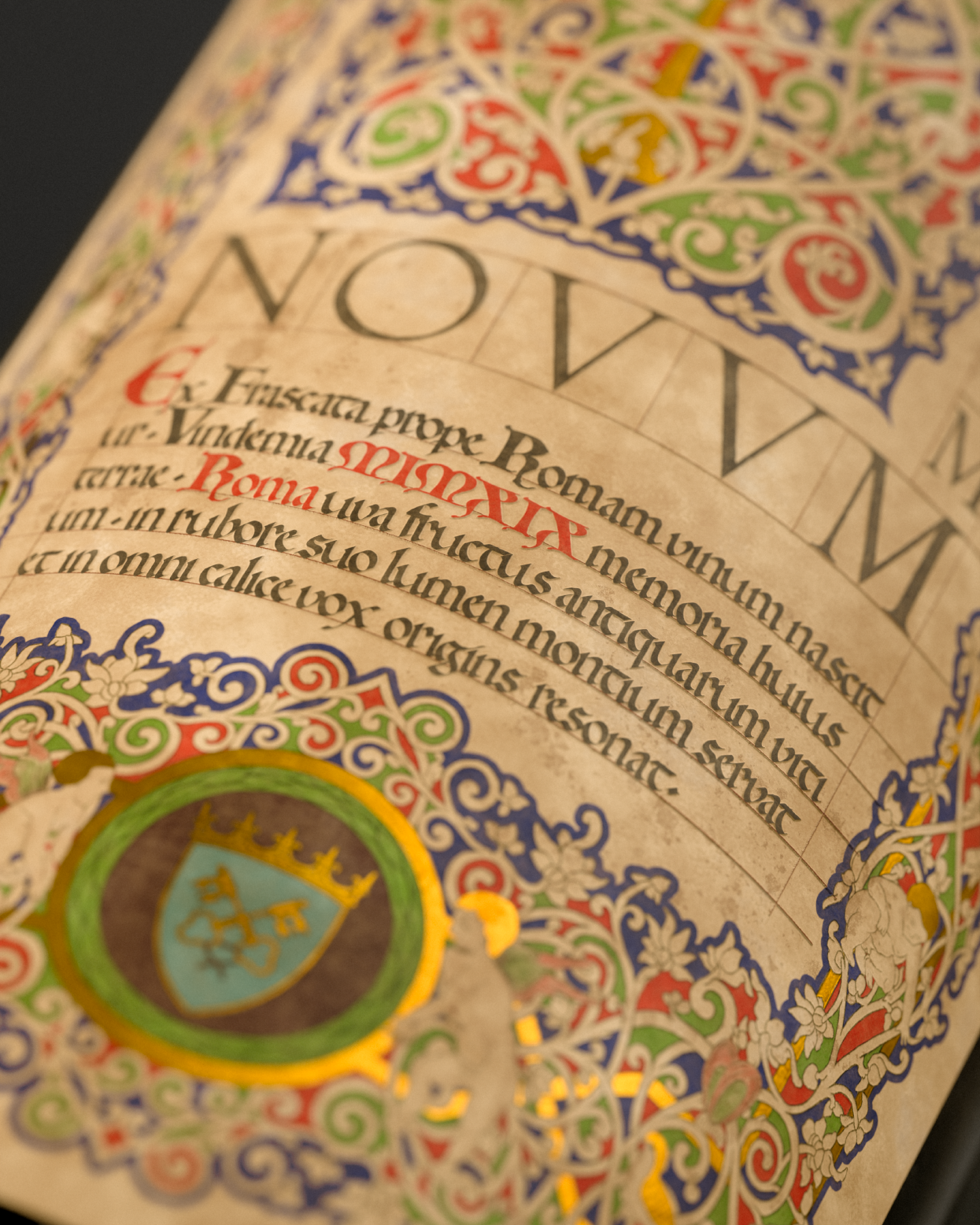
Its composition is structured by an ornamental border that runs around the entire label. At the center, a large illuminated T begins the name Tusculum, followed by a sequence of Roman capitals. Below it, a short text in Latin is set in a Proto-Gothic-inspired script.
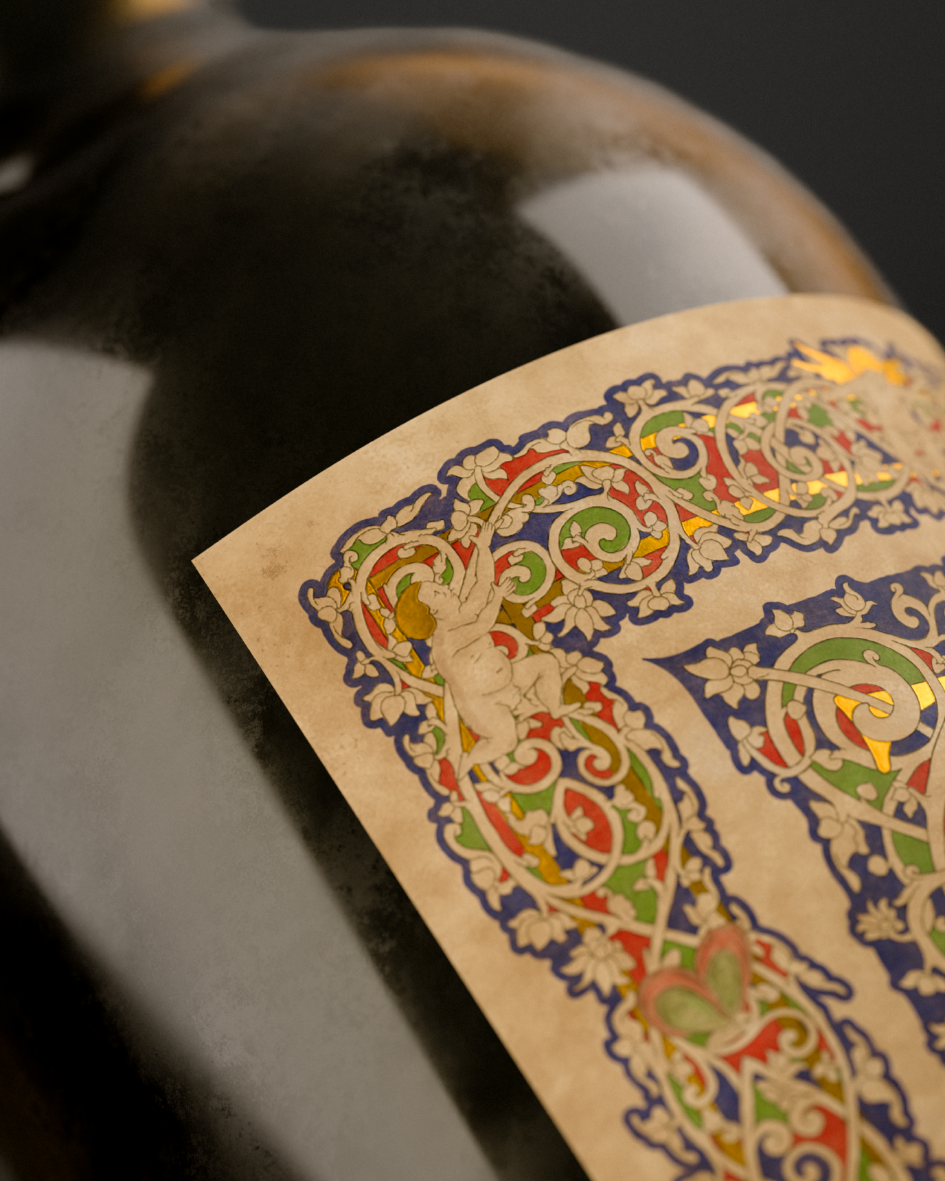
The decorative system is based on bianchi girari, the white-vine ornament found in Italian manuscript traditions. Their interlacing forms were particularly appropriate for the project because they could also be read as a reference to grapevines, connecting the manuscript language with the product itself.
The lower section contains the coat of arms of Frascati, surrounded by ornamental elements and small figures inspired by medieval manuscript marginalia.
A limited palette of red, blue, green, ivory and gold was used throughout the label.
The blue was chosen to evoke the deep ultramarine traditionally obtained from lapis lazuli, while the gold areas reference the use of gold leaf in illuminated manuscripts. The initial T, selected inner borders and the circular frame surrounding the Frascati coat of arms were designed as gilded surfaces, allowing light to become an active part of the label.
The visual system also extends to the bottle capsule. The letters SPQT — Senatus Populusque Tusculanus appear in low relief as a reinterpretation of the Roman SPQR formula, while the Frascati coat of arms is embossed on the top. Both details use a gold finish to maintain continuity with the label.
The project combined historical and visual research with illustration, typography, vector drawing and 3D visualization.
The ornamental borders, illuminated initial and decorative elements were drawn and refined digitally before being prepared as the final label artwork. Once the graphic design was completed, the entire packaging was recreated in 3D.
The bottle, capsule and supporting elements were modeled and textured in Blender. Custom shaders were developed for the glass, wine, paper, embossed details and gilded surfaces.
The final result is a packaging system that treats the wine label not simply as a printed surface, but as a contemporary reinterpretation of an illuminated manuscript.
From the lettering and white-vine ornament to the relief work on the capsule and the 3D environments used for its presentation, every element was designed to belong to the same narrative.
Tusculum Novum became an exercise in bringing together historical research, illustration, typography, packaging design and 3D art within a single project.






 monther al omari
 Alexander Skurihin
 Studio K95
 ARMBRAND
 Richa Rai
 houseoferas by Miti
 Agence des Coteaux
 Kushi Eaknath
 Ann Treasa
 Xiao Ning
 krrrrrllii
 babyage
 Deep
Deep Atiq Alam
 TUERCA Studio
 neo creative studio
 Pinot Agency
 Pixels Studio
 Anastasia Cherepanova | xtramez
 awaiskhadim
 Studio Be Design
 Belova Oksana