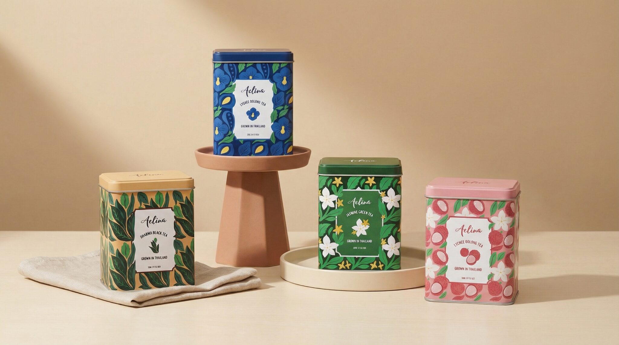

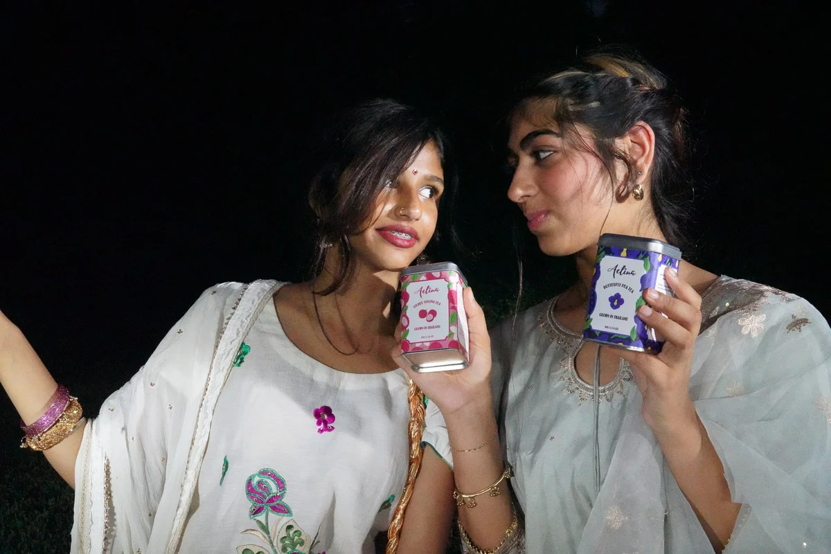
Aelina is a tea collection featuring a mix of floral, fruity and classic teas, each with its own distinct flavour profile.
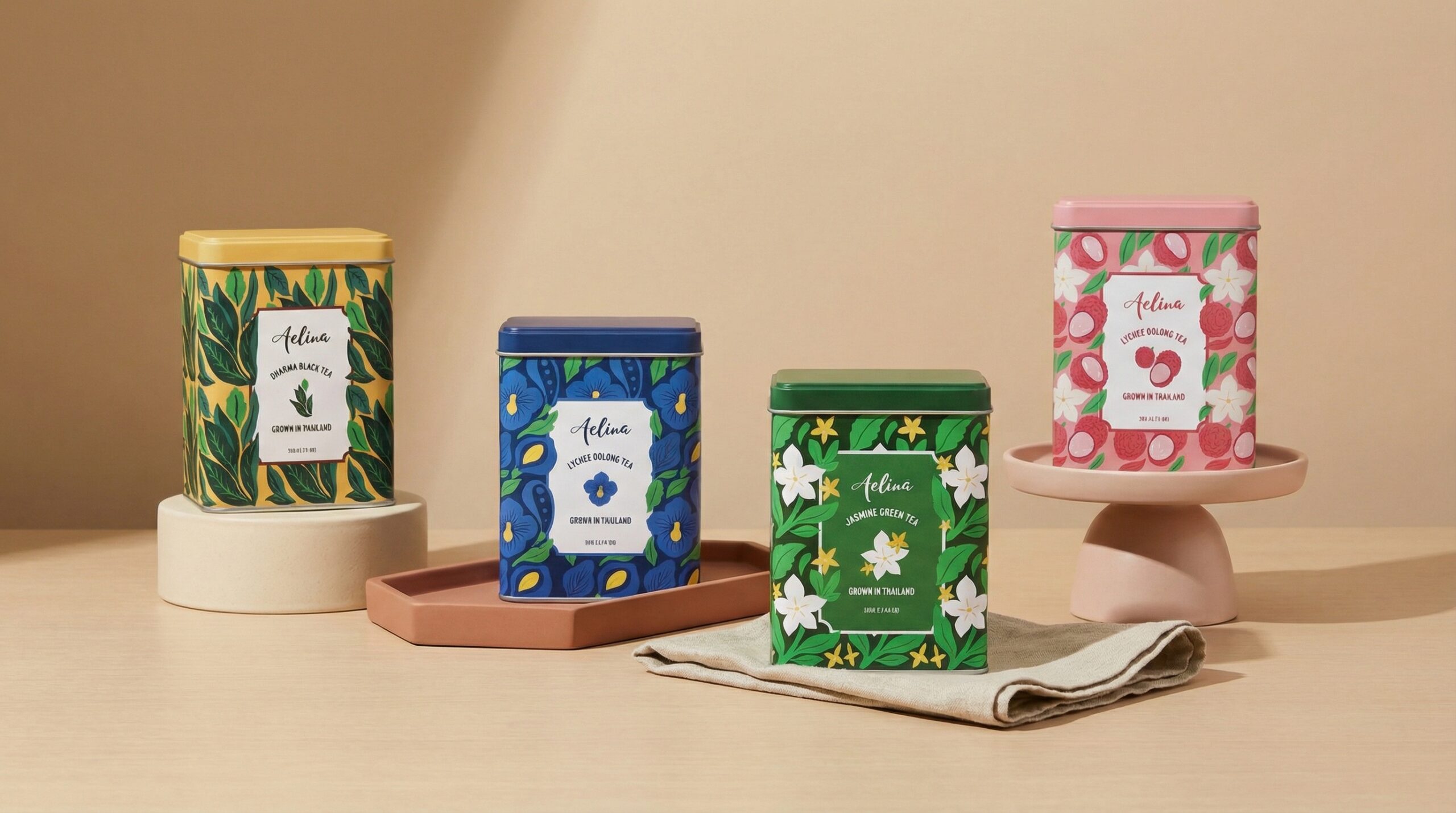
The project focused on developing a cohesive packaging system for the collection while giving each tea its own visual character. With seven different varieties ranging from Jasmine Green Tea and Lychee Oolong to Rose White Tea and Artisan Black Tea, the challenge was to create packaging that felt connected as a collection without making every flavour look the same.
The Approach
The packaging was designed around the characteristics of each tea. I researched the different tea varieties, their flavour profiles, ingredients and origins to understand what made each blend distinct.
Rather than treating the flavours as completely separate products, I looked at how they could work together as one collection. The packaging system therefore needed to have a consistent visual language, while colour, imagery and small details helped customers distinguish between the different varieties.
The Collection
Aelina’s collection includes:
Jasmine Green Tea
A fresh green tea with delicate jasmine notes.
Lychee Oolong Tea
A smooth oolong paired with the sweet, fruity character of lychee.
Passionfruit Green Tea
A bright green tea with tropical passionfruit notes.
Butterfly Pea Tea
A naturally blue botanical tea with its distinctive colour and gentle flavour.
Artisan Black Tea
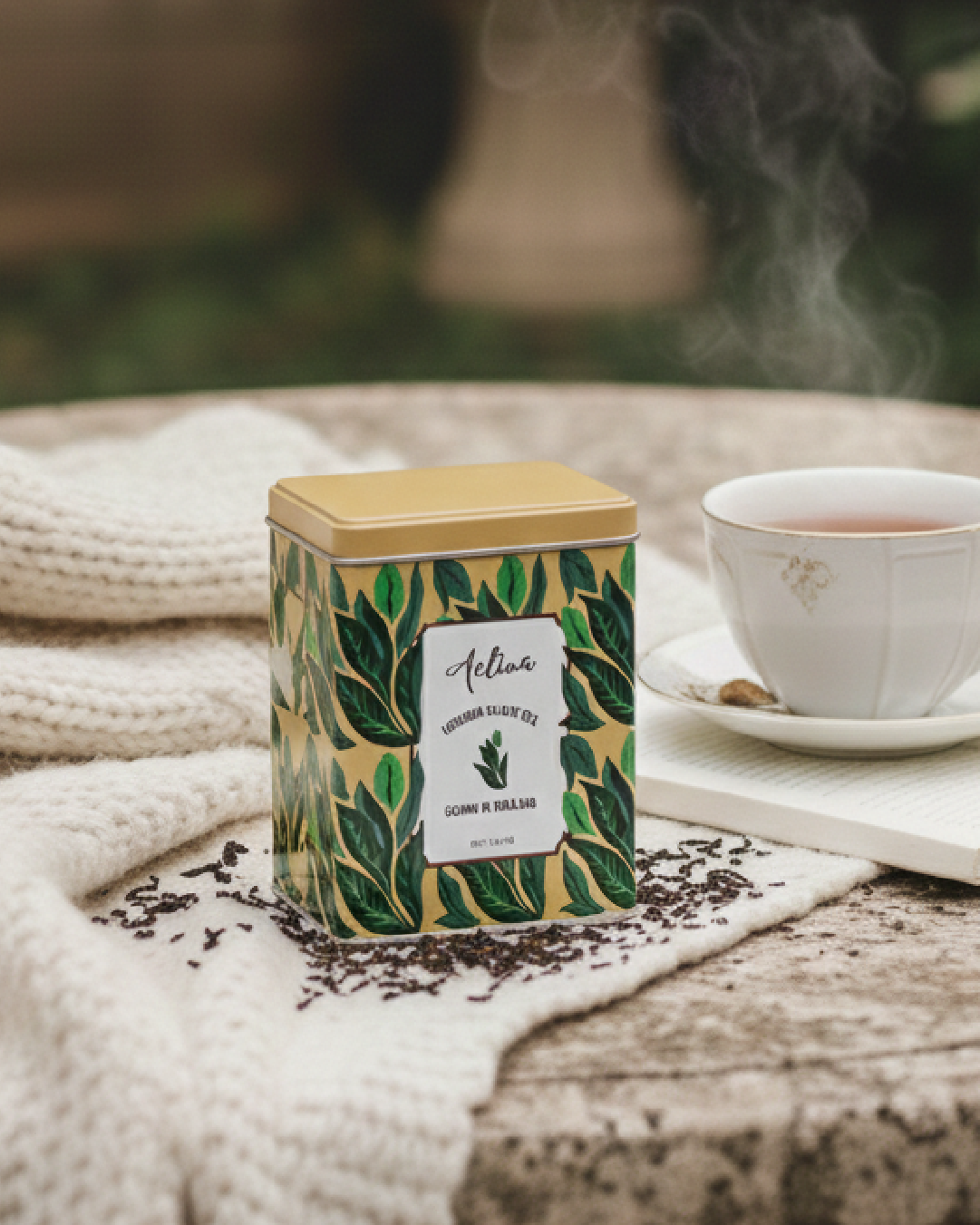
A whole-leaf black tea from Mae Hong Son, Thailand, with deep amber colour, honey-like flavour notes and a traditional black tea aroma.
Rose White Tea
A delicate white tea with soft floral rose notes.
White Tea Blend
A layered blend of white tea, peach, dried ginger, rose and jasmine.
Creating a Packaging System
With such a varied collection, consistency was an important part of the design process.
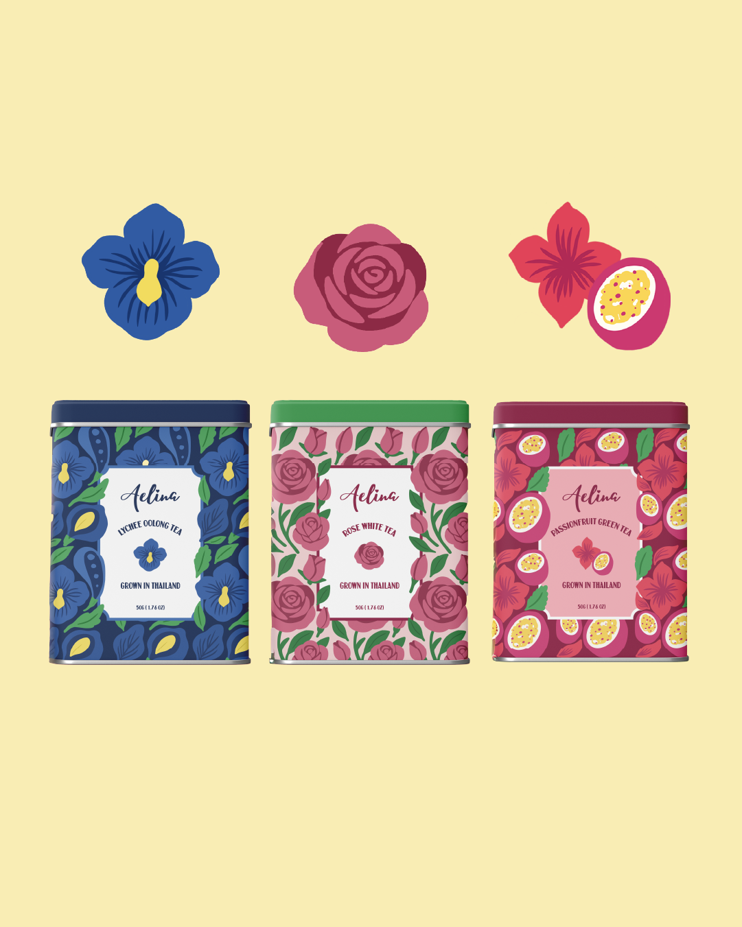
The goal was not to make seven identical packages with different names. Instead, the system allows each tea to feel like its own product while still being recognisable as part of Aelina’s collection.
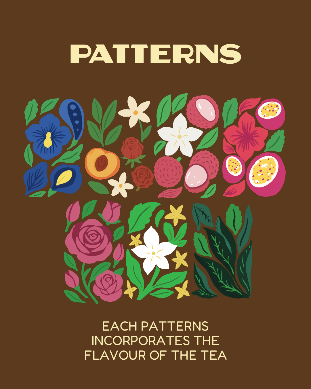
The tea type, flavour and ingredients informed the visual direction for each variant, while the overall layout and design language brought the range together.
Research & Exploration
Before developing the final packaging, I looked into tea culture, different tea processing methods, flavour profiles, tea origins and existing packaging systems.
I also studied how tea brands use typography, colour, botanical imagery and information hierarchy to communicate flavour and product characteristics on a relatively small surface.
This helped inform decisions around what information needed to stand out, how each flavour could be differentiated and how the entire range could work visually when displayed together.
Deliverables
- Packaging design for 7 tea varieties
- Packaging visual system
- Flavour differentiation
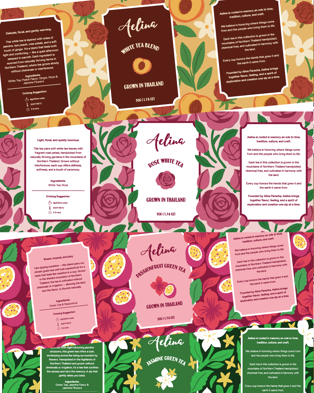
- Front and back packaging artwork
- Print-ready artwork

 habiba hatem
 Up-Brands
 sayadworks
 Kingdom & Sparrow
 furtgoods
 Si me preguntas
 Narrow House Packaging Branding & Design
 Clever Branding
 About House of Ta
 Hossam khalifa
 Valentyna Hradova
 Backbar Studios
 Holy Studio
 Prime
Prime Buddy Creative
 ezgidesignstudio
 Minim Brand Design
 Nenad Došen Studio
 Atyan
Atyan Massimo Lo Cascio
 Carreto Concepts Design Studio
 Charles Mason
 Pinot Agency
 VIEWPOINT