

AQD — Legal & Business Advisory
What happens when a contract becomes an identity?
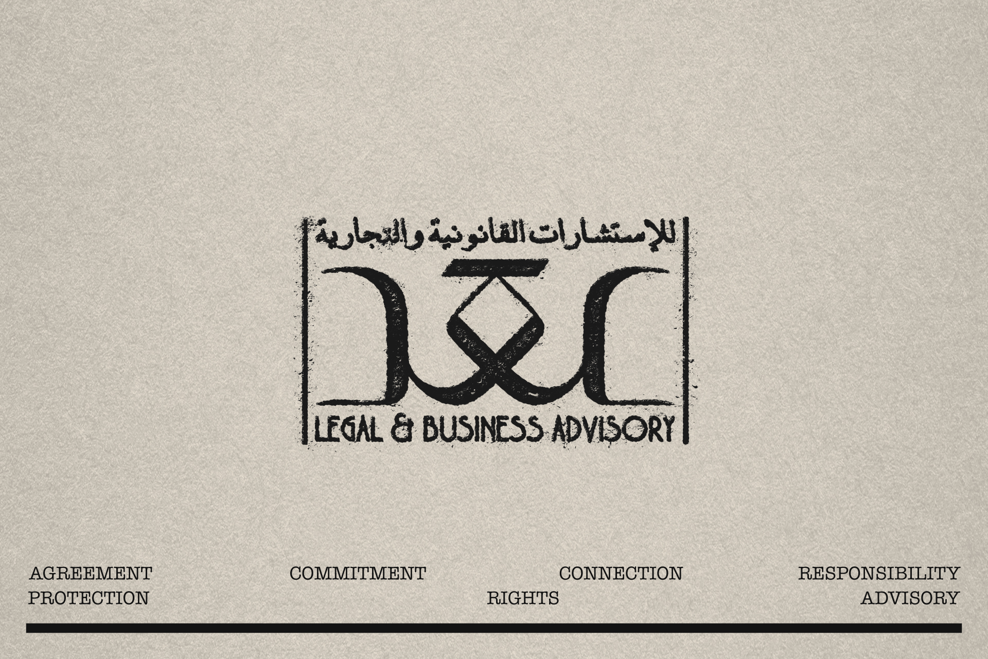
Built around the Arabic word عقد, AQD explores the relationship between agreement and connection. In Arabic, the name refers to a contract, while its visual construction evokes a knot — something tied, held and strengthened through connection.That dual meaning became the foundation of the identity.
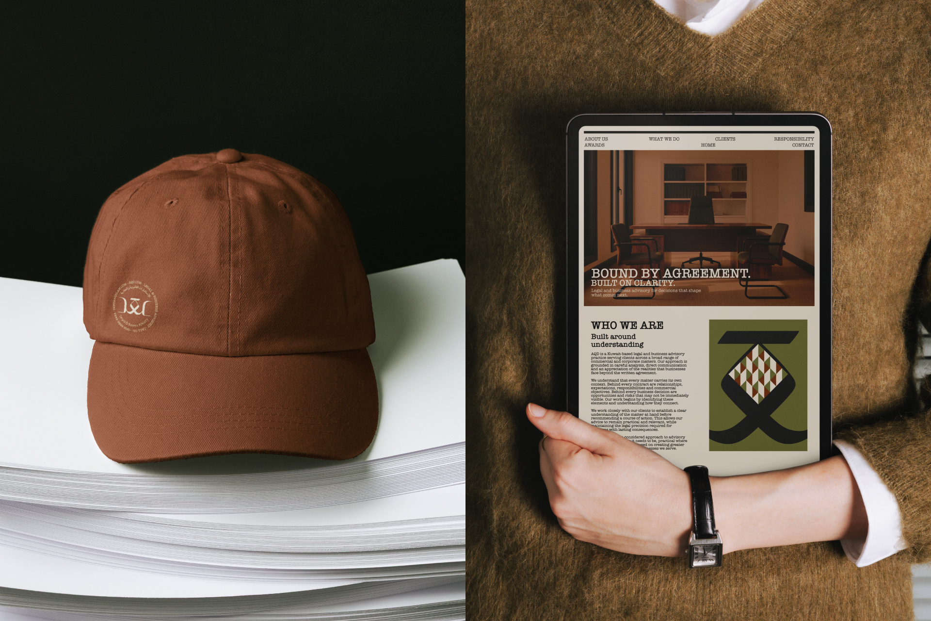
Rather than relying on the familiar symbols of the legal world, AQD was developed around clarity, structure, trust and responsibility. The custom Arabic wordmark carries the concept at its core, transforming the idea of a knot into a typographic gesture rather than a literal symbol.
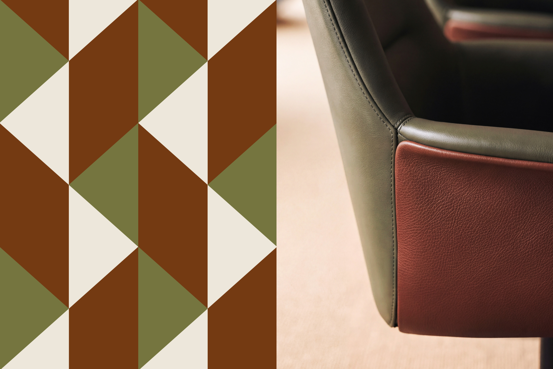
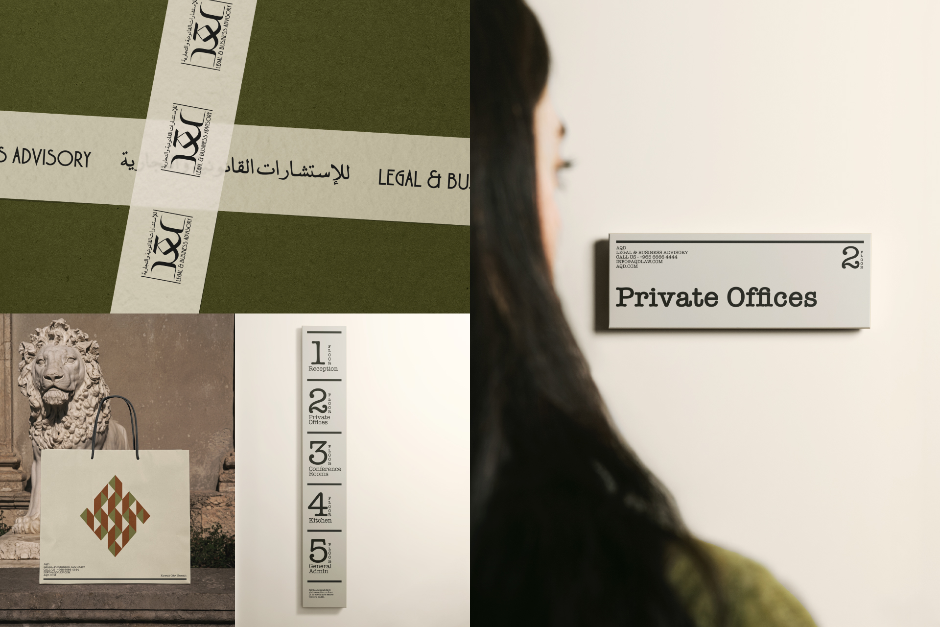
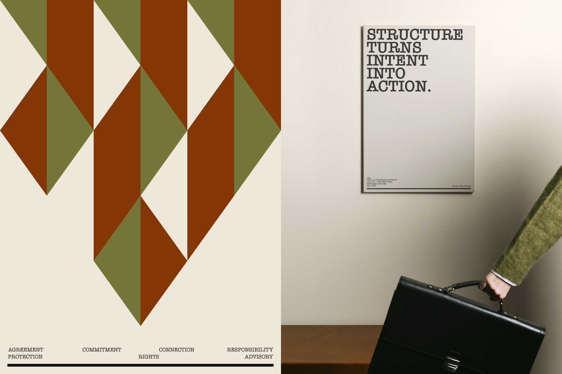
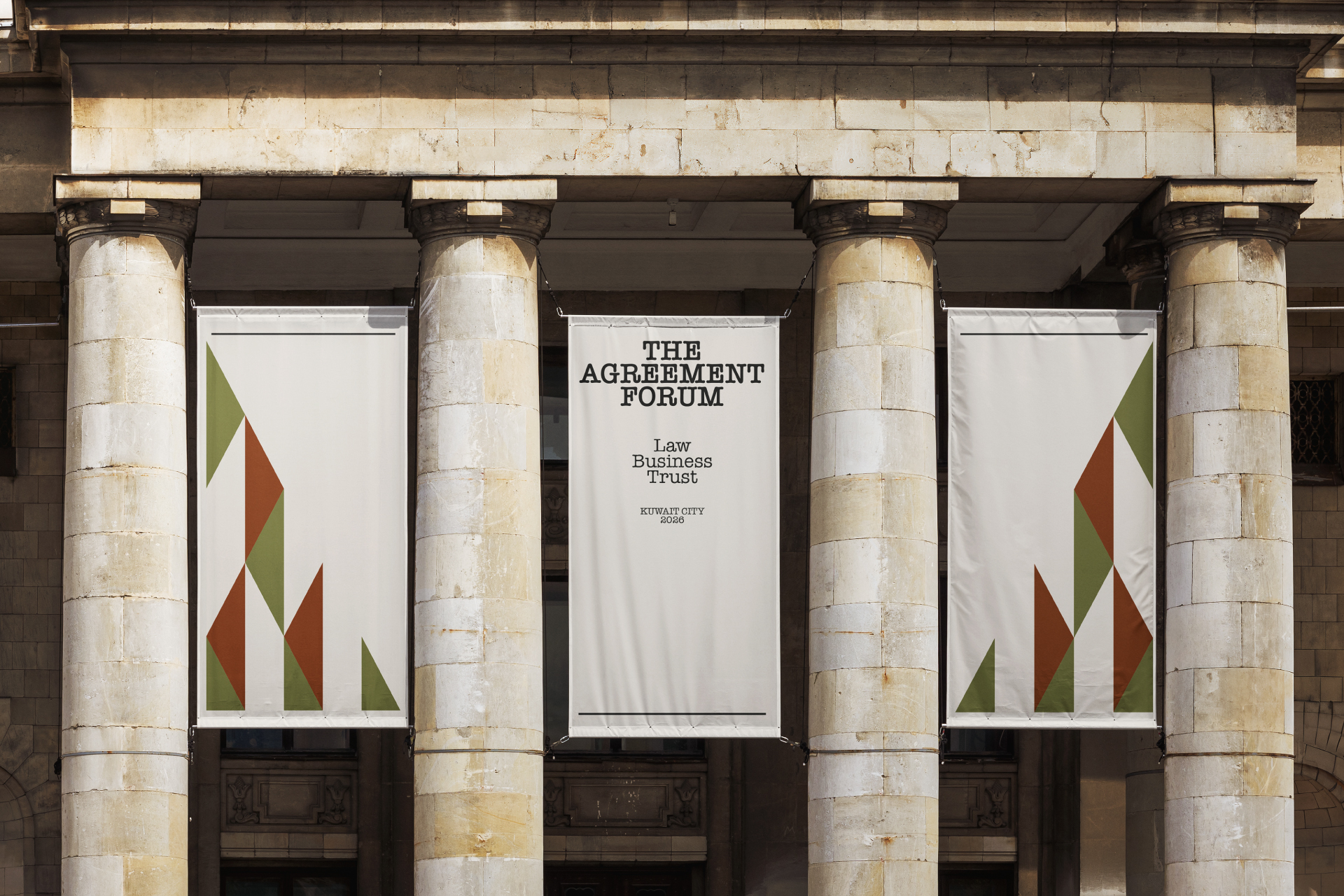
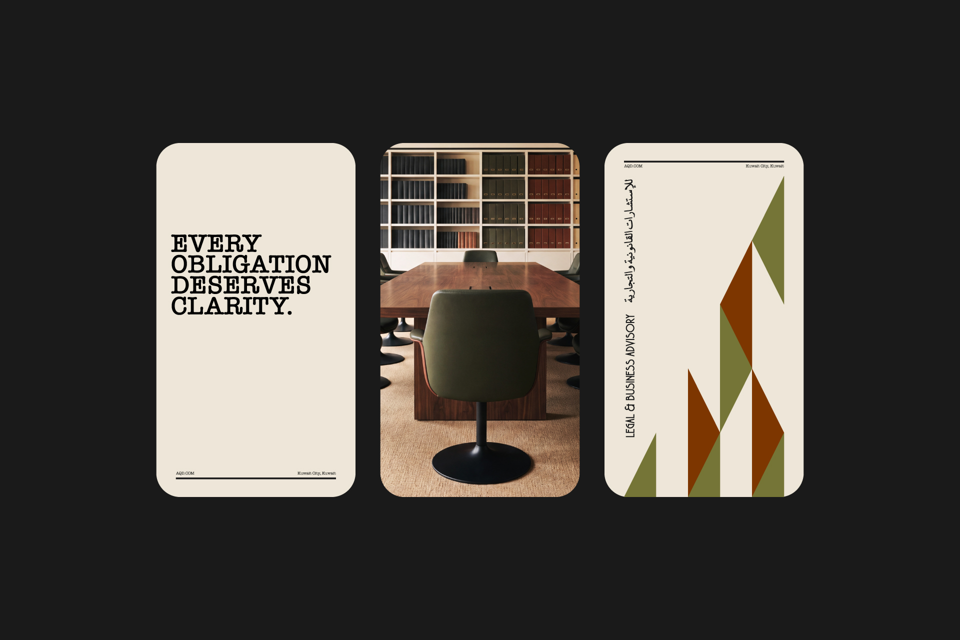
From that starting point, the identity extends into a complete visual language: structured typography, a restrained palette of olive, terracotta, warm ivory and charcoal, and a spatial system that brings the same sense of order and permanence into the physical environment.
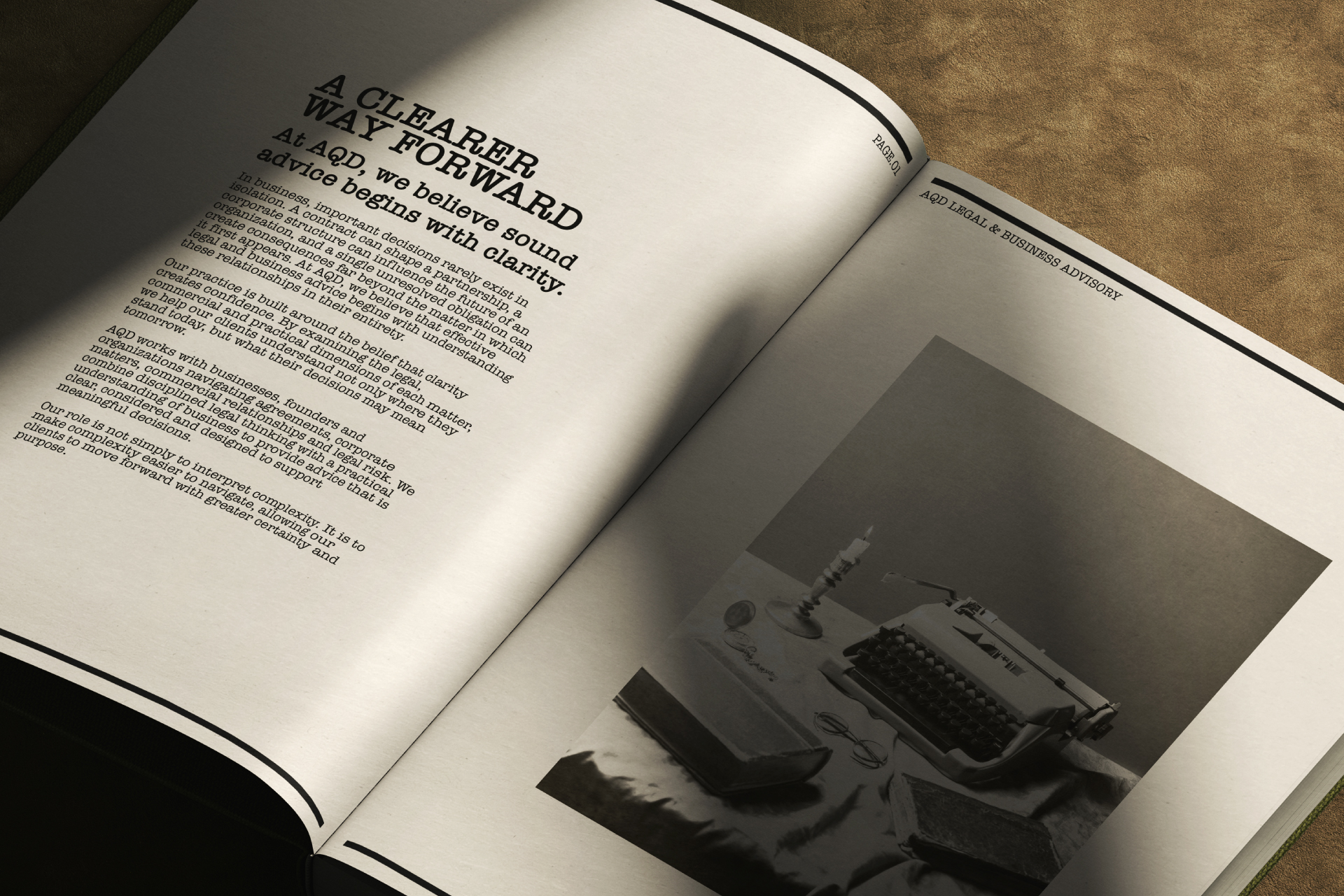
Every application follows the same principle — from legal documents and editorial matter to office interiors, environmental graphics, digital interfaces and event communication.The intention was never to make a legal practice look louder, more luxurious or more conventional.
It was to create something calm, precise and confident — an identity that feels established, thinks clearly, and understands that behind every agreement is a relationship worth protecting.









 Derrick Lin
 salutifg
 ADStudio
 WeAreDepot
 Manuvila
 Yellow Umbrella Creative
 Toka
Toka Studio Zak
 Atiq Alam
 monther al omari
 Modern Theory
 Sirka Agency
 DESIGN CONCEPTS
 Eva Chistyakova
 Puigdemont Roca
 marianaaworks
 bloomburo
 andreamarinnn
 Alina
Alina Saadmost
 Bruhken
 Maruf Nishat
 Richest Branding Pvt. Ltd.
 Sophiagdotcom
 saifullahmaslool
 Up-Brands