
CONTEXT:
In Ecuador, each Carnival has its own characters, rituals, and codes. All different. All Ecuadorian, but never all together.
INSIGHT:
There isn’t just one way to celebrate Carnival in Ecuador. But they all have one thing in common:
Pilsener. If one brand could connect that diversity, it was the beer that was already present at every celebration.
IDEA:
To pay homage to iconic characters from different Ecuadorian carnivals and design a system of cans that, when joined together, would also symbolically unite the country.
EXECUTION:
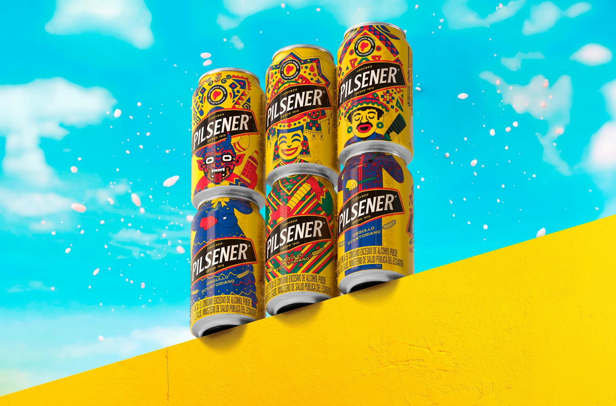
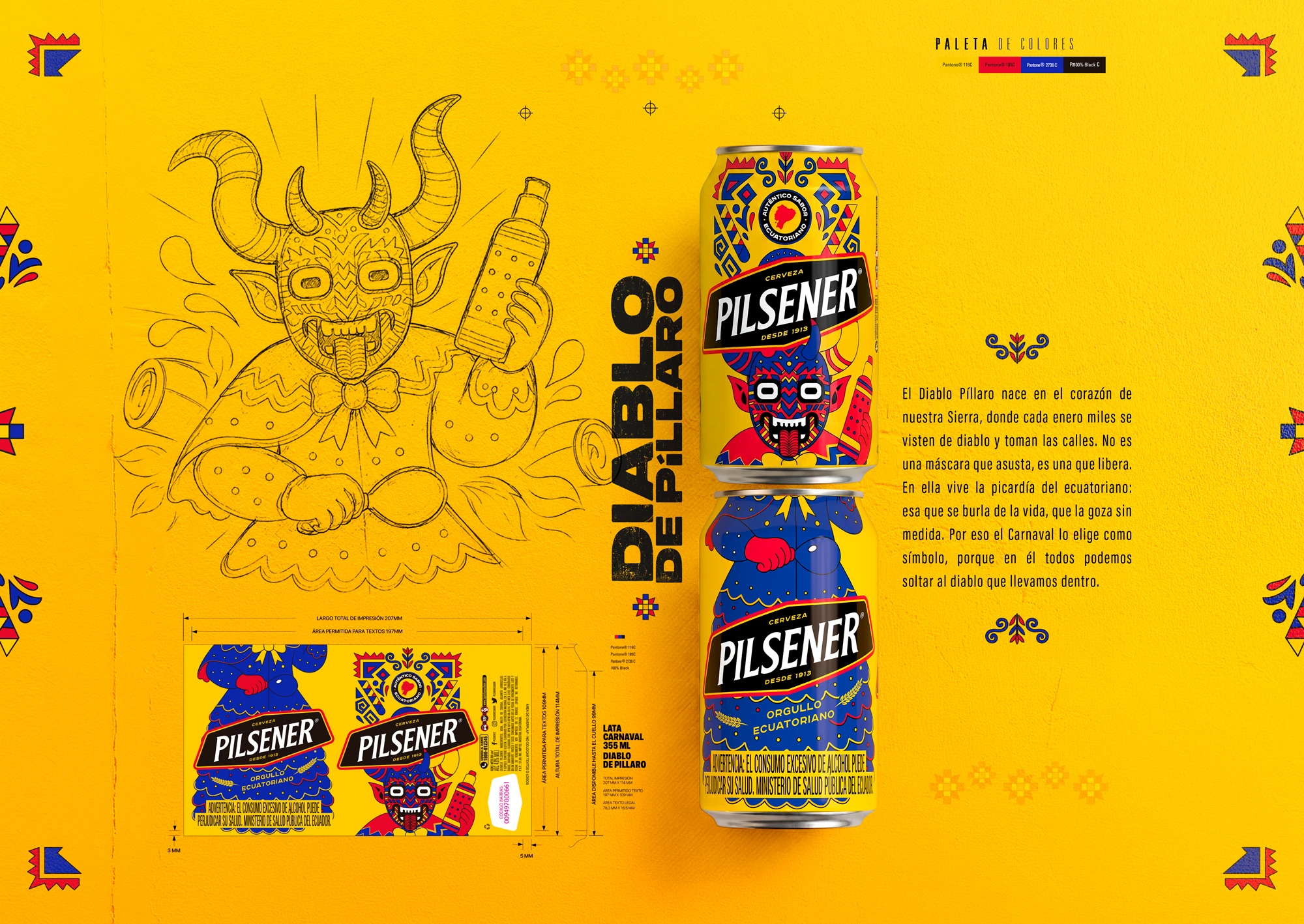
We created three collectible cans inspired by the Dancer of Pujilí, the Marimba Player, and the Devil of Píllaro. Their faces are on the front.
Their bodies are on the back. By placing one can on top of another, the characters were completed. And by mixing them, new combinations appeared. Thus, the packaging ceased to be just packaging and became a game, a collectible, and a cultural connection.
Cliente: Pilsener
Vp Marketing: Pepe Pérez-vargas
Gerente De Marca Premium Y Global: Eddy Cepeda
Líder De Marca: Kiti Ramos
Agencia: Delta Mullenlowe
Presidente: Pablo Salazar
Director General: Juan Ignacio Gallego
Director Creativo: Marco Tapia / André Pedroso
Director General Del Cliente: César Centeno
Jefe De Estrategia: Eduardo Carvajalino
Director Creativo Jefe: Leonardo Jurado
Director Creativo: Javier Maldonado / César Sepúlveda
Redactor Creativo: Germán Demey
Director Principal De Arte: Jonathan Aguiar
Director De Arte: Andrés Vallejo / Melanie Rosental
Ilustrador: Jonathan Aguiar
Diseñador Gráfico: Ricardo Loor / Roberto Alarcón / Gonzalo Vallejo
Diseñador Multimedia: Matthew Ardern / Leandro Aguirre / Jorge Yépez
Directora De Cuentas: Daniella Fernández
Ejecutiva De Cuentas: María Gracias Luna
Directora De Producción: Julieta Kropivka
Productora Ejecutiva: Diana Hungria
Planificadora Estratégica: Fernanda Martínez
Productora: Levector
Agencia Socia: Draftline Ecuador
Curator’s Insight
What makes this system work is a constraint most collectible packaging avoids: the artwork only completes itself vertically, not on a single can. Splitting each character into a head panel and a body panel forces the illustration to be built as two independently legible halves that also register correctly when a second can sits directly on top of the first. That is a print production problem as much as an illustration one, since can diameter, seam placement and stacking height all have to align closely enough for a horn, a hand or a hemline to continue believably from one surface to the next.
The more interesting decision is what happens when the halves do not match. Rather than treating mismatched stacking as a flaw to be minimized, the system treats it as a second mode. Wrong pairings still resolve into something coherent, a body from one character topped with the head of another, which turns the packaging into a loose generative system rather than a fixed set of three finished designs. That shifts the collectible logic away from simple completism (find all three) toward combinatorics (find every version), which extends shelf engagement well past the initial purchase.
The transferable principle is that modular packaging gains the most value when the “wrong” combinations are designed to still work. A system built only for its correct pairing invites frustration when it fails; one built to reward any pairing turns variation itself into the product’s appeal.



 Derrick Lin
 Biaa
Biaa Petitmoulin Studio
 White Bear Studio
 Eva Chistyakova
 monther al omari
 Atipus
 alchimistestudioParis
 oneandother
 bloomburo
 helocrene
 Shapers Studio
 Denver Design
 Aidearte
 andrew.huerta
 softmachine
 airobtq
 Buzz & Co.
 Ruby
Ruby themythographer
 IDNB Inc.
 viktorflr
 Zenpack