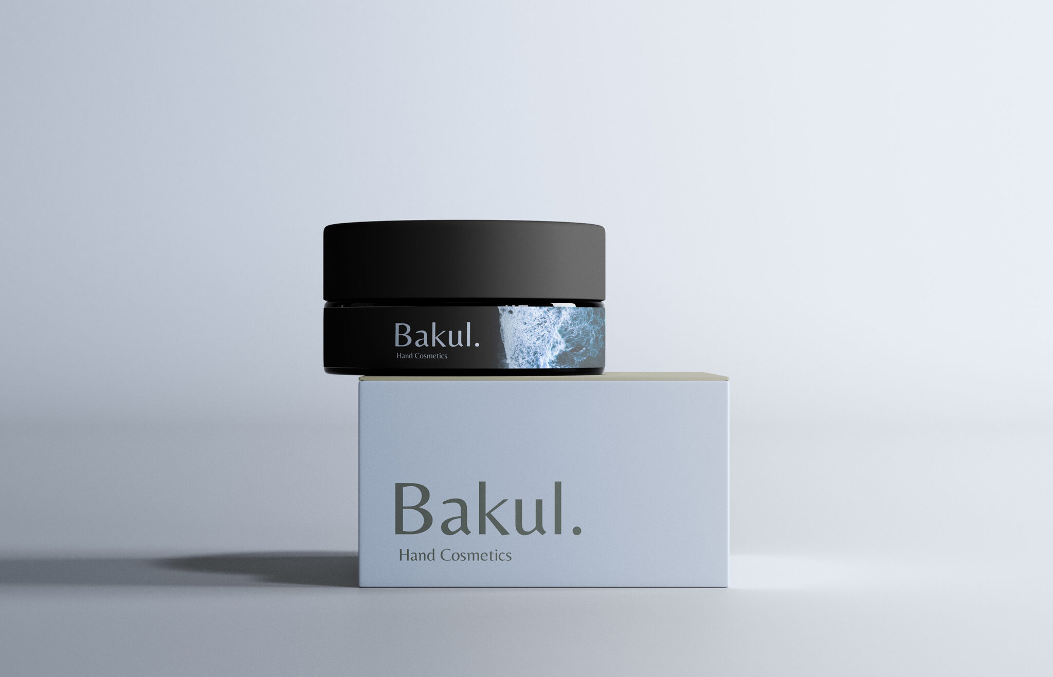

Bakul. — Hand Cosmetics Brand & Packaging Design Case Study
ABOUT
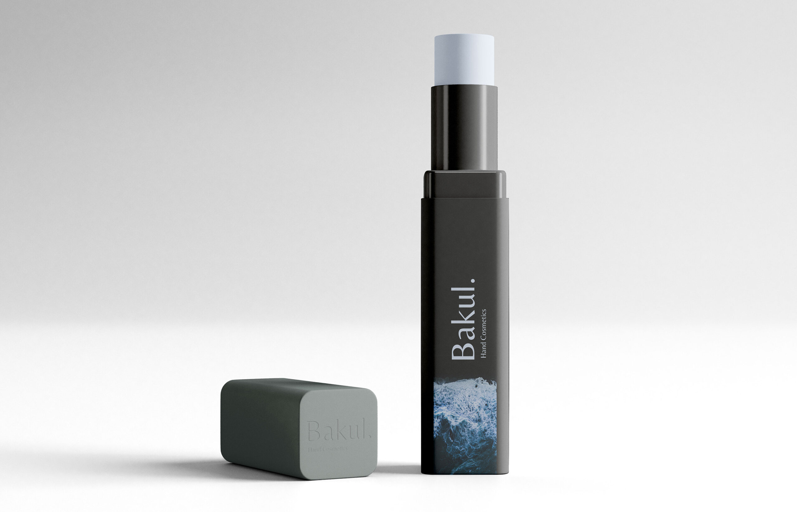
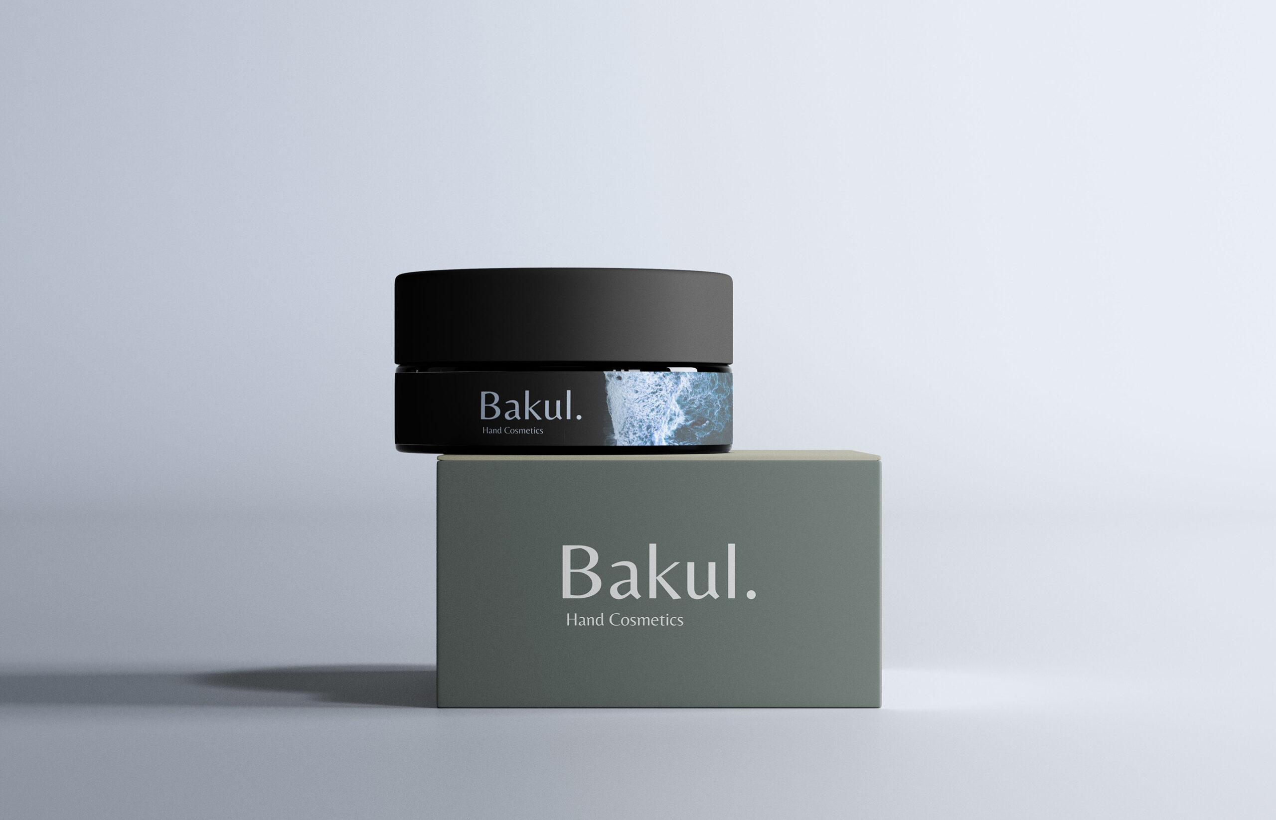
This was a creative branding and packaging project where we developed a distinct visual identity and packaging system for Bakul. Hand Cosmetics. The goal was to establish a premium hand care brand that communicates deep hydration, organic purity, and elemental beauty.
Why water and raw earth textures?
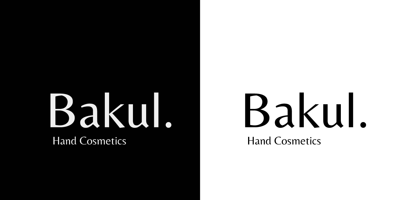
Because hand cosmetics often focus on gentle, delicate imagery, whereas hands are constantly exposed to the raw elements of daily life. So we came up with a contrast-driven solution, balancing minimal, stark typography with the powerful, fluid energy of natural aquatic elements.
SOLUTION
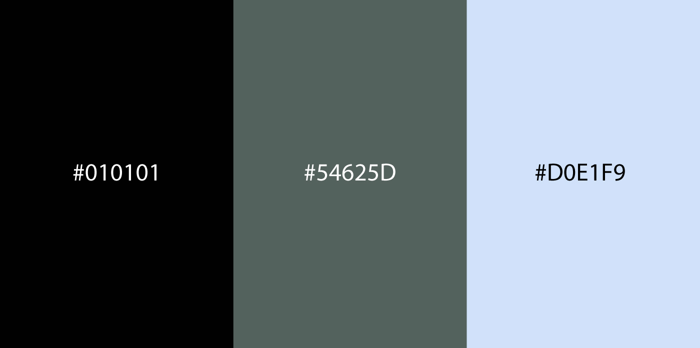
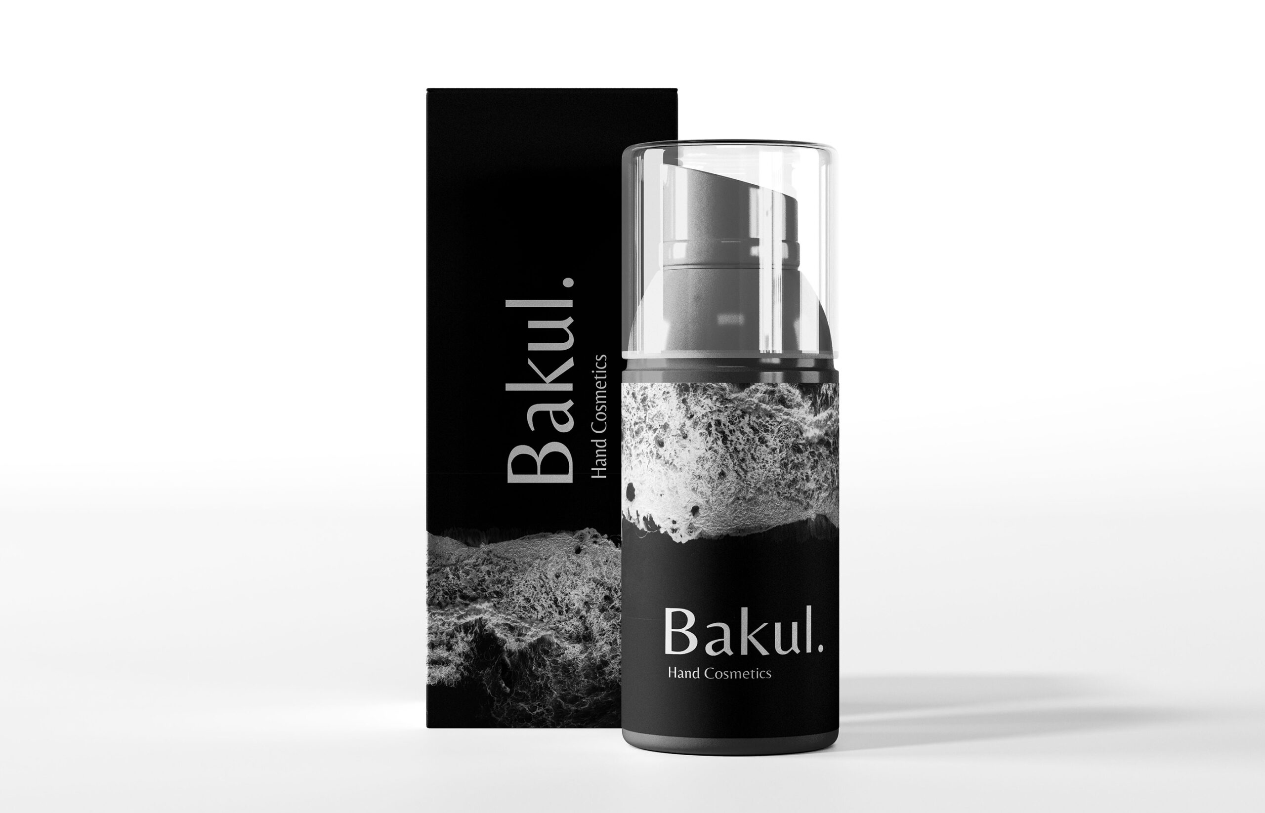
To reflect how the product deeply restores and hydrates dry skin, we wrapped dynamic, macro photography of crashing ocean waves and foaming water directly around dark, sleek cosmetic jars, bottles, and lip balm tubes. The bottle acts as a dark canvas, while the high-contrast blue seafoam band serves as a visual metaphor for intense moisture. For the outer packaging, we utilized solid muted earth tones—deep charcoal (#010101), sage green (#54625D), and soft ice blue (#D0E1F9)—creating a dual-layered unboxing experience where a quiet, minimalist exterior opens to reveal a vivid, textured product inside.
RESULT
This creates an immediate visual and tactile experience that elevates the perception of hand care from an everyday routine to a luxurious ritual. As an outcome, we managed to translate the raw essence of natural hydration into a sleek, modern cosmetic line, creating an exceptional design that stands out instantly on retail shelves and remains unforgettable.

 NEV
NEV Stefano Bracci
 Alina
Alina monther al omari
 Lizakjx
 JOAOMARCOSDESIGN
 alchimistestudioParis
 Harriet Neild
 octavio rojo
 宏洛图品牌设计HONGLT
 DESIGN CONCEPTS
 Alexander Skurihin
 Studio K95
 ARMBRAND
 Richa Rai
 houseoferas by Miti
 Agence des Coteaux
 Kushi Eaknath
 Ann Treasa
 Xiao Ning
 krrrrrllii
 babyage
 Deep
Deep