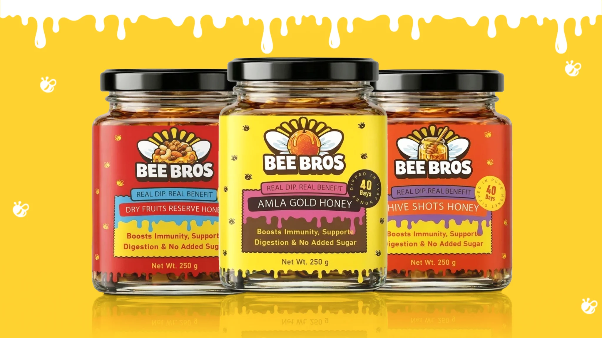

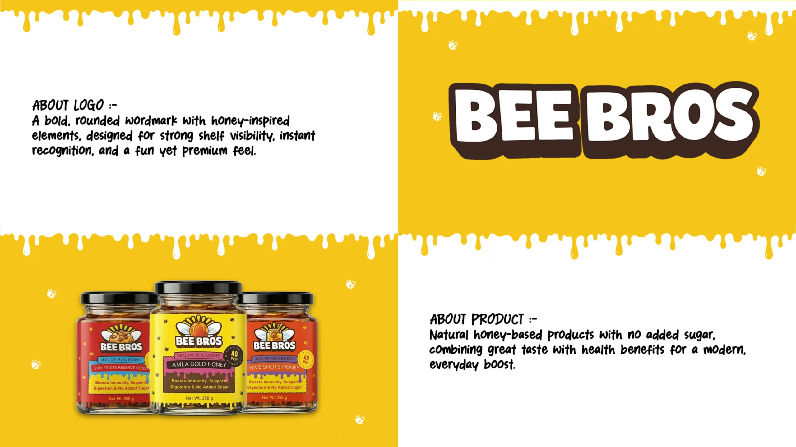
BEE BROS is a premium honey brand built around natural sweetness, warmth and everyday wellness. The objective was to create an identity and packaging system that feels authentic and trustworthy while remaining bold, playful and easy to recognise.
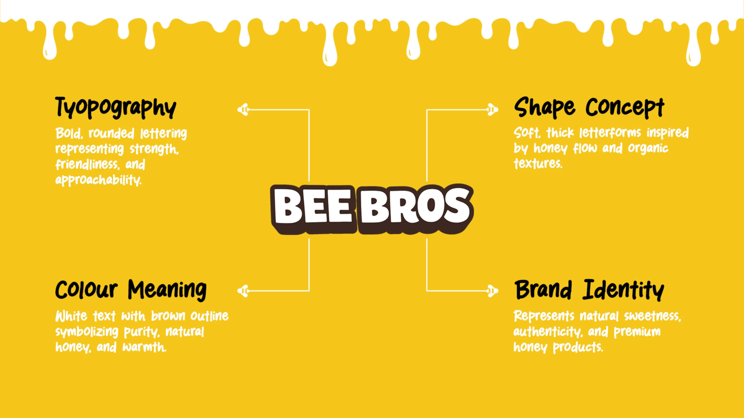
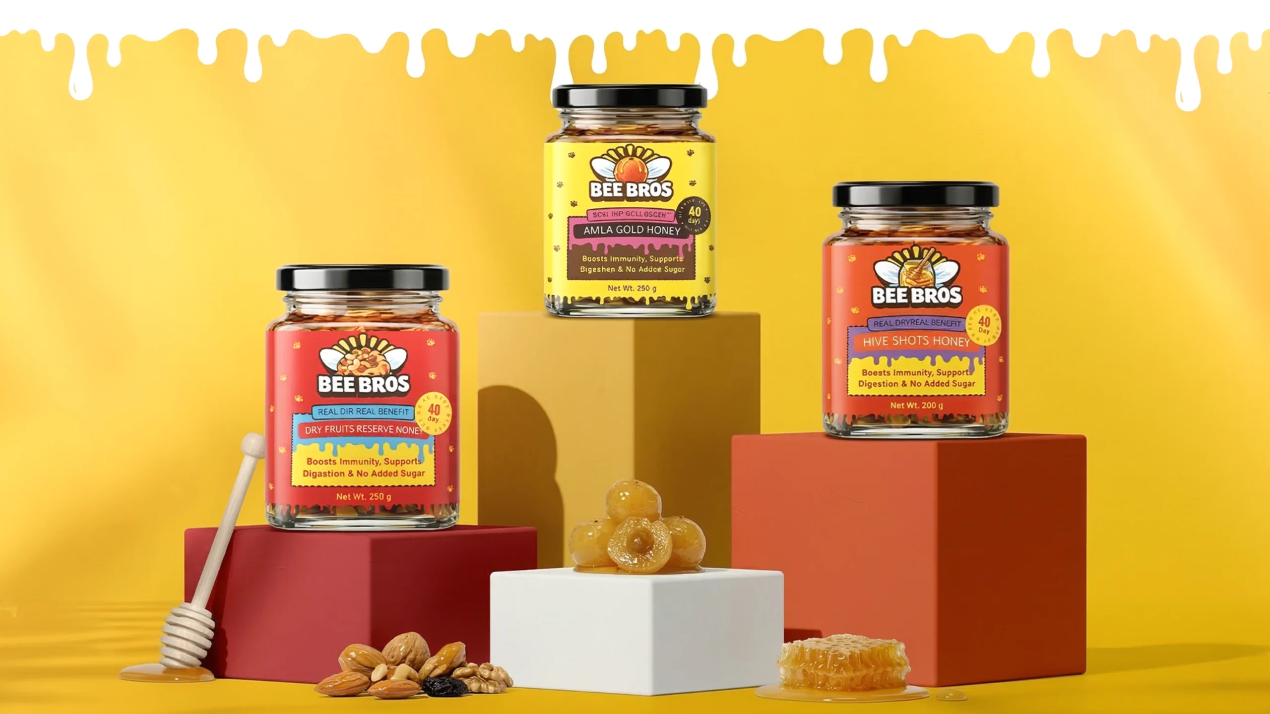
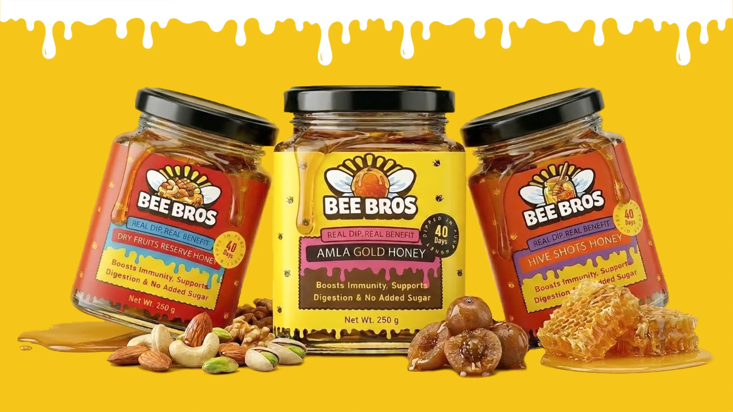
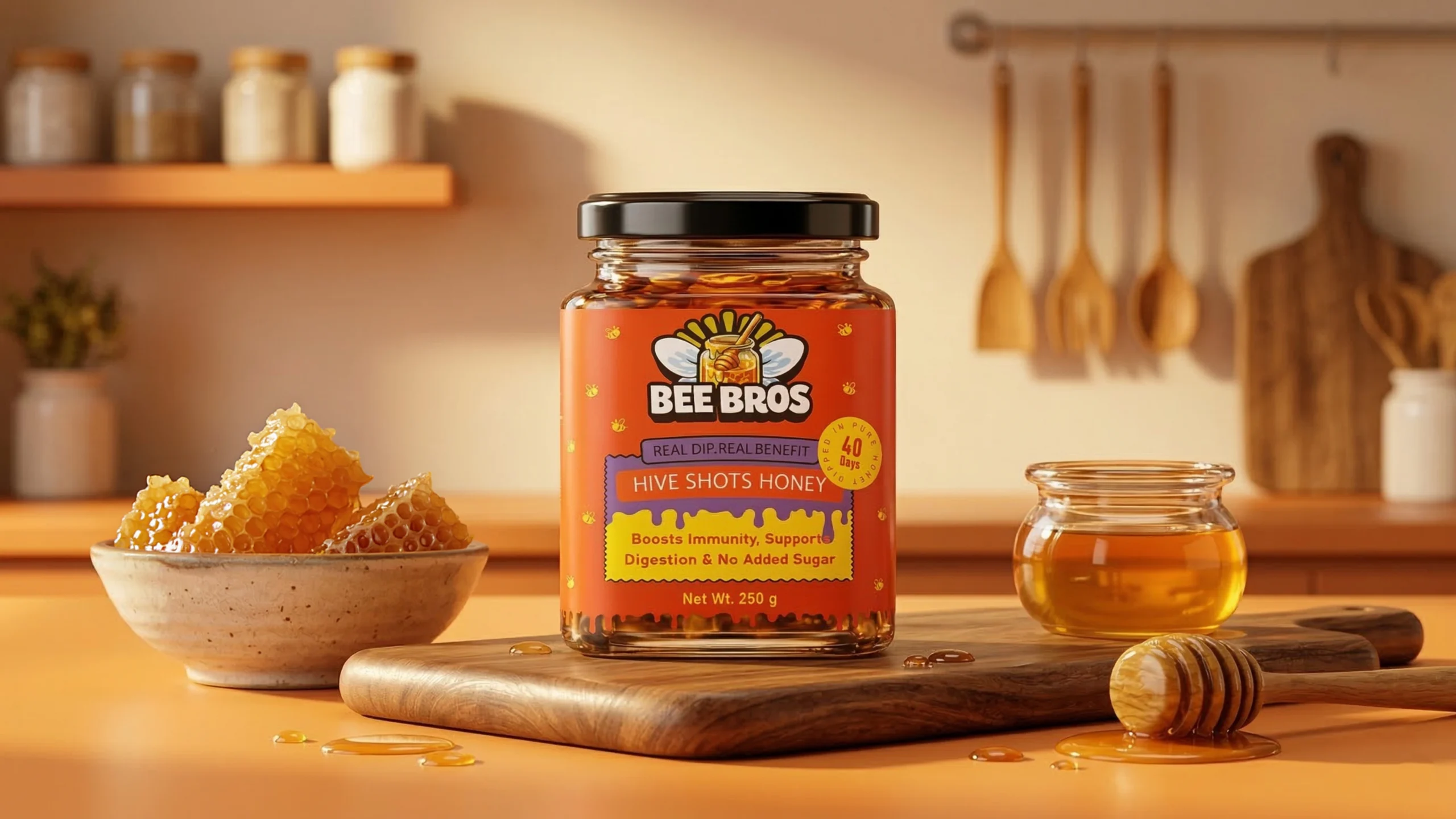
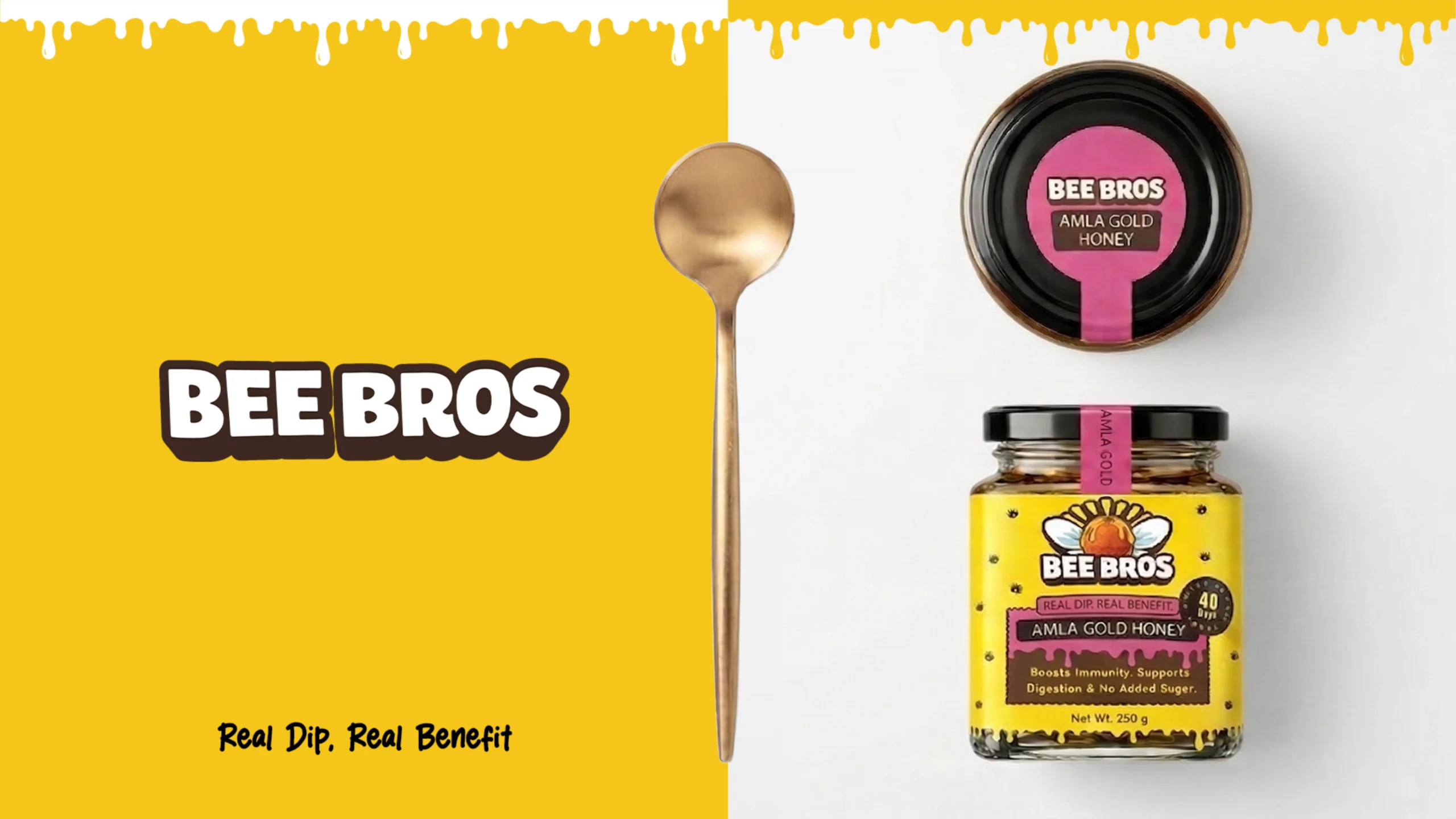
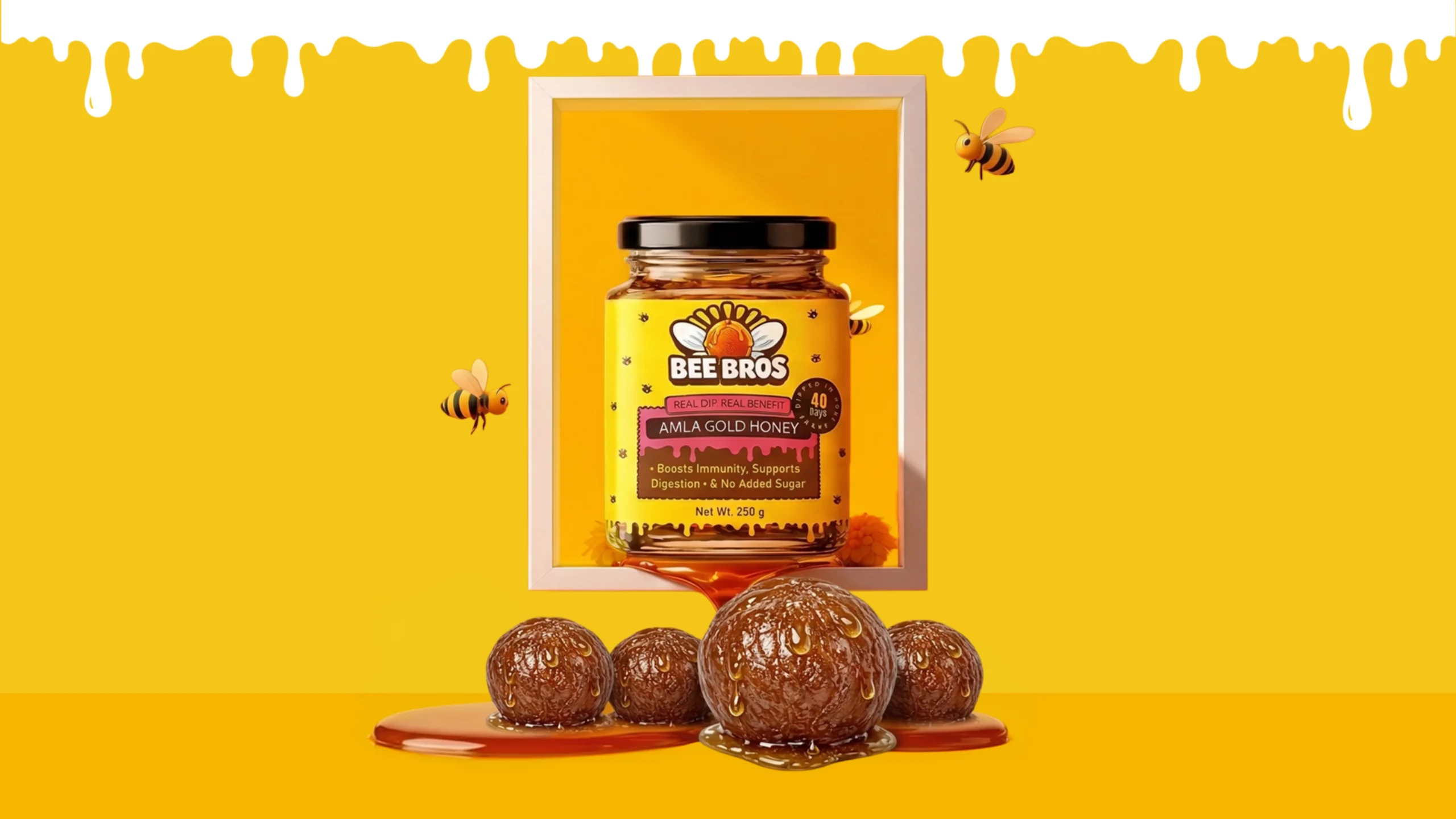
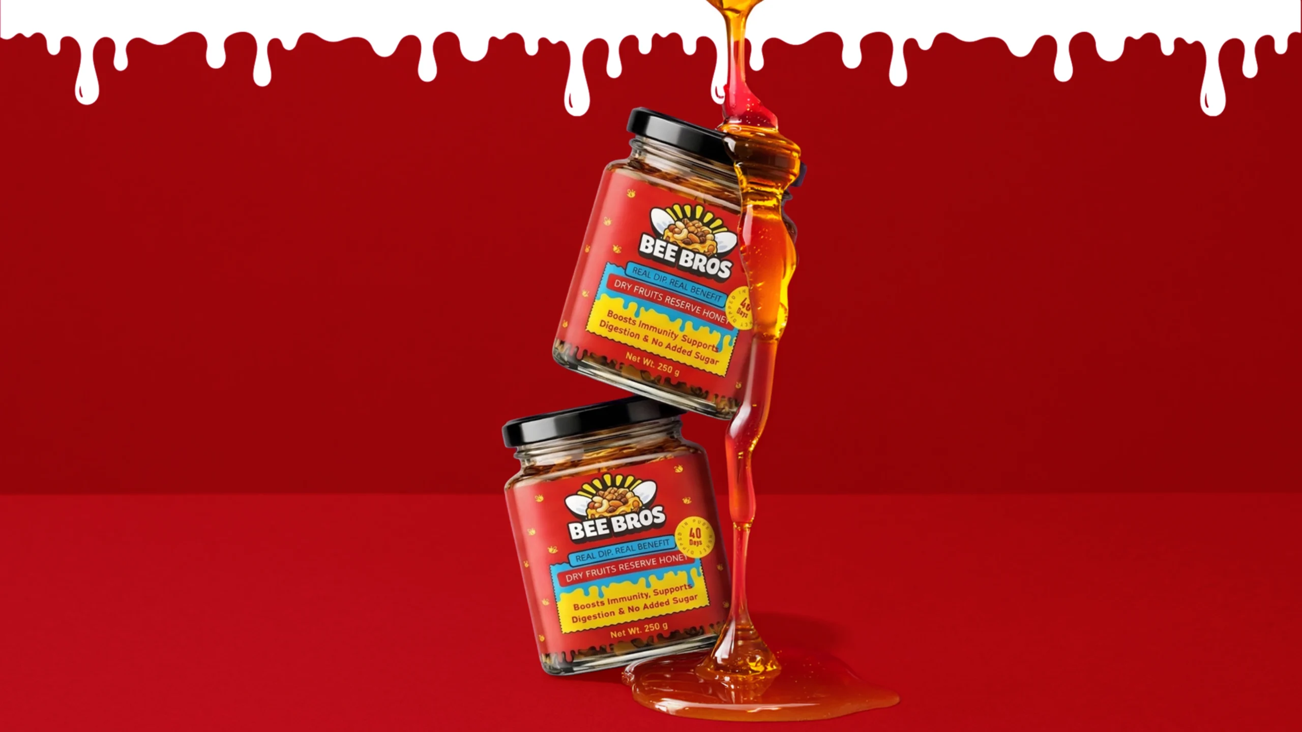
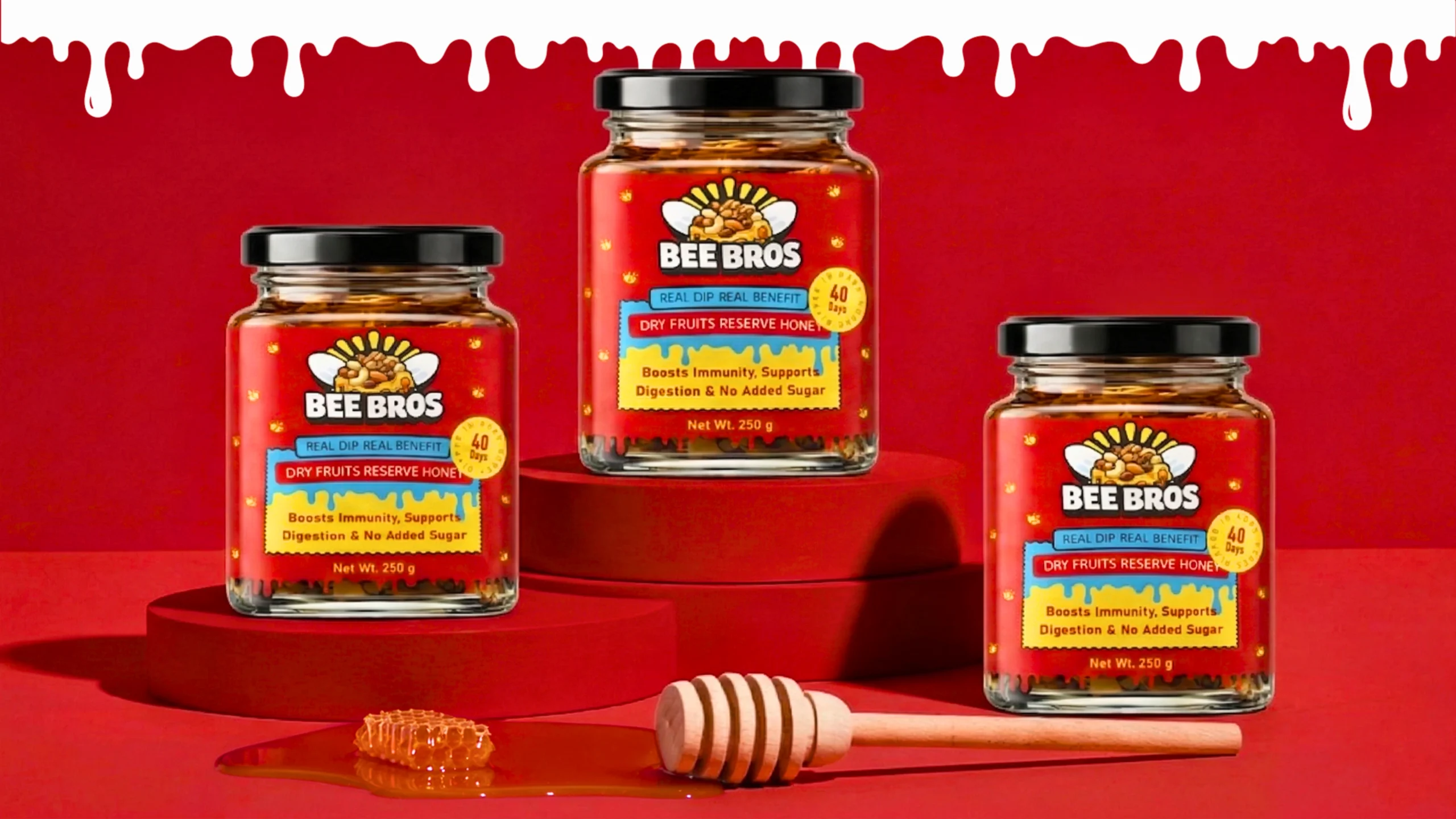
The logo uses strong, rounded typography inspired by the smooth movement of honey. The illustrated bee symbol adds personality and establishes an immediate connection with the product. Yellow, red, orange, pink and brown create a warm, energetic colour system that helps every product variant stand apart on the shelf while maintaining a consistent brand identity.
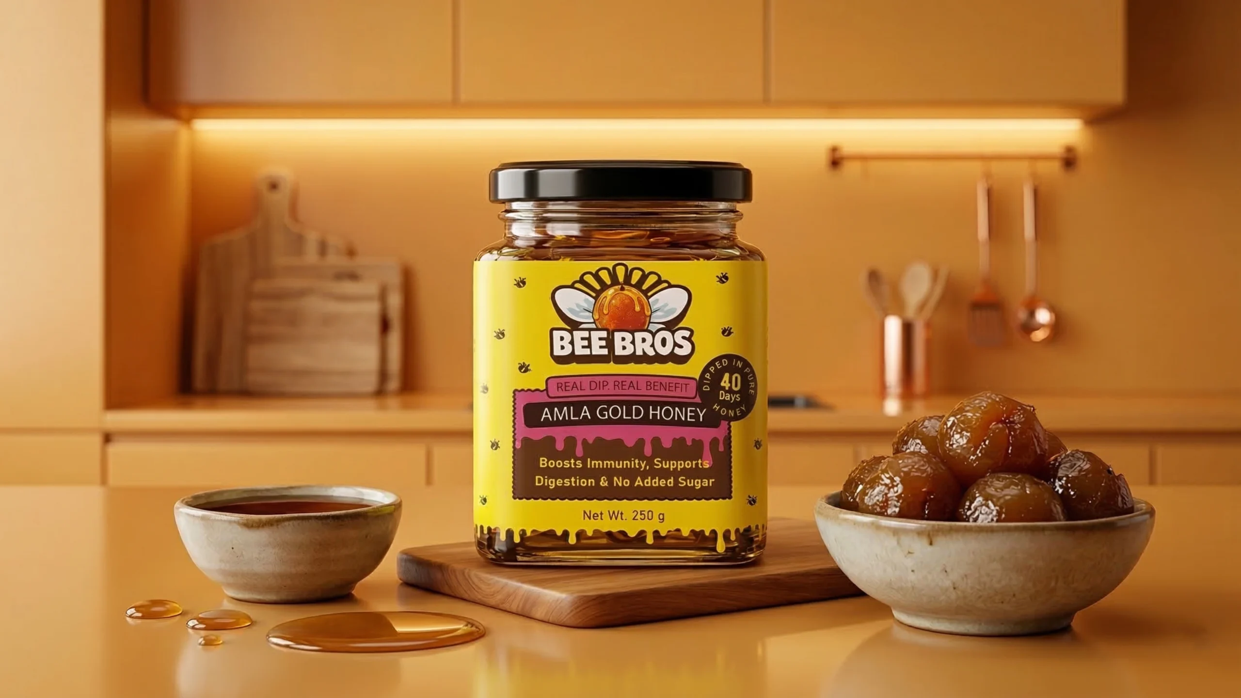
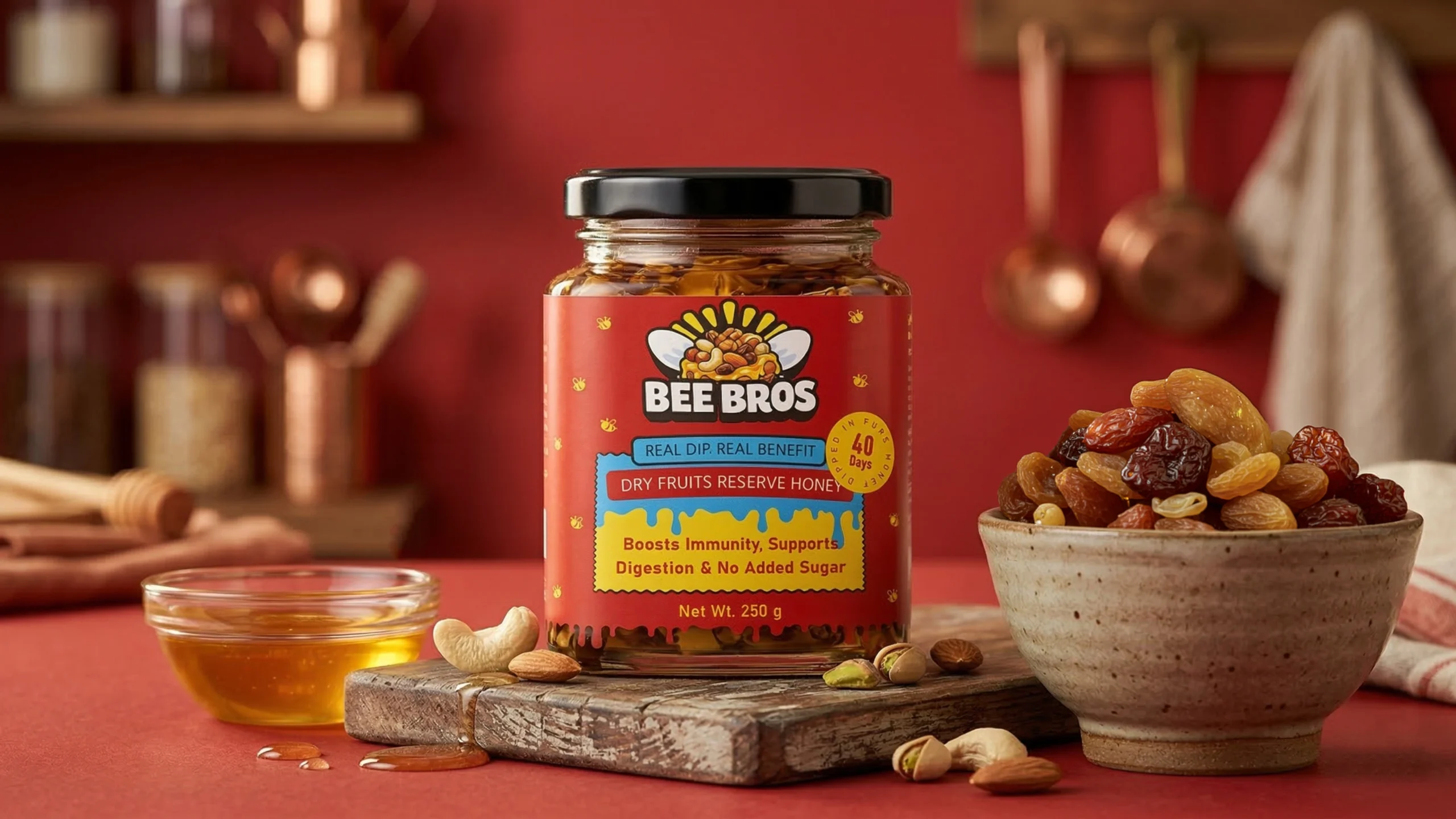
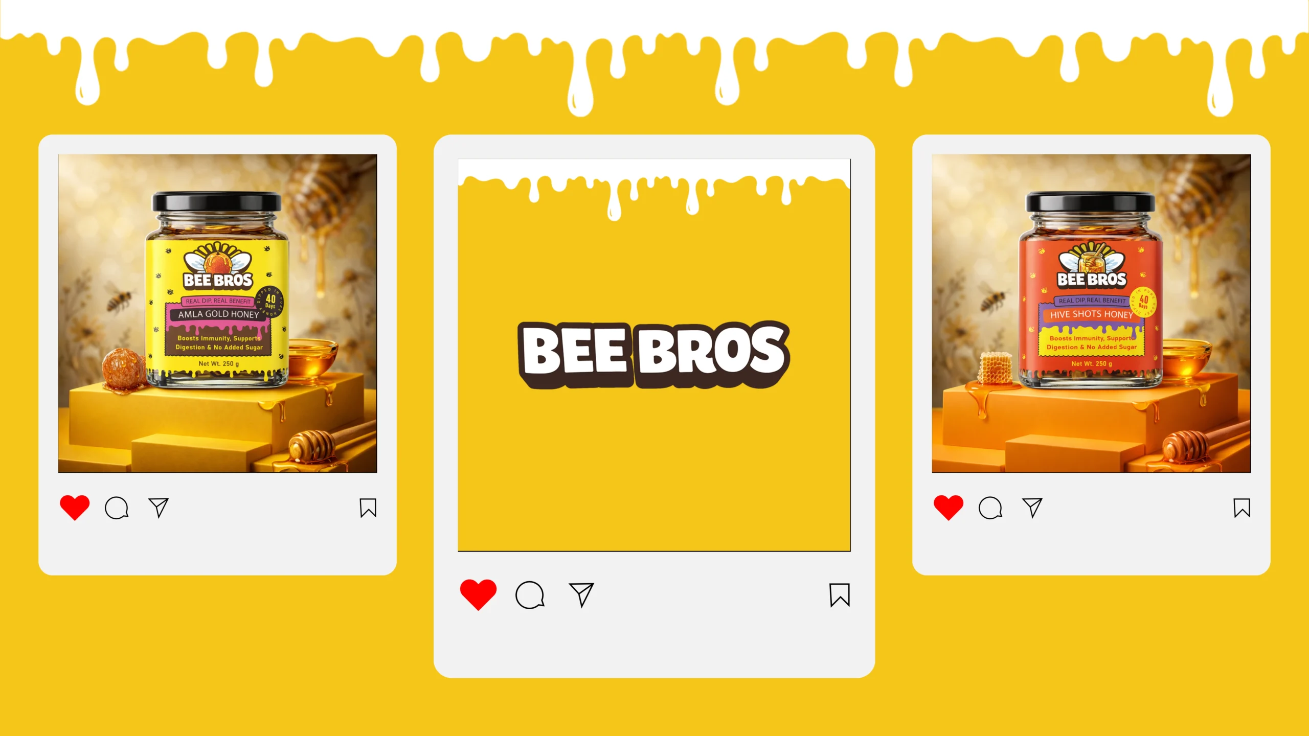
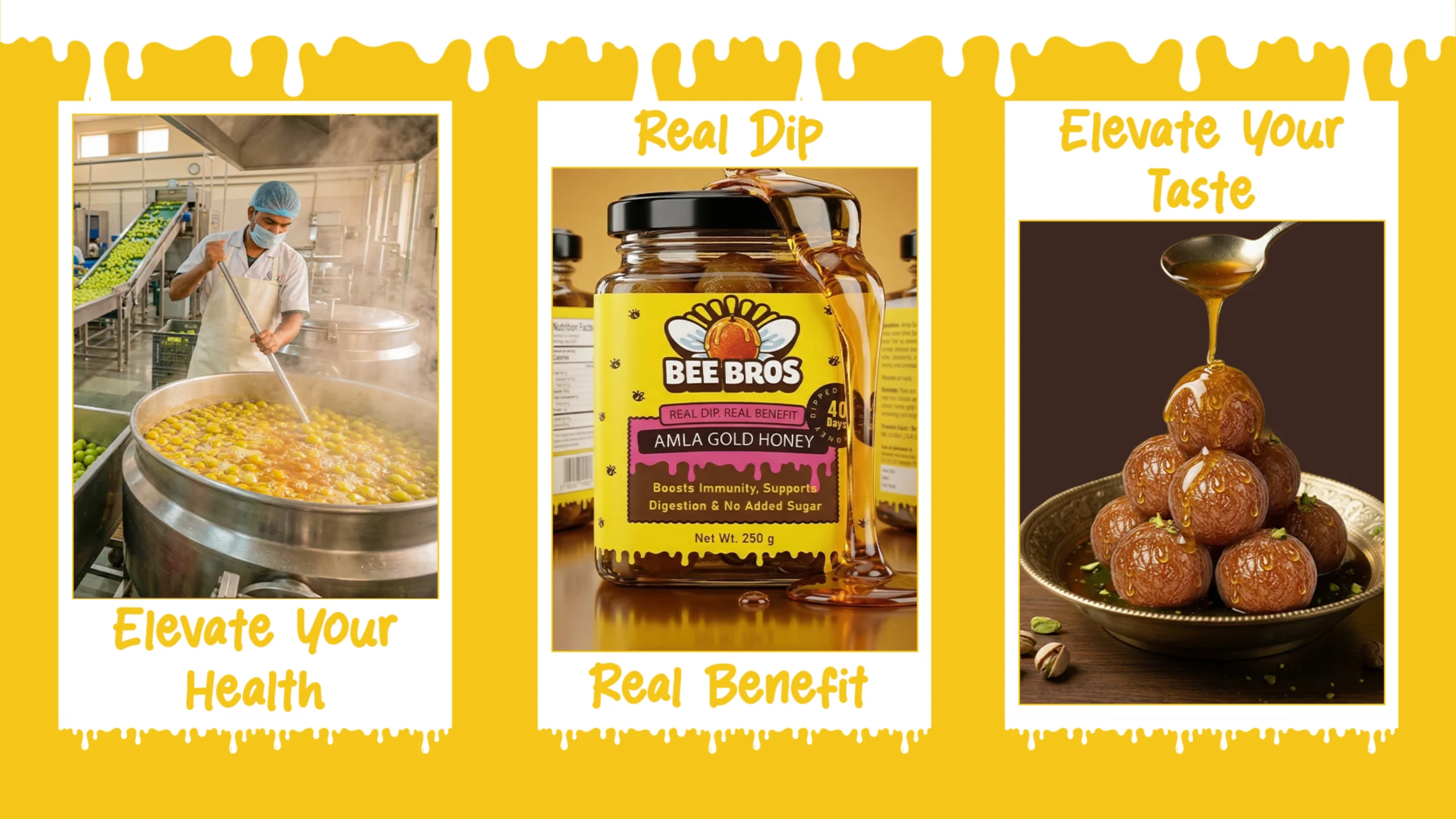
The packaging range includes Amla Gold Honey, Dry Fruits Reserve Honey and Hive Shots Honey. Each glass jar uses a distinctive colour-coded label, ingredient-inspired illustrations and clear product information. Honey-drip graphics connect the visual system across the complete range and reinforce the natural character of the brand.
The final design gives BEE BROS a friendly but premium shelf presence that works across physical packaging, retail displays, social-media communication and branded merchandise.

 Derrick Lin
 monther al omari
 43oz
43oz lilyz design23
 Eighteen Brand Studio
 Bhumika Singh
 MohamedMashaly
 Pixels Studio
 Gulya
Gulya UPRISE
 Lizaveta Kharitonyuk
 Bonsanco Creative Studio
 DesignRepublic
 GIRAFA STUDIO
 PiotrWisniewski
 Sophiagdotcom
 CreativeWise
 SoreThumbStudio®
 Modern World Studio
 Palashcc
 Valérie Colace
 andreamarinnn
 Chochoi Creative